
-

-
Subscribe
Thanks for stopping by The Colorful Bee! Stay in touch and never miss a post. Subscribe to receive an e-mail when a new post is up, HERE.Sponsor
If you're interesting in advertising on The Colorful Bee, click here to learn more.Contact
You can also email me at Linda.Leyble@gmail.com -


Categories
Subscribe
Popular posts
-
Recent Posts
Blogroll
Links

Author Archives: Linda
Color Roundup: Emerald Green
When I was a kid, I envied anyone who was born in May because their birthstone was Emerald. I loved that gem so much – still do. My birthday is in August – which lists two birthstones – the very pretty Peridot and Sardonyx. Before I learned about Peridot, I pleaded with my mother to buy me an Emerald ring, just so I didn’t have to have an ugly birthstone like Sardonyx! I did get it – fake of course – but I was happy nonetheless. I found out much later that Peridot is also called the “evening emerald,” so I wasn’t quite cheating asking for an emerald!

Miles Redd’s Emerald Green Bedroom from Lonny Magazine
Miles Redd’s “Homage” to Emerald Green might be one of the most talked about rooms with this color. His use of it is bold but not overwhelming.

With a lot of white surrounding it, the green seems lighter and brighter. That’s what I think the key is to using any dark or bold color – it’s what you surround it with that makes all the difference. Without the white and some of the other surrounding colors in this room – this space would seem darker, more somber.
 How great does the artwork look up against this color! The artwork pops – seems more important as well. I love the mellow orange tone of the headboard up against this color. The white vase looks like a piece of sculpture against the rich color.

In this bedroom, designer Laura Britt uses a bold green but, again, with generous doses of white and more subdued colors. I might not have chosen the brown drapes at first. But after looking at this photo a little more, the use of brown makes sense – it ties in the wood tones in the furniture, floor and rug.

In the same room, lots of white of course. But look how great the artwork looks up against this color on the walls.
I wanted to bring in a room that was done by James McNeill Whistler – you know the artist who did the famous painting “Arrangement in Grey and Black No. 1” of his mother in all grays and black…better known as Whistler’s Mother. He decorated a room called the Peacock Room – with his artwork and decorative painting. If you get a chance, read about the artist’s life and this room in particular here. Apparently, Whistler just did his “artist” thing when decorating – and really didn’t pay complete attention to what the patron really wanted. Here are some images from the space.

While not 100% Emerald Green, I think that what I love about the room is the artist’s sheer abandon with blue/green and green and gold…and art! There just seems to be a connection with this green color and artwork.

Use emerald green in small doses
Some tips for using Emerald Green…
- Start with using some emerald green accessories – vases, pillows, in artwork
- Try using an Emerald green and white fabric as drapes or on your furniture
- Think about a lemon yellow chair with emerald green piping. That will bring warmth to a space – even in the coldest spot in house.
- Use plenty of white with this color. Add in some black as well to help ground the color
- If you are still timid about using the color full force, why not paint a piece of furniture in the color

Get out your paintbrush to add just a touch of Emerald Green
- Bring in other colors: Oranges, pale yellows, blue or blue green or reds, pinks would help balance out the color scheme.
- If the green seems too bright for you – add some red tint or red paint to help neutralize the color a little. Test first! Put a little bit in at a time, then paint the color on a sample board to see how you like it.
- If the green seems a little too cool of a color, add some ochre yellow tint or some yellow paint to your mix to warm up the paint color. Just add a little at a time – and test on a sample board to get the right color.
- Use the color in a small room that isn’t used as much – a powder room, for example. Bold colors are great for these little jewel boxes.
- Emerald green is a great color for tiles – especially in a bathroom. The color will bring life to a cold room. Emerald green tiles on a table in the kitchen will give it that outdoor feel (that seems so welcome during the cold winter months).
- Still too timid, don’t choose the darkest and boldest color on the paint chart. Choose a color that’s in the same family, but lighter – a color a few steps up the chart. Then bring in some emerald green accessories.


Luce, by Madeline Weinrib
I hope that you will give this color a try. It’s such a rich and happy hue – it will breathe life in to just about any room. Just look at it in nature – green goes with everything!

Image Credits: Photos 1, 2 and 3, Miles Redd; 4 and 5, Laura Britt; 6, Collage by Whistler; 7 and 9, Charm Home ; 8, Melanie Morris; 10, Madeline Weinrib; 11, The Colorful Bee
Thanks for stopping by The Colorful Bee! Stay in touch and never miss a post.
*Subscribe to receive an e-mail when a new post is up, HERE.
*Subscribe to receive an e-mail when a new post is up, HERE.
2 Comments
Posted in Color Roundup
How to Attract More Blog Viewers via Pinterest
OK – so I am not an expert by any means…but you can turn many of your blogposts into “How To’s” on Pinterest. If you are looking for more blog traffic to your blog, this will help you alot. Whether you are a service provider, a DIY blogger, a marketing consultant, a realtor, lawyer, tech wizard, salesperson, florist, electrician, plumber, heating/AC company – or whatever…you can gain more readership by creating a useful “How-To” infographic – and then link it to your website, blog, Facebook fan page, landing page – or whatever place you feel you want your prospective clientele will want to go to find out more about you.

Pin a How to on Pinterest with a Liink to your Blog, Website or Landing Page
If you link it, like I did, to a blog link, you can go into more detail about the step-by-step details. Think about How To’s that you have recenly done on your blog, a home you recently sold quickly, a client project – or an easy update/idea for you that may be difficult for others. Don’t think that everyone knows how to do something. Most people need help and they are looking for ideas on how to solve their problems. If you don’t want to upload to YouTube – it’s easy to just create a simple How To – and place it on Pinterest. You can do BOTH to – a video link on Pinterest will be doubly viral!
What Does Pinterest Look For?: You can put up a small picture with some graphics that no one clicks on…OR you can put up an Infographic that people WILL CLICK ON!. Here are some statistics to give you some food for thought.
- 80% of Pinterest is “Repinning.” So – when you pin your own pictures/infographics, know that you are putting up information that has a greater possibility of activity back to your website/blog (instead of giving more creedence to others!)
- Tall pins get the most re-pinning action! Pins that are roughly 191 pixels wide and 300 pixels tall will get the most “eyeballs.” Why? Mainly because they stand out in the smaller pin crowd.

{How is that for standing out in the crowd!! I made it simply with PicMonkey. If you are interested in how I did it – please comment below and I will do a blogpost on it}.
The image above stands out in the crowd because it is tall, colorful and simple – so think about pins that you could create with some simple statement/quote that could be directed back to your blog or website!
Right now – write down about 5 (five) How To, Instructional, Teaching Pins that you could create. Sketch it out on notebook paper (like a storyboard) and then go about collecting visuals and creating wording. You will probably come up with more than 5 – and that’s great!! These “Pins” may become the impetus to create other blogposts that you may not have even thought of (BONUS!!!). I know that was the case with me. I now think in terms of Pinterest first…and Blogpost later – so I would recommend that for you too! WHY?? Because a Pinterest Pin will become more VIRAL than a blogpost. And if you are in business for yourself – going viral can mean the difference between staying in business and thriving…or failing and closing your doors!!

Laughter is the best medicine!
Even pins that do not directly relate to your business can give you a more human face. This pin with my grandson laughing uncontrollably – was my way of showing people that my Pinterest board is not just “business.” It’s also a very human experience – with laughter, fun and family types of boards on it. So important to show that human side of business as well!
Let me know what you think of this type of post. Would LOVE to know if you felt that this was instructional and useful!! Also – if you would like me to post some instructional advice on creating these types of Pin Boards – let me know. Thanks!!
Thanks for stopping by The Colorful Bee! Stay in touch and never miss a post.
*Subscribe to receive an e-mail when a new post is up, HERE.
*Subscribe to receive an e-mail when a new post is up, HERE.
Leave a comment
Posted in Uncategorized
A Fall Mantle: Decorated in Silver, Gold, Pale Blue and Off White

The blue lantern I just had to bring home!
I wanted to do something a little different than I normally would do, decorating-wise. In my great room, I usually use rich, saturated colors but I wanted to try a color scheme I never use – blue, silver and gold. I came across a beautiful lantern in HomeGoods – and that started the whole thing!
{I apologize in advance for the dark pics. We have no electricity and my great room doesn’t get an inordinate amount of natural light. I hope we get our power back soon}
 Adding a neutral, textural wreath with painted berries and a brown velvet bow would be the centerpiece. You can see some of the scrapbook paper butterfiles that I made as well.
 Here’s a little rundown of what I did…
1. I found an aluminum-type lantern with some burlap covering – but, wrong color
2. I painted it Annie Sloan Chalk Paint Duck Egg Blue + spray painted some weeds white
3. I decoupaged some items to add an antique flavor
4. Made some butterflies from some scrapbook paper

I added some antique books, some silver pumpkins and gourds, some painted pumpkins, acorns and fall leaves. I also painted a small wicker chair Annie Sloan Chalk Paint in Duck Egg Blue – and added some excelsior for the painted pumpkin to sit in.
 Hope you enjoyed the long awaited Fall Mantle. Prior to my photographing it, we also had some plywood on the windows becuase of Hurricane Sandy – making it impossible to take any shots. At least with the plywood removed – it improved my pics somewhat…but the room is still fairly dark.
You may also like how I gilded and antiqued the fireplace mantle. If so, click here.
Sharing this with Between Naps on the Porch, Miss Mustardseed; Redoux, Savvy Southern Style; My Romantic Home; Domestically Speaking; French Country Cottage; Shabby Nest; At the Picket Fence; Uncommon Slice of Suburbia; Southern Lovely
Thanks for stopping by The Colorful Bee! Stay in touch and never miss a post.
*Subscribe to receive an e-mail when a new post is up, HERE.
*Subscribe to receive an e-mail when a new post is up, HERE.
2 Comments
Posted in Annie Sloan's chalk paint, interior design
Color Roundup: Using Red in Interior Design
Good morning everyone. Before I start with today’s color, I just want to say that I hope everyone is doing well. Since Sandy, we have been without power but I am so happy that my family is safe and sound. We had very little damage to our property – some fallen trees and some missing fence sections – but all of that is very fixable. My stepson had terrible flooding in his house and now he’s replacing sheetrock, flooring, re-doing wiring – and he had to throw out his sofa, cherished pictures and diplomas and other furnishings and belongings. Many here on Long Island are without power and many are without their homes and many have lost loved ones – so I am thankful that we came out of this relatively unscathed. I pray for the people who sustained the worst of this storm. We donated to the Red Cross – I hope that many of you did. Much is needed.
So…on to the color red.
 When you use red in interior design, you can really make a statement. I’ve seen it used badly, of course, but when used correctly it’s dramatic and beautiful. In small doses, it give any room a lift and when used en masse – it makes a bold staement.

Do have a spare $30M? This could be yours!
When you envelope a room in red, it warms you up immediately. This beautiful room – which is owned by George Soros’ daughter, Andrea – is for sale right now for a mere $29,500,00. Can you imagine this room just done in white or just light panelling? It would be very cold and bland. The way the color red is used here gives the space more human dimensions – the room doesn’t seem as vast and large. It helps to cozy the room up.

An all red room from Martha Stewart
The black accents in this room keep this space from being “too much red.” Layering in red adds a generous amount of warmth to a room – so don’t be afriad to use this color. Temper it with black frames, paler shades of red for fabrics – and add some gold to the mix.

Red is a great color for a dining room
The color red enlivens the appetite so it’s a great color to use in a kitchen or dining room. The lacquered finish as used above by designer Brian McCarthy also gives the color depth and it prevents the space from seeming too dark and imposing.
Sorry for the short post today. We have to turn off the generator to save gas! Be back soon to finish this post!
Thanks for stopping by The Colorful Bee! Stay in touch and never miss a post.
*Subscribe to receive an e-mail when a new post is up, HERE.
*Subscribe to receive an e-mail when a new post is up, HERE.
2 Comments
Posted in Color Roundup
I Hope that Everyone Stays Safe During Hurricane Sandy
 Bridges and roadways are closed. A crane is about to topple over onto West 57th in Manhattan…Evacuations everywhere. Waist deep water on Ocean Beach, Fire Island. My mother used to talk about the storm of ’38. Well – we may be in the midst of one that’s worse.

Hurricane Sandy’s effects on Cape May NJ
I can’t believe that we still have electricity – so many people on Long Island are without it. My neighbors across the street are dark! It’s usually my town (and my house) that goes out first. We are as prepared as we can be. Lawn furniture is in, pots of flowers and plants are in the house (so pretty!) but the storm hasn’t even hit the maximum yet and it sounds like the end of the world outside.
Stay safe everyone.
Image credits: 1) NY Daily News 2) LA Times
Thanks for stopping by The Colorful Bee! Stay in touch and never miss a post.
*Subscribe to receive an e-mail when a new post is up, HERE.
*Subscribe to receive an e-mail when a new post is up, HERE.
Leave a comment
Posted in Uncategorized
Color Roundup: Using Navy Blue in Interior Design
 Navy blue and indigo hues are so useful and versatile in interior design. These colors can be used in kitchens, dining rooms, bedrooms, outdoors, in playrooms and they are great as accent colors as well. When combined with different colors that you wouldn’t expect – like pink – the pairing creates energy. With whites – especially with moldings, furniture and fabrics, the look can be modern and classic. White sets off navy blue beautifully.

Navy toned lacquered walls
Above, the sheen of the lacquered walls keeps this space from being dark despite the deep hue. Keeping it light also are the white mats – which pop against the navy. I love how the designer, Todd Romano, also painted the moldings and the door in the same color.

The white in this navy bedroom really pops
The white shutters and other accents really help this bedroom come alive in a beachy, seaside way. I love the navy painted wicker chair as well. I can’t imagine this room without those white shutters as a headboard!

A beautiful navy and white color scheme in a living room
The deep navy and the white used in this living room helps to update this space. It’s a very traditional room but the bright graphic rug and the navy on the walls surrounding the mantle – give it a modern touch.

This navy and white scheme makes me want to re-do my bedroom
This picture says it all. I just love navy blue and white in a bedroom.

Navy blue subway tiles can give you a great look without a huge color commiment
If you’re not ready for navy blue cabinets, perhaps adding navy subway tiles could give your kitchen a lift without going all the way with this hue.

Navy blue walls and white wainscoting in an entryway
What a great way to use navy blue – in an entryway. The white wainscoting keep it from being too dark. Love the navy and white carpeting going up the stairs.

The teal sofa pops in this living room
The artwork pops against this deep blue wall – but the teal sofa pops too.

Deep blue for a studio or office
A deep blue is a great color to use in an office or home studio. Again, the color comes alive against the contrast of white.

Pink is a great accent color to use in a navy blue room
Many people think that you can’t marry pink and blue in a room – but here designer Mary McDonald does it beautifully. It makes the room less serious, doesn’t it?

Look how great these bright colors go with navy!
Navy blue goes so well with many other colors – you can contrast it with chartreuse, mustard, yellow, emerald, magenta, black and so many more.

Navy and white horizontal stripes on an accent wall in a playroom

Navy blue furniture and accent pieces look great in rooms – without going overboard with this color

Add a touch of navy blue by painitng your furniture
You can add navy blue in smaller does by using it as an accent wall (as above with the horizontally striped wall by Wendy of The Shabby Nest) or in furniture and accent pieces. The last two images – the beautiful chest by Martha O’Hara Interiors and the British flag chest painted by my new blog friend, Deny, of A Girl and a Brush give you ideas on how to incorporate this color in small ways.

Some of my favorite navies by Benjamin Moore: Van Deusen Blue, Stunning and Old Navy
So, whether you give it the full treatment by painting an entire room in navy blue or use it in small doses, you will love how this color can really update your space. So – give it a try. Personally – I really love the color because it is so dramatic. Yet, I have only been able to convince two of my clients to do rooms in a deep cobalt blue plaster and both rooms were powder rooms – so no big commitment. When I can get back to these homes to take proper pictures – I will publish them here. They are both beautiful.
So, go blue!
Image credits: 1) Little Blue Deer 2) Todd Romano 3) House Beautiful 4) Emily Clarke 5) Kim Armstrong 6) Karen Soojian ASID 7) McKinley Architects 8) Michael Robert Construction 9) Horchow 10) Garrison Hullinger 11) Mary McDonald 12) BHG.com 13) The Shabby Nest 14) Martha O’Hara 15) A Girl and a Brush
Thanks for stopping by The Colorful Bee! Stay in touch and never miss a post.
*Subscribe to receive an e-mail when a new post is up, HERE.
*Subscribe to receive an e-mail when a new post is up, HERE.
Leave a comment
Posted in Color Roundup
A Sneak Peek of My Fall Mantle – It’s Almost Finished

It’s almost finished!
It took me the longest time to decorate my mantle for fall. I think it’s because I just loved my Summer Mantle so much. I hated to put away all the birds, artwork and accessories – but change is good even if it’s hard!
It went from this very simple decoration…

Simple yet lovely mantle decoration in our great room
To this…

Our summer mantle
So, stay tuned. It will be done this week. What have you done for fall decorating? Please leave a comment to let me know! Also – are you a fan of simple decor – or the “more is more” philosphy? I seem to straddle both – but I lean towards the “more.”
Thanks for stopping by The Colorful Bee! Stay in touch and never miss a post.
*Subscribe to receive an e-mail when a new post is up, HERE.
*Subscribe to receive an e-mail when a new post is up, HERE.
1 Comment
Posted in interior design
Color Roundup: Yellow…Mellow or Bold, It’s a Happy Hue

A field of yellow tulips from Scene From My Eyes blog
I’ve been in love with yellow my whole life. I have such memories of my favorite summer dress as a child and it was a pale creamy yellow ground with yellow flowers all over it. I can still envision it in my head and I remember longing for it long after I outgrew it. My favorite rose color – yup, yellow. I even had to get myself some yellow (ok…blonde) hair 15 years ago! Ok – it helped to cover the gray – but let’s not go there!

Yellow is a great accent color
Splash yellow in your room for just the right amount of lift. It always adds a happy note. Who wouldn’t want to take a bath in the bathtub made by English company Catchpole and Rye above?

The mantle above comes alive with the bright yellow accessories and daffodils. Imagine the room on the right via Martha Stewart without the yellow/gold artwork and other yellow accessories. It would be pretty boring!
Here are some other yellow favorites I’ve been saving in my Inspiration Folder…

In rainy Seattle (I know ’cause I lived there!), you need a little yellow to brighten your day. Via Apartment Therapy

Old world charm re-interpreted by Diane Burn with yellow walls and decorative painting

Two beautiful yellow rooms by the Jeffers Design Group

Yellow is a natural for a kitchen…from designer Barry Dixon

Yellow is a great color to use in passthrough spaces. It’s great in upstairs landings that don’t get a lot of light. Via Martha Stewart blog

Bright Premium Yellow by Pratt and Lambert can warm up a wintery morning. Via Country Living

A soft yellow entryway, designed by Gerri Bremmerman, Via Cote de Texas

From the Eclectic Revisited blog, a soft yellow bedroom with a soothing yellow patterned wallpaper
And finally, I will leave you with two different versions of yellow that I did – one in my office, a soft buttery yellow Venetian Plaster and a closeup of a Tuscan plaster that I did in a bath. The Venetian Plaster in my office is great because I have no windows in this room (only skylights) but the color, lightness and sheen from the walls help brighten the room!

Two ways of incorporating yellow in plaster form in your home. A soft Venetian Plaster on the left and a more rustic Tuscan plaster on the right
Hope you enjoyed this post about one of my favorite colors. Have you used yellow lately in one of your rooms? Leave a comment and let me know!
Thanks for stopping by The Colorful Bee! Stay in touch and never miss a post.
*Subscribe to receive an e-mail when a new post is up, HERE.
*Subscribe to receive an e-mail when a new post is up, HERE.
2 Comments
Posted in Color Roundup
Color Roundup: Soft Blues and Blue Greens
Soft blues, blue greens, and gray blues on walls, fabrics, cabinetry and furniture never fail to please. These colors can instantly put you at ease. Here’s a roundup of some of my own designs…plus selected images from the web that feature these hues.

This blue gray zinc finish is one that I am planning for my own Master Bath

A soft cream glaze over blue, with French script and floral stencils from Royal Design Studio, that we did in a Designer Showhouse

Benjamin Moore’s Buxton Blue in a beautiful living room

We used a soft blue green metallic plaster for this guest bathroom. Besides being beautiful – it doesn’t get affected by water and humidity

Benjamin Moore Staffordshire Blue with a pearl glaze stried over it helps create a restful guest room

Soft blue shelf with collage of wallpaper
Image Credits: First pic, third pic, last pic. All others…The Colorful Bee
Sharing this with…
Between Naps on the Porch; Be Colorful; My Uncommon Slice of Suburbia; Cherished Bliss
Thanks for stopping by The Colorful Bee! Stay in touch and never miss a post.
*Subscribe to receive an e-mail when a new post is up, HERE.
*Subscribe to receive an e-mail when a new post is up, HERE.
2 Comments
Posted in Color Roundup, interior design, Uncategorized
Layering in Interior Design: Some Easy Ideas that will Add Interest to Your Rooms
Most of us innately understand the art of layering in fashion – even if we think we don’t. We do it unconsciously every day. We add a sweater over a shirt and then add a scarf with a similar color scheme. We add jewelry in same colorway…plus shoes, a purse and other accesories that blend. But, when it comes to our rooms, we either err on the side of blandness – or we go overboard with too much stuff.
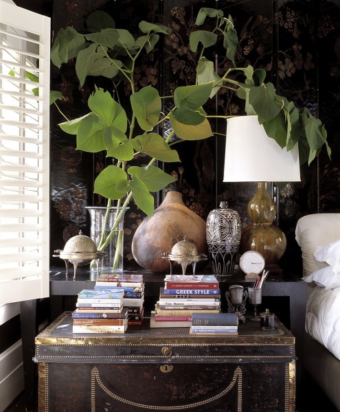
Creating a Delicate Balance: The photo above just seems so naturally done and that’s how the best layering in design should look. The person whose room this is from has surrounded themselves with well-loved items and books, some natural materials – on top of a well-loved trunk. The decorative screen in the background seems to envelope whoever is in here. It just seems as if you could plunk yourself here and have a great, relaxing time thumbing through the books supplied. The pencils are there to jot down some notes and there’s a beautiful lamp that provides ample lighting in case you’re reading til the wee hours.
How do you add layers so that your room is interesting and warm – without going overboard. How do you layer effectively without looking like a room in the Restoration Hardware catalogue? In your home, you want your room to look “collected” in a natural, effortless way. Here are some ideas to help you achieve that…

A guest bedroom layered with comfort in mind
Layer by Function: Think about who uses the room and how? What type of room is it – is it a guest room, living room, great room, kitchen? This will help dictate some of the layering elements. In a guest room, layering can be soothing colors and smells…a welcoming robe and fluffy towels…some books and magazines…and some warmth with extra blankets and throws. Perhaps a chair and desk and some stationery…and some niceties like soaps, cologne and shampoos in a woven basket on the dresser. The layers should be accessories and decorations that will make your guest feel at ease and very “homey.”

Add a punch of color for contrast
Layer with Color: You can also layer by color in your rooms. During the Christmas season you can layer with whites, golds or silvers, and/or reds and greens. You can bring more punch and personality with a colorful piece of artwork. Add more interest to your room by layering in a contrasting color, as above in a predominantly cream and blue room designed by Melissa Warner, a punch of orange was used. That shot of pink in the blossoms helps too!

In our great room, I added texture to the wall, floor, furnishings, accessories, window treatments and mantle
Adding Texture: Texture doesn’t always mean just with fabrics…you can add texture on your walls (with a beautiful plaster or a stried pattern) and on your floors…think of sisal and seagrass for instance. Adding fringe and beading to pillows and other items also adds a layer of texture. The textured layer adds warmth to any room – it’s like giving your room a “big hug.”

There are so many patterns in this room – but they all work
Layering with Patterns: Just using solid fabrics and plain vanilla wall colors can make a potentially beautiful room very boring. You can add some zest and energy to a room by adding patterns. Think about mixing the scale of patterns (one or two large, with some medium and small) as well as the type (geometric, allover, striped, checked). The above room, designed by Jason Oliver Nixon and John Loecke, is a perfect example of how many types of pattern you can put in a room – and it’s still beautiful…not cluttered or loud.

Even a vignette on a table can show and reinforce your home’s style
Layering by Style: In the photo above, designed by Sandy Foster of My Shabby Streamside Studio blog, every item in the vignette shows the style of the home – Shabby Chic. The antique bottles with minimal blossoms, the antique mirror, the lace doily, the covered books, the beadboard peeking out under the shelf – all combine to reinforce the style. Think of things in your home’s style that you can add to complete the picture.
The Lighting Layer: You have functional, task lighting, of course, but you can also add lighting that will amp up the interest of your room. Use an uplight to create some drama in a dark corner. Employ a perfectly placed spotlight to highlight a piece of sculpture or important piece of art. Flickering candlelight or the glow of a fire can add romance and warmth to a room…fast. Chandeliers and wall sconces are perfect for adding some jewlery, sparkle and personality to a room.
A living room, for example, should have multiple sources of light. Mine has 7 different lamps – 2 wall sconces, a floor lamp by an arm chair, a decorative lamp on a table between two occasional chairs, a piano lamp and 2 good-sized buffet lamps on the sofa table behind the couch. Next week I will be doing a post on all the different light fixtures in my home – so I hope that you’ll come back to see that!

My dining room ceiling says “me”
Layer with Personality: This is what makes the room “you.” Most of the rooms in my home tell anyone who enters who I am and what I love. My kitchen is very French Country and you’ll see a textured range hood, roosters, toile artwork on furniture and even on my hand done backsplash. My powder room features monkeys and pineapples, which I love. You will see decorative, artistic work that I have done in almost every room. I definitely have my personality depicted throughout my home. So, make sure your home looks like you had a hand in it. Show your personality, your artistry – the things that are unique to your home.
If you have collected items (teapots, plates etc), make sure that they are in a grouping together and not scattered here and there throughout the home. You’re going for impact here!
So let me know how you’ve added layers in your home. Your comments below might spark some additional ideas for my readers. So – let me know what you’ve done in your home!
Sharing this with…
Savvy Southern Style; Between Naps on the Porch; Ivy and Elephants; Katherine’s Corner
Thanks for stopping by The Colorful Bee! Stay in touch and never miss a post.
*Subscribe to receive an e-mail when a new post is up, HERE.
*Subscribe to receive an e-mail when a new post is up, HERE.
5 Comments
Posted in Uncategorized


 Decorative Finishes
 Interior Design
 Home
Home Garden
 Holiday
 Makeovers
 My Life
 Business
 Tutorials
 Videos
 Paint
Paint