To all my friends…may this beautiful holiday be filled with family and friends, faith and love, happiness and joy. This Easter I am so happy because there was a rift in my family – but it’s beginning to mend. Everyone will be at the table this year – I am so grateful for that.
Happy, Happy Easter to all!
Thanks for stopping by The Colorful Bee! Stay in touch and never miss a post. *Subscribe to receive an e-mail when a new post is up, HERE.
A Beautiful White Laundry Room…goes from Dark Brown to White
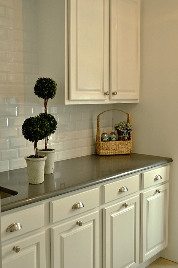
I recently helped a client revamp her Laundry Room. Her dark brown cabinets were getting her down and she needed a change. White cabinetry was the answer – Annie Sloan Pure White Chalk Paint was the tool. It’s so important to make our more utilitarian spaces look beautiful and fun to be in. Most of us forget that (me included). When a room we labor in is beautiful, stylish and functional – we don’t mind being in there and we don’t mind (at least we mind it less!) doing work there.
Selling Your Home? It’s even more important to have work spaces in our homes look beautiful and a pleasure to be in. When selling, you want to keep the notion of the word “WORK” out of Laundry Rooms, Kitchens etc. I always tell clients to hide the paper towels, dish detergent, toasters and the like in kitchens…and the same goes for the Laundry Room.
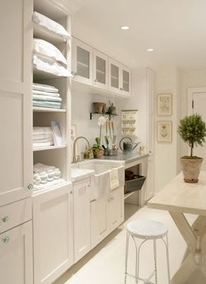
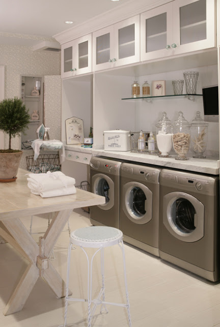
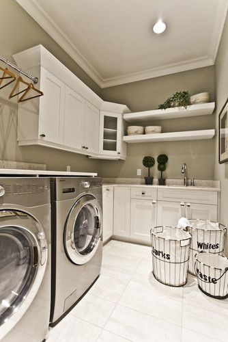
Here were some inspirational rooms that I used to get the creative juices flowing…..
My client had attempted to paint the cabinets herself with some chalk paint but she was nervous because they weren’t coming out at all like she thought. Chalk Paint is kind of thick and if you put it on too thickly – it can crack and not look good at all. A phone call to me and my painting partner, Marty Wiesehahn – and she could relax and do other things rather than toil away painting cabinets, walls, moldings etc.
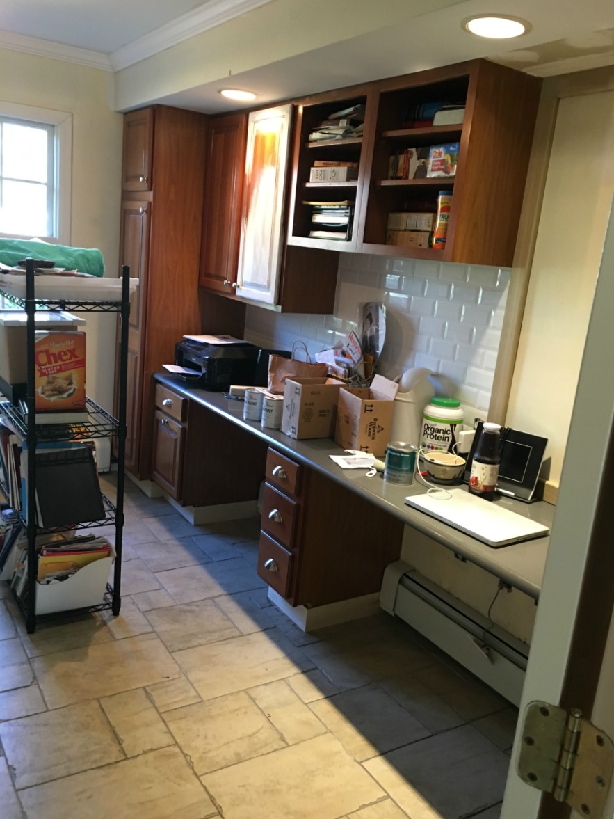
Here are some before shots…
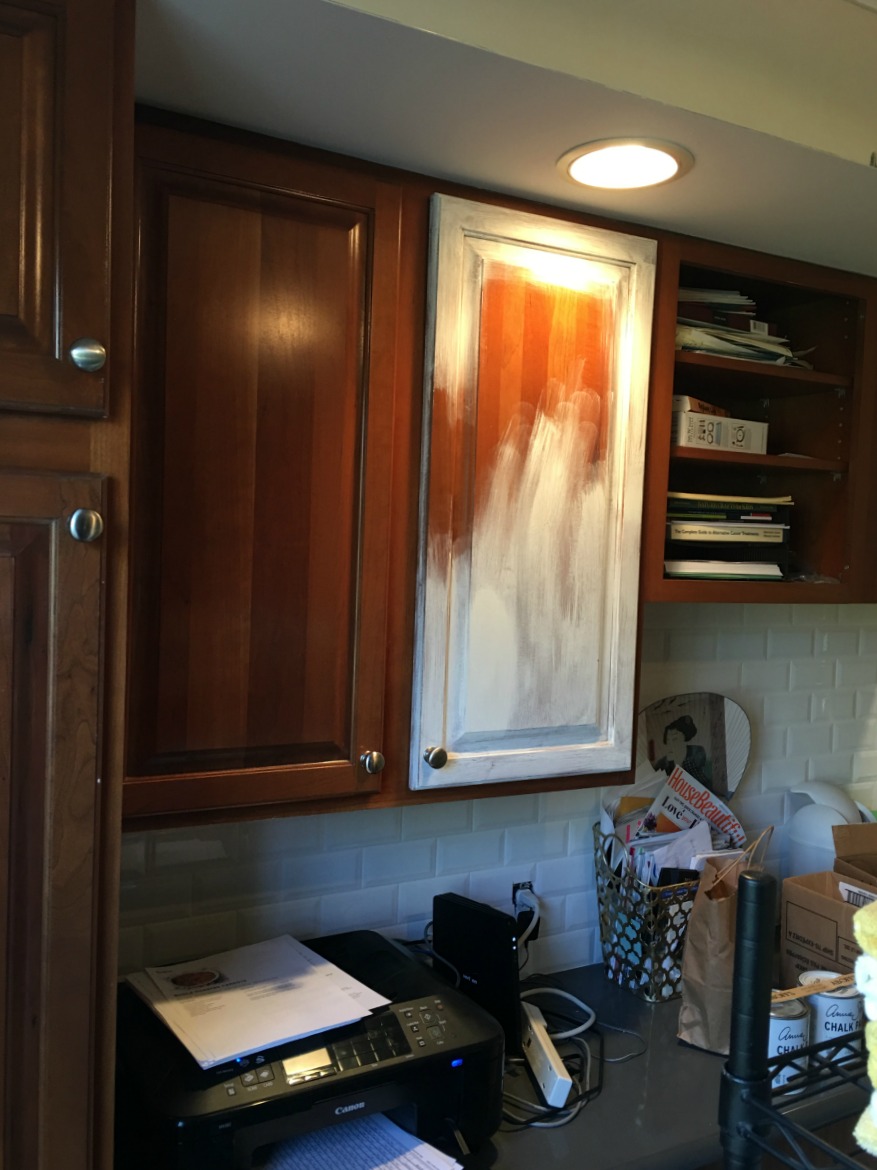
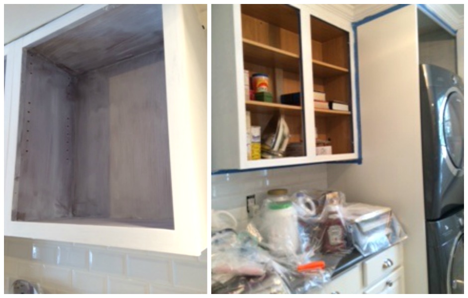
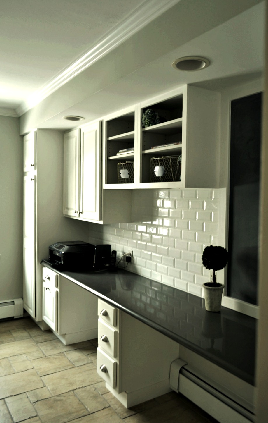
While Marty went to work fixing and priming the ceiling and painting the walls (with a gorgeous color I love to specify, Grey Owl by Benjamin Moore), I went to work on the cabinets. An issue that my client’s room had was that a few of her lower cabinets were white laminate – and the rest were dark wood. She wanted to have all the cabinets match (who wouldn’t? I didn’t ask her why some were white and the rest dark – I was only there to help!) The laminated cabinets had a slight shine to them – so we had to approximate that shine on the other cabinets as well as get the right color white! Luckily – the chalk paint (Annie Sloan’s Pure White) she started out with turned out to be a really good match. We had to do 4 coats for total coverage. For protection, I decided to use a wax that only had a slight, satin shine that would be a very close match to her laminate cabinetry’s shine.
Here are some photos of the process…..
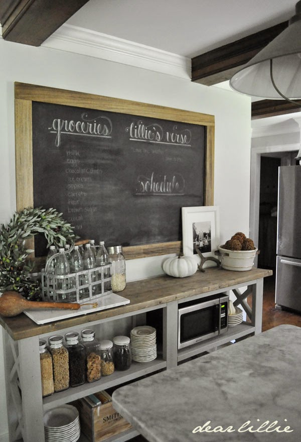
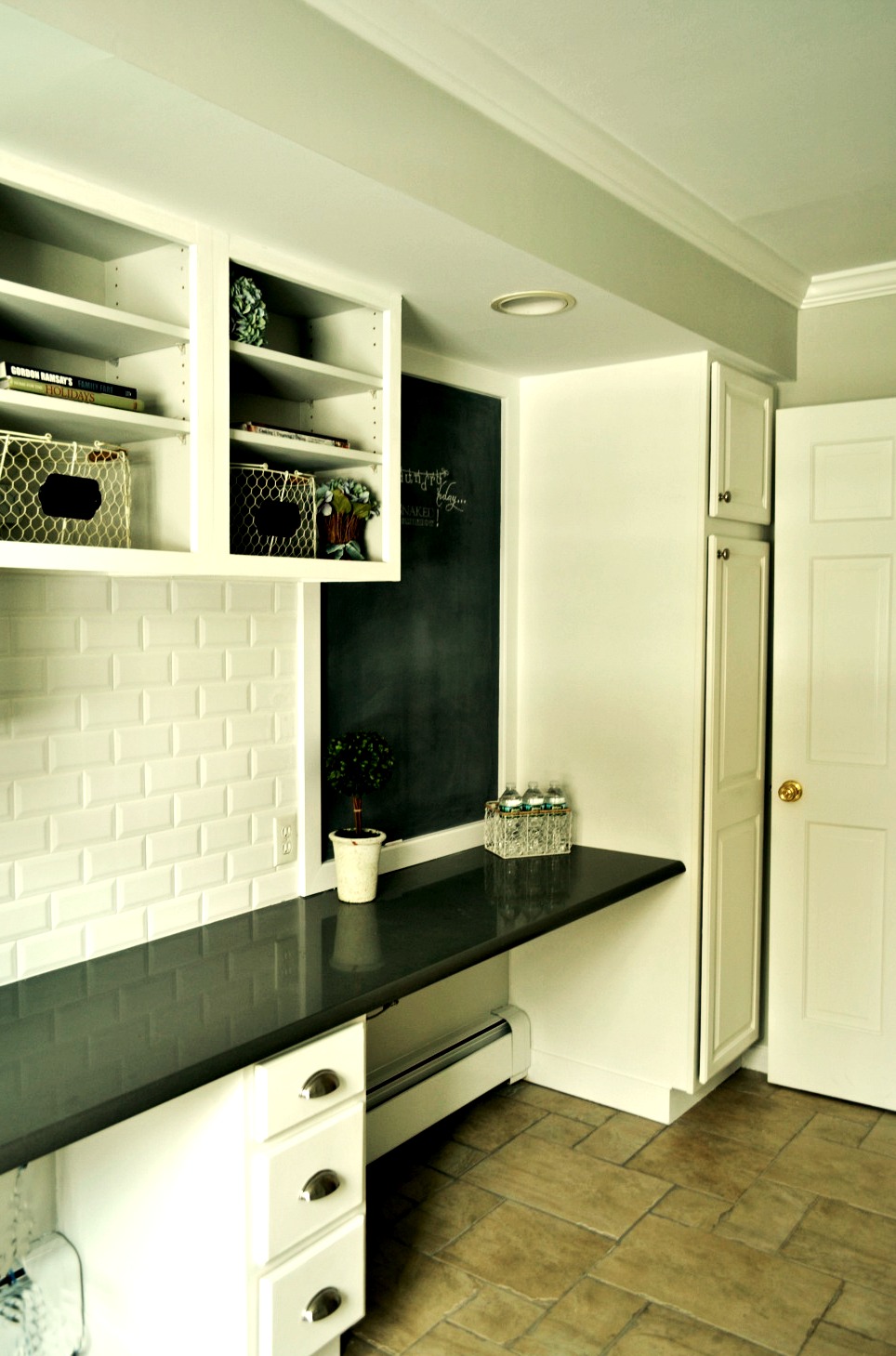
My client had a section of one wall framed – apparently she thought about installing a corkboard. I suggested that we paint on a blackboard with some Graphite Chalk Paint. This was one of the pics I showed her for inspiration…
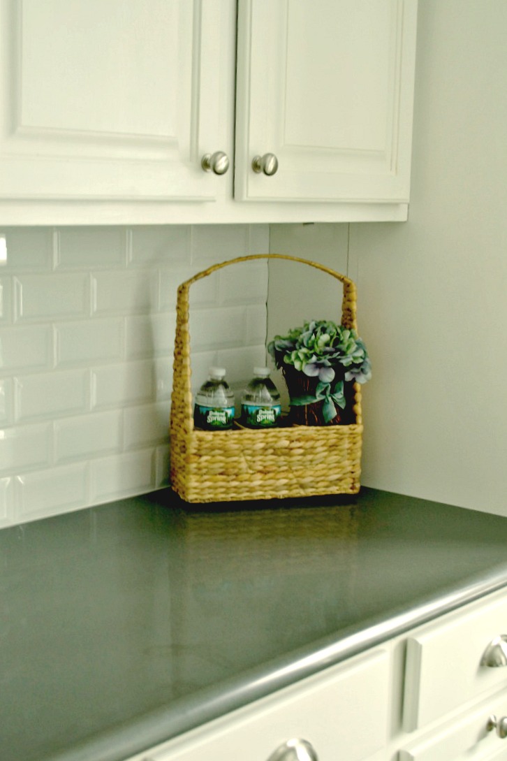
And, of course, I had to stage the laundry room for her. Naturally!
The most difficult (and frustrating at times) part of this job was that there had to be complete coverage (so, no distressing). We had to match as best we could the white laminate cabinets on the lower left side of the room. We applied 4 coats (plus a wet sanding) and if the underneath color came through – apply more paint! Then a clear wax coat…then a buffing. Tedious – but it was exactly what the client wanted.
If I can help you with your laundry room – or any other room you’re not happy with…just let me know. I am only a phone call away – 631 793-1315
If you are going to sell your home this season, it’s a great idea to make your home look as beautiful, stylish and organized as possible. If you want to sell your home fast and for more profit, here are some top tips from me…
Look at the competing homes in your area to see how you “stack up.” Are the homes that are selling in your area updated? Granite countertops and new cabinets? All hardwood flooring? Freshly painted? You want to be in line with your competition (but better!)
Make sure that you have packed away everything that you need to take with you (that doesn’t need to be “displayed” in your current home/listing online). A clutter-free home looks great and sells fast.
Check to see how “dated” your accessories are: If your home has doilies, bathroom seat covers and matching toilet rugs, vertical blinds, dusty faux florals, mirrored walls, dark paneled rooms etc. – it may be time for some changes and some updated accessories!
Do you have wood floors hiding under wall-to-wall carpeting? It’s time to show your beautiful floors. Today’s buyers want hardwood flooring.
Does your home have bold colors in flooring, walls and accessories: It may have been great for you and your family but think about how today’s buyers might think. Not everyone can “move in” with purple walls, teal carpets and floral wallpaper: Today’s buyer needs a neutral palette that can accommodate any kind/color of furnishings. They want to be able to move right in.
Use color wisely – don’t overwhelm a buyer with it but employ it to bring attention to important characteristics of your home (fireplace mantels, large windows etc). Buyers will remember a home and its assets that way.
Use a professional photographer for all of your photos. Great online photos will bring more potential buyers to your home. Over 90% of home searches today start online.
Look at (really study!) the homes in your neighborhood that sold quickly. Did they sell because of price or because of condition? If you don’t know how to do this – ask your realtor or look at a website like redfin.com. You can check to see how long a listing has been on the market, how many price reductions – and who the realtor is. This information is so invaluable to you. Please – do your homework before you list your home!!
Here’s some of my company’s other photos of homes we have staged. Most of these homes sold before or at the Open House – or in less than a month. Please call us to help you. Preparing and staging your home can make a significant difference in the sale of your home (quicker) and the profit (more than your competition!)
Don’t make the mistake of being penny-wise and pound foolish. Every day that your home is not presented well and staged properly could be costing you thousands upon thousands of dollars in lost revenue.
Thanks for stopping by The Colorful Bee! Stay in touch and never miss a post. *Subscribe to receive an e-mail when a new post is up, HERE.
“All great change in America begins at the dinner table.” – Ronald Reagan.
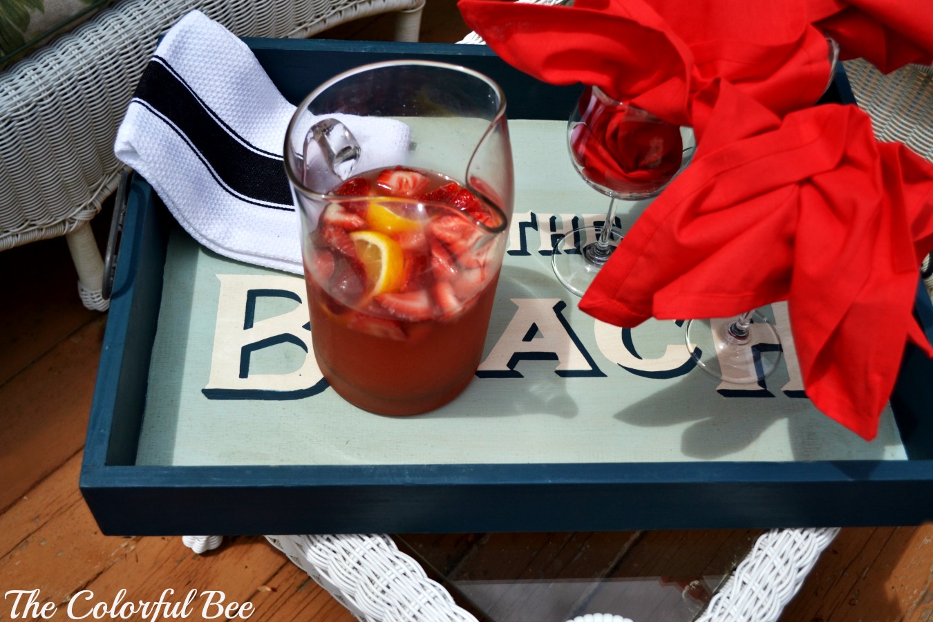
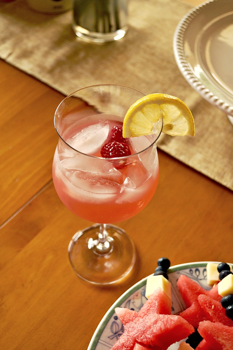
So why not at our own dinner tables…on July 4th especially? Do we really instill the reasons why we celebrate the 4th? We need to – more and more. Our family had its share of political talks but also of the reasons why we wanted our freedom – and why this is so important. But, of course, the celebratory part took over. I wanted it to be a memorable one for our family so I tried my best – I think it worked. Here are some pics from the party…and a recipe for a Summer Sangria, if you’d like to make something special for your guests this season.
I am still trying to get the hang of icing cupcakes – but this cream cheese icing (usually what I use for carrot cake) tasted delicious with the devil’s food cupcakes. It was entirely by accident that I did this. I ran out of the vanilla icing and I needed a substitute. I had cream cheese in the fridge – so….
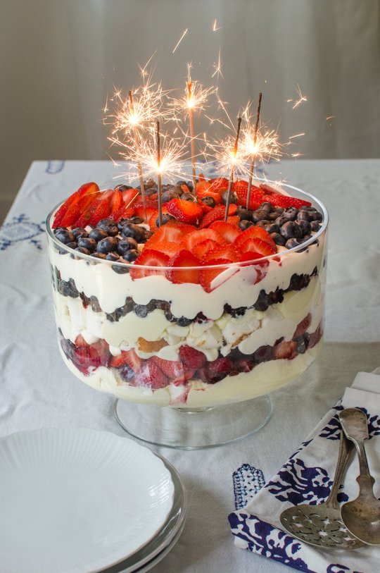
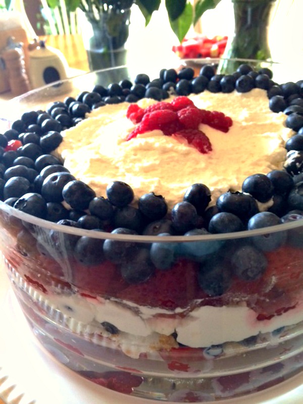
My attempt at making trifle…and making a star out of raspberries!
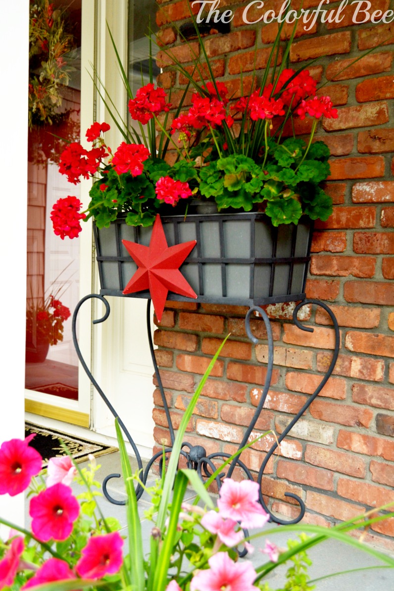
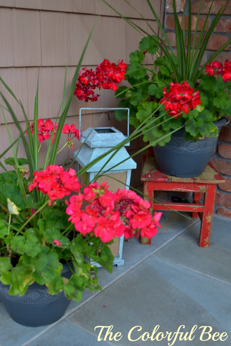
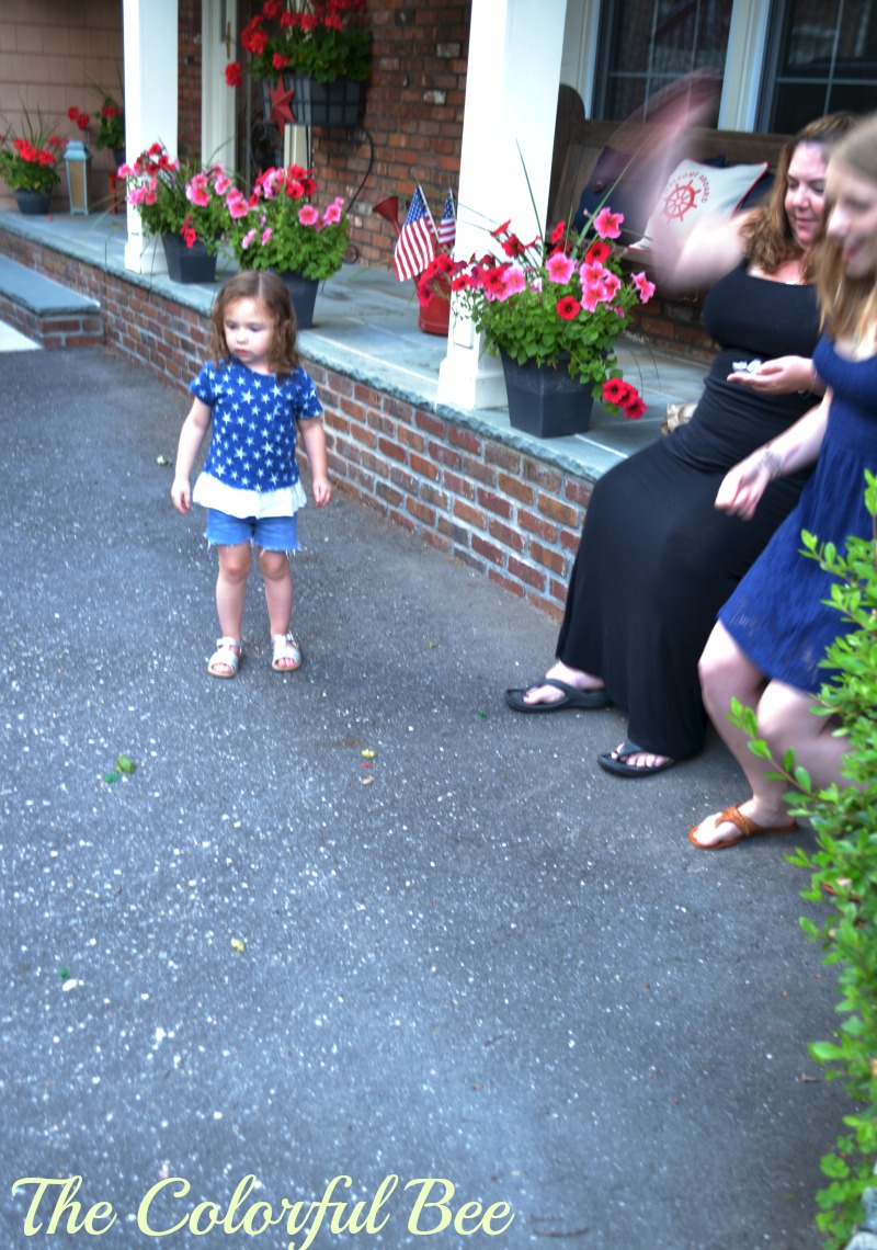
My family was greeted at the door with some colorful décor. This part was a lot more fun for me than the baking!
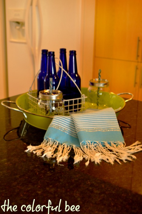
Because we’re a sailing family, I had to include some nautical decoration.
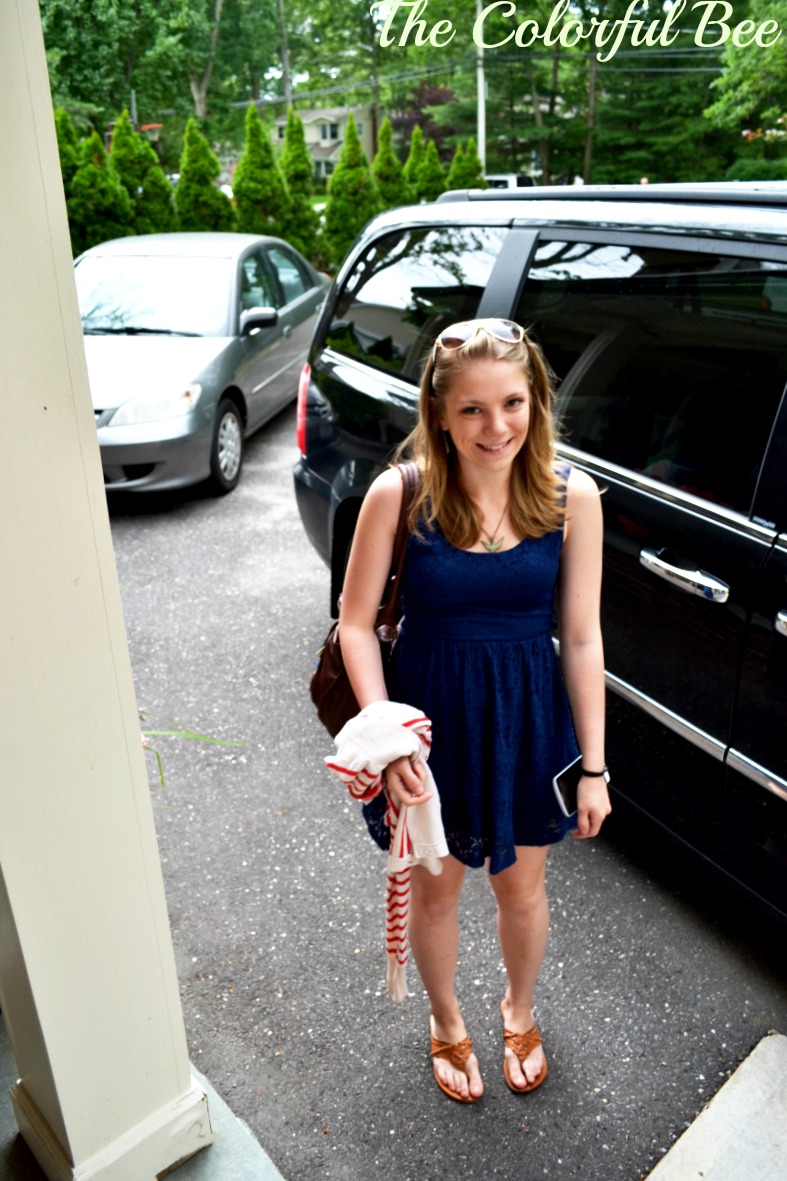
My oldest granddaughter, Meghan, arrived first. I am so proud of her. She graduated from college this year (full scholarship) and she is now going for her Masters in Psychology. I know …she looks like she’s 14! She was just awarded a grant from NASA too. She’s a brilliant young lady.
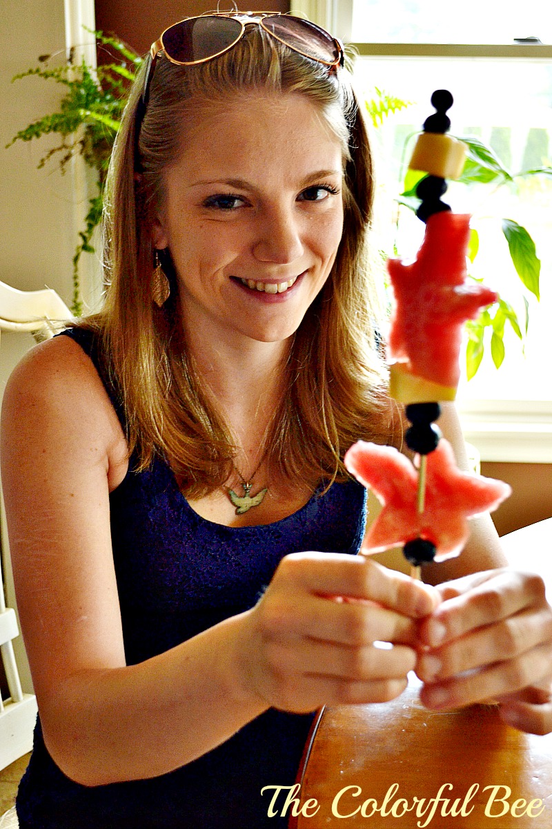
But she’s still young enough to eat the star shaped watermelon, blueberry and cheese kabobs I made for my 3 year old granddaughter – who wasn’t that interested in them!
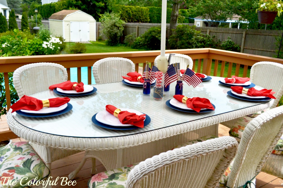
I just did a simple red, white and blue for the outdoor table setting. I didn’t want to do that much ‘cause there was the threat of rain – and it did come. But it didn’t rain that hard and, thankfully, it didn’t last that long!
I snapped a few Limoncello Sangria shots before it started sprinkling. My husband and I had visited Italy last October and we ordered several bottles of Limoncello when we were on the Amalfi Coast. We still had a few bottles left so I thought that I could use some for a different kind of Sangria.
Here’s the recipe. You can make your own Limoncello, or buy it online (much easier!)
Limoncello Sangria
Serves 6 3/4 cup limoncello 1 cup fresh raspberries 1 cup hulled and quartered fresh strawberries 1 750-ml bottle chilled demi-sec rosé champagne 1 medium lemon, thinly sliced, seeds discarded
In a large pitcher, combine the limoncello and the strawberries. Top with the chilled rosé champagne and stir in half of the lemon wheels.
Pour the sangria into ice-filled stemware. Scoop some fruit into each glass and garnish with a lemon wheel.
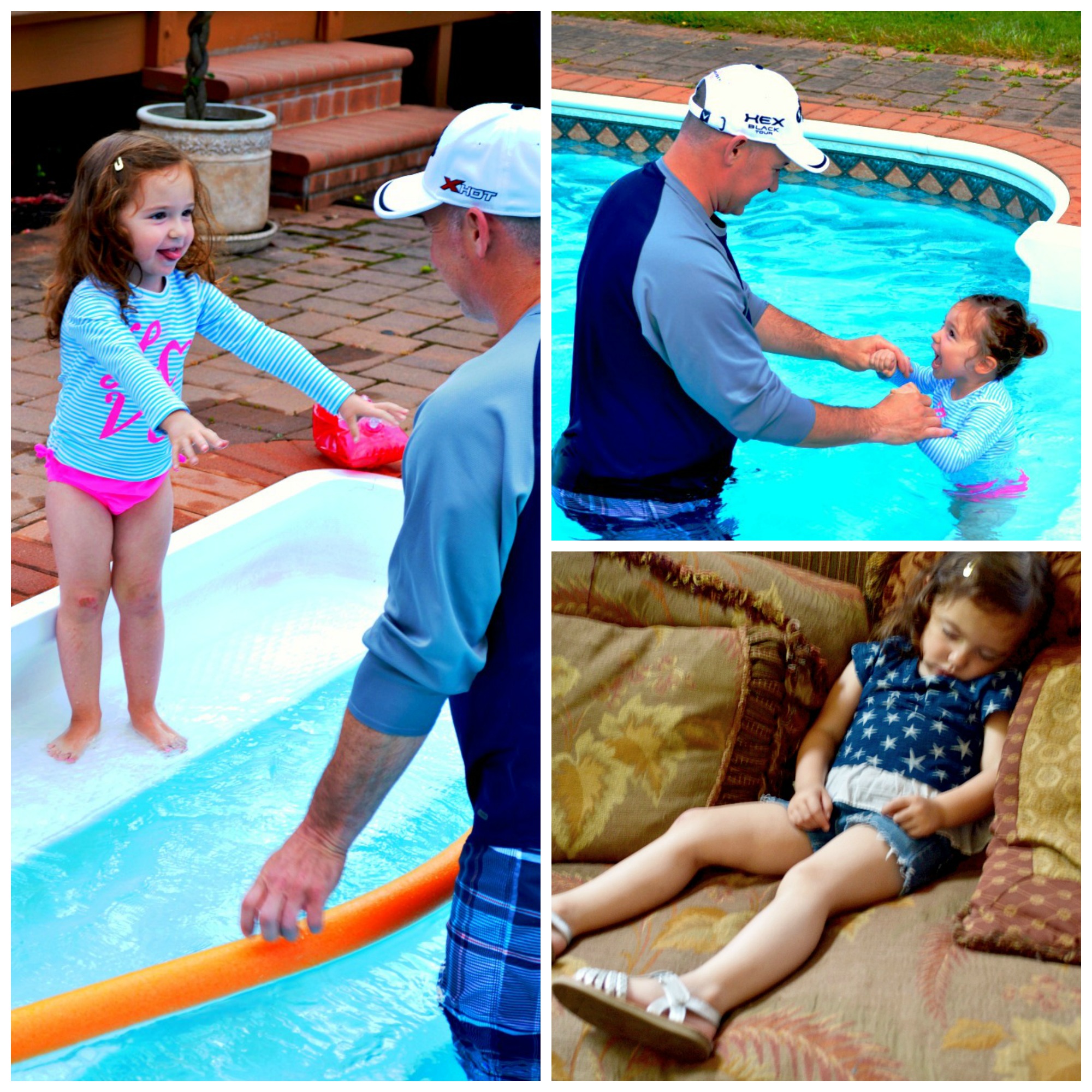
When the rain subsided, it was time for fun – in the pool. My granddaughter Peyton had so much fun with her dad. She would have stayed in for hours…but by the time the rain was through, it was about 4PM.
She was exhausted – but she had to do some “fireworks” – some safe ones (snaps). Safety first!!
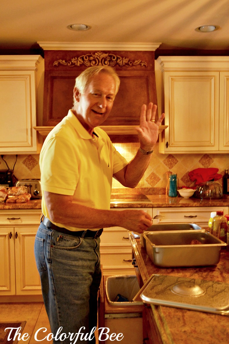
All in all, it was a great day. A big thanks to my husband, Richard, who did the barbequing (great job!!) and my daughters who brought appetizers, libations…and their children (most important!).
And to my family – kids, step children, grandkids, brother Dan and sister-in-law, Marie…I love you all. Thanks for such a great day!
Thanks for stopping by The Colorful Bee! Stay in touch and never miss a post. *Subscribe to receive an e-mail when a new post is up, HERE.
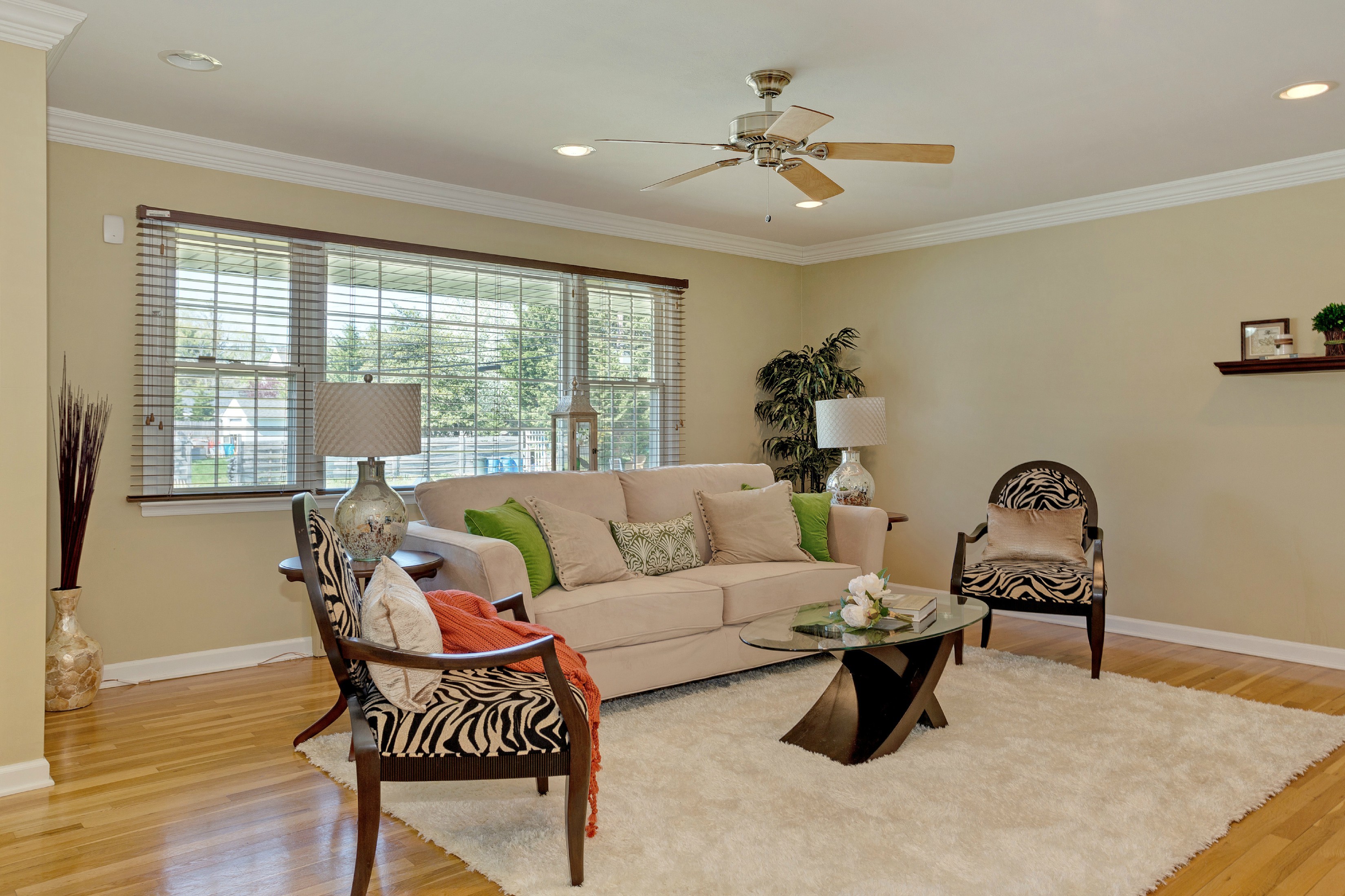
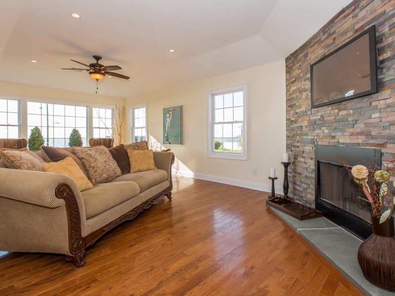
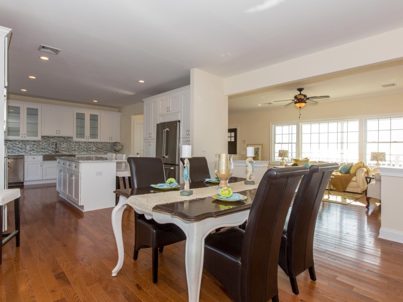
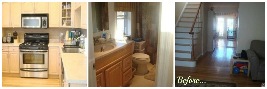
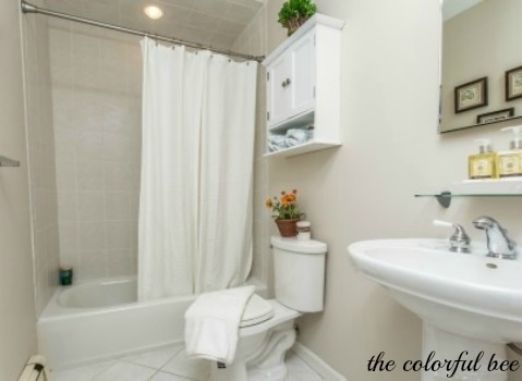
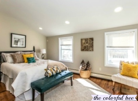
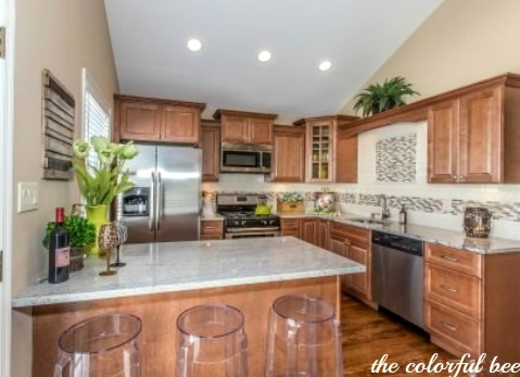
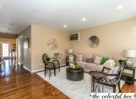
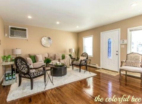
We staged this unfurnished home for a real estate investor that we had worked with before – and the home sold even before there was a public Open House. Here are some of the before pictures.
When staging a home for sale, I feel it’s very important to give a potential buyer a glimpse into what his or her life will be like if they buy the house. Giving the home (even very modest ones like this one) some elegant touches like a bar cart with drinks and accessories in the living room, allows the buyer to dream a little. Even if they never put a bar cart in the space once they move in – it’s important to fashion a beautiful lifestyle in the home.
The layout was a little problematic – and that’s where I believe that home staging really can make a huge difference in whether a home gets purchased quickly or not. Narrow living rooms, small bedrooms, open floor plans – these kinds of spaces confound a potential buyer. If a buyer cannot figure out where to place their furniture and if they wonder if their furniture will even fit – most likely they will not make an offer. It’s always best to stage an unfurnished home. It’s also important to rearrange and edit furnishings in a home for sale that has furniture. Most people have too many furnishings, accessories etc. in their rooms and the spaces look cramped and small. Here are some other pictures from this project.
If you would love some help getting your Long Island or Queens home sold, please give me a call at 631 793-1315.
Thanks for stopping by The Colorful Bee! Stay in touch and never miss a post. *Subscribe to receive an e-mail when a new post is up, HERE.
I was so happy to hear from Dan Adams of Real Living Innovations Realty in Wantagh, NY. Dan hired me several times when I was a fairly new home stylist, so I give him credit for helping to jumpstart my business. The first vacant property I staged for him sold in 1 day for list price! This was back when my inventory consisted of a cream love seat, a sofa, 2 faux TVs, some pillows, several end tables, two nightstands, a coffee table, a few console tables and occasional chairs – and some art and accessories. Hardly a small corner of a warehouse – to say the least! But, I put what resources I had to good use and with the money I made from that home staging – I bought more.Continue reading →
Thanks for stopping by The Colorful Bee! Stay in touch and never miss a post. *Subscribe to receive an e-mail when a new post is up, HERE.
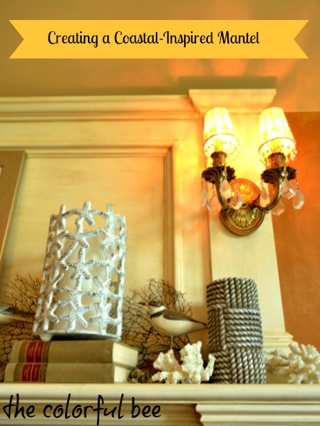
I have a habit of changing the decorations on my great room mantel pretty often…but sometimes I am guilty of being lazy and not changing it soon enough. Up until a few days ago my mantel was stacked with bunnies and nests – so it was surely time for an overhaul!Continue reading →
Thanks for stopping by The Colorful Bee! Stay in touch and never miss a post. *Subscribe to receive an e-mail when a new post is up, HERE.
I had to give this a try…been reading about it so much on different blogs. I watched Annie Sloan’s YouTube video on the subject, read some other tutorials as well (11 Magnolia Lane ) and I just decided that I would just jump in and see what happens to a loveseat that I had purchased a few years ago that had seen better days.
Of course, I started with something “big” instead of a small seat cover – that’s my nature…just go for broke. The worst thing that could happen would be that it looked terrible and I’d have to scrap it or bite the bullet and get it reupholstered.Continue reading →
Thanks for stopping by The Colorful Bee! Stay in touch and never miss a post. *Subscribe to receive an e-mail when a new post is up, HERE.
The Unmatched Beauty of Bespoke and Handmade Furniture: A Guest Blogpost
Here is another guest article from my friend, Jo Lee of Swedish Interior Design, in our “View From Europe” series. Handmade furniture from craftsmen who are applying timeless, painstaking techniques to make beautiful, lovingly crafted pieces, are being edged out it seems in this economy of fast, soulless, cheaper MDF-type case goods. Here Joe looks at the benefits to be gained by ordering a custom made piece of furniture.
The world of interior design is increasingly cluttered by poorly made reproduction furniture in a wide range of styles coming from China and the Far East. This is all to satisfy our unshakeable desire for something new, different or exciting in this world of transient tastes and ever changing fashions. We forget, as we spend to maintain our ‘habit’, about the attendant environmental costs of mass manufacture, carbon intensive shipping and cheap Third World labour. These become ever more important as resources become scarce and the quality of human life lessens – just remember the recent factory collapses and death tolls in India as a direct result of our need for new things.Continue reading →
Thanks for stopping by The Colorful Bee! Stay in touch and never miss a post. *Subscribe to receive an e-mail when a new post is up, HERE.


 Decorative Finishes
 Interior Design
 Home
Home Garden
 Holiday
 Makeovers
 My Life
 Business
 Tutorials
 Videos
 Paint
Paint