
-

-
Subscribe
Thanks for stopping by The Colorful Bee! Stay in touch and never miss a post. Subscribe to receive an e-mail when a new post is up, HERE.Sponsor
If you're interesting in advertising on The Colorful Bee, click here to learn more.Contact
You can also email me at Linda.Leyble@gmail.com -


Categories
Subscribe
Popular posts
-
Recent Posts
Blogroll
Links

Tag Archives: faux finishing
Painting and Decorating Architectural Fragments
Creating something from nothing
I was coming back from a decorative painting job out in the Hamptons and I came across this wonderful old antique shop named Lloyds in Eastport, New York. I had passed this store many times before and finally – I had a little bit of time to go in and take a look. The store is a lot larger than it appears from the outside – and there are two large floors full of antiques. Just what I needed – a ton of stuff to choose from! Anyway, I fell in love with a couple of things that I just had to pick them up (I only had about 20 minutes to peruse because I had another appointment to go to). (more…)
Thanks for stopping by The Colorful Bee! Stay in touch and never miss a post.
*Subscribe to receive an e-mail when a new post is up, HERE.
*Subscribe to receive an e-mail when a new post is up, HERE.
Why a New Ring Setting is Like Interior Design
A New Engagement Ring Setting is Like Interior Decorating? Yes!
A week before Christmas, I received an early present from my husband – a new setting for my engagement ring. I wanted this for such a long time but I always felt that it might be too expensive and that I should be happy with the actual ring that my husband gave me. It’s the memory thing, you know. I wanted to preserve the beautiful memory of my engagement and my wedding day.
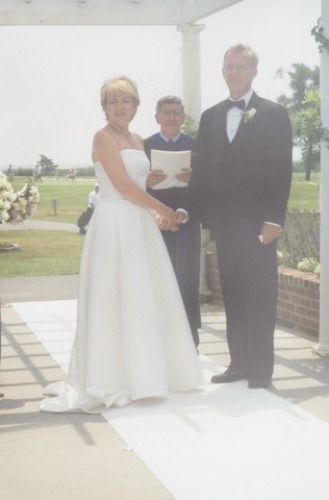
My husband Richard and I on our wedding day
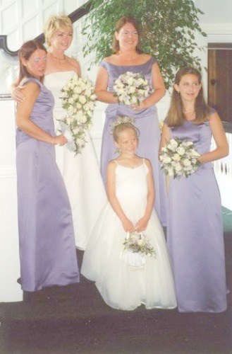
From left to right, my daughter Jessica, me, daughter Krista, stepdaughter Megan and granddaughter, Meghan
That was a blessed time in my life and I will never forget how I felt and how I still feel.
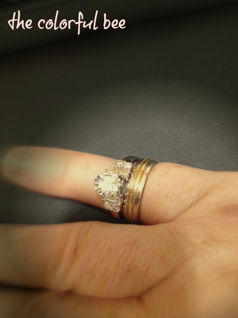
Trying on my rings and the new setting before resizing
But the reality of my rings were…
- My fingers had gotten fatter and I was lucky to be able to wrestle my engagement ring off my finger – not so lucky with my wedding band. That had to be removed by my jeweler professionally. They had to resize it for me.
- I was in danger of losing my diamond because the prongs holding it were crooked. Might have been my years of troweling plaster and maybe that time when I had to run home to get something from my garage while on a job – and in closing the garage door, it slammed shut suddenly on my left hand, nearly breaking my fingers. I was really in pain after that and I was in the middle of a large Venetian Plaster job, so I had to keep going. Thank goodness it was my left hand that got hurt…and not my right (right-handed, you know!)
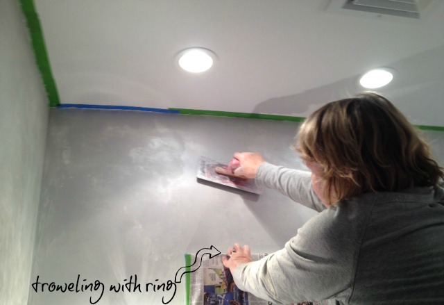
And speaking of troweling, you wouldn’t believe how many times I cleaned and soaked my rings. But that stuff got trapped in some of the teeniest crevices. So – because of daily use and the extra wear and tear that I put my rings through, they no longer looked good, at all.
How much did the new setting cost? $805. Not too bad. And now this really clear and nearly perfect ¾ carat diamond, sits higher up with the new setting (so it looks bigger and more important than it really is) and 6 new baguette diamonds flank it on either side – plus 2 baguettes from my original ring. The setting still resembled the original setting – but much better. My jeweler also informed us that two of the original baguettes were made of broken diamonds, which some in the industry use to repurpose their diamonds that have broken. The settings get sold as whole diamonds – but, in reality, they are not. So, when my husband bought the ring for me, he understood that the total carat count, with the baguettes, was a full carat. That was not true.
So, the reason why I bring this little story up is because I can relate it to how many people might feel about hiring an interior decorator or other design professional. Silly, you say? No, not at all. There are so many people who would like to redesign one or more of their rooms but maybe they lack the talent or energy to do it…and they think that hiring a professional would cost too much money (just like I thought about the cost of a new setting!) So – they do nothing. Even though they have outgrown the current design and it no longer suits their taste or the function of the room. Or maybe they tried to do a few things on their own – and they failed…so they stopped.
They didn’t realize that a designer would do a small project or be available on a consulting basis.
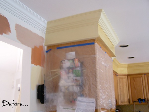
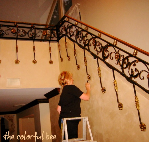
First we added crown molding and started to paint the soffits and crown
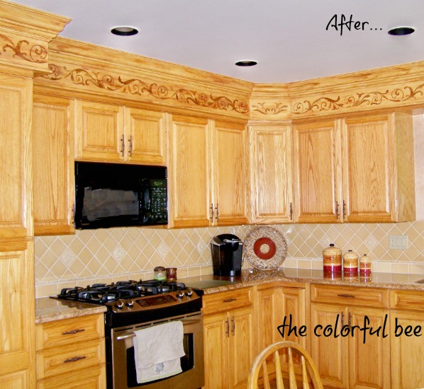
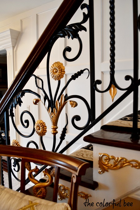
The finished project
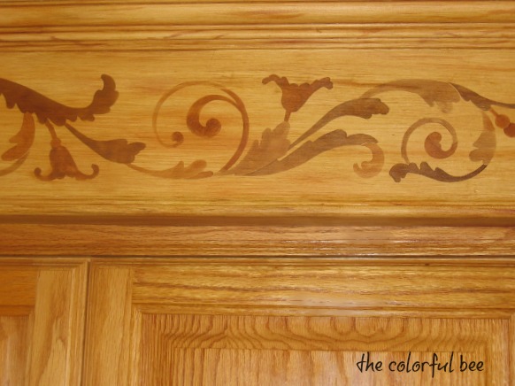
They would love to hire a designer but feel their budgets would be too small…that designers are just too expensive. They don’t realize that a designer’s creativity could save them a lot of money. The kitchen that I helped a client revamp, took 3 days to do. We added crown molding and then faux oak grained them and the soffits to match the cabinetry – plus we added a faux inlaid marquetry design that added a little punch to the kitchen. This was a much less expensive way to update a kitchen than to gut and buy new cabinetry…and less stressful as well.
Not realizing that a designer can take the best and most beautiful things you have (your diamonds) and allow them to shine in a new setting (pun intended!), people shortchange themselves by not using the trained eye of a professional. A designer will use things that you already have, repurpose them and create a new and improved look – without busting the budget. Just like my jeweler took my small but nearly perfect diamond and made it look more important and impressive – a talented designer can do that with your room.
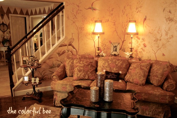
After, a lonely corner becomes a focal point
Designers think about things that you overlook. Just living your life – kids, work, stress, every day chaos etc impedes your keeping your home picture perfect. Do you now have too many things in your rooms – too much furniture? (Did your room get fat…just like my fingers??) Has your furniture, pillows, wall colors dulled with age (too much plastering with your rings on??) Most times the fix is simpler than you think.
Making an entryway more grand
Helping clients make an impact in their homes
A designer can help you achieve a unique and collected over the years look. With resources not available to the general public and with specialized training, a designer can assess the real value of what you have (crushed diamonds passing as full ones), repurpose your best things in a unique way (creating a unique setting that’s you and not cookie cutter).
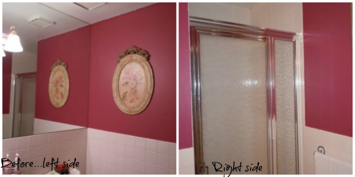
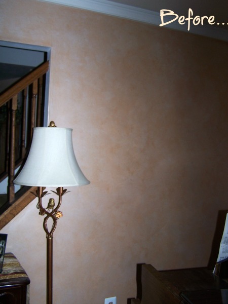
Before: A powder bath that my client was unhappy with
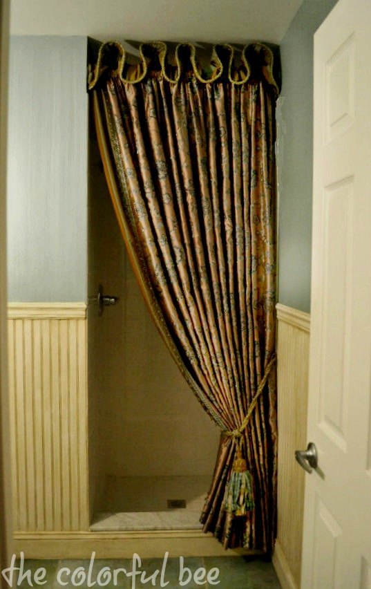
After: Since she never used the shower, we created a beautiful silk treatment to make this room more elegant
A designer can enhance the quality of your life in the space. Just like when I no longer received any joy from looking at my worn out engagement ring, the skill and knowledge a designer has can make living and entertaining in your room so much more pleasurable. In the above room, we added a beautiful teal and pearl stried wall finish and antiqued wainscoting and a silk treatment for the shower – to update and add elegance to this little powder room.
So, as I was admiring my new setting and feeling so good and proud of it, I saw that my husband was truly enjoying it also. Maybe it’s a little bit of “Happy wife, happy life,” but he feels that the ring just looks so beautiful now – in its new setting.
If you have been putting off doing something with your home, think about my little story. With the right person guiding you, your home can look and serve you better. It doesn’t cost as much as you think it does…and it’s an investment in your future happiness.
If you would like to feel happiness and joy when entering a room you no longer love – contact me.
Linking to: Between Naps on the Porch
Thanks for stopping by The Colorful Bee! Stay in touch and never miss a post.
*Subscribe to receive an e-mail when a new post is up, HERE.
*Subscribe to receive an e-mail when a new post is up, HERE.
6 Comments
Posted in Decorative Finishes, interior design, Makeovers, My Life
The Custom Blue Chalk Painted and Stenciled Coffee Table
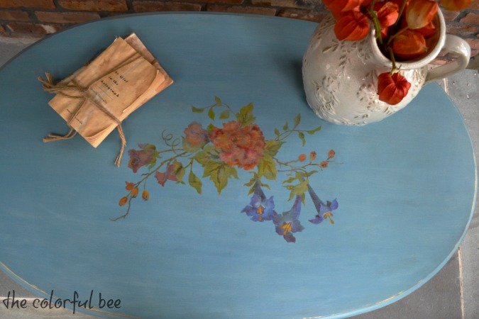
I finally finished a coffee table I had been working on for a while. I didn’t want to post it until I figured out how to tame the super shine I was getting from the wax I put on the table. I figured it out soon enough…made the necessary adjustments (not hard – a little more sanding back) and it’s a beautiful finished table. (more…)
Thanks for stopping by The Colorful Bee! Stay in touch and never miss a post.
*Subscribe to receive an e-mail when a new post is up, HERE.
*Subscribe to receive an e-mail when a new post is up, HERE.
4 Comments
Posted in Decorative Finishes, interior design, Makeovers, Paint, Tutorials
Using Metallic Foils: For Artwork and Embellishing Other Surfaces
 I was in Marshall’s the other day shopping for a client in NYC. I was staging his huge apartment that needed a lot of work. I was buying some soaps and other toiletry items for his barren bathrooms (he has 4!!). I spied a very pretty plastic hand soap dispenser with a lovely hummingbird on the label. I said to myself, “This is mine – not his. Sorry!”

The inspiration!
I immediately thought that I could use the image idea for artwork. What attracted me was the metallics used for the wings and the head. I immediately thought – metallic foils. I had purchased some for a client awhile back and I had some left over…so I figured, why not?

Metallic foils come in several sizes and many colors
If you’re not familiar with metallic foils, they are similar to gold and silver leaf but they come in larger sized sheets and rolls – and they come in a variety of colors. You can buy a sample pack, which I would recommend, so you can get a feel for using them while you see how many colors are available. They also come in holographic foils which are great too. I’ve used them to effect glass tiles. I think Michael’s carries them now – but you can order them from Royal Design Studio or Prismatic Painting Studio.

From plain to pearl metallic painted canvas
I decided that I could do a humming bird series of small paintings (as I’ve been collecting images for this purpose). I had 3 small pre-primed canvases, so I took one and painted it in a metallic pearl.

You can practice the placement of leaves first – or if you’re brave or really talented…paint them on freehand!
Then I floated in some leaves and stems in a raw umber color with a little water added. If you want to try this, you could practice this on a piece of paper first to get a feel for placement. I painted it lightly at first – knowing I could always amp up the leaves up later on.

I traced using graphite paper but use any method you’d like
Then I enlarged, cropped and printed the photo and traced it onto the canvas using graphite paper. If you decide to do this – use any transfer method you are comfortable with.

Richen up the shadows, add size and foil
I took the same raw umber color and began to fill out and outline the body, wings etc. You can build this color up slowly. If you go too dark, just blot a bit with some cheesecloth to lighten.Then I “painted” on some adhesive size using Wundasize in the areas I wanted the metallics. (You can see it somewhat in the above left photo). I first did the green areas. I decided not to put all the size on at once because I didn’t want any green foil going into gold areas and vice versa. When the size comes to “tack” you can start putting the foil on. On these small areas I was able to start foiling after about 15 minutes or so. I used the “knuckle test,” which means I placed my knuckle gently into the area and if it made a slight pop sound, it was ready.
I cut smaller pieces of the foil and placed it Shiny Side Up (very important). I used a medium sized stencil brush to transfer the foil to the canvas. I used a fairly hard, swirling motion because I wanted to transfer it fully.

You can learn from my mistake. The blue metallic foil didn’t transfer, so I painted it blue first. Didn’t like that either! Too dark.
I didn’t have pink or purple foil, as in the image, so I decided on blue and gold. The gold went on beautifully – but something was wrong with the blue. It didn’t transfer much at all. In fact, when I rubbed hard it transferred a brown, muddy color. Yuck. I tried repainting it with blue and then sizing and transferring again – but no luck. So, I had to abandon the blue idea.
I have to say that I felt that this mess up ruined my day – and it made my painting not as good as I thought it would be. But – I carried on and decided that I learned something important. Test your foil if it’s old!! Perhaps that was the problem.
Anyway, I had a little tack left on those areas, so I sprinkled some gold mica powder on it to save it somewhat. I learned that you need to have a clean surface in order for the foil transfer to work. When I transferred the blue – the backing of the metallic foil transferred instead – and I think it made the canvas a bit dirty. So – lesson learned.

Gold mica powder softened the blue problem and glazing over the entire piece melded everything together
After the foils were on I added some more shading and I added some gold to the belly of the humming bird. I also added some more leaves to the canvas and I added some gold to the leaves as well.
For the final touch, I made up a glaze of Raw Umber, Van Dyke Brown and a touch of Gold to go over the whole canvas. (In the photo, above right, you can see that I softened the glaze at the top and not yet on the bottom – to show you how dark the glaze was when I started). You don’t have to do this but I wanted to “push back” the bird and leaves and I wanted to soften the whole look of the painting.
 I may outline the edges of the canvas with some gimp – and I may add some upholstery tacks on the edges as well.
Hope you enjoyed this. Have you ever used metallic foils? Let me know. I’d love to hear how you are using them. Stay tuned this week because I am going to show some ideas for wall finishes and moldings using metallic foils. Thanks for coming by!!
Sharing this with these friends…
Between Naps on the Porch; DIY Showoff, Jennifer Rizzo; Market Yourself Monday, The Creative Spark Link Party; Savvy Southern Style; Our Delightful Home, Blackberryvine; Artsy Corner
Thanks for stopping by The Colorful Bee! Stay in touch and never miss a post.
*Subscribe to receive an e-mail when a new post is up, HERE.
*Subscribe to receive an e-mail when a new post is up, HERE.
7 Comments
Posted in Tutorials
Painting and Antiquing a Unique Coffee Table
I have always yearned for great studio space – but forever and a day I had to deal with little scraps of space to do my finishing and artwork. First I had a basement (dreary and light starved), then my studio was in my garage (better space – but still light was at a minimum)… then finally I was able to take over the space that was formerly our family room. It was a bit dark (northern exposure), so I put in 3 skylights and that helped a lot. But still, I made the space as light as possible by having just about everything in it be a creamy shade of pale yellow – the floors, the ceiling, the sofa and the furniture had to be a light buttery hue so that the room felt more light filled and spacious. My walls were treated with a fabulous authentic Venetian Plaster – and the shine from that helps to illuminate the room. To read about that finish (Venetian Plaster in general), go here.
But I had this great, spacious coffee table that I had found (and lucky for me it was on sale!!) and I always used it to spread out ideas for myself and clients. It’s a great size – at 51 inches long and 39 1/4 inches wide. But it was Dark – with a capital D.

Here’s the coffee table during the transformation!
I fell in love with it at first sight. It was an old Tibetan door that was transformed into a coffee table. I used it in my new great room for quite a while until I found something that suited that space better. Then the table was ushered in to my “new” studio space in the family room.

Coffee table during the primer stage
With its dark finish, you really couldn’t see the great carvings – the scrolls and the birds – in the metal inlays. And, in my usual style, I had books and a vase of flowers on it at all times – so who knew it had this great character?

My coffee table primed and painted in off white
So, in keeping with the pale color scheme of my new studio, I kept going with the priming and painting.
- I used Benjamin Moore All Purpose Primer
- Then 2 coats of Aqua Finishing Solutions Off White Setcoat as the base paint.
- For the decorative metal parts of the coffee table inlays I used a smooth texture product called StucoLux Metallic in Pale Gold. I put in on with a chip brush and let dry. Then I rubbed back with some fine sandpaper to expose some of the dark color underneath to antique it.

Closeup of the coffee table inlay with the StucoLux Pale Gold
- Next, I antiqued the entire piece with a brown and gold glaze just to dirty up the finish.
- For a protective coat, I used Benjamin Moore’s All Clear Polyurethane as the final coat.

How my studio looks today with the antiqued coffee table
I had a little trepidation showing my raw space where everything happens. I am just not as neat and perfect as some ofthe other DIY design blogs – but I can only show you the reality (and this is on a good day!!!) of what my space looks like!
But – I love how the coffee table blends with everything in my studio (can you see how the project table above, which was white, now blends with the Venetian Plaster wall color?) I painted and antiqued everything with a similar baseboat and glaze. To read about how I antiqued the bookcase with faux leather inserts – that you can see in the mirror, go here. And, of course, that mirror was once black and I lightened, gilded and antiqued it!
The coffee table and the decor of the office work for me – right now. Though I have my eye on doing some more transformations to the space – so stay tuned! I don’t know why I am like this…but it’s in my blood to change things!
Sharing this with…
Thanks for stopping by The Colorful Bee! Stay in touch and never miss a post.
*Subscribe to receive an e-mail when a new post is up, HERE.
*Subscribe to receive an e-mail when a new post is up, HERE.
12 Comments
Posted in Benjamin Moore, Uncategorized
How to Create an Heirloom: Easy Way to Add Years to New Furniture
Sometimes you buy a piece of furniture that you love but when you get it home it just doesn’t seem to “go” with your home. This happens to me every now and again – unless I’m buying an antique. I find that by giving it a little bit of antiquing helps quite a bit.

Before: Our Swedish clock before I antiqued it
I purchased a lovely Swedish clock that was reasonably priced – especially when I compared it to the real deal antiques that I’ve seen online. The all white clock just looked out of place in my traditional home. So – I got to work, giving it a bit of aging.
- First, I used a clear coat (Aquaseal from Faux Effects) on the entire piece. This seals the surface very well and ensures a better glaze. I let that dry.
- Then I added some adhesive size to some of the the edges of the clock – wherever I wanted to see some gold leafing that was fading. I let it come to tack (about a half hour or so) and then I ripped up some Dutch Metal Gold Leaf and put it on haphazardly wherever I put the size. Let dry.
- Next I mixed up some browns and golds into my glaze mixture (I used Faux Creme clear from Faux Effects) and set about antiquing the piece.
- Finally, after everything was dry, I mixed up some brown and dark brown colorant and dipped a chipbrush into it (and offloaded onto a paper towel) – and then I drybrushed here and there and on the edges to give it more age.
I loved the simplicity of it – just a gentle aging. But as I lived with it what annoyed me was the fact that the clockface still looked new! So I got to work aging the clockface. I just used some glaze that I had leftover from another project that was similar to the glaze I used for the body of the clock – putting it on with a chipbrush and then smoothing it with a badger brush (but you can use any soft bristled brush that you have on hand).

During the clock face aging

Closeup of our clock
Now the clock looks like it belongs in my home. Everything in my home shows it’s age – including me, sorry to say! I may try to find an an antique clockface to really make it look like an heirloom. And I may do some handpainting on it to give it a little more character.
 I hope you enjoyed looking at my project! If you’d like to know more about the Venetian Plaster wall finish in the entryway, click here.
Sharing this with: Funky Junk Interiors; Between Naps on the Porch; Be Colorful; Home Stories from A to Z; BoogieBoard Cottage; Miss Mustardseed; French Country Cottage; Cherished Bliss
Thanks for stopping by The Colorful Bee! Stay in touch and never miss a post.
*Subscribe to receive an e-mail when a new post is up, HERE.
*Subscribe to receive an e-mail when a new post is up, HERE.
22 Comments
Posted in Uncategorized
Evolution of a Powder Room: Removing Yet Another 70s Era Wallpaper
When I married my husband, I moved into a house with a lot of 70s type wallpaper. For a decorative artist like myself – that’s like being in purgatory (or worse!!!). Now, I love wallpaper…well-done, handpainted or beautifully textured or patterned wallpaper. But – the living room, the powder room, the kitchen, the dining room – the upstairs baths and all the bedrooms had 70s era wallpaper….and I just couldn’t live with it. So, slowly but surely, I began to remove all of it. I will feature more of the before and afters in coming months. I only have one last wall of wallpaper to remove – a camouflage paper (spare me) in what will become a nursery for my new grandchildren.

Here’s a picture of our powder room right after I did the last transformation…first removing all the wallpaper, then oil priming, painting and doing an embossed stencil and tissue finish. I say “last” transformation because the finish was the same – only the room was, at first, painted an antiqued gunmetal silver – which I really loved. But as I was re-doing my home, the colors of adjacent rooms were getting warmer and warmer – so the silver just didn’t go with the palette I was coming up with. I chose a softer and warmer metallic color – called Veridine (from Faux Effects). Then I gave it an antique bronze glaze. I covered the switchplates also – to give it a more uniform look.


My inspiration photo done by Melanie Royals of Royal Design Studio

Here is the first color of the powder room finish – a gun metal silver
The vanity and countertop were really horrendous and way past their prime – but my husband didn’t want to buy anything new because the vanity hid all the pipes underneath (which also include some pipes for the washing machine in an adjacent room – don’t ask!). This powder room has 7 sides – it’s really an oddity and I could have gutted the whole thing and started over – but that would have been too much $$ for my husband to handle. So, I made do! I sanded and primed…painted and glazed…and clearcoated the vanity and countertop and it’s held up beautifully over the years.
I don’t have a before picture of the powder room – but I do have a snippet of the wallpaper. Was it horrible?…not really. But it was dated and it did’t really say anything about me and the spirit I wanted my home to portray. This room and the wallpaper were someone else’s idea of beauty – not mine. So, I had to change it.

It was perfectly nice – but it didn’t say “me.” And coupled with the peeling, orange yellow vanity and countertop – it had to go!
About the Wall Finish: The one thing that is difficult about doing this finish is the amount of time and patience it takes to do it. It’s not an overnight sensation…and trust me – I needed a shrink during and after the process. When you are doing an embossed, raised stencil on a wall – you first have to stencil most of it on the wall first in a light tone. Why? Because when you do anything raised/embossed on a large surface – you can’t easily go from design to design in a row…because the plaster or whatever you are using to make the design raised – is still wet. So, you have to jump to another section that’s dry in order to do your next raised/embossed area. So, in this design that I decided on for this room, I first had to make the design “stripes” level and equidistant – I had to stencil just about everything in a tint on the wall before I could trowel any material through the stencil to make the raised design. I hope I didn’t lose anyone here yet!! You also have to do this to make sure your vertical design is level and not “off.” So – it’s a process…that takes a lot of time.
Whenever I price this for a client, they always look at me a little crazy because they see the finished product and think “Oh – that’s beautiful…I want it.” But when I explain how much time and precision it takes to pull it off…they back off. Only interior designers so far have said “No problem – I love it. Let’s do it!”

A closer look: You’ll see the slight wrinkled texture on the wall. You don’t “have” to do this…but I laid gently wrinkled gift tissue over the entire wall as I was painting the color on the wall. One of the reasons I did this was because my surface was not 100% perfect – it showed some leftover wallpaper lining and I just wanted to give the wall a little extra texture. If your walls are perfect – you do not have to do this step and I wish that I could have skipped it!!


A closer look at the wall finish – see the slight wrinkled texture?
One very important note about doing an embossed stencil design with a tissue finish: Once your tissue is on, you have to make sure that the tissue lies flat next to the raised part of the design. I had to flatten out the tissue many times and I also had to pin prick some of the bubbles that this finish naturally creates. Did I get every single one perfect? No – but overall it looks good and you can see every part of the design. Next time I do this, I won’t choose such a small stencil design – you can see it above to the left of the larger design. That was a nightmare to get all the tissue to lay down around the design. So – don’t do this! Choose larger designs to emboss – much easier!

And another tip – if you have to go through some curved surfaces like I did…pick a simpler design!!
For the vanity and countertop: I first sanded any chipped spots, then oil base primed it and then painted the base in Off White from Faux Effects. To antique it, I used a brown and gold glaze. The countertop – I sanded it (A-LOT!!!) and then I oil base primed it in a tinted dark brown primer – and then I did several coats of Modern Masters’ Statuary Bronze. I then did several coats of Faux Effects Satin topcoat called Varnish Plus. I cannot tell you how much I love this product. I used it on this countertop and while I was re-doing my kitchen, this powder room became my “slop sink” when I was doing any other type of painting or cleaning or washing dishes. The countertop stayed clean and beautiful after a TON of punishment!!! Enough said – go buy it!!!!

For the interior section of the vanity, I painted it the Veridine color and then stenciled Royal Design Studio’s Small Victorian Grille. Modern Master’s Statuary Bronze surrounds it – but I sanded it back to age it. I kept the same knobs – only I painted them in the Statuary Bronze. I plan on changing them soon. Anyone have any suggestions? In my kitchen I have the French Birdcage ones in oil rubbed bronze and I love then – so that’s a possibility. But I would love some other ideas.
Future Changes: I am also going to do some other changes to the room. I’d love to put something different in that center panel in the vanity. A handpainted monkey or pineapple? Or is that overkill? I also want to perhaps get a new stone or granite top for the vanity…plus a new sink, faucet and light fixture. I would also love to do a raised design on the panel right below the countertop – I think it’s calling out for something! And finally, I’d love to do something special to the ceiling. Right now it’s a mid tone sage green, which is nice – but it needs some pizzaz! I’d like to add some moldings as well on the top but with 7 sides…it’s a challenge. I had though of spray painting a thick rope in bronze and then attaching it.
Would love to hear from all of you on what you’d like me to do with the room…and then I’ll post the changes.
Thanks for coming by to see this project! For another project I did with raised stenciling, Click Here.
Sharing this with…
Thanks for stopping by The Colorful Bee! Stay in touch and never miss a post.
*Subscribe to receive an e-mail when a new post is up, HERE.
*Subscribe to receive an e-mail when a new post is up, HERE.
16 Comments
Posted in Portfolio
A Faux Cobblestone Dog House
Every once in a while, I get to do something tremendously enjoyable. I was working in a beautiful and very expensive kitchen which was being revamped. There was a closet in the space that the client didn’t know what to do with. She wanted a bulletin board space for her children – a place where her 4 kids could post their school and extra curricular activities etc. I suggested that we divide the closet in half and have the upper half for the kids…and the lower half…for their beloved dog (who was a rather large dog with the temperment of an angel!). This is what I came up with!


I had my contractor fashion out a dog house facade shape from sheetrock which I then primed and painted. I wanted to keep the same look as the floor, so I first rolled on a texture (Sandstone from Faux Effects) to mimic the grout. I let it dry (not…I used a hair dryer and made it dry faster!) then I taped the pattern of the cobblestones with 1/8″ tape. I burnished it to make sure it stayed put. Then I troweled on a few tinted layers (some whiter, some with a bit of ochre and some raw umber) of a texture called Quartzstone from Faux Effects. For getting in to some of the smaller areas, I made my own little plastic trowel from a styrene board. After it dried (the next day), I toned it (with some of the same tints I used in the texture) here and there to match the floor even better.
I loved doing this project because it really helped keep the look and feel of the kitchen – but it served a practical purpose. Decorative techniques can really help solve problems.
If you are having any difficulty figuring out any problems with your rooms, just give me a call. I am sure that I can come up with something unique and beautiful!
I am linking this project to…
Miss Mustardseed Between Naps on the Porch Hope Studios’ Tutorial Tuesday Home Stories A to Z My Uncommon Slice of Suburbia Redoux
Thanks for stopping by The Colorful Bee! Stay in touch and never miss a post.
*Subscribe to receive an e-mail when a new post is up, HERE.
*Subscribe to receive an e-mail when a new post is up, HERE.
9 Comments
Posted in Tutorials
 Decorative Finishes
 Interior Design
 Home
Home Garden
 Holiday
 Makeovers
 My Life
 Business
 Tutorials
 Videos
 Paint
Paint