
-

-
Subscribe
Thanks for stopping by The Colorful Bee! Stay in touch and never miss a post. Subscribe to receive an e-mail when a new post is up, HERE.Sponsor
If you're interesting in advertising on The Colorful Bee, click here to learn more.Contact
You can also email me at Linda.Leyble@gmail.com -


Categories
Subscribe
Popular posts
-
Recent Posts
Blogroll
Links

Author Archives: Linda
Learning to Take Better Blog Pics: New Shots from a New Lens
I am far from taking the best blog pictures in the world, but I had to post this. I just got (thank you very much Universe…and my daughters, Krista and Jessica – and my husband, Richard) for giving me a great extra lens for my camera. It’s a Nikkor 50mm f/1.4 lens and I have only used it for a day – but I LOVE IT!!! I have to learn more about using it – but I find myself just pulling it out and taking pics of my home – and seeing what happens! I’m experimenting – before really knowing how to use it. My usual way of going about things anyway.

Fall flowers on my island
I love the blurred background!!! So excited about that! I have always wanted to learn how to do that better – it can happen with the lens you get with a DSLR but it happens so much easier with this lens. Yippee!
So, I found out that I have to be a bit of a distance away from my subject (or else it blurs the foreground too much). So I have to stand about a foot and a half away from the subject.
 I used to have to (or should I say try to) make all of my shots very picture perfect – but with the blurred background I can take more “normal shots.” It’s what my house is like all the time anyway – the background may be messy…but now no one can tell!! Ok, this is temporary! I will have to start cleaning up every single room in my house – instead of just the ones I am photographing at the time. But this lens gives me a little breathing room!

By going too close to a subject, I also got some shots that I didn’t expect. This photo below of my Swedish clock face, which I was way too close to, gave me an unusual image of the reflected ceiling fixture in my entryway!

Here are some other random shots I took of my home…


If you have a DSLR camera (I have a Nikon D3100), you should check out purchasing this lens (fairly expensive though – a bit less than $500). Nikkor makes several other lenses, like the 35mm f/1.8, that are less expensive and can give you these types of beauty shots. What you want to look for are lenses that allow you to take pictures in lower light situations with lower f stops.
For my next lens purchase, I will be looking for one that will let me take very close shots. That way I can illustrate some faux and furniture techniques better. But for now, I am thrilled with this new lens.
Have you purchased any extra lenses for your cameras? Let me know!
Sharing this with…
Thanks for stopping by The Colorful Bee! Stay in touch and never miss a post.
*Subscribe to receive an e-mail when a new post is up, HERE.
*Subscribe to receive an e-mail when a new post is up, HERE.
5 Comments
Posted in Uncategorized
A Farewell to Summer Post
 Summer is over and I am a little sad but I’ll fondly look back at all the wonderful things that this season brought. My daughter moving back here from California – after “too long” an absence. Getting to know my gorgeous granddaughter…5 month old Peyton. My heart skips a beat every time I see her and hold her.

Summer brought me a new re-designed blog and I am so grateful that I had the money in the bank to afford it! Thank you Blair for doing a wonderful job and putting up with my endless questions.

I am also so thankful to my wonderful husband, Richard, for buying me two things I really, really needed for my birthday – a new mini van and an iPad. I only asked for the iPad…was totally blown away by the mini van. I promise to be very careful with it and not get paint on it (like I did with my old one). Lesson learned!

I am also so thankful for the birthday gift certificate from my two daughters – so that I can buy a 50mm f1.4 lens for my camera…so that I can take really cool close up photos. It’s in the mail – I can’t wait!!
Although I had a great summer, it’s still sad to let go of the warm weather, the flowers, the beach, sailing and great scenery. But I’m looking forward to fall – with my favorite colors of russet, orange, cinnamon, deep chocolate and gold. I am looking forward to decking out my home in those fantastic hues.
Thanks for coming to my blog. What great things happened to you over the summer? And what are you looking forward to this fall? Let me know!
PS – If you would like to know how I did the finish on the table (it used to be an ugly shade of pale olive green, go here for the recipe. The only difference was that this table was painted off white first. I was lucky to pick it up when Bombay was going out of business. Ditto for the small chair on the table – found it in a back room of a gift shop that was going out of business (but it was an electric green when I found it!)
Thanks for stopping by The Colorful Bee! Stay in touch and never miss a post.
*Subscribe to receive an e-mail when a new post is up, HERE.
*Subscribe to receive an e-mail when a new post is up, HERE.
Leave a comment
Posted in Uncategorized
Easy Ways to Gild and Use Metallics on Moldings and Furniture
I may be impetuous most of the time but there’s one thing that I do that involves some level of organizing and planning – I make samples before going all out on a color or technique for a wall, molding or furniture. This is especially helpful if you are new to using a product. Investing a small amount of time in testing a color, product or technique on a sample board or a piece of molding – will save you not only money but a lot of time as well. This small sample can also be useful when you go shopping. When you’re hunting for fabrics etc, it’s easy to tote around a 3 inch molding with the color you just painted your coffee table with.

Pearl base with gold metallic paint on design, then pearl stippled over it
Using Gold and Pearl Metallics: Above is a sample I did a few years ago for a client in NYC. I had to do a different finish on his crown moldings because he neglected to tell me that the moldings had about 100 layers of paint on them! You need a smooth surface for metallic paints to look great. I wound up using a Sandstone texture on them and I made them look like limestone moldings.

This Nina Campbell wallpaper and my molding might make a beautiful powder room or small entryway design
Flash Gilding: This is a gold leafing technique where you put the adhesive size on here and there (not on the entire piece) and it’s typically done with Schiabin – which are the leftover skewings from creating gold leaf. You can use gold leaf also but you will have a lot of waste.

After the leaf is on and dry, you burnish it with a soft cloth first and then with a brush to get it into crevices and to wipe away the leaf that did not stick. I toned this particular sample with Dark Brown Faux Color from Faux Effects. This effect looks beautiful on carved moldings and furniture.

For the more dramatic, this color Nina Campbell wallpaper and a flash gilded crown molding
I had tried using metallic foils on moldings once before – at a trade show 5 or 6 years ago – so I felt it was time to do some samples with it. I had a warm red molding collecting dust in my studio – so I figured I would try some gold on that first.

For less decorative moldings, I usually just tip or highlight the edges and I make just one edge a little thicker with whatever metallic I’m using. I didn’t want it too heavy, so I sanded back a bit to distress the metallic foil. For the thin lines, I either use a very small brush to apply the size (I used Wundasize) – and sometimes I even use the tip of my finger to apply the size. When the size comes to tack, you apply the metallic foil – with the shiny side up. Then you apply pressure with a fairly stiff brush (I used a stencil brush) and transfer the foil to the molding. You can then antique it, like I did.

I toned the molding with some eggplant and dark brown glaze
You can choose to have more of the gold showing but I prefer a more aged look. I first toned it with Eggplant Faux Color from Faux Effects – but I wound up adding some Dark Brown Faux Color to mellow it a bit more.

I pulled together some fabrics that could be used in a relaxed room with my molding sample – perhaps as a coffee table, entertainment unit or bookcase
And finally, I wanted to try the foil on a more ornate piece that was lighter in color – to see if I could get close to the flash gilding sample. Well, I learned something by doing this. The sample I did with the metallic foil came out hardly looking like there was any gold on it at all after I toned it! So, with lighter colors – when you are antiquing – you should put more foil on than you think.

After antiquing, you could hardly see the foil
With metallic foil, it’s very easy to go back and add more foil to a piece. And, if you add too much, you can sand it back and antique it to push it back a bit – so I find it’s very forgiving.

This foil technique came close to the flash gilding technique
If the foil is too flashy, you can wax it with dark wax, which will tone it down. I’ll probably do this.
Hope you enjoyed my metallics post. You might also enjoy my posts about using metallic foils in artwork and gilding and antiquing a Swedish clock. I love using metallics on moldings and furniture so much that I have to hold myself back sometimes so as not to do it “too much.” Let me know how you are using metallics and foils.
Sharing this with…
Thanks for stopping by The Colorful Bee! Stay in touch and never miss a post.
*Subscribe to receive an e-mail when a new post is up, HERE.
*Subscribe to receive an e-mail when a new post is up, HERE.
5 Comments
Posted in interior design, Tutorials
Using Metallic Foils: For Artwork and Embellishing Other Surfaces
 I was in Marshall’s the other day shopping for a client in NYC. I was staging his huge apartment that needed a lot of work. I was buying some soaps and other toiletry items for his barren bathrooms (he has 4!!). I spied a very pretty plastic hand soap dispenser with a lovely hummingbird on the label. I said to myself, “This is mine – not his. Sorry!”

The inspiration!
I immediately thought that I could use the image idea for artwork. What attracted me was the metallics used for the wings and the head. I immediately thought – metallic foils. I had purchased some for a client awhile back and I had some left over…so I figured, why not?

Metallic foils come in several sizes and many colors
If you’re not familiar with metallic foils, they are similar to gold and silver leaf but they come in larger sized sheets and rolls – and they come in a variety of colors. You can buy a sample pack, which I would recommend, so you can get a feel for using them while you see how many colors are available. They also come in holographic foils which are great too. I’ve used them to effect glass tiles. I think Michael’s carries them now – but you can order them from Royal Design Studio or Prismatic Painting Studio.

From plain to pearl metallic painted canvas
I decided that I could do a humming bird series of small paintings (as I’ve been collecting images for this purpose). I had 3 small pre-primed canvases, so I took one and painted it in a metallic pearl.

You can practice the placement of leaves first – or if you’re brave or really talented…paint them on freehand!
Then I floated in some leaves and stems in a raw umber color with a little water added. If you want to try this, you could practice this on a piece of paper first to get a feel for placement. I painted it lightly at first – knowing I could always amp up the leaves up later on.

I traced using graphite paper but use any method you’d like
Then I enlarged, cropped and printed the photo and traced it onto the canvas using graphite paper. If you decide to do this – use any transfer method you are comfortable with.

Richen up the shadows, add size and foil
I took the same raw umber color and began to fill out and outline the body, wings etc. You can build this color up slowly. If you go too dark, just blot a bit with some cheesecloth to lighten.Then I “painted” on some adhesive size using Wundasize in the areas I wanted the metallics. (You can see it somewhat in the above left photo). I first did the green areas. I decided not to put all the size on at once because I didn’t want any green foil going into gold areas and vice versa. When the size comes to “tack” you can start putting the foil on. On these small areas I was able to start foiling after about 15 minutes or so. I used the “knuckle test,” which means I placed my knuckle gently into the area and if it made a slight pop sound, it was ready.
I cut smaller pieces of the foil and placed it Shiny Side Up (very important). I used a medium sized stencil brush to transfer the foil to the canvas. I used a fairly hard, swirling motion because I wanted to transfer it fully.

You can learn from my mistake. The blue metallic foil didn’t transfer, so I painted it blue first. Didn’t like that either! Too dark.
I didn’t have pink or purple foil, as in the image, so I decided on blue and gold. The gold went on beautifully – but something was wrong with the blue. It didn’t transfer much at all. In fact, when I rubbed hard it transferred a brown, muddy color. Yuck. I tried repainting it with blue and then sizing and transferring again – but no luck. So, I had to abandon the blue idea.
I have to say that I felt that this mess up ruined my day – and it made my painting not as good as I thought it would be. But – I carried on and decided that I learned something important. Test your foil if it’s old!! Perhaps that was the problem.
Anyway, I had a little tack left on those areas, so I sprinkled some gold mica powder on it to save it somewhat. I learned that you need to have a clean surface in order for the foil transfer to work. When I transferred the blue – the backing of the metallic foil transferred instead – and I think it made the canvas a bit dirty. So – lesson learned.

Gold mica powder softened the blue problem and glazing over the entire piece melded everything together
After the foils were on I added some more shading and I added some gold to the belly of the humming bird. I also added some more leaves to the canvas and I added some gold to the leaves as well.
For the final touch, I made up a glaze of Raw Umber, Van Dyke Brown and a touch of Gold to go over the whole canvas. (In the photo, above right, you can see that I softened the glaze at the top and not yet on the bottom – to show you how dark the glaze was when I started). You don’t have to do this but I wanted to “push back” the bird and leaves and I wanted to soften the whole look of the painting.
 I may outline the edges of the canvas with some gimp – and I may add some upholstery tacks on the edges as well.
Hope you enjoyed this. Have you ever used metallic foils? Let me know. I’d love to hear how you are using them. Stay tuned this week because I am going to show some ideas for wall finishes and moldings using metallic foils. Thanks for coming by!!
Sharing this with these friends…
Between Naps on the Porch; DIY Showoff, Jennifer Rizzo; Market Yourself Monday, The Creative Spark Link Party; Savvy Southern Style; Our Delightful Home, Blackberryvine; Artsy Corner
Thanks for stopping by The Colorful Bee! Stay in touch and never miss a post.
*Subscribe to receive an e-mail when a new post is up, HERE.
*Subscribe to receive an e-mail when a new post is up, HERE.
7 Comments
Posted in Tutorials
Painting and Antiquing a Unique Coffee Table
I have always yearned for great studio space – but forever and a day I had to deal with little scraps of space to do my finishing and artwork. First I had a basement (dreary and light starved), then my studio was in my garage (better space – but still light was at a minimum)… then finally I was able to take over the space that was formerly our family room. It was a bit dark (northern exposure), so I put in 3 skylights and that helped a lot. But still, I made the space as light as possible by having just about everything in it be a creamy shade of pale yellow – the floors, the ceiling, the sofa and the furniture had to be a light buttery hue so that the room felt more light filled and spacious. My walls were treated with a fabulous authentic Venetian Plaster – and the shine from that helps to illuminate the room. To read about that finish (Venetian Plaster in general), go here.
But I had this great, spacious coffee table that I had found (and lucky for me it was on sale!!) and I always used it to spread out ideas for myself and clients. It’s a great size – at 51 inches long and 39 1/4 inches wide. But it was Dark – with a capital D.

Here’s the coffee table during the transformation!
I fell in love with it at first sight. It was an old Tibetan door that was transformed into a coffee table. I used it in my new great room for quite a while until I found something that suited that space better. Then the table was ushered in to my “new” studio space in the family room.

Coffee table during the primer stage
With its dark finish, you really couldn’t see the great carvings – the scrolls and the birds – in the metal inlays. And, in my usual style, I had books and a vase of flowers on it at all times – so who knew it had this great character?

My coffee table primed and painted in off white
So, in keeping with the pale color scheme of my new studio, I kept going with the priming and painting.
- I used Benjamin Moore All Purpose Primer
- Then 2 coats of Aqua Finishing Solutions Off White Setcoat as the base paint.
- For the decorative metal parts of the coffee table inlays I used a smooth texture product called StucoLux Metallic in Pale Gold. I put in on with a chip brush and let dry. Then I rubbed back with some fine sandpaper to expose some of the dark color underneath to antique it.

Closeup of the coffee table inlay with the StucoLux Pale Gold
- Next, I antiqued the entire piece with a brown and gold glaze just to dirty up the finish.
- For a protective coat, I used Benjamin Moore’s All Clear Polyurethane as the final coat.

How my studio looks today with the antiqued coffee table
I had a little trepidation showing my raw space where everything happens. I am just not as neat and perfect as some ofthe other DIY design blogs – but I can only show you the reality (and this is on a good day!!!) of what my space looks like!
But – I love how the coffee table blends with everything in my studio (can you see how the project table above, which was white, now blends with the Venetian Plaster wall color?) I painted and antiqued everything with a similar baseboat and glaze. To read about how I antiqued the bookcase with faux leather inserts – that you can see in the mirror, go here. And, of course, that mirror was once black and I lightened, gilded and antiqued it!
The coffee table and the decor of the office work for me – right now. Though I have my eye on doing some more transformations to the space – so stay tuned! I don’t know why I am like this…but it’s in my blood to change things!
Sharing this with…
Thanks for stopping by The Colorful Bee! Stay in touch and never miss a post.
*Subscribe to receive an e-mail when a new post is up, HERE.
*Subscribe to receive an e-mail when a new post is up, HERE.
12 Comments
Posted in Benjamin Moore, Uncategorized
My Favorite Flower and A Dahlia Show
I remember the first time I ever really recognized a dahlia. I was a latecomer to the love of dahlias, but once I recognized its beauty, power and might – I was a lover through and through. Although I am not a lover of having to dig up the bulbs and over-wintering them – I know that it is so worth doing this because of their beauty and history.

Lovely dark pink dahlia from a recent LI Dahlia show
I didn’t know how much I would come to love them – their differences, beauty and their long history. But once I realized the longevity of this flower and its importance – my love of the flower increased tenfold.
It started out as humble wildflowers in Mexico during the Aztec reign. They utilized the flower for food and medical purposes but most of the history of this flower during that time has been lost since the Spanish conquest. It wasn’t until around 1570 when King Phillip II of Spain sent Francisco Hernandez to study the resources of Mexico that descriptions of these native plants appeared. Much later, in 1651, drawings of the plant were published. In 1789, the director of the Botanical Garden in Mexico City sent some of these native plant parts to Antonio Jose Cavarilles who was with the Royal Gardens of Madrid. That’s when all the magic of the Dahlia as we know it started to happen. From these plants, he grew 3 new plants. He named the genus after Anders Dahl, a Swedish botanist who was the student of the famous botanist, Carolus Linnaeus. Although in Germany it is called Georgina, after the botanist Johann Gottlieb Georgi.
These plant parts were distributed throughout Europe and finally, in 1929, the scarlet Dahlia coccinea – the nine petaled flower was crossed with the multi-petaled Dahlia pinnata (supposedly) and the modern Dahlia hybrid was started. This modern hybrid was easier to grow and so it flourished throughout Europe and America. Today, there are over 50,000 varieties of this wonderful flower.

The beauty of the many varieties of the Dahlia inspires me
Every time the Long Island Dahlia Society has a show at the Bayard Cutting Arboretum right by our home, my husband and I go to see all of the beautiful Dahlias that have been cultivated.

The rich colors of the Dahlia amaze me
The show is very well attended and at the end the society raffles off some beautiful baskets – and then they wrap up the rest of the exhibited plants so that attendees can purchase them.

Beautiful variegated Dahlai
Well – my husband and I used to wait til the end of the show to purchase some of these beauties. But, I have to tell you that this turns into the most extreme pandemonium sometimes. The people attending the show turn into raving lunatics – they step in front of you, muscle their way into grabbing flowers that I might have wanted.

You could create a room color scheme from any Dahlia
It’s crazy – and so now I just take pictures. It lasts longer! But I think this craziness attests to the fact that these plants are so well-loved by so many people.

Thank you to the Long Island Dahlia Society for hosting this event. If you would like to know more about the Dahlia, please visit The History of the Dahlia and The Dahlia Guide – where I derived some of the material for this blogpost.
Hope you enjoyed these images!
Thanks for stopping by The Colorful Bee! Stay in touch and never miss a post.
*Subscribe to receive an e-mail when a new post is up, HERE.
*Subscribe to receive an e-mail when a new post is up, HERE.
1 Comment
Posted in Uncategorized
How to Create an Heirloom: Easy Way to Add Years to New Furniture
Sometimes you buy a piece of furniture that you love but when you get it home it just doesn’t seem to “go” with your home. This happens to me every now and again – unless I’m buying an antique. I find that by giving it a little bit of antiquing helps quite a bit.

Before: Our Swedish clock before I antiqued it
I purchased a lovely Swedish clock that was reasonably priced – especially when I compared it to the real deal antiques that I’ve seen online. The all white clock just looked out of place in my traditional home. So – I got to work, giving it a bit of aging.
- First, I used a clear coat (Aquaseal from Faux Effects) on the entire piece. This seals the surface very well and ensures a better glaze. I let that dry.
- Then I added some adhesive size to some of the the edges of the clock – wherever I wanted to see some gold leafing that was fading. I let it come to tack (about a half hour or so) and then I ripped up some Dutch Metal Gold Leaf and put it on haphazardly wherever I put the size. Let dry.
- Next I mixed up some browns and golds into my glaze mixture (I used Faux Creme clear from Faux Effects) and set about antiquing the piece.
- Finally, after everything was dry, I mixed up some brown and dark brown colorant and dipped a chipbrush into it (and offloaded onto a paper towel) – and then I drybrushed here and there and on the edges to give it more age.
I loved the simplicity of it – just a gentle aging. But as I lived with it what annoyed me was the fact that the clockface still looked new! So I got to work aging the clockface. I just used some glaze that I had leftover from another project that was similar to the glaze I used for the body of the clock – putting it on with a chipbrush and then smoothing it with a badger brush (but you can use any soft bristled brush that you have on hand).

During the clock face aging

Closeup of our clock
Now the clock looks like it belongs in my home. Everything in my home shows it’s age – including me, sorry to say! I may try to find an an antique clockface to really make it look like an heirloom. And I may do some handpainting on it to give it a little more character.
 I hope you enjoyed looking at my project! If you’d like to know more about the Venetian Plaster wall finish in the entryway, click here.
Sharing this with: Funky Junk Interiors; Between Naps on the Porch; Be Colorful; Home Stories from A to Z; BoogieBoard Cottage; Miss Mustardseed; French Country Cottage; Cherished Bliss
Thanks for stopping by The Colorful Bee! Stay in touch and never miss a post.
*Subscribe to receive an e-mail when a new post is up, HERE.
*Subscribe to receive an e-mail when a new post is up, HERE.
22 Comments
Posted in Uncategorized
Evolution of a Powder Room: Removing Yet Another 70s Era Wallpaper
When I married my husband, I moved into a house with a lot of 70s type wallpaper. For a decorative artist like myself – that’s like being in purgatory (or worse!!!). Now, I love wallpaper…well-done, handpainted or beautifully textured or patterned wallpaper. But – the living room, the powder room, the kitchen, the dining room – the upstairs baths and all the bedrooms had 70s era wallpaper….and I just couldn’t live with it. So, slowly but surely, I began to remove all of it. I will feature more of the before and afters in coming months. I only have one last wall of wallpaper to remove – a camouflage paper (spare me) in what will become a nursery for my new grandchildren.

Here’s a picture of our powder room right after I did the last transformation…first removing all the wallpaper, then oil priming, painting and doing an embossed stencil and tissue finish. I say “last” transformation because the finish was the same – only the room was, at first, painted an antiqued gunmetal silver – which I really loved. But as I was re-doing my home, the colors of adjacent rooms were getting warmer and warmer – so the silver just didn’t go with the palette I was coming up with. I chose a softer and warmer metallic color – called Veridine (from Faux Effects). Then I gave it an antique bronze glaze. I covered the switchplates also – to give it a more uniform look.


My inspiration photo done by Melanie Royals of Royal Design Studio

Here is the first color of the powder room finish – a gun metal silver
The vanity and countertop were really horrendous and way past their prime – but my husband didn’t want to buy anything new because the vanity hid all the pipes underneath (which also include some pipes for the washing machine in an adjacent room – don’t ask!). This powder room has 7 sides – it’s really an oddity and I could have gutted the whole thing and started over – but that would have been too much $$ for my husband to handle. So, I made do! I sanded and primed…painted and glazed…and clearcoated the vanity and countertop and it’s held up beautifully over the years.
I don’t have a before picture of the powder room – but I do have a snippet of the wallpaper. Was it horrible?…not really. But it was dated and it did’t really say anything about me and the spirit I wanted my home to portray. This room and the wallpaper were someone else’s idea of beauty – not mine. So, I had to change it.

It was perfectly nice – but it didn’t say “me.” And coupled with the peeling, orange yellow vanity and countertop – it had to go!
About the Wall Finish: The one thing that is difficult about doing this finish is the amount of time and patience it takes to do it. It’s not an overnight sensation…and trust me – I needed a shrink during and after the process. When you are doing an embossed, raised stencil on a wall – you first have to stencil most of it on the wall first in a light tone. Why? Because when you do anything raised/embossed on a large surface – you can’t easily go from design to design in a row…because the plaster or whatever you are using to make the design raised – is still wet. So, you have to jump to another section that’s dry in order to do your next raised/embossed area. So, in this design that I decided on for this room, I first had to make the design “stripes” level and equidistant – I had to stencil just about everything in a tint on the wall before I could trowel any material through the stencil to make the raised design. I hope I didn’t lose anyone here yet!! You also have to do this to make sure your vertical design is level and not “off.” So – it’s a process…that takes a lot of time.
Whenever I price this for a client, they always look at me a little crazy because they see the finished product and think “Oh – that’s beautiful…I want it.” But when I explain how much time and precision it takes to pull it off…they back off. Only interior designers so far have said “No problem – I love it. Let’s do it!”

A closer look: You’ll see the slight wrinkled texture on the wall. You don’t “have” to do this…but I laid gently wrinkled gift tissue over the entire wall as I was painting the color on the wall. One of the reasons I did this was because my surface was not 100% perfect – it showed some leftover wallpaper lining and I just wanted to give the wall a little extra texture. If your walls are perfect – you do not have to do this step and I wish that I could have skipped it!!


A closer look at the wall finish – see the slight wrinkled texture?
One very important note about doing an embossed stencil design with a tissue finish: Once your tissue is on, you have to make sure that the tissue lies flat next to the raised part of the design. I had to flatten out the tissue many times and I also had to pin prick some of the bubbles that this finish naturally creates. Did I get every single one perfect? No – but overall it looks good and you can see every part of the design. Next time I do this, I won’t choose such a small stencil design – you can see it above to the left of the larger design. That was a nightmare to get all the tissue to lay down around the design. So – don’t do this! Choose larger designs to emboss – much easier!

And another tip – if you have to go through some curved surfaces like I did…pick a simpler design!!
For the vanity and countertop: I first sanded any chipped spots, then oil base primed it and then painted the base in Off White from Faux Effects. To antique it, I used a brown and gold glaze. The countertop – I sanded it (A-LOT!!!) and then I oil base primed it in a tinted dark brown primer – and then I did several coats of Modern Masters’ Statuary Bronze. I then did several coats of Faux Effects Satin topcoat called Varnish Plus. I cannot tell you how much I love this product. I used it on this countertop and while I was re-doing my kitchen, this powder room became my “slop sink” when I was doing any other type of painting or cleaning or washing dishes. The countertop stayed clean and beautiful after a TON of punishment!!! Enough said – go buy it!!!!

For the interior section of the vanity, I painted it the Veridine color and then stenciled Royal Design Studio’s Small Victorian Grille. Modern Master’s Statuary Bronze surrounds it – but I sanded it back to age it. I kept the same knobs – only I painted them in the Statuary Bronze. I plan on changing them soon. Anyone have any suggestions? In my kitchen I have the French Birdcage ones in oil rubbed bronze and I love then – so that’s a possibility. But I would love some other ideas.
Future Changes: I am also going to do some other changes to the room. I’d love to put something different in that center panel in the vanity. A handpainted monkey or pineapple? Or is that overkill? I also want to perhaps get a new stone or granite top for the vanity…plus a new sink, faucet and light fixture. I would also love to do a raised design on the panel right below the countertop – I think it’s calling out for something! And finally, I’d love to do something special to the ceiling. Right now it’s a mid tone sage green, which is nice – but it needs some pizzaz! I’d like to add some moldings as well on the top but with 7 sides…it’s a challenge. I had though of spray painting a thick rope in bronze and then attaching it.
Would love to hear from all of you on what you’d like me to do with the room…and then I’ll post the changes.
Thanks for coming by to see this project! For another project I did with raised stenciling, Click Here.
Sharing this with…
Thanks for stopping by The Colorful Bee! Stay in touch and never miss a post.
*Subscribe to receive an e-mail when a new post is up, HERE.
*Subscribe to receive an e-mail when a new post is up, HERE.
16 Comments
Posted in Portfolio
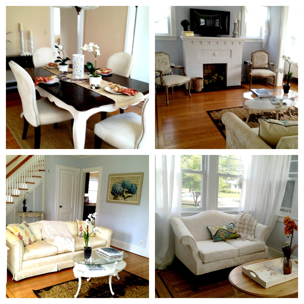
Revamping an Old Chair for a New Purpose
This week I was asked to stage a vacant home in Malverne NY. It’s a lovely Dutch Colonial that has a great, homey feel to it. When I looked at the home for the first time, I jotted down my ideas for which furnishings to bring to make this house feel even more like a home. I usually know pretty quickly – but I knew that I might be missing one or two things that would make the staging complete.The home featured an enclosed porch that’s adjacent to the living room. It’s a narrow room, so I knew that I had to bring a loveseat. But what should I place on the other side? It needed a relaxed feel but the piece had to be a bit compact. A wing chair would be too formal and too large. I had an idea what to use…but it needed a little work and an OK from my husband.


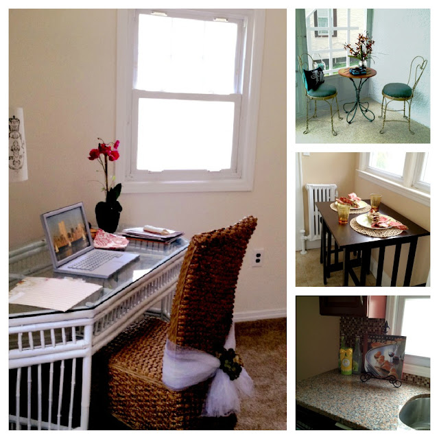
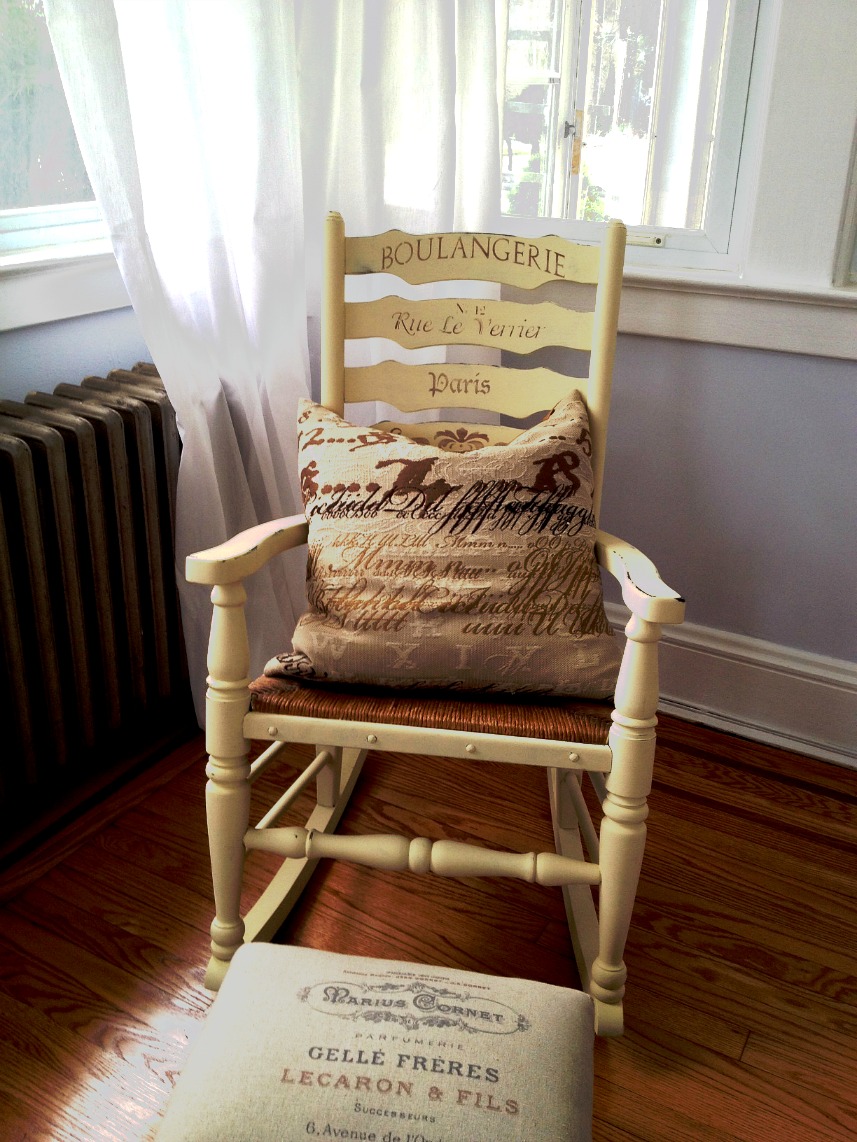

This is the piece I used…but it didn’t start out that way. It was dark and ugly but you didn’t see much of it ’cause my husband’s clothes covered most of it! I convinced him I needed it for a job and that I had to lighten it up and make it prettier. He said “Why?” and I just looked at him and then he said “OK!”

This picture would have looked funnier if I had taken it with all of his clothes racked on top of it – but at least I got a before (OK – with a few paint marks!). I had to finish this in a hurry – like a half day – in order to get the staging job done.
I used Annie Sloan’s Chalk Paint in Cream. I didn’t have enough time to do the waxing but I add some nice stencilled French words, a motif or two and some distressing and the chair was ready to go. I used several word and graphic stencils from Maison de Stencils to make the job go quickly!
Here are some other shots of the home I staged…

It was a fun job – except for the fact that the air conditioning was not really working well (and it was about 100 degrees outside!). But we managed to get all the furniture, lamps, rugs and accessories in – without dying of heatstroke. One of my great workers, Lyn, suggested to the realtors that perhaps they should take the winter cover off the air conditioning units. That worked…alas too late!
Sharing this project with…
Under the Table and Dreaming; Funky Junk; At the Picket Fence; French Country Cottage; Sundae Scoop; Between Naps on the Porch; Be Colorful; Masterpiece Monday; Home Stories A to Z; My Uncommon Slice of Suburbia; Domestically Speaking; Savvy Southern Style; Knick of Time; The Southern Institute
Thanks for stopping by The Colorful Bee! Stay in touch and never miss a post.
*Subscribe to receive an e-mail when a new post is up, HERE.
*Subscribe to receive an e-mail when a new post is up, HERE.
An Inspiring Seminar from Larry Laslo
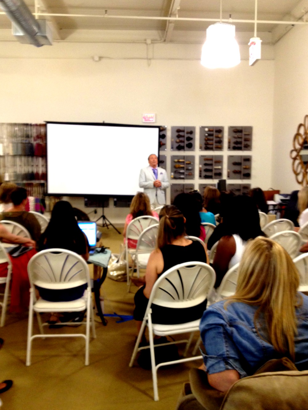
This morning I attended a wonderful seminar by designer Larry Laslo that was held at the Robert Allen Showroom in Woodbury NY. After hearing Larry talk, I can see why he is so successful – he is so down to earth, funny and warm that I can see why his well-heeled clients love him. He gave a slide show of many of his projects and showed how he went about designing the spaces. Some of the homes were so huge that you have to have a mastery in the art of scale and balance in order to pull it off successfully.
Here were some of the images he shared with the designers in attendance…
Most people would think that using dark and bold colors on a wall would make a room seem smaller, but in Larry’s hands the dark colors actually expand the sense of space. I loved his use of padded charcoal gray walls with the black and white theme.

In the above room he also mentioned that he chose just one light fixture instead of two sconces on either side – for a neater more functional look for his client.
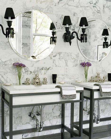
Speaking of black and white, Larry loves to use Carrerra marble because it creates its own pattern. He kept the rest of the space simple because of the busyness of the pattern.

He also showed us several rooms that had beautiful mosaics, as in the bath above. Several thousand small tiles make up this beautiful feature wall.

Larry is a master at mixing genres and styles. These Christopher Guy dining chairs have antique damask backs and white patent leather seats. Many of his rooms feature a hearty mix of now and then – mixing old and new.
What was really wonderful though was that he said that if you have the talent for using color – don’t be afraid to use it and be confident about it. Just because your client might be timid about it – if you know it’s the right thing to do you really need to do it. I really took this to heart because I have felt that I pushed the color envelope with my clients and I felt a little bad about it (although I knew it was the right thing to do in their homes). I felt validated and it was a freeing message that he sent to us today.

Above, a small collection of his fabrics that I picked up today. I can’t wait to use them. I have some great ideas for using these gorgeous designs. The largest sample in the above collage is called Scrolling Art. I have plans to use this on two chairs. I love how he isolates a motif so that you can use the fabric as a central design on a chair.
It was great to connect up with other designers I have known for awhile and to meet some new and talented people as well. I learned some great tips even after the seminar from other designers in attendance. We talked about getting together to network and to help each other.
And besides all that…the seminar was catered and the lunch was fabulous! You can’t beat that. Everyone had a great time – so thanks Larry for your inspiration and Robert Allen Fabrics for hosting!
Thanks for stopping by The Colorful Bee! Stay in touch and never miss a post.
*Subscribe to receive an e-mail when a new post is up, HERE.
*Subscribe to receive an e-mail when a new post is up, HERE.
Leave a comment
Posted in Uncategorized


 Decorative Finishes
 Interior Design
 Home
Home Garden
 Holiday
 Makeovers
 My Life
 Business
 Tutorials
 Videos
 Paint
Paint