
-

-
Subscribe
Thanks for stopping by The Colorful Bee! Stay in touch and never miss a post. Subscribe to receive an e-mail when a new post is up, HERE.Sponsor
If you're interesting in advertising on The Colorful Bee, click here to learn more.Contact
You can also email me at Linda.Leyble@gmail.com -


Categories
Subscribe
Popular posts
-
Recent Posts
Blogroll
Links

Author Archives: Linda
My New Little Masterpiece
Hi everyone…
As some of you know, I am out in California visiting my new little granddaughter, Peyton – who is the most precious little bundle of joy. I thought I’d post a picture of her that was done professionally.

She’s such a great baby too. She was a bit fussy last night – but she finally went to sleep at 9:45PM and didn’t get up until 5:30AM.
I love her to pieces!!!
Thanks for stopping by The Colorful Bee! Stay in touch and never miss a post.
*Subscribe to receive an e-mail when a new post is up, HERE.
*Subscribe to receive an e-mail when a new post is up, HERE.
3 Comments
Posted in Uncategorized
Creating an Elegant Powder Room
A friend, and now a client, wanted a beautiful powder room. She hated the dark color that was on the wall (originally a maroon hue). She also disliked the glass shower door in the room and so when I asked who takes showers here…she said “No one!” So, I asked her if she’d love to have a beautiful window treatment instead. “Yes,” was the answer.


The flooring in the room was the one thing that could not be changed (at least, not budget-wise) and it was a pretty strong blue-green with silvery taupe overtones. I found a few fabrics that blended beautifully with the flooring that the client loved – one in particular she adored. However, when I went to call up to order it – it was no longer being made. Darn. So, back to the drawing board.
The floor color was a very difficult color to find a fabric for. Either it was too blue or too green. It was maddening! But, I finally found a gorgeous fabric at Robert Allen that fit the bill. After that, I started to create some sample boards for the wall finish.
A Blue-green (Staffordshire Blue from Benjamin Moore) was painted on the upper wall and white painted beadboard was added to the room that used to be a dark maroon.
I suggested a blue green wall color but with a pearl glaze with some added silver streaked in – stried. The client was purchasing a mirrored vanity that had all polished nickel fixtures – so the silver glaze added would bring a little bit of that tone on the wall. A vertical strie would help the room seem taller. A strie (or “stripe” in French) is a glaze or a texture that gets put on a wall or molding/furniture – and then removed or manipulated with a brush to create “striations.” This finish adds a touch of elegance to a room.
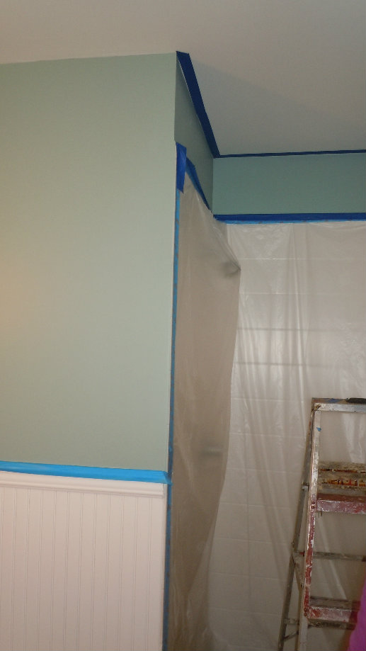
Off came the shower door…
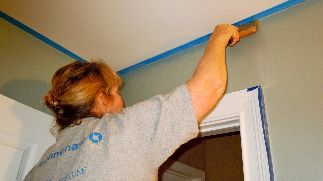
Yours truly….doing the stried finish on the upper wall
The toughest part of doing a stried finish is trying to keep the lines straight!! You never end up with something 100% perfect, but you can get very close…at least visually. The other thing you have to be careful about is where the tape meets the molding (especially, in this case, by the beadboard). To avoid a build-up of glaze, after you do your downward stroke, you should sweep back up gently.
A Closeup of the Stried Upper Wall and the Beginning of Antiquing the Beadboard
Instead of keeping the beadboard white, I suggested that we antique it to blend better with the fabric that was chosen for the “window treatment.” I mixed up some Dark Brown and Van Dyke Brown into a Silver glaze.
The Finale!
And, here it is! II wish you could see the fabric better – it’s gorgeous…and the tassel is to die for! It was a bit tough taking a picture of this room – I couldn’t get enough light – but this is fairly close to the look.
I just have to place some decorative items inside the shower. I will post pictures of the mirrored vanity and the beautiful light fixture purchased for the room when it arrives!
I’ll be linking up here:
Thanks for stopping by The Colorful Bee! Stay in touch and never miss a post.
*Subscribe to receive an e-mail when a new post is up, HERE.
*Subscribe to receive an e-mail when a new post is up, HERE.
11 Comments
Posted in interior design
Happy Birthday William Shakespeare!
Happy Birthday, William Shakespeare. I was an English major – way back when – and I have always celebrated The Bard’s birthday in one way or another. Today – he gets a blog post! One of favorite English professors, Dr. Leonard Albert at Hunter College, used to remind us that “Shakespeare was a true genius. He was born and he died on the same day!”

I usually read passages from Hamlet, The Tempest or MacBeth or from his sonnets and I honor the man whose work has been questioned as his own recently. I still think his words are his words and I will continue to be in awe of how he changed the English language forever. He painted with words and very few writers have come close to the mastery that I believe is his alone.
In the summer of 2001, my future husband and I went to France and while we were in Paris I just had to go to the Shakespeare and Company bookstore. The original and very famous Shakespeare and Company bookstore (the store today is the second incarnation) was started by Sylvia Beach, an ex-patriate from New Jersey. It was frequented by Hemingway, Ezra Pound, F. Scott Fitzgerald and James Joyce, among others. It was a bookstore and a lending library as well and it was here that you could borrow the banned Lady Chatterley’s Lover by DH Lawrence. Ms. Beach was also famous as the publisher of James Joyce’s Ulysses – one of the world’s most famous banned books.

The interior of the bookstore is something to behold. Books are all over the place (see the picture below) – piled up in stacks and stacks and it’s amazing to think that people actually find things that they are looking for here. But the store is a wonderful tribute to the love of books, which I’m sad to say has been waning in this ipad and e-reader age.
So, Happy Birthday Will. May your words live on…and may printed books continue to be published and continue to fascinate and inspire us.
Thanks for stopping by The Colorful Bee! Stay in touch and never miss a post.
*Subscribe to receive an e-mail when a new post is up, HERE.
*Subscribe to receive an e-mail when a new post is up, HERE.
1 Comment
Posted in Uncategorized
Gold Leafing and Antiquing a Fireplace Mantle
When I finally convinced my husband that we needed a kitchen renovation, I figured that if I got him that far…let me see if I can also get another room added on – a great room, off the kitchen. Amazingly he said “yes!” This was a few years ago – and I have been working on this great room since then. It’s been a work in progress.Since my laptop is in the repair shop (my hard drive was damaged…so I won’t have access to a lot of my pictures til next week or so), I’d like to share the pictures I do have to show you the work I did on the room.


First Incarnation…
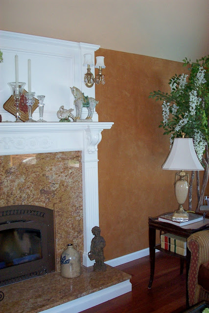
I was happy to finally have a fireplace and mantle in my home – yippee, something else to decorate! (And that tree was supposed to be on our deck then – sorry about that one). But having the mantle so stark white really wasn’t doing it for me. I had done a nice sueded plaster on the walls in a cinnamon hue – very Ralph Lauren-ish kind of look and feel (without it being Ralph Lauren material!)…and I loved the warmth of it.
So – what’s a girl to do to make it all come together? Add some decorative onlays, gold leaf them and then antique the entire mantle.

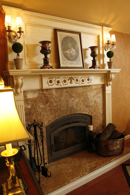
Mantle…After
The gold leafing (or gilding) of the onlay gave the mantle more distinction and character, I think. And the antiquing gave the onlay a nice patina – and now the tone of the painted wood blends so much better with the finish on the wall. Before the white just shouted at me – I am so much happier with this look.

Closeup of gilded and antiqued onlay
GILDING STEP-BY-STEP…
-
I first painted the onlay with a yellow gold paint – this will help you out later…because not every piece of leaf will stick!
-
I used Gold Leaf sheets from Michael’s – nothing fancy. But after you put on the gold leaf size (the glue that makes the leaf stick to what you are gilding which you can get at Michael’s also) – let it come to a tack. Don’t put the gold leaf on when the size is still wet. Never place your finger on the size to check if it’s ready – use your index finger knuckle to check it.
-
Once it’s ready, place the sheets on your object and tamp them down softly with a soft artist’s brush. Once everything is on your onlay (or whatever you are gilding), take some cheesecloth and start to take and brush away the gold leafing that didn’t stick. You can use an artist’s brush to get into any crevices etc.
-
Once that’s done, use your cheesecloth to burnish the gold leaf – you’ll begin to see that it starts to get shinier. Now – the leaf sold at Michael’s and elsewhere is not real gold leaf…so the leaf will look a bit too brassy. But after you antique it (as I did – with the rest of the mantle), it will lessen the shininess. In addition, I took an artist’s brush and took some dark brown tint and brushed it on to age and darken it.
-
Optional: You can also use a dark wax (Annie Sloan’s Dark Wax or Liberon Wax etc) to do this as well. This will protect and seal your work
So – hope you enjoyed this. If you’d like to see a few more pics of this up close…click the links below to my website.
Happy Painting!!
Linking this project up to…
Miss Mustardseed Romantic Home Serenity Now French Country Cottage Funky Junk Interiors Home Stories A to Z My Uncommon Slice of Suburbia
Thanks for stopping by The Colorful Bee! Stay in touch and never miss a post.
*Subscribe to receive an e-mail when a new post is up, HERE.
*Subscribe to receive an e-mail when a new post is up, HERE.
13 Comments
Posted in interior design, Tutorials
Weekly Faux Finishing Column Idea: What do you Think?
I am distraught today because I don’t have my laptop – it’s in the shop getting a little overhaul (and I hope it’s “little”!!). So I thought I would try something different for a blog post and see what kind of reaction I get. This morning, I took some pictures of some sample boards that I’ve done and I’ve uploaded them to my husband’s laptop.
I am thinking of doing a weekly column called “Sample Saturday…or Sample Sunday.” So, please comment below and let me know if you think you’d like to see something like this weekly!
In the column, I would show you a faux finish or a furniture finishing idea – with a recipe. I’m going to start out with a troweled faux finish that I love – it’s a little difficult, but I will show you how you can make it simpler.
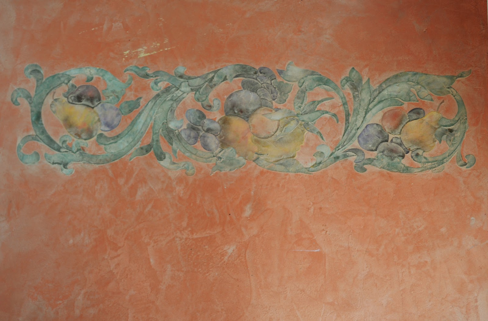
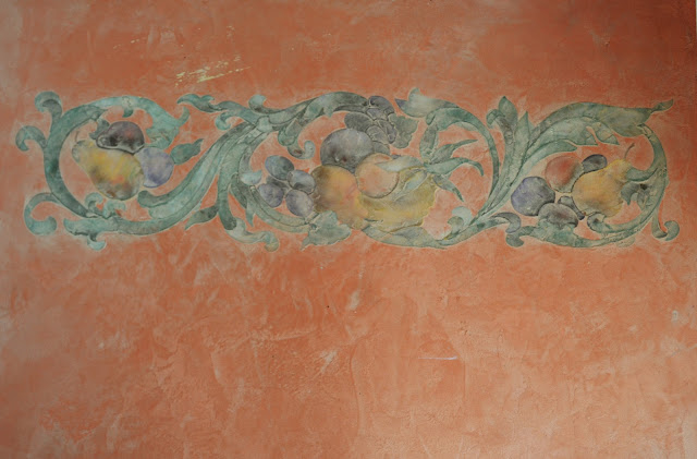
Metallic Plaster with an Embedded Stencil
Now, embedding a stencil can be a little difficult (especially this stencil because I used one with 3 overlays). You can make it easier on yourself if you use a stencil with just one overlay! Or you can just do a a regular stenciled design over the metallic plaster. If you are a beginner, do a single overlay stencil. But, as with any new technique, I would do some practicing on a sample board (like I did on this one).
I would encourage you to try to do a troweled finish like this – it’s easier than it looks. It just takes some practice. I used a product called LusterStone from Faux Effects. It can be ordered online – but there are many Sherwin Williams dealers throughout the country that carry this product. It’s the same product that I used on my Ceiling Design. There are several metallics on the market – Modern Masters makes two different kinds – Shimmerstone and Metallic Plaster. You can also use any of the faux suede products as well…but I love the luscious shimmer that the metallics give you.
FIRST LAYERS
1) First, roll two layers of a good latex paint in a color that is the closest to your plaster color. I used a Terra Cotta color because that’s the color I used for the plaster.
2) Add about 10-15% water to your metallic plaster and mix fairly well. With a small roller (Whizz roller i.e.), roll this mix haphazardly – don’t do it like you are painting (up and down). Do some strokes diagonally, vertically and horizontally – for a little movement. Let dry.
3). With a stainless steel trowel, apply the plaster full strength. But don’t put it on too thick or it will crack. It’s a fairly easy material to move and it stays moist for quite a long time. Aim for about 85% coverage – leaving some areas of the first layer showing. This will give some textural interest to the plaster. Let dry.
3). With a stainless steel trowel, apply the plaster full strength. But don’t put it on too thick or it will crack. It’s a fairly easy material to move and it stays moist for quite a long time. Aim for about 85% coverage – leaving some areas of the first layer showing. This will give some textural interest to the plaster. Let dry.
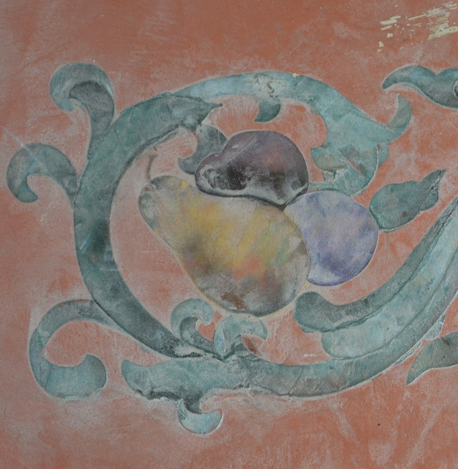
Close up of the Embedded Stencil
EMBEDDED STENCIL LAYER
4) I used the Rinceaux Fruit stencil from Royal Design Studio, but you can used any design that you’d like. I used some spray adhesive on the back of the stencil – but I also taped all the sides. I mixed up several different colors for the fruits – some yellows, greens, plums. One thing that’s great about using the LusterStone is that it comes in many different colors – but they also have a tinting base (which I used here as well). You can add tints to the tinting base to get the color you want for the plaster. So, instead of buying many different quarts of the metallic plaster to do the raised designs…you can buy a quart or so of tinting base and create your own custom colors. You can use Sherwin Williams or Benjamin Moore tints (yes – the same ones they use for their paints). Just ask your paint dealer for a quart of tint only…not the paint. Put a few drops into the plaster – and build up to the color you want.
5) You want to have the stencil on very well because you don’t want any leakage from underneath the edges of the design. For my “trowel” I cut a small square of a piece of styrene board and then I lightly sanded the edges to soften and round them a bit. Pick up a small amount of your tinted plaster onto your “trowel” and trowel lightly into the design areas of the stencil – green for the leaves, purple for the grapes and plums etc. You will have to place some tape over the areas you don’t want “green” for instance. If you are doing a multi-overlay stencil, you have to make sure each layer is dry before you put the next overlay on. If you are doing the above stencil or something like it, you can give it a little more realism by adding shading to the leaves and fruits.
Tip: If some of the plaster has seeped out a bit – don’t worry! Use a Q-Tip to remove the plaster that leaked out. It doesn’t have to be 100% perfect because you will be suffusing the design with another layer of plaster.
THE FINAL LAYER
6) Once your stencil design is completely filled in with the plaster and dry, you then do one more layer to “embed” it. You can use the same color plaster you used in step two (the watered down version). But I used a lighter, more neutral color – Champagne Mist. I just put maybe 5-10% water into the plaster. I put it on first with a brush – and then I took my stainless steel trowel to move the plaster around. It’s like you are “frosting” the finish.
So…give it a try. It’s a beautiful finish for just about any room. You can even use it on furniture. A single motif embedded in the center of a cabinet door would look gorgeous!
Happy painting!
Thanks for stopping by The Colorful Bee! Stay in touch and never miss a post.
*Subscribe to receive an e-mail when a new post is up, HERE.
*Subscribe to receive an e-mail when a new post is up, HERE.
3 Comments
Posted in Uncategorized
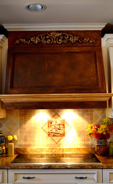
Creating an Old World Range Hood
When we finally redid our kitchen a few years ago, I was beyond happy with it. No longer was I embarrassed having people over for dinner because I had new cabinetry, granite counter tops, new flooring…in short – my kitchen was finally a place I could be proud of.
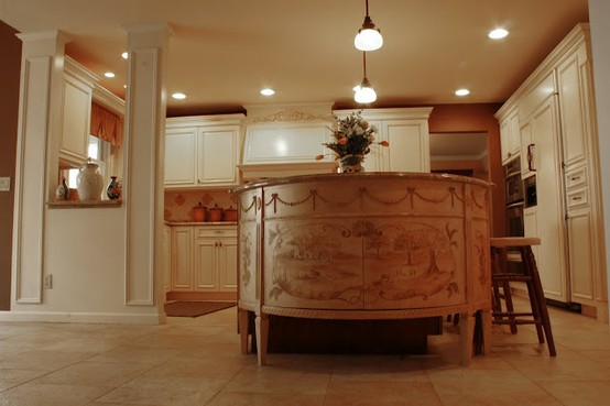


My kitchen was featured in HOUZZ!
But…I couldn’t make up my mind which backsplash I wanted. Nothing seemed to go with the granite (oh, it probably did…I was just very picky). So, I finally took the plunge and created my own backsplash (which you’ll see a better picture of soon). Because the backsplash was very old world, textured and rustic, it made my range hood look too new, too light and out of place. So – that had to change. I took out the trowel…
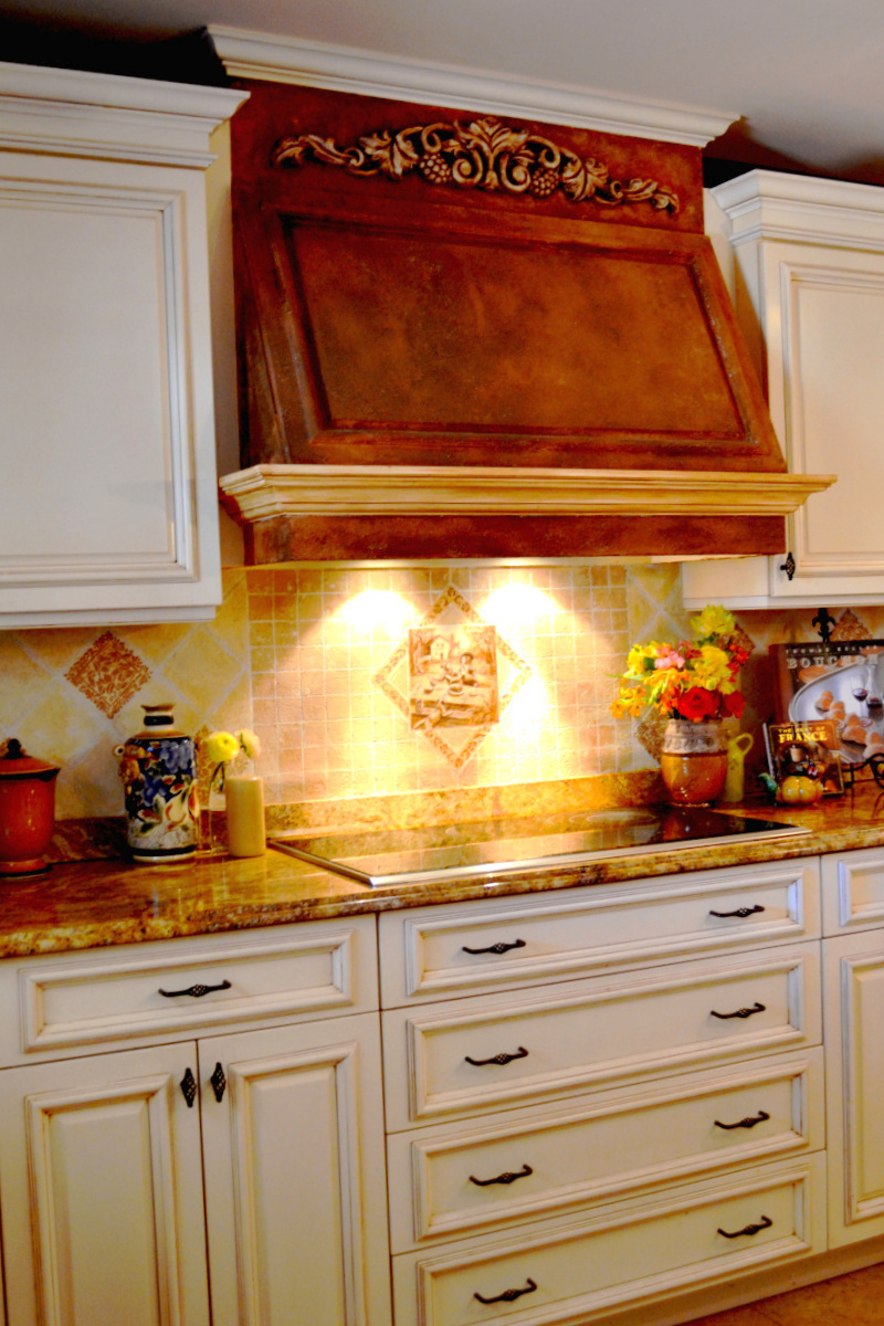
I used a product called PlasterTex from Faux Effects. It’s a wonderful texture for old world effects – plus it takes a glaze well. I stippled the texture on first with an old brush, then I troweled it, giving it that “been there forever” type of look. In the smaller and straighter sections where I couldn’t use a trowel, I stippled and then I “mushed” with my fingers (very technical faux treatment!!) Then, after it was dry, I took out a large brush and glazed the entire range hood with some Mahogany Stain and Seal (also from Faux Effects). I threw in a little bit of chestnut brown and brown glaze as well. Where it was too dark, I just wiped it back with some cheesecloth. For the onlay on the top of the range hood, I just wiped back a lot of it because I wanted it to stand out…otherwise the depth and definition of that feature would have been lost.

Above, not the best cropping job, but you can see the range hood a bit better. I then used the same glaze and wiped it over the lower molding on the hood. The question I have for all of you reading this – should I also do the same glaze on the top molding? I left it cream – like the rest of the cabinetry. I’m not sure…so I would love some suggestions.
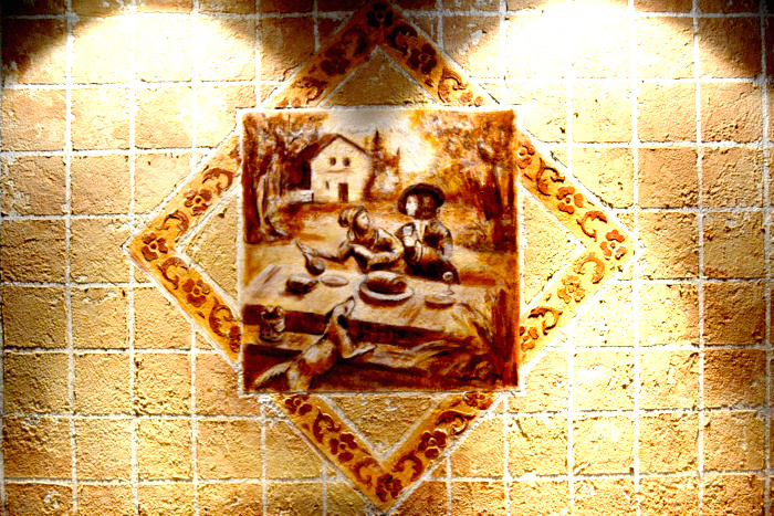
Here’s a closeup of the section over the cooktop.
I wish I could say that I painted that middle tile – but I was afraid of messing it up too much, so I had a friend who’s a fabulous artist do it for me. It’s a revised version of a section of a toile fabric that I had purchased awhile back. We didn’t copy the toile exactly, we changed it quite a bit. I like to think that the lady is taking the wine bottle away from the man because he’s getting a little crazy. In my house, it’s usually my husband taking the wine bottle away from me! Oh well – in art, you can be a more glorified version of yourself!!
If you’d like to see a few other photos of my kitchen, go HERE
Hope you enjoyed this!
I’m linking this project up to…

Thanks for stopping by The Colorful Bee! Stay in touch and never miss a post.
*Subscribe to receive an e-mail when a new post is up, HERE.
*Subscribe to receive an e-mail when a new post is up, HERE.
20 Comments
Posted in Uncategorized
The Fifth Wall: The Importance of Decorating Your Ceiling
While I am awaiting the news of my new granddaughter’s birth (it should happen within a few hours…I can’t wait!!), I thought I’d share a project that I did in my home recently…my dining room moldings and some metallic plaster and decorative pattern on the ceiling. Here are some before shots…
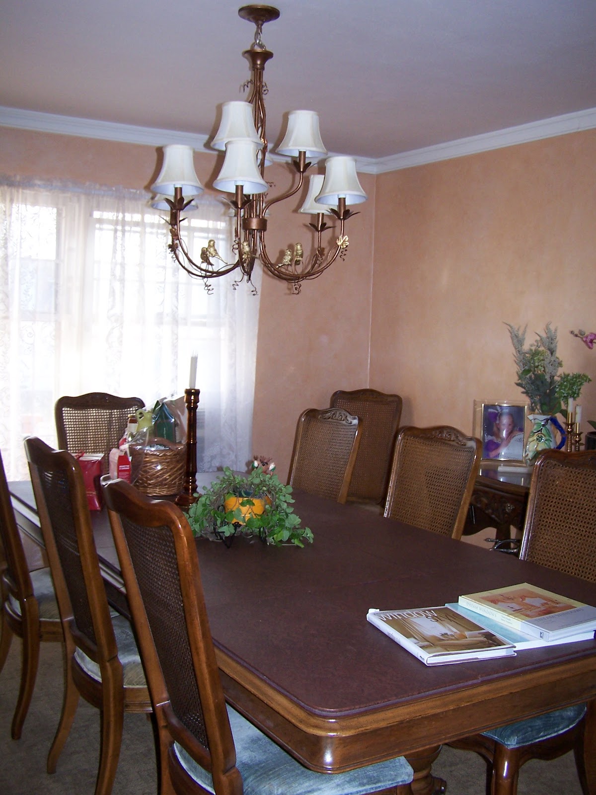


Above, you can see that adding new window treatments, artwork and carpeting helped a lot. It was very nice…but it wasn’t “me.” You know that feeling you may get about a room in your house that you’ve decorated – but you hardly ever sit in it? Well, that’s because it doesn’t speak to you and I believe every room should speak to its owner! I had done a lovely faux finish a few years back and I loved it…but it wasn’t enough. The lace curtains were not me – so I changed them. The ceiling and the moldings were just “so-so.” Adding a small crown molding and decorative base – and antiquing them helped a lot.
I love my dining set (love it but it needs to be updated with some new upholstery and some paint and antiquing still! Another post perhaps!) But…something was still missing. It needed more cohesiveness and extra intimacy (every dining room needs this!).

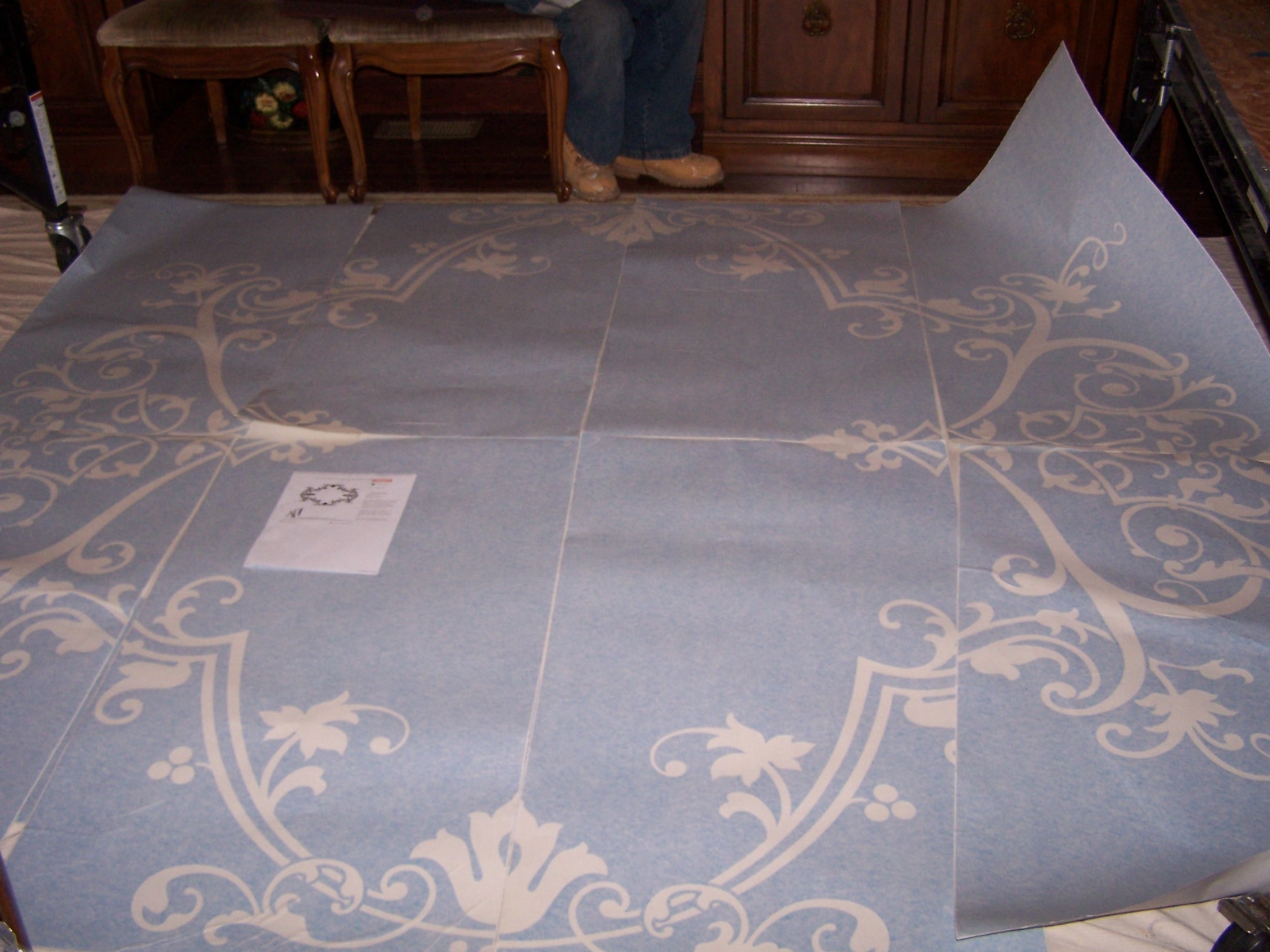
So, I went to my favorite stencil designer, Melanie Royals’ Modello Designs, and I ordered the largest stencil (a special, one-time use one) I had ever seen – and got to work! Here it is laid out on the floor – Yikes!

Above, the first part of the stencil is adhered to the ceiling. That only took about an hour to get put up correctly!.

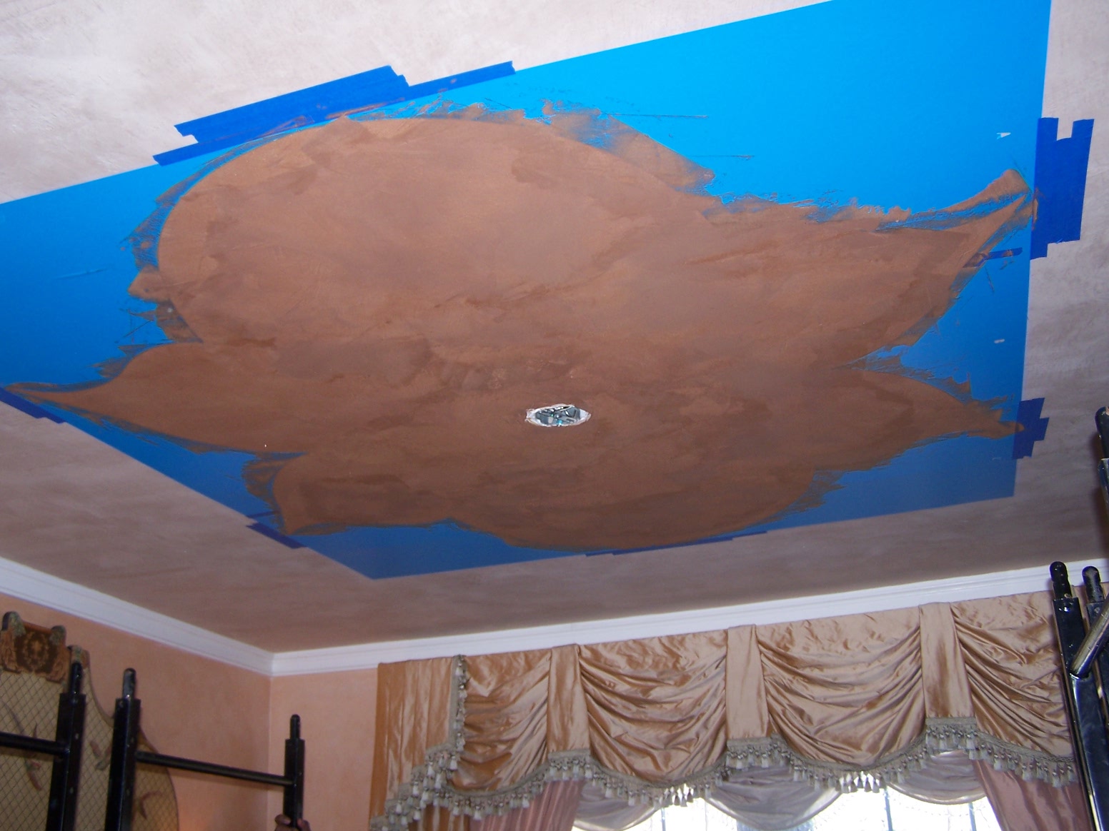
Then I added 2 layers of Brown Metallic Plaster for the first part of this process.

Once the plaster is dry, you put up the next part of the stencil.
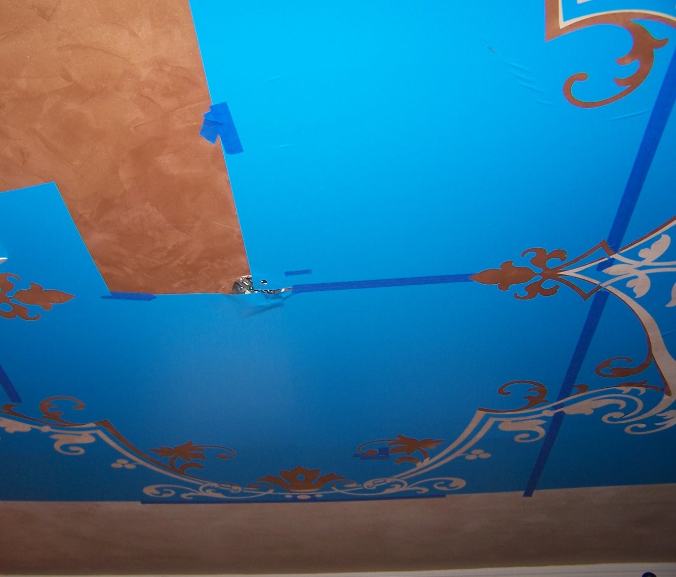
That only took about 2 hours!!! Eh, maybe longer!
For the scrolled part of the design that was on the Brown, I troweled an antiqued metallic gold plaster and then I threw some large Mica flakes onto it while wet so there’d be a bit more bling! More bling than this?? For the scrolled parts that were on the lighter part of the ceiling, I alternated between the Brown and the antique gold plaster being troweled on.
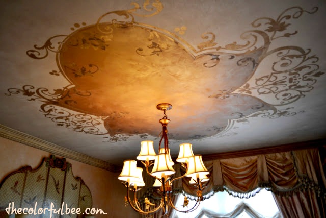

I love how it came out. When you sit at the dining room table, the design helps to make the room more intimate. Now when I go into this room, I’m happy! I’ll even sit there and pay bills! It was hard to do (a lot of measuring, which is not my forte) and you do need an extra set of hands to help you place it on the ceiling (and to give you a rest when your back and neck are aching!).
I have done many different stencil designs on ceilings before – but they were smaller and easier to do. This takes more time, patience and skill…but it is well worth it! Melanie has a lot of helpful directions on her website – so if you are thinking of doing something like this – you’ll have some help along the way. Start out with something small (like a design in the four corners of a ceiling). Do something manageable before you tackle something like this!
If you would like to read how to do a somewhat simpler version of this technique, click here
Baby update: My daughter had the baby while I was writing this post. Little Peyton weighed in at 7 pounds 13 ounces and mother and baby are doing great!
Thanks for reading. I welcome all your comments and questions!
Linking this project up to…
Thanks for stopping by The Colorful Bee! Stay in touch and never miss a post.
*Subscribe to receive an e-mail when a new post is up, HERE.
*Subscribe to receive an e-mail when a new post is up, HERE.
38 Comments
Posted in Decorative Finishes, interior design, Makeovers, Paint, Tutorials
My Baby is Having a Baby Today!
When we got the phone call yesterday morning that my youngest daughter, Jessica, was en route to the hospital because her contractions were 5 minutes apart…I was so excited that I couldn’t really concentrate on anything very well. I was able to get Easter dinner ready for our guests but every few minutes I was checking my phone to see if I got a new text message.

Jess lives in California and, of course, I’m here in New York. I will be going out there to help her with the baby next week but I was wishing that I was there to help her through this.
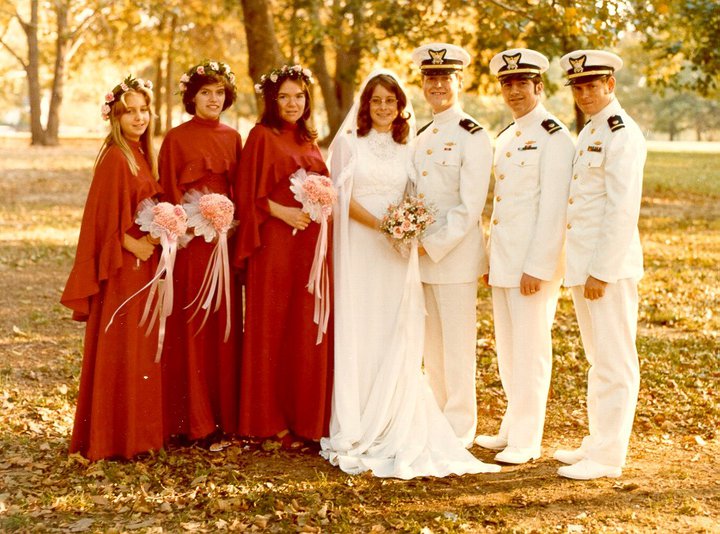
A picture of me as Matron of Honor for my friend Joanie when I was 9 months pregnant with Jessica. I’m the bulging one next to the bride! I gave birth 2 days later – after dancing the polka at the wedding!
She stayed at the hospital for awhile but she only dilated to 1 1/2 cm, so they sent her home. Then she came back 7 or so hours later – but was sent home again becuase she only reached 2 cm. So – it seemed like this wasn’t going to be an Easter baby. (I should have told her to Polka!!) Then this morning (8:30 am EST) I got a text message from her that her water broke and she was en route to the hospital again.
So now I am trying to be patient awaiting the news. My new granddaughter’s name will be Peyton. I know that my daughter will be such a great Mom. And I am so thankful that she will be moving back here in July! I am so happy and blessed.
Thanks for stopping by The Colorful Bee! Stay in touch and never miss a post.
*Subscribe to receive an e-mail when a new post is up, HERE.
*Subscribe to receive an e-mail when a new post is up, HERE.
Leave a comment
Posted in Uncategorized
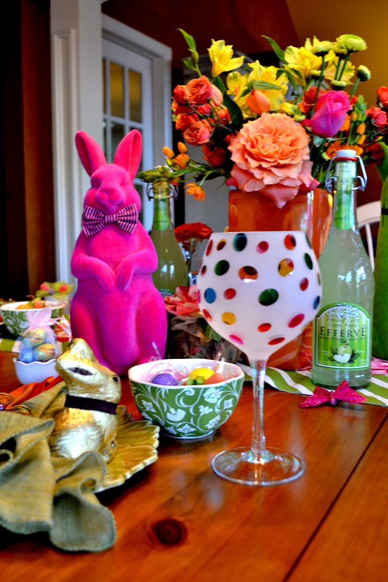
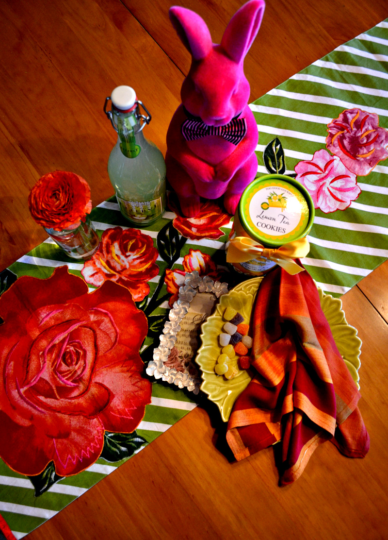
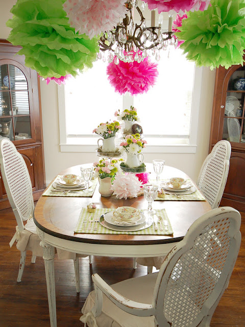
Our Easter Tablescape
Well…by the time I got home and finished setting the table, the sun decided to change to clouds! But I wanted to post some pictures tonight. Hopefully there will be good sunlight tomorrow, so I post more pictures.
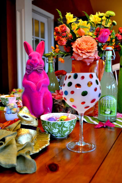
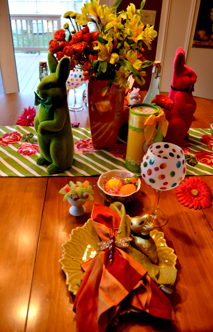
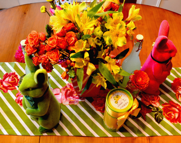

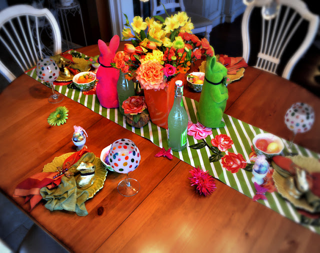
I just fell in love with the orange, green, pink and a dash of yellow color scheme. It’s such a happy combination. It says spring plus warm weather ahead for me.


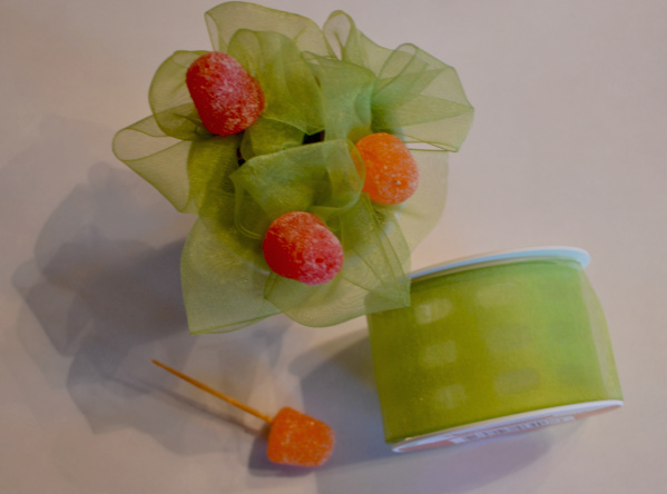
Maybe you noticed the little “flowers” I placed in the egg cups in the second picture. These were super simple to make and perhaps a little more fun to see in the egg cups than eggs!

Just use a toothpick to skewer the gumdrops…then wind some organza ribbon around it in leaf-like folds. Secure with florist wire or rubberbands – whatever you have on hand and then place in egg cups or small glassware. You can secure several together at a time – or once you have a few in your cup, you can just place a few extra gumdrops on top.
So…hopefully the sun will be shining tomorrow, so I can post more pics! Thanks for coming to take a look!
Linking up to….
Thanks for stopping by The Colorful Bee! Stay in touch and never miss a post.
*Subscribe to receive an e-mail when a new post is up, HERE.
*Subscribe to receive an e-mail when a new post is up, HERE.
2 Comments
Posted in Uncategorized
Getting Ready for Easter and Easter Decorations
I don’t know where the time went…but it’s almost Easter. How did that happen? Wasn’t it just Christmas? Anyway, with the warm weather that we had today, I had to go shopping for some Easter supplies for my children and grandchildren. Thank goodness I was able to snag some chocolate Easter bunnies (they were all out of the regular hollow ones – that I don’t really like anyway) – they were solid and they cost a fortune…but my kids are worth it!I just put the water on to boil for the Easter eggs. It gets lonelier each year doing Easter eggs, now that my kids are all grown up and they don’t want to do it. There were one or two times recently that I didn’t bother to color eggs – but I know that it’s such a nice tradition and they are so colorful…and good for you!


I am going to do a tablescape tomorrow, in preparation for the weekend festivities. But I thought I’d show you some of the things that inspired me this year. I love vibrant colors – I’m not the pastel type at all. It started with my friend Debbie who owns Honeysuckle and Roses florals in Westhampton Beach, NY. She gave me a few roses…which were beautiful.

And then I did a little bit of shopping at Pier One and HomeGoods (with the colors of the roses in my head!). I found the beautiful table runner and the napkins at Pier One and most of the other items at HomeGoods (except that cute bunny, which I bought a few years ago in NYC!)
So…I hope that you will come back to see how I did with the tablescape. Oh boy, the pressure’s on! But, I will leave you with a link to one of Marian Parson’s (Miss Mustardseed’s) tablescape projects – how to make these tissue pompoms. This appeared awhile back on HGTV.com. I am going to make some tomorrow as well. If you have never seen her blog, I encourage you to visit it!

So…my eggs are just about done. I hope that you’ll pop back tomorrow to see my tablescape!
Thanks for stopping by The Colorful Bee! Stay in touch and never miss a post.
*Subscribe to receive an e-mail when a new post is up, HERE.
*Subscribe to receive an e-mail when a new post is up, HERE.
1 Comment
Posted in Uncategorized


 Decorative Finishes
 Interior Design
 Home
Home Garden
 Holiday
 Makeovers
 My Life
 Business
 Tutorials
 Videos
 Paint
Paint