
-

-
Subscribe
Thanks for stopping by The Colorful Bee! Stay in touch and never miss a post. Subscribe to receive an e-mail when a new post is up, HERE.Sponsor
If you're interesting in advertising on The Colorful Bee, click here to learn more.Contact
You can also email me at Linda.Leyble@gmail.com -


Categories
Subscribe
Popular posts
-
Recent Posts
Blogroll
Links

Author Archives: Linda
A Quick Revamp of a Bookcase in My Great Room
Does this ever happen to anyone else? You think you’ve put a nice vignette together for a bookcase and then over time it just doesn’t look as good. Well, I have a husband who likes to sneak stuff from the basement or attic and he places it where I don’t want it! I don’t notice it right off the bat…but then I will be passing by a shelf, cabinet or bookcase one day – and there’s a stuffed toy, a frog, a silver Mexican hat and countless other absurdities that he’s collected over the years – and he think he’s adding to the beauty of the vignette.
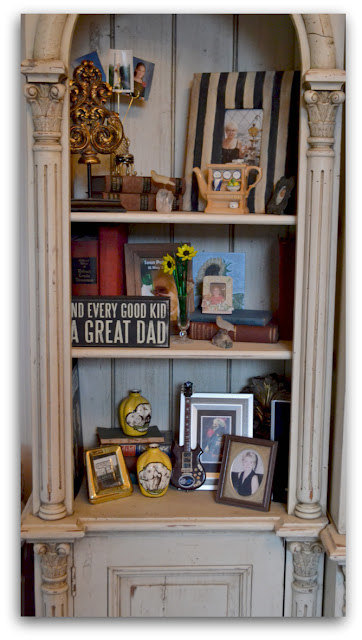


The above picture was actually worse – there also was the silver Mexican hat and a pink stuffed elephant in that mix. I had orginally done a nice little “story” that included photos and some items we picked up on travels to Europe…but slowly over time, lots of my husband’s extras wormed their way into the bookcase. This is way too crowded – and you really can’t notice the items displayed because there’s too many of them.

This was my first revamp. It’s nice – but I’m a little underwhelmed. But I love the top grouping – a picture of me and my husband in front of a winery in Chateauneuf-du-Pape in Provence…and a pic of me at the top of the Eiffel Tower. The frame on the right was a crappy one I picked up for a dollar in HomeGoods – but I added the black stripes and now I love it. In front of the books is a thistle that my husband picked in the gardens by the Eiffel Tower – so it’s very sentimental for both of us. The other frame is one of the first Christmas presents that I gave my husband – he loves anything dealing with the sea so this was a perfect little gift.

Then I tried this, above. It’s still not wowing me. But I’m liking the middle shelf a bit. I have some antique books by Charles Dickens that my mother owned – and a teapot that I bought in Harrads (ridiculously expensive but I bought it anyway) that has a book theme. The lower shelf looks a bit barren – have to do something about that.

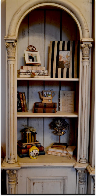
Then I came up with this arrangement. I think I like this one the best. But – I still have to work on it a bit. I added a picture I painted of a sunflower that I gave to my husband as a present on our first anniversary – I think it would look better in a frame on the lower shelf…so I have to work on that. It adds some needed color to the vignette. I love the antique books in the lower shelf…but perhaps I need something other than books in this space. Maybe I need to add the small yellow Italian vase (I also have another one like it) on the lower shelf. These little vases were the first antiques that I bought on Long Island after moving back from here from Seattle WA. So, they hold some special thoughts for me. They would look nice with the framed sunflower artwork. OK – now I am on the hunt for a great frame!
I will post again when I am finished with the arrangement. Would love to get your ideas and suggestions on what I’ve done so far. The changes that I made took me about 10 – 15 minutes and the items that I see here now mean so much more to me – so I get a good feeling about this bookcase now when I see it.

I’ll be posting my revamp of the entire bookcase – it’s really a beautiful piece. Here’s a picture of it and how I decorated it when we first got it. The bookcase section to the right now has husband’s trademark “put everything on the shelf” design aesthetic all over it (unlike how it looks above). That’s his desk in front of it and he feels that the bookcase is his personal office bookcase. I will publish it very soon even though I am embarrassed by it. I have to figure out a way to make it beautiful – yet functional for my husband. Oh boy – that’s going to be a tough one!!
Thanks for stopping by The Colorful Bee! Stay in touch and never miss a post.
*Subscribe to receive an e-mail when a new post is up, HERE.
*Subscribe to receive an e-mail when a new post is up, HERE.
4 Comments
Posted in Uncategorized
How do you Decorate a Very Large Room?
One of the questions that I get a lot is what to do with a very large space. Many people that I know who moved from their one family residence to a town home in a gated community have had this problem. While they may have downsized in square footage, their living rooms (or great rooms) were usually very tall (some double entry height) and their old furnishings and art work just didn’t work in the room anymore.
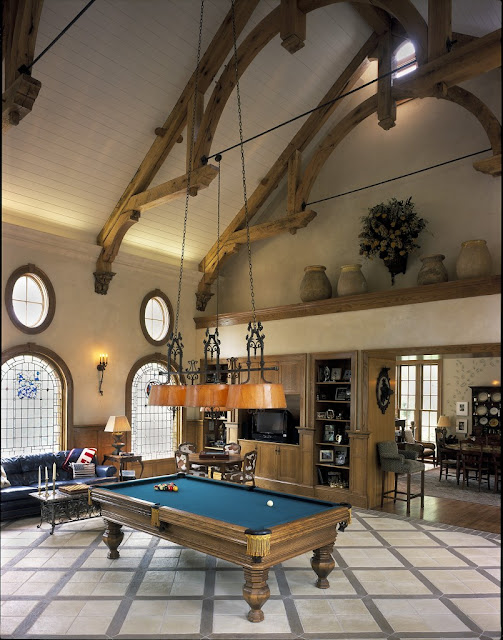


A great way to break up a huge space via
The above room would look too voluminous and imposing if it was left without any architectural embellishments. Adding the built-ins and the ledge (which brings your eye up – but not as far up as the ceiling) help tame the height of this room. The decorative beams, the wainscoting, the moldings and the windows all aid in bringing your eye down and help break up the vastness of the space. The flooring, with its diagonal design, helps to emphasize the width of the room. Even the planking on the ceiling helps to bolster the sense of width in this room. The pendant over the billiards table brings your eye down as well. The billiard table itself is chunky and substantial. A smaller piece of furniture would have been out of place.
What I am talking about here is the principal of scale. In an over-scaled room like this, you need items that are as substantial as the space and architectural elements that help bring the room to a more human scale. This room would make anyone feel small if the items I mentioned above were not part of the room.
What else makes this space warm and welcoming?…the texture on the walls and the warmth of the wood tones. Anytime you use a texture on walls, it’s like giving your room “a big hug.” It’s not only just warm – it actually helps to prevent light from bouncing off it and it gives the sense that the wall is “advancing” and coming forward – so the room feels more cozy and smaller.
If you’re puzzled by your large space, try to think about ways to break up the vastness – as above. Use texture on your walls to cozy up the space. A darker color on the wall would also help to reduce the perceived size of the room.

Kitchen, designed by Kenneth Bordewick
The beautiful kitchen, above, shows how to tame the scale of this room. Look at the hefty beamed ceilings – this brings down the perceived height of the room. The room is also broken up – notice where the cabinets begin and end – and they don’t go up to the ceiling. There are also two isalnds – again helping to break up the space, The large scaled pieces, like the Italian vase, are very substantial…and in scale with the room. The lighting also brings your eye down.
So, when you are decorating an overscaled room, try to remember some of these things – and don’t be afraid to use larger accessories and artwork. Your room needs them!
If you are having any trouble with your rooms, just give me a call. I know that I can help. Happy decorating!
Thanks for stopping by The Colorful Bee! Stay in touch and never miss a post.
*Subscribe to receive an e-mail when a new post is up, HERE.
*Subscribe to receive an e-mail when a new post is up, HERE.
3 Comments
Posted in Uncategorized
A Glimpse into My Glamorous Life
When people see the “after photos” of projects that I’ve done, most times they don’t understand what it took to get to that beautiful state. All the time it took to gather materials, prepare samples – and, when I am doing a decorative painting project, how crappy I look when I’m doing it!! When I’m speaking in front of a group or presenting ideas for a project, I look neat and respectable…
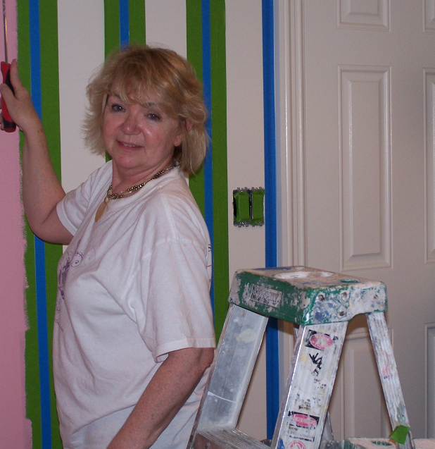


But when I am working, I look like mad scientist/painting chick! And sometimes when I’m on a very tight deadline (and furniture is coming the next day), I sometimes have to work well into the wee hours of the morning. And no one looks good when they are tired and they still have to work past midnight!

We worked til 2AM on this project – to meet a deadline
Sometime it’s just me and the wall (sometimes doing projects I love and sometimes…not)

And sometimes the work is way up high (a dome in a double entry foyer) and the client (a homebuilder) gladly puts up the scaffolding for you. When I got to this job, I was shaking when I went out on the scaffolding, so…
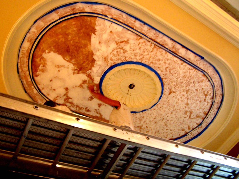
I gave instructions to my crew on what material to trowel first, second, third, fourth and fifth layers – and took pictures of the progress.

I still have to go back and take pictures with the chandelier.
This project came out so beautiful – despite my knocking knees.
More to come in future posts. Just thought I’d show you some pics of the glamorous side of me!!
Thanks for stopping by The Colorful Bee! Stay in touch and never miss a post.
*Subscribe to receive an e-mail when a new post is up, HERE.
*Subscribe to receive an e-mail when a new post is up, HERE.
2 Comments
Posted in Uncategorized
Today I am Loving…Porter Chairs
One earthly possession that I have yet to get is a Porter chair. And I want one…who wouldn’t?

Kelly Wearstler’s Porter Chairs in Bergdorf Goodman’s Restaurant Via
Back in the 16th century Europe, Porter chairs used to serve a real purpose. They were originally made for well-to-do families’ hall porters, who were the gatekeepers of the home. The porter would admit or refuse a visitor to the home. The porters would stay in their chairs throughout the day and evening (some even took their meals and slept in the chairs). Some of these chairs were equipped with drawers underneath – where supplies or even hot coals could be kept. These chairs were usually in cold entrance halls, so the shape of the chair also kept the cold drafts at bay.

The chairs evolved over the years…

This one is not as beautiful as Kelly Wearstler’s Porter chairs, but this one is from 1827 and it’s in the Bank of England’s Museum.


This chair from Christie’s auction House fetched over $4200

1950s version of the Porter Chair. From 1st Dibs

A 1960s Porter Chair for sale at Cannery Exchange for $2500
Furniture designers will always change the shape and alter the material used…
 |
| Image Via |
They will even make one for your pooch…

But this all just serves to keep the Porter Chair alive…& well in today’s interiors!

Kelly Wearstler Via
The shape and the style of the Porter Chair is still so beautiful. I just love them. How do you feel about it?
Thanks for stopping by The Colorful Bee! Stay in touch and never miss a post.
*Subscribe to receive an e-mail when a new post is up, HERE.
*Subscribe to receive an e-mail when a new post is up, HERE.
5 Comments
Posted in Uncategorized
A Faux Cobblestone Dog House
Every once in a while, I get to do something tremendously enjoyable. I was working in a beautiful and very expensive kitchen which was being revamped. There was a closet in the space that the client didn’t know what to do with. She wanted a bulletin board space for her children – a place where her 4 kids could post their school and extra curricular activities etc. I suggested that we divide the closet in half and have the upper half for the kids…and the lower half…for their beloved dog (who was a rather large dog with the temperment of an angel!). This is what I came up with!


I had my contractor fashion out a dog house facade shape from sheetrock which I then primed and painted. I wanted to keep the same look as the floor, so I first rolled on a texture (Sandstone from Faux Effects) to mimic the grout. I let it dry (not…I used a hair dryer and made it dry faster!) then I taped the pattern of the cobblestones with 1/8″ tape. I burnished it to make sure it stayed put. Then I troweled on a few tinted layers (some whiter, some with a bit of ochre and some raw umber) of a texture called Quartzstone from Faux Effects. For getting in to some of the smaller areas, I made my own little plastic trowel from a styrene board. After it dried (the next day), I toned it (with some of the same tints I used in the texture) here and there to match the floor even better.
I loved doing this project because it really helped keep the look and feel of the kitchen – but it served a practical purpose. Decorative techniques can really help solve problems.
If you are having any difficulty figuring out any problems with your rooms, just give me a call. I am sure that I can come up with something unique and beautiful!
I am linking this project to…
Miss Mustardseed Between Naps on the Porch Hope Studios’ Tutorial Tuesday Home Stories A to Z My Uncommon Slice of Suburbia Redoux
Thanks for stopping by The Colorful Bee! Stay in touch and never miss a post.
*Subscribe to receive an e-mail when a new post is up, HERE.
*Subscribe to receive an e-mail when a new post is up, HERE.
9 Comments
Posted in Tutorials
Using Geometric Patterns to Update and Beautify Your Rooms
If you want to update the look of a room – use some geometric patterns. If you want your room to exude more energy…add some geometrics. Do you have lackluster rooms without any architectural interest? Add some geometrics to it! You can add a sense of height or width to a room by using geometric patterns on your walls (vertical stripes for height…harlequin patterns for width and height). There are numerous benefits to using geometric patterns in today’s interiors.

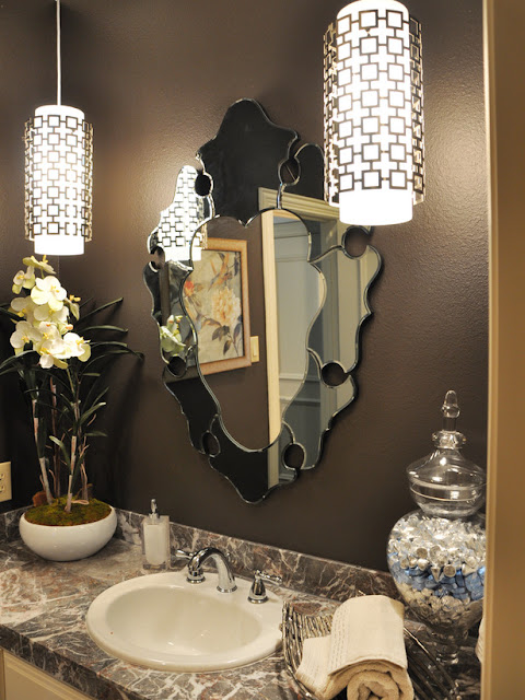


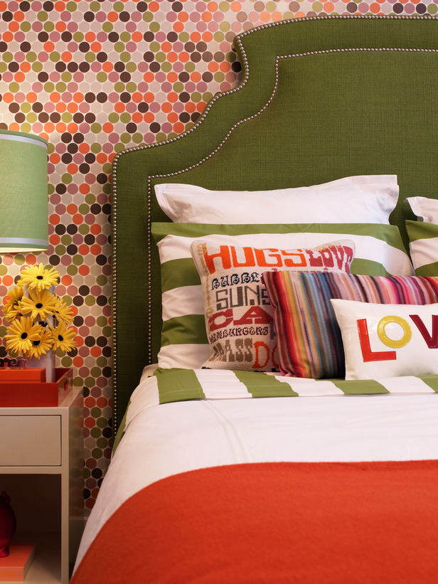
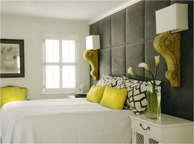
The bedroom above is given extra life and zip through the mix of geometric patterns. Hexagons, vertical and horizontal stripes – even the rectangular and square pillows add to the geometric recipe. The small hexagons on the wall give this room extra energy. A bit busy for me (and I’m sure I would have trouble sleeping here), but I love how the designer, Deborah Wecselman, used the patterns to give an energetic, youthful and updated look to this room.

Sarah Richardson, one of my favorite designers, used zigzags, chain stitches and polka dots with great effect in this bedroom. The combination updates and energizes the room – but in such a subtle way that the bedroom is still a very restful and inviting space.

Elaine Williamson via
Adding just one geometric pattern can be the finishing touch to a great room. The Jonathan Adler sconces update this room in such a stylish way. A more timid designer might have just used more traditional sconces on either side of the mirror. These sconces give the room a unique twist. The room would have been fairly commonplace and very predictable otherwise.

Elaine Williamson via
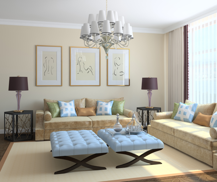
In the above room, we see a successful mix of geometrics that updates and makes the room far more interesting. The diamond-shaped wallcovering helps to widen the room and give it more presence. The pattern on the pillow gives a modern touch and the upholstery tack pattern on the ottoman gives the piece more interest. Not clearly visible but adding to the mix is the zebra pattern on the rug. Adding some soft curves in the room keeps the space from being too rigid looking.

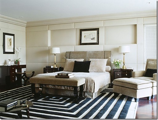
Designer Alberto Pinto knows a thing or two about adding geometrics to interiors. Look at this room. It’s all based on geometry. The carpeting to the right is all squares, rectangles and triangles; the carpeting to the right adds circles and rectangles. The fireplace mantle is a stroke of genius – radiating rectangles from a circular and convex mirror. If he had placed a more common mantle here – the room would have suffered a bit. Add to this the striped pattern on the walls and the shelving and the placement of the artwork – it’s all a fantastic study in geometric perfection.
Here’s Alberto again with another study in geometric deliciousness. The rug, the wall treatment, the inset in the wall treatment, the artwork, the furniture, the headboard, the books on the bench – everything is geometric. If you’ll take a really good look at this photo, you will notice that the main wall has only one window. His deft use of pattern tricks you into not noticing the deficiencies in this room. Truly brilliant! How he uses pattern creates a modern and fresh look in this room but it’s also restful and simple. I encourage everyone to look at his website and study the way he employs pattern – it’s truly a lesson in interior design.

Jonathan Adler via
Jonathan Adler mixes geometric patterns like a maestro also. The dining room he created for maternity fashion designer, Liz Lange in her Westchester NY home, combines zigzags, rectangles, diamonds and circles. The look is very youthful and fresh – befitting someone who designs beautiful maternity clothes.
Some Simple Ways to Start Bringing More Geometrics into Your Home
1) Add stripes not only in your draperies, but also consider using a horizontal striped border in a bath. Use plain tiles in unique ways – mix up the way you lay them. Place some diagonally.

Image via
2) Add a splash of geometry with pillows and tufted x benches. Hang prints in 3s over a sofa.
3) Consider adding panels to your walls. The bedroom below would be so bland if not for the panelled wall making a wonderful statement. If your room lasks achitectural interest – add it yourself.

Image via
4) In a traditional room, you can punch up its pedigree by adding panels, wainscoting and Palladian windows. Adding these geometric features helps to tame a huge room – making it more livable and warm. Place a beautiful trellis patterned rug on the floor for added interest.
5) I used a vertical stried pattern in the room below to help heighten the space…plus give it great texture and interest.

So whether you need to energize or update a space, improve or add architectural interest, using geometric patterns can help you do the job. There are so many fabric patterns in the market that will add some pizzaz to your home – so take advantage of them. Don’t forget your walls and floors – adding geometric patterns to them will improve your rooms immensely.
If you need some assistance in updating your rooms, give me a call at 631 793-1315. I’d be glad to help. Sometimes just a small change can effect an immeasurable difference in a room!
Thanks for stopping by The Colorful Bee! Stay in touch and never miss a post.
*Subscribe to receive an e-mail when a new post is up, HERE.
*Subscribe to receive an e-mail when a new post is up, HERE.
3 Comments
Posted in Uncategorized
Using Art as a Starting Point for Choosing a Color Palette for Your Rooms
I love to use artwork to inform a color scheme in rooms that I am working on. Artists use and combine colors in such unique and beautiful ways…so it’s virtually foolproof letting a great piece of art be your guide to a beautiful color plan.
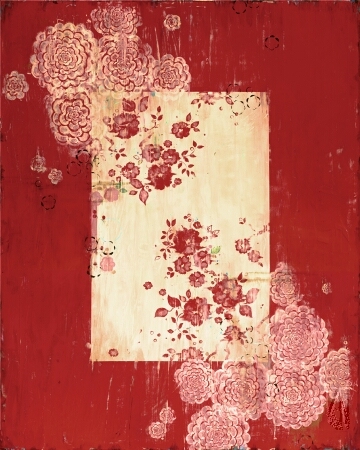


Artist, Kathe Frage Via
This beautiful piece, available on canvas or paper, is very modestly priced and it can be the inspiration for a sweet room. You could frame it in a faded gold – or a cream frame. I then might do a wainscoting and trim in Benjamin Moore’s White Opulence (Classic Colors, 879) because it’s a warm white that has a little touch of pink in it. Then for the wall color above it, I would think about Benjamin Moore’s Love and Happiness (1191). For a little extra texture, I might do a vertical stried finish on the wall with a creamy pink glaze. For the ceiling – I’d mix the two colors together to get a barely there pale pink – just for a blush color overhead.
 |
| Benjamin Moore’s Love and Happiness (1191) |
For a little girl’s bedroom, I’d add a colorful floral, like Quadrille’s Henriot Floral as an upholstered headboard. I’m partial to the name “Henriot” because it’s the name most closely associated with Quimper pottery (which is such a favorite of mine).
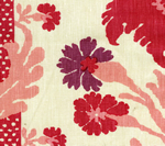 |
| Quadrille’s Henriot Floral in Pinks on Ecru |
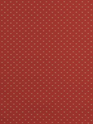
I’d add a cream or ecru duvet cover (that would match the background of the headboard). I add a red and cream polka dot for the dust ruffle and for a pillow or two. Duralee offers this fabric – but I’m sure that this would be fairly easy to source less expensively.
 |
| Red and cream polka dots for the dust ruffle and a pillow or two. |
Some extra pillows for the bed could be…
 |
| Robert Allen’s Flower Prints in Poppy |
 |
| A pink velevet – Kravet’s Versailles |
 |
| Robert Allen’s Zinging Along in Poppy |
I might do the Versailles pink velvet, edged with the Quadrille Henriot fabric as a throw at the bottom of the bed.
Window treatments: I could also see the red polka dot fabric as a Roman shade – with the Quadrille Henriot fabric as the draperies.
Carpet: I would love to see something that’s easy care – maybe a slight shag in a pink or slightly darker to help ground it.
Additional art could be something like these decals from Surface Inspired on Etsy. You can order them in just about any color.

Just Another Idea for a Little Girl’s Room: I would do a vertical stripe with the Love and Happiness color and White Opulence by Benjamin Moore. We did a pink and cream stripe in a little girl’s room that came out so beautiful. My client and I (and her mom) went to the Kips Bay Showhouse in New York City several years ago – and my client went nuts over this room designed by Bograd Kids. She wanted something similar for her little girl in their new home that they were renovating.
 |
| Inspiration Room |
She so loved the Showhouse space that as soon as the room was ready, we were in there painting…stripes! A lot of them – it was a very big room!


We also revamped all of the furniture in the room (that was in the family for over 60 years) by painting it a soft cream and antiquing it.
If you would love to have a Showhouse-inspired room in your home, give me a call at 631 793-1315
Thanks for stopping by The Colorful Bee! Stay in touch and never miss a post.
*Subscribe to receive an e-mail when a new post is up, HERE.
*Subscribe to receive an e-mail when a new post is up, HERE.
5 Comments
Posted in Color Roundup, Decorative Finishes, Home Staging, interior design, Makeovers, Paint
Color Roundup: More Eye Candy in the Gray Color Palette
I just wanted to show some other beautiful rooms that feature the color gray – which I am learning to love a lot. One of my “must do’s” for 2012 is to do a beautiful room with gray as the star. I am such a color lover, but the color gray will help pop other colors in the room.


How lovely is this? It makes me want to get rid of my windows where my bed is – so I could do a padded gray wall like this! If you have never seen the work of Caldwell and Flake, as above, take a look at their portfolio on their website. Their designs are so simple…but simply beautiful. I love how an unlikely combination of gray and yellow work so beautifully!

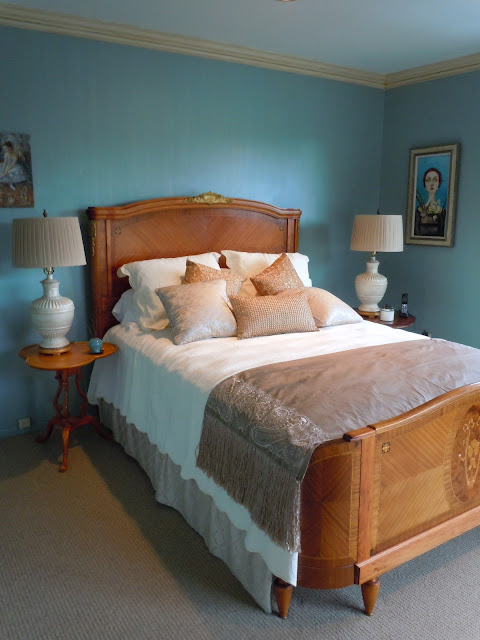
Another restful gray bedroom. The wall color is Coastal Fog from Benjamin Moore (BM 976) It’s a warm gray that I would definitely specify for a client who may be afraid of using gray. I love how the gold starburst mirror really pops on this wall.
Two years ago, I used Muskoka Trail (BM 974), which is lighter than Coastal Fog (it’s the first color on the strip in their Classic Colors collection). But we did the color in a Metallic Plaster, which has a beautiful luminescence to it. The client had several Steven Meyer prints which she loved. If you have never seen his work, he is a radiography artist and his floral X-ray prints are really beautiful. Using BM 947 in the metallic plaster plus these prints on her walls created a soothing monochromatic entry in her home.


I just really may be talking myself into doing a gray infused bedroom – with all of these images! But how soothing is the above bedroom? The paisley wallpaper pattern is from Cole and Sons and it’s called Rajapur.

Another Caldwell and Flake designed room, this kitchen is so sophisticated and unique. It may be too cold for some people but I feel it would be something that some of my NYC clients would love to have in their apartments. The quilted stainless steel backsplash creates some pattern and texture and breaks the monotony of the cabinetry.

How would like this for a hallway or pass through in your home. The colors chosen reflect the tones of the adjacent rooms in the Stately Homes by-the-Sea Showhouse rooms designed by Merilyn Marshall Cullen of MMC Designs. Merilyn created the wallpaper to reflect the flora and fauna of the area during 1905 time period when the home was built. I love the gray-silver ceiling and how that blue chair just pops against the gray.
That’s it for today. More to come on the color gray…so stay with me. Let me know how you have used the color gray. I would love to know.
If you would love to have a room like one of the images shown today, give me a call at 631 793-1315. I would love to help you create some beauty in your home.
Thanks for stopping by The Colorful Bee! Stay in touch and never miss a post.
*Subscribe to receive an e-mail when a new post is up, HERE.
*Subscribe to receive an e-mail when a new post is up, HERE.
3 Comments
Posted in Benjamin Moore, Color Roundup
Color Roundup: Gray – There’s More Than 50 Shades of It!
Gray, gray everywhere! So what’s a color girl like me gonna say about “Gray?” I happen to love the color when it comes to clothing. With my blonde hair, the color gray blends beautifully – so I’ve been wearing the color for quite a while. But there’s not one wall in my house that is gray. I obviously haven’t fallen victim (on the home front, anyway) to this “it” color. I don’t have furniture or accessories that are that color. Oh – I have two pillows that are gray with a yellow, cream and tan floral pattern…and some stainless steel in my kitchen – but that’s it. Everybody’s using it, so maybe I should really look into this! It’s really not a new trend – it’s been building over the last few years.If any of you are also in the non-gray user category, I will be sharing some insights about the color and how to use it in a number of posts this month. The color has been gaining momentum for awhile and, it seems, that I see it everywhere now – in fashion, fabrics, paint colors, tile, home accessories and more.Color trends usually start in fashion and then migrate to the home decor arena. Whether it was silver, pewter, a warm or cool gray…slate or sweatshirt gray, last year’s Fashion Week showed me that the color had really arrived.


Ralph Lauren
Ralph Lauren

Michael Kors

Narciso Rodriquez

Narciso Rodriquez

Marc Jacobs
In the home color category, gray has been on the radar for quite some time. So this “trend” isn’t actually new. Starting quietly at first, gray has been increasingly on the uptake in the design world.

Via Cote de Texas
Sally Wheat’s kitchen above caused a stir several years ago when pictures of her kitchen, painted in Benjamin Moore’s Fieldstone Gray, was shown on the blog Cote de Texas. At this time, Belgian design was really entering the US psyche and this color was very emblematic of Belgian style.
Martha Stewart also went “gray” early in her kitchen when she painted her island Bedford Gray from her own paint collection.

Thom Filicia and other designers have been on the gray train for quite some time as well. Below, this sitting room that he designed in 2009 for Designer Visions: Cinema Style featured dark and light gray walls (Palais Royal with Pale Grey by Ralph Lauren on the battens).

A successful use of gray needs some extra pops of color. Red, blue, orange, aqua will help infuse life in a room that is predominantly gray. I love how Mr. Filicia used the horizontal stripes above as well. The lighter stripe keeps the room from being too dark and it also gives the space a restful feel.

Gray is such a great choice of color when you’re mixing Cararra marble, mirror, brushed nickle hardware and stainless steel, as above. It’s a simple way of ensuring a sophisticated aura in just about any room.

In the above room, I used a deep taupe basepaint and then I stried pearl and a little bit of gold metallic glaze to create an elegant backdrop for the mirrored funriture, silvered furnishing and silvered gray metallic window treatments. I did this room back in 2007 – and I think it looks like it was done yesterday.
Gray popped up in many of the Design Showhouses this past season. I took part in one over the summer…and what do you know – a gray kitchen! At the San Francisco Designer Showhouse last year, gray seemed to be everywhere.

Guest Bedroom by Green Couch

Master Bath by Val Fiscalini

Silver handpainting over gray Venetian Plaster Via

Stencilled leaves over gray Venetian Plaster to blend with the gray limestone tile by Artistic Tile (below) in the penthouse bath by Mark Newman

I will be continuing this look into the color gray in more posts this month. I even have an interview with color specialist and interior designer, Michelle Winick, who recently created a designer color palette for Muralo Paints. Hope you will stay tuned.
Let me know if you have used gray for your interiors. Would love to hear all of your thoughts – successes as well as failures. If you are having trouble with color in your home, just give me a call at 631 793-1315.
Thanks for stopping by The Colorful Bee! Stay in touch and never miss a post.
*Subscribe to receive an e-mail when a new post is up, HERE.
*Subscribe to receive an e-mail when a new post is up, HERE.
4 Comments
Posted in Color Roundup
Using Books in Interior Design
The great decorator, Billy Baldwin, called books the greatest accessories. Books are one of my favorite ways to bring color, texture, height and interest into a room. Not just for lining library walls anymore, you can use books to add height and color to a tabletop display, place books in tea carts, on a server in a dining room – and much more.
If you are anything like me, you have more books than you have storage space. So, by default, I had to devise ways to 1) organize my books, so that I could find them and 2) use my books in other ways rather than just on bookshelves.
One of the first things that I had to do was to whittle down the number of books that I had. When I got married, I also married into my husband’s books. And when my father-in-law passed away – we inherited his vast book collection! That was more than my little house could take! Several garage sales later – and then I had a somewhat manageable number.

A Christmas vignette on my piano. Books add height, texture & interest

I didn’t style the above picture yet in my great room, but I wanted to show how some of your larger books can be used decoratively on a table top. They add height and color. Plus people looking at this may think I am smarter than I am with that huge tome of Shakespeare!
Even in small spots around the house, a grouping of books adds a lively note. On top of a chair next to your bed, stacked next to a reading chair or in piles on a large coffee table, books provide warmth and informality to a space.


Think of books as accessories and even art! I advise that you should take off the book jacket because most of the time it’s a lot nicer underneath! Group the colors of books together – and make sure they coordinate with your other accessories and room colors. Also, combine books by category – gardening, design, travel etc to bolster a theme in a room. Use books to heighten other accessories and objects – you want to stagger the heights in a display for greater interest.
Margot Austin, the senior design editor of Style at Home – the Canadian magazine, uses the following books as her “go to” accessories.
1. I Married Adventure: The Lives of Martin and Osa Johnson
2. David Hicks On Living – with Taste
3. Slim Aarons, Once Upon a Time
4. Century
5. The Way We Live
6. The Garden Book
7. Axel Vervoordt Timeless Interiors
8. Tom Ford
9. The Hamptons
10. Chanel
I would add some of the larger books (like my Shakespeare in the first photo) plus…Domus, Wall Painting in the Roman House, anything by designer Tricia Guild (her books you can keep the jackets on – they are gorgeous) and two great books for the kitchen – Bouchon and the French Laundry Cookbook by Thomas Keller. I’d also add any fun and colorful Cupcake Cookbook – it will brighten up any countertop!
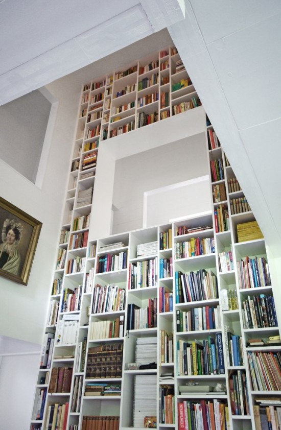
Books can also fill huge, otherwise empty and bland spaces. The hallway, above, would have
looked far too intimidating and vertical without the lively addition of the books.

Instead of filling an entire library, install bookshelves on one focal point wall.

In a family room, books share space with the TV, accessories and family photos

Or…use books to create furniture
Books can also be the subject of an artwork, as in British artist Su Blackwell’s work…

So get your books out of storage or off the shelves and use them in interesting ways in your home. Let me know how you have used books in your designs.
Sources: 1 and 2) Linda Leyble; 3) Margo Austin 4) bhg.com 5) Absolutely Beautiful Things 6) Contemporist 7 and 8) LM Interior Design 9) Stylist, Grace Light of Poetic Home and 10) Su Blackwell
Thanks for stopping by The Colorful Bee! Stay in touch and never miss a post.
*Subscribe to receive an e-mail when a new post is up, HERE.
*Subscribe to receive an e-mail when a new post is up, HERE.
8 Comments
Posted in Uncategorized


 Decorative Finishes
 Interior Design
 Home
Home Garden
 Holiday
 Makeovers
 My Life
 Business
 Tutorials
 Videos
 Paint
Paint