
-

-
Subscribe
Thanks for stopping by The Colorful Bee! Stay in touch and never miss a post. Subscribe to receive an e-mail when a new post is up, HERE.Sponsor
If you're interesting in advertising on The Colorful Bee, click here to learn more.Contact
You can also email me at Linda.Leyble@gmail.com -


Categories
Subscribe
Popular posts
-
Recent Posts
Blogroll
Links

Author Archives: Linda
The E-Book on “Design Your Home With Color”
-
An E-Book to Give You Some Color Inspiration
To Learn Some of My Instant Color Updates, Get Your Free EBOOK...Click Here
Thanks for stopping by The Colorful Bee! Stay in touch and never miss a post.
*Subscribe to receive an e-mail when a new post is up, HERE.
*Subscribe to receive an e-mail when a new post is up, HERE.
2 Comments
Posted in Color Roundup, interior design, Paint
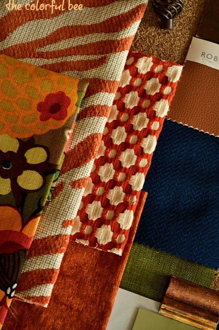
Painting and Decorating Architectural Fragments
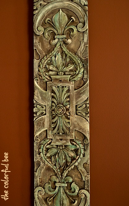
Creating something from nothing
I was coming back from a decorative painting job out in the Hamptons and I came across this wonderful old antique shop named Lloyds in Eastport, New York. I had passed this store many times before and finally – I had a little bit of time to go in and take a look. The store is a lot larger than it appears from the outside – and there are two large floors full of antiques. Just what I needed – a ton of stuff to choose from! Anyway, I fell in love with a couple of things that I just had to pick them up (I only had about 20 minutes to peruse because I had another appointment to go to). (more…)
Thanks for stopping by The Colorful Bee! Stay in touch and never miss a post.
*Subscribe to receive an e-mail when a new post is up, HERE.
*Subscribe to receive an e-mail when a new post is up, HERE.
Help! I’m Having a Problem Picking Paint Colors
NEW FREE E-BOOK ON “DESIGN YOUR HOME WITH COLOR.” Click Here
What’s Involved in a Paint Color Consultation?
I have received a few questions about how I go about doing a color consultation for my clients. Instead of answering separately, I thought it best to do a blogpost about it…so here goes!

Q: I am having trouble picking some colors for the first floor of my home. Can you tell me how I should prepare for a color consult with you and what should I expect – what’s your process?
Hi – this is a great question. I do things a little differently than some color consultants, so I am glad to tell you a little about my process.
First we’ll start with how you can prepare for it. I will have a phone conversation with you before I come over. I want to know which rooms you are having the most trouble with and I ask you why you think you are finding them difficult. I then ask questions like these… (more…)
Thanks for stopping by The Colorful Bee! Stay in touch and never miss a post.
*Subscribe to receive an e-mail when a new post is up, HERE.
*Subscribe to receive an e-mail when a new post is up, HERE.
2 Comments
Posted in Benjamin Moore, Business, Color Roundup, Decorative Finishes, interior design, Paint
A Winter Mantel and an Online Class in Photography
Books…Candles…Pinecones…Action!
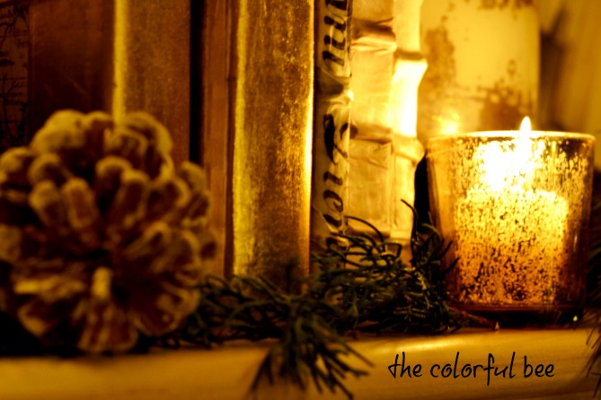
I was so late in taking down my Christmas decorations…and I finally decided that today I was going to de-Christmas my mantel as well. I’m still loving the wintery look, so I used some greenery, pinecones, candles and mercury votive holders but I added some books to the mix this time. Winter is a time when I read a lot more than I do the rest of the year, so the decoration fits my personality in the great room. (more…)
Thanks for stopping by The Colorful Bee! Stay in touch and never miss a post.
*Subscribe to receive an e-mail when a new post is up, HERE.
*Subscribe to receive an e-mail when a new post is up, HERE.
6 Comments
Posted in Holiday Decorating, interior design, Makeovers, Tutorials
Putting Christmas Away
Packing Up My Favorite Christmas Decorations
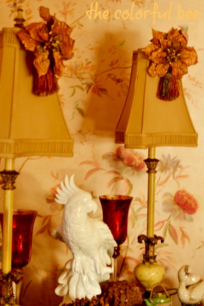
Even the lamps got into the Christmas spirit!
I know I’m a bit late in doing this, but I am only getting to put away my Christmas decorations. I put them up so late – Christmas Eve (trees and everything…and even some decorating Christmas morning before my family came over for dinner that afternoon) – so I just had to leave them up a little longer. It’s a sad time for me because I love these silly little trinkets (oh grow up, Linda)…but it’s true.
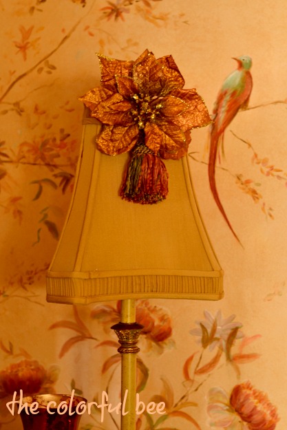
So, as I am getting ready to pack everything away, I thought I’d take some shots of my favorite things before I say goodbye to them until next year. This will also be a reminder for my husband who stows the boxes in our attic and swears that he has taken down every one each Christmas – yet I know which ornaments are still missing!

But with everything put away, I’ll have a clean slate to begin some new projects in our house. I have a lot of ideas running around in my head – but with all the Christmas stuff still up it’s hard to plan! So goodbye Hula Christmas monkey…

See you next year old horse…you’re off til next year…

Well Rocky Raccoon is going back in his room…maybe he’ll find Gideon’s Bible!

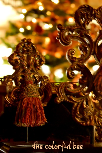
Packing up the florals, ribbons and faux poinsettias…
Goodbye Christmas…til next year!
Thanks for stopping by The Colorful Bee! Stay in touch and never miss a post.
*Subscribe to receive an e-mail when a new post is up, HERE.
*Subscribe to receive an e-mail when a new post is up, HERE.
4 Comments
Posted in Holiday Decorating, interior design, My Life
Color Roundup: Using Radiant Orchid in Interior Design
My Take on Radiant Orchid
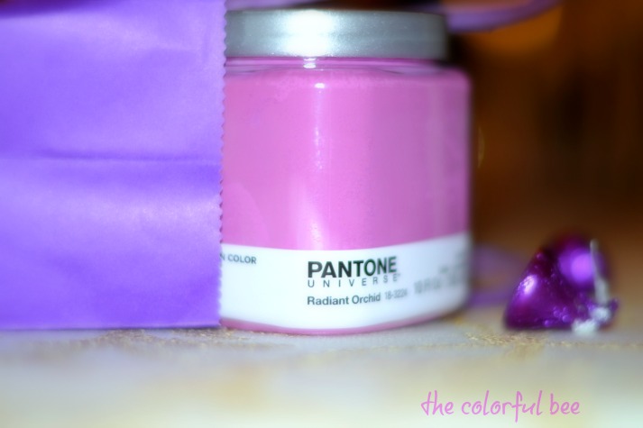
I have always been a fan of this color – whether a more or less intense or more red or violet versions. Color experts say it’s an artistic color (I would agree!) and that it symbolizes innovation, creativity and originality. Yup – in total agreement. This girl loved it so much that she dyed her communion dress orchid! A few days after the ceremony, I had my mother buy some Rit Dye to make a beautiful princess dress in that color. I was in color heaven!
What I don’t agree on is some of the statements I see in many articles on how to use it. I read today a comment from an expert who said to just use it in small doses – like adding toss pillows in the color. That’s fine if you have a mostly neutral room with a white or off white sofa or perhaps taupe walls with a chocolate sofa…but there are many instances that this toss pillow idea just won’t work! The colors in your room have to blend, at least, with this very brilliant hue.
Here are some great ways to use this color in interior design…
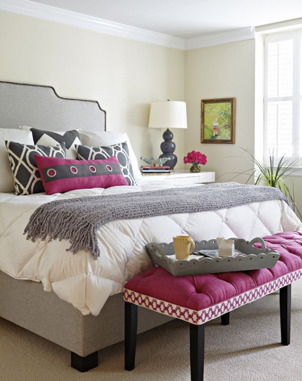
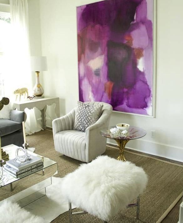
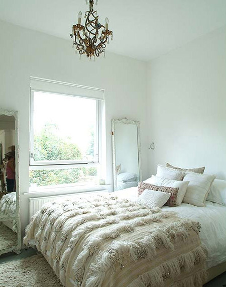
It works in small doses – with grays and other neutrals. Above, Holly Kidwell used it to punch up the color in this lovely bedroom.
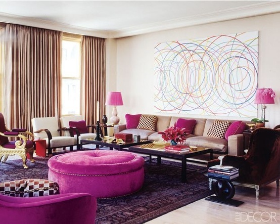
Designer Jamie Drake used varying shades and tints of the color in this vibrant living room. Notice how he used the color to have your eye flow from one spot to another in the room.
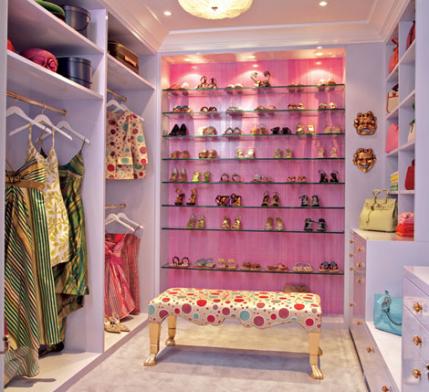
It works as an accent color. Here’s Jamie Drake again using it in a closet – a very elegant closet.
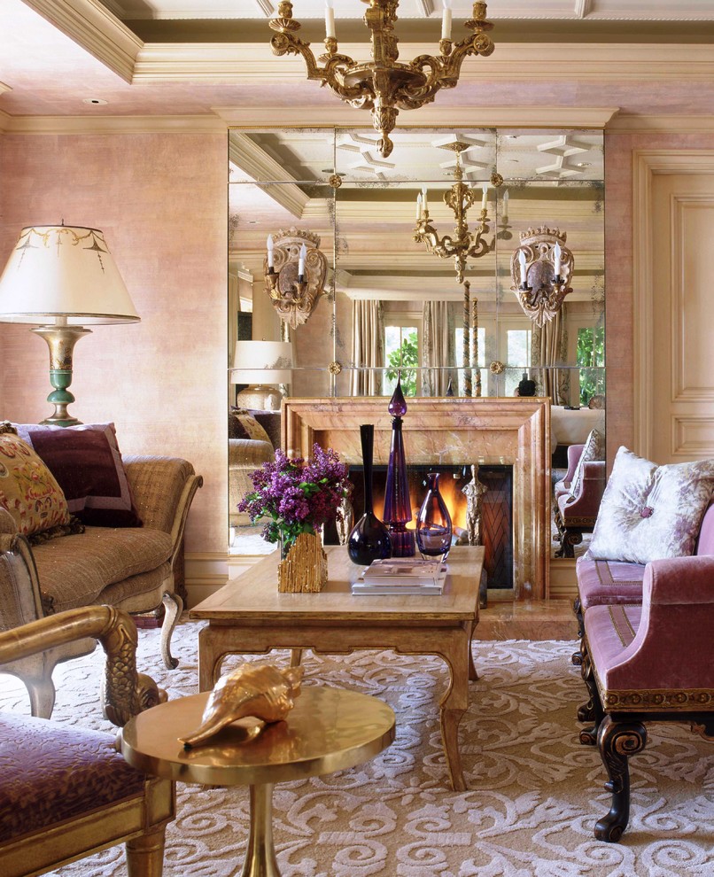
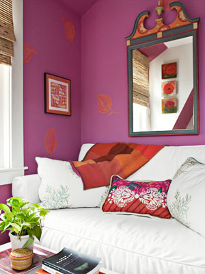
Designer Wendi Young used a slightly more violet version of the color in this lovely living room. I love the walls – a dusty pink faux finish. The mix of golds and creams and the punch of deep purple in the accessories works beautifully.
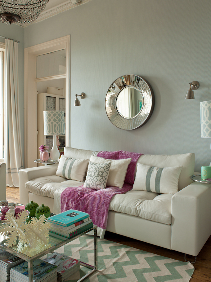
Anna Antunes shows us how just a few touches of radiant orchid can take a neutral room from nice to beautiful.
You’d like to be more bold with the color but you don’t want the commitment on your walls? Look for a beautiful piece of art that contains the color of the year!
If you want to be more daring, think about using it as a wall color. Here designer and color expert, Lisa Teague, uses it in her home office. A creative person can really benefit from a big dose of this inspiring color. On your bedroom walls – maybe not. You might have trouble sleeping. But in a space you use to dream up ideas and designs – for sure! I love the hue with those bright touches of orange – so vibrant.

Designer, Lisa Teague
You see, no shy violet here. Lisa practices what she preaches – in a sweater that’s a more violet version of Radiant Orchid!
I still wear the color (mostly since I became a blonde – it seems to go with my hair color and complexion). Since I have a fair complexion and my hair is blonde – so hardly any contrast going on – a soft version of the color suits me the best.
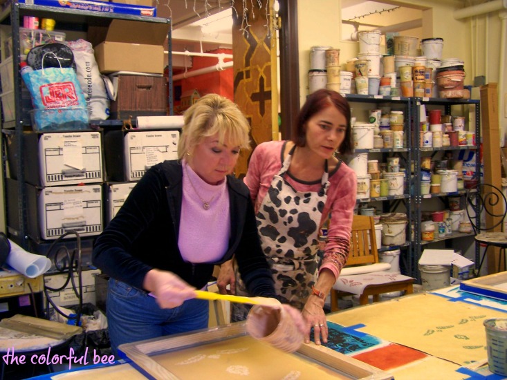
Me, learning silk screening from Lucretia Moroni of Fatto a Mano in NYC
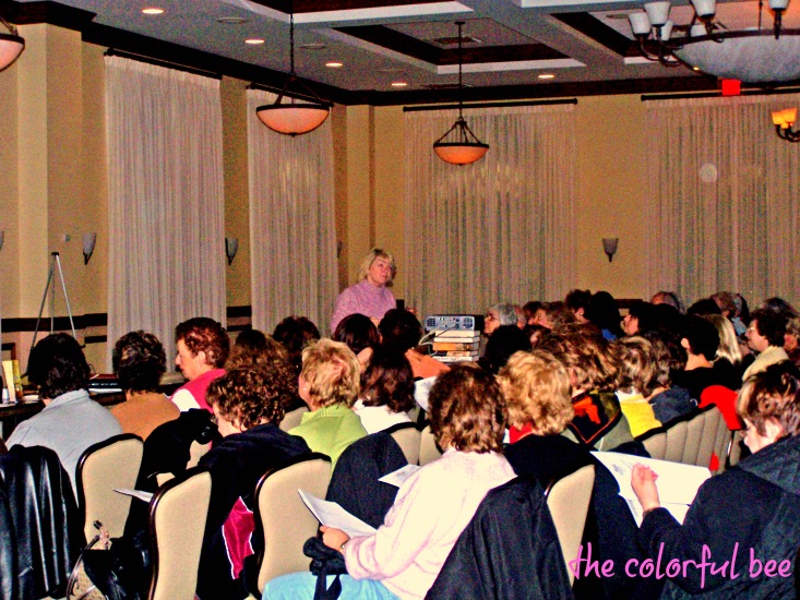
Wearing the same sweater, here I am teaching a class on Color and Design
Here I am wearing a light tint of the color. I wore this sweater a lot – until my husband put it in the dryer and shrunk it! It has been nearly impossible to find this color anywhere in the stores. Now – I guess it will become easier. What I love about it is that it is a warmer color – not cool as in a totally lilac hue. Once I wore the sweater to a cocktail reception in Floral Park NY for Melanie Royals of Royal Design Studio. She came up to me and told me it was the perfect color for my complexion. Thanks Melanie…I agree!
Thanks for stopping by The Colorful Bee! Stay in touch and never miss a post.
*Subscribe to receive an e-mail when a new post is up, HERE.
*Subscribe to receive an e-mail when a new post is up, HERE.
Leave a comment
Posted in Color Roundup, interior design, Paint
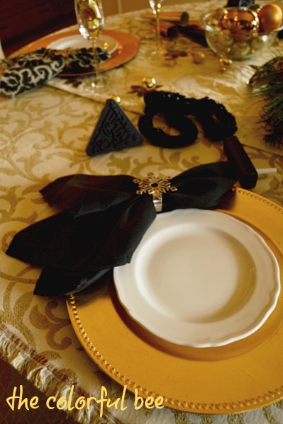
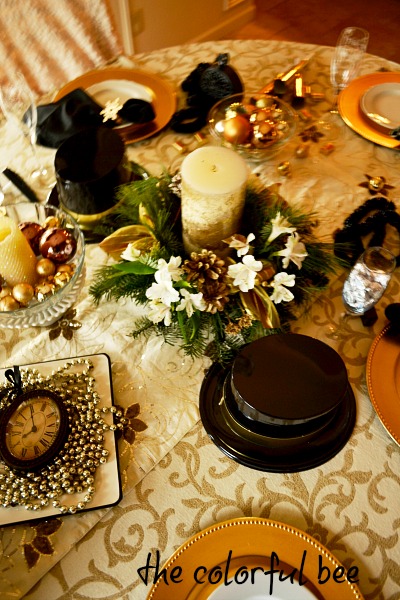
Happy New Year’s to All and a Little Table Decoration!
Happy New Year’s to All My Readers and Friends

I hope you are all planning a wonderful celebration. I am having a little pre-dinner celebration and then my husband and I are meeting my brother and sister-in-law (a yearly tradition) and having a wonderful Italian dinner – and we’ll be ringing in the New Year at the restaurant. I am looking forward to it!
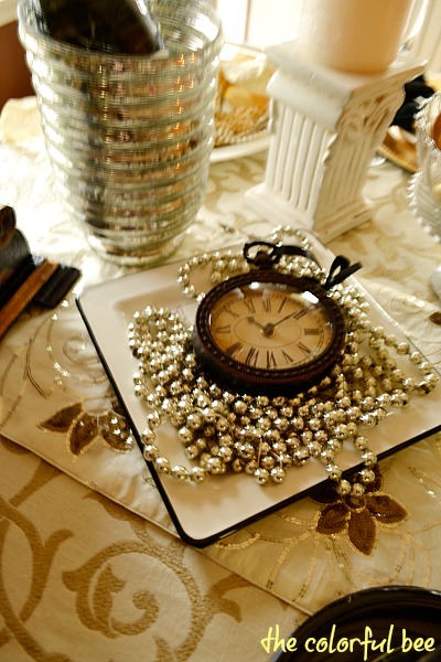
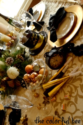 On the table I put about 4 or 5 clocks. A great idea is to set them at different times (New York, San Francisco, Paris etc) and then you’ll have an excuse to have a drink or a kiss whenever it’s midnight somewhere!!
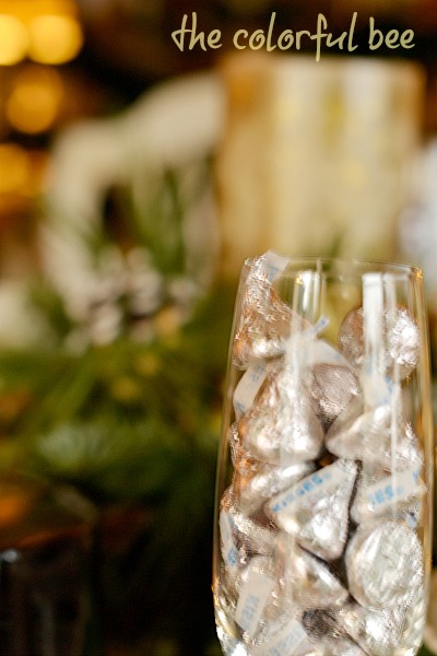
Pre-celebration we will be having a little bubbly and some snacks because our dinner reservation is not until 9PM. If it’s not too late, we may go to my nephew’s house after midnight because that’s his birthday – January 1.
For New Year’s morning, the table will already be set for a wonderful breakfast…we’ll just add some orange juice to the champagne for a Mimosa.
So for tonight – don’t deny yourself some chocolate and bubbly. You’ll start a new leaf tomorrow!
Are you making any resolutions? I have a few – but if I can stick to just one or two (losing weight…is the biggest one), I will be happy.
So, please be safe and have a wonderful and healthy New Year. Let me know about your resolutions and how you celebrated in the comments below. Thank you for coming by!

Happy 2014! I still can’t believe that that’s the year it is now. Unbelievable…where does the time go?
Linking with…A Stroll Thru Life, Between Naps on the Porch
Thanks for stopping by The Colorful Bee! Stay in touch and never miss a post.
*Subscribe to receive an e-mail when a new post is up, HERE.
*Subscribe to receive an e-mail when a new post is up, HERE.
10 Comments
Posted in Holiday Decorating, interior design, My Life
Why a New Ring Setting is Like Interior Design
A New Engagement Ring Setting is Like Interior Decorating? Yes!
A week before Christmas, I received an early present from my husband – a new setting for my engagement ring. I wanted this for such a long time but I always felt that it might be too expensive and that I should be happy with the actual ring that my husband gave me. It’s the memory thing, you know. I wanted to preserve the beautiful memory of my engagement and my wedding day.
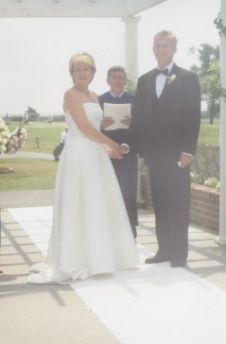
My husband Richard and I on our wedding day
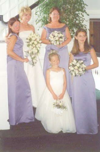
From left to right, my daughter Jessica, me, daughter Krista, stepdaughter Megan and granddaughter, Meghan
That was a blessed time in my life and I will never forget how I felt and how I still feel.

Trying on my rings and the new setting before resizing
But the reality of my rings were…
- My fingers had gotten fatter and I was lucky to be able to wrestle my engagement ring off my finger – not so lucky with my wedding band. That had to be removed by my jeweler professionally. They had to resize it for me.
- I was in danger of losing my diamond because the prongs holding it were crooked. Might have been my years of troweling plaster and maybe that time when I had to run home to get something from my garage while on a job – and in closing the garage door, it slammed shut suddenly on my left hand, nearly breaking my fingers. I was really in pain after that and I was in the middle of a large Venetian Plaster job, so I had to keep going. Thank goodness it was my left hand that got hurt…and not my right (right-handed, you know!)
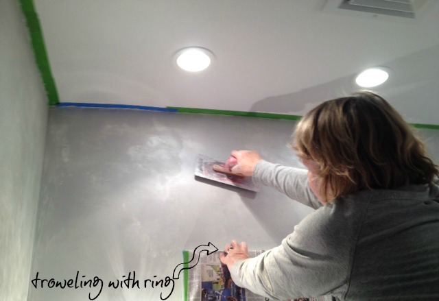
And speaking of troweling, you wouldn’t believe how many times I cleaned and soaked my rings. But that stuff got trapped in some of the teeniest crevices. So – because of daily use and the extra wear and tear that I put my rings through, they no longer looked good, at all.
How much did the new setting cost? $805. Not too bad. And now this really clear and nearly perfect ¾ carat diamond, sits higher up with the new setting (so it looks bigger and more important than it really is) and 6 new baguette diamonds flank it on either side – plus 2 baguettes from my original ring. The setting still resembled the original setting – but much better. My jeweler also informed us that two of the original baguettes were made of broken diamonds, which some in the industry use to repurpose their diamonds that have broken. The settings get sold as whole diamonds – but, in reality, they are not. So, when my husband bought the ring for me, he understood that the total carat count, with the baguettes, was a full carat. That was not true.
So, the reason why I bring this little story up is because I can relate it to how many people might feel about hiring an interior decorator or other design professional. Silly, you say? No, not at all. There are so many people who would like to redesign one or more of their rooms but maybe they lack the talent or energy to do it…and they think that hiring a professional would cost too much money (just like I thought about the cost of a new setting!) So – they do nothing. Even though they have outgrown the current design and it no longer suits their taste or the function of the room. Or maybe they tried to do a few things on their own – and they failed…so they stopped.
They didn’t realize that a designer would do a small project or be available on a consulting basis.
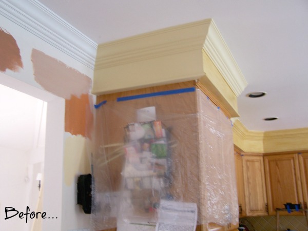
First we added crown molding and started to paint the soffits and crown
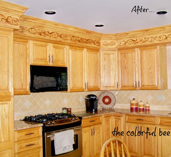
The finished project
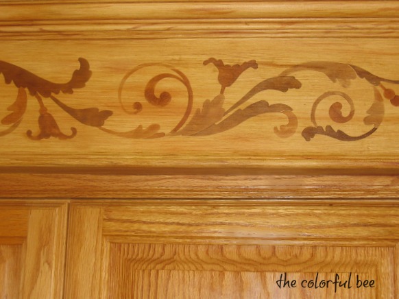
They would love to hire a designer but feel their budgets would be too small…that designers are just too expensive. They don’t realize that a designer’s creativity could save them a lot of money. The kitchen that I helped a client revamp, took 3 days to do. We added crown molding and then faux oak grained them and the soffits to match the cabinetry – plus we added a faux inlaid marquetry design that added a little punch to the kitchen. This was a much less expensive way to update a kitchen than to gut and buy new cabinetry…and less stressful as well.
Not realizing that a designer can take the best and most beautiful things you have (your diamonds) and allow them to shine in a new setting (pun intended!), people shortchange themselves by not using the trained eye of a professional. A designer will use things that you already have, repurpose them and create a new and improved look – without busting the budget. Just like my jeweler took my small but nearly perfect diamond and made it look more important and impressive – a talented designer can do that with your room.
After, a lonely corner becomes a focal point
Designers think about things that you overlook. Just living your life – kids, work, stress, every day chaos etc impedes your keeping your home picture perfect. Do you now have too many things in your rooms – too much furniture? (Did your room get fat…just like my fingers??) Has your furniture, pillows, wall colors dulled with age (too much plastering with your rings on??) Most times the fix is simpler than you think.
Making an entryway more grand
Helping clients make an impact in their homes
A designer can help you achieve a unique and collected over the years look. With resources not available to the general public and with specialized training, a designer can assess the real value of what you have (crushed diamonds passing as full ones), repurpose your best things in a unique way (creating a unique setting that’s you and not cookie cutter).
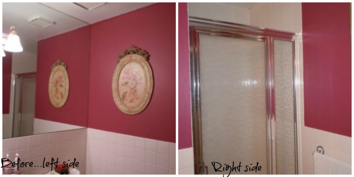
Before: A powder bath that my client was unhappy with
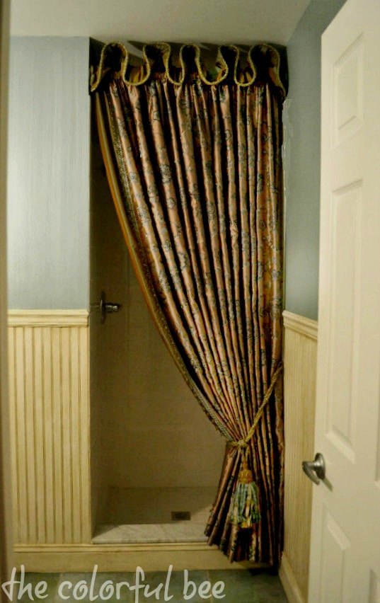
After: Since she never used the shower, we created a beautiful silk treatment to make this room more elegant
A designer can enhance the quality of your life in the space. Just like when I no longer received any joy from looking at my worn out engagement ring, the skill and knowledge a designer has can make living and entertaining in your room so much more pleasurable. In the above room, we added a beautiful teal and pearl stried wall finish and antiqued wainscoting and a silk treatment for the shower – to update and add elegance to this little powder room.
So, as I was admiring my new setting and feeling so good and proud of it, I saw that my husband was truly enjoying it also. Maybe it’s a little bit of “Happy wife, happy life,” but he feels that the ring just looks so beautiful now – in its new setting.
If you have been putting off doing something with your home, think about my little story. With the right person guiding you, your home can look and serve you better. It doesn’t cost as much as you think it does…and it’s an investment in your future happiness.
If you would like to feel happiness and joy when entering a room you no longer love – contact me.
Linking to: Between Naps on the Porch
Thanks for stopping by The Colorful Bee! Stay in touch and never miss a post.
*Subscribe to receive an e-mail when a new post is up, HERE.
*Subscribe to receive an e-mail when a new post is up, HERE.
6 Comments
Posted in Decorative Finishes, interior design, Makeovers, My Life
A Fun Quiz for Christmas
The other night I played a fun game with my family. The object of the game was to figure out the first lines of famous songs based on a set of initials. We had 13 people – so one was the judge (to determine how many answers were right and to count up who got the most answers correct) and the rest of us split up into 4 teams of 3. Team members should go to different parts of the house, so they can’t hear answers being talked about by other members.
I am pretty good at knowing the words of Christmas songs (and my team won the game!) but this was a tricky but fun game. Print out copies of the game that I came up with below – or create your own. The answers to the first lines are below the quiz. You can set different time limits for the quiz – but we did 15 minutes.

Have fun and Merry Christmas to all!
Answers… O come, all ye faithful joyful and triumphant; Deck the Halls with Boughs of Holly fa la la la la la la la la; It Came Upon a Midnight Clear that glorious song of old; We Three Kings of Orient are bearing gifts they travel afar; Silent night holy night all is calm all is bright; Away in a Manger no crib for a bed; Chestnuts roasting on an open fire, Jack Frost nipping at your nose; Frosty the Snowman was a jolly happy soul; I saw Mommy kissing Santa Claus underneath the mistletoe last night; Oh the weather outside is frightful but the fire is so delightful; Rudolph, the red-nosed reindeer had a very shiny nose; I’m dreaming of a White Christmas just like the ones I used to know; Sleigh bells ring, are you listening, in the lane snow is glistening; Good King Wenceslas looked out, on the feast of Stephen; Jingle bell, jingle bell, jingle bell rock; On the first day of Christmas, my true love gave to me, a partridge in a pear tree; You better watch out, you better not cry, you better not pout I’m telling you why; City sidewalks, busy sidewalks dressed in holiday style; Santa baby, slip a sable under the tree for me; It’s the most wonderful time of the year.
Thanks for stopping by The Colorful Bee! Stay in touch and never miss a post.
*Subscribe to receive an e-mail when a new post is up, HERE.
*Subscribe to receive an e-mail when a new post is up, HERE.
Leave a comment
Posted in Holiday Decorating, My Life
Color Roundup: The Secrets to a Beautiful White Room
You all know how much I love color…especially on walls. I don’t have any white walls in my home but that doesn’t mean I hate white – I just hate it when white walls fail…because then the room fails. The room fails because most people either put a cacophony of color in the room to make up for the lack of color on the walls…or they don’t use any color or textures or patterns to make the room live and breathe. Or…they don’t choose the right white for their room. White can be tricky. Click here to read my first post on choosing white.
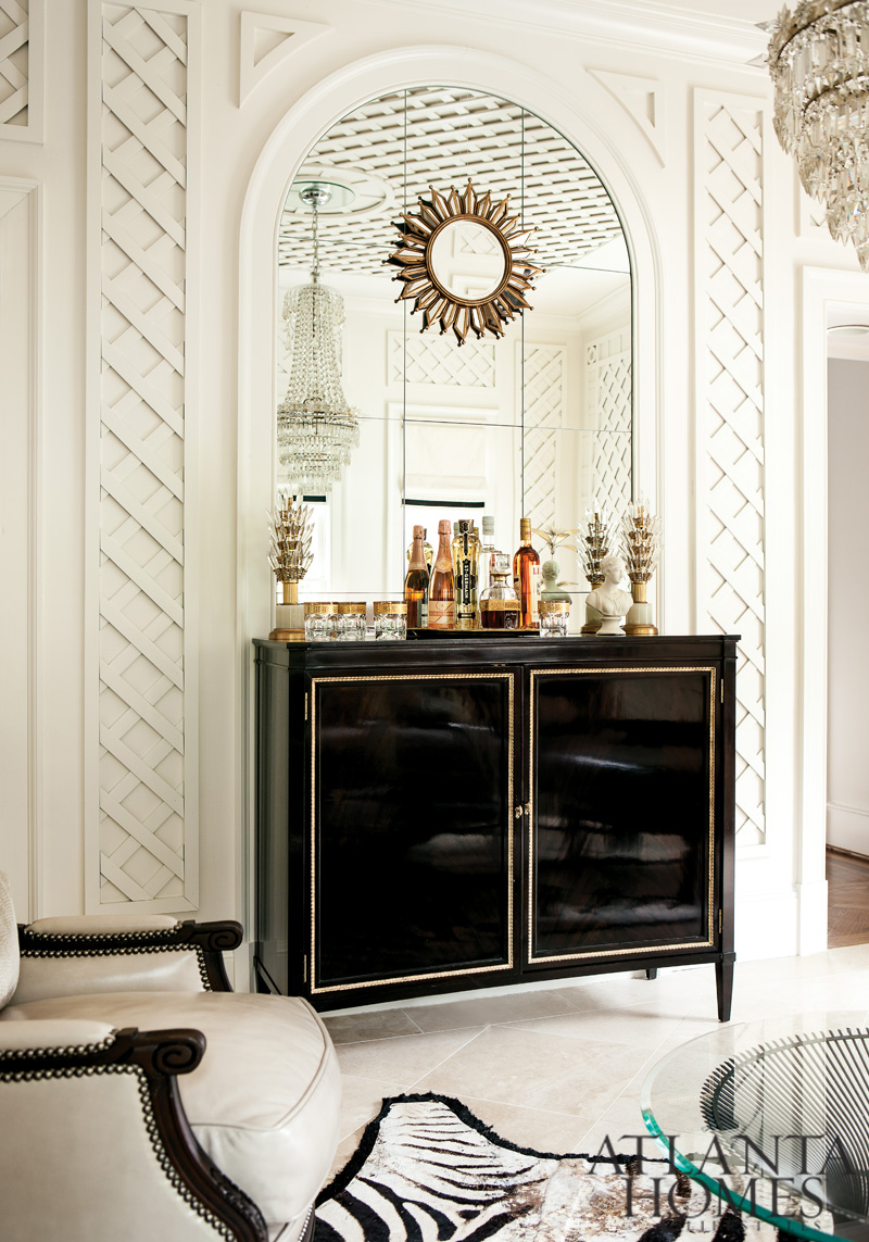
Everything in the above room, designed by Margaret Bosbyshell and Clary Bosbyshell Froeba, was done beautifully. Every element in the room conspires together to make white the star of the show. The textural, geometric trellised walls and ceiling, the unique architecture and moldings, the black bar and the other black accents, the white marble floors, the mirrors, the chandelier – all foster the color choice of this space.
A totally white room can be deathly sterile in the wrong hands. And there are a lot of “wrong hands” out there. So, if you really want white walls and nothing else will do…here is what you need to know about white and what you have to have to go with your white walls.
So – what’s the real problem with white? White is really a whole panoply of colors. Black is the absence of color and white reflects all colors. Depending on how white is used – how much or little light in a room…what type of sun exposure…and what is placed near the white wall (flooring, furniture etc), white can exhibit different effects. An oak floor near a sunny window will reflect a warm honey tone on the wall. A white wall in a northern exposure can look a bit purplish in the late afternoon. In addition, cool whites can have purple, gray, blue or green undertones. Warmer whites will have yellow, beige or peach undertones. I always recommend to my readers that they roll on their chosen paints on a large sample board – and tack them up vertically on the wall and see how they look in the morning, afternoon and nighttime.
Once you have chosen the right white for your room, don’t forget these other elements to make your room memorable instead of forgettable.
Add Texture
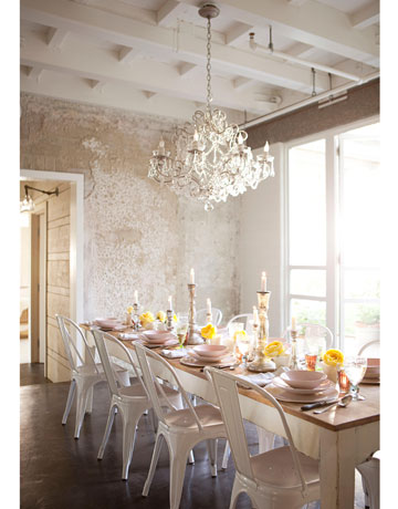
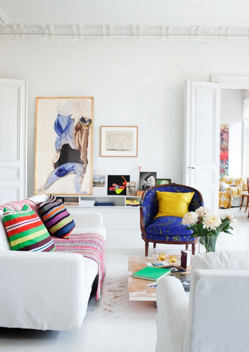
When you add textures, whether on the wall or in your accessories, your white room will start to come together. In the above room in photographer Amy Neunsinger’s home, workers were chipping away at old tiles and revealed an old concrete wall. It looked perfect – so it stayed. It made the room so much more interesting.
Don’t have a beautiful textured wall? Think about adding nubby, tactile throws, linens, wools, seagrass, antiqued furniture – these items will stand out and give depth to an all white room.
Add Color
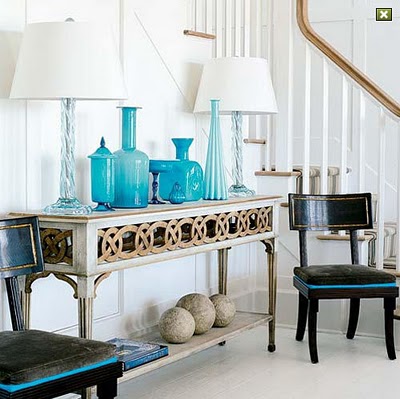
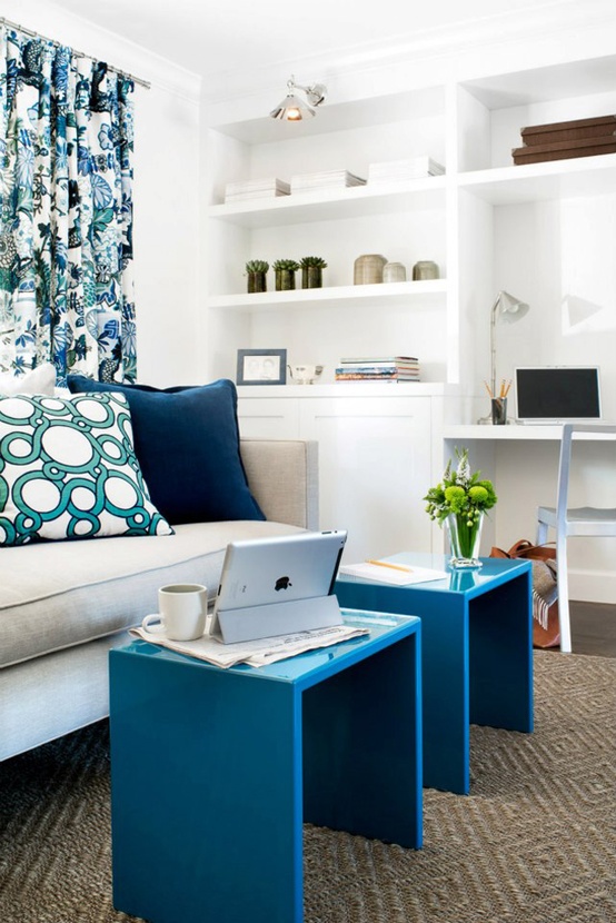
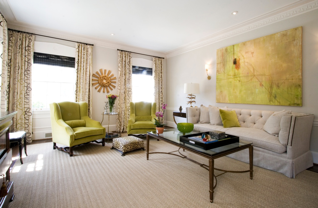
 Color in a white room can make people even forget or ignore that your walls are white! The designer, Tobi Fairley, uses color so well that she is known for her “colorful” rooms, even when the walls are white or neutral. That’s the mark of great design. The two spaces above show that the blues and greens in these rooms are the lead actors…and the walls play supporting roles. Use her rooms as inspiration for your own spaces.
Add Moldings and Millwork
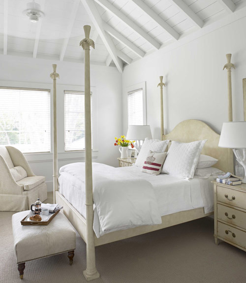
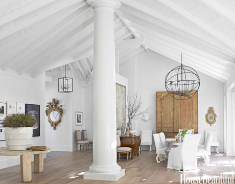
Beamed or coffered ceilings, built-ins, decorative crown and base moldings, columns, wainscoting, clapboard paneling, substantial mantels – these architectural features in a white room will really make the room spectacular. Above, designer Myra Hoefer, used Benjamin Moore’s Winter White on the beams, columns and moldings to give a sculptural effect to the rooms. Otherwise the architecture would have been too busy and it would have downplayed the serene quality of the rooms.
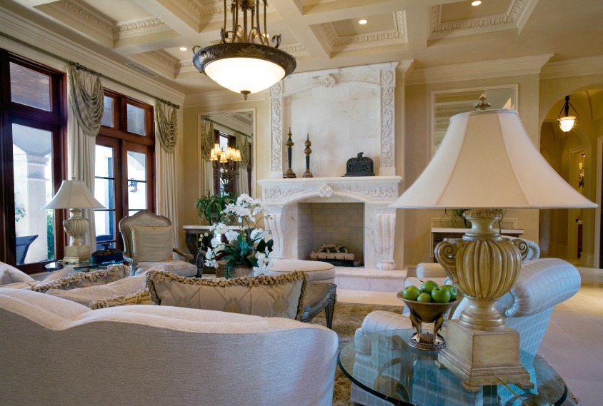
If your room is large and tall – but you still want to use whites and off whites in your room, consider adding a coffered ceiling and painting it. It helps to bring down the size of the room – making it a cozier space. In the above photo, notice how the walls etc are off white but the limestone mantel is white. Just that subtle difference allows this feature to stand out.
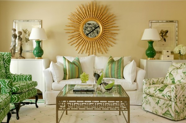
Add Art
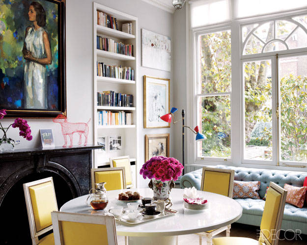
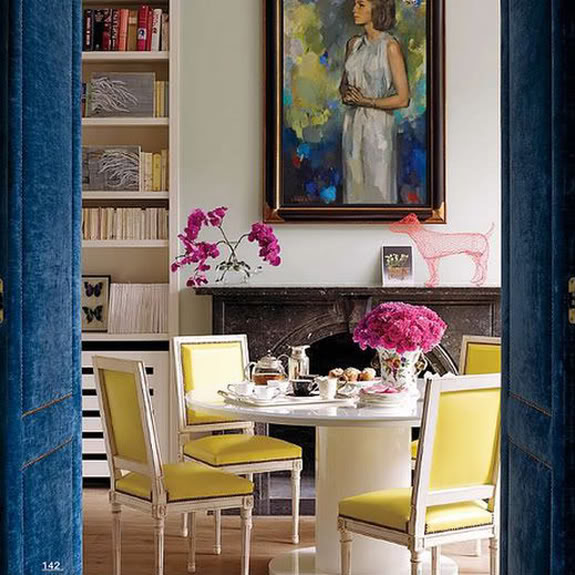
Since white will pop anything placed against it, make sure your art is worth that pop! The mistake people make is placing unremarkable artwork on the walls. Make it count! The above photos of the dining room/library of Christine d’Ornano, who oversees the British operations of her family’s cosmetics firm, Sisley, displays the use of art beautifully. The art informs the color scheme for the room – mostly blue and yellow. Those blue upholstered doors are to die for, aren’t they? But they also serve as a hint as to what’s behind them.
Don’t go for “basic” or neutral art pieces – go for the wow factor. Let the colors in the art inspire you to bring in a few other colors (not too many…just two, three…maybe four max).
Let me know how you have decorated with white. Share with others in the comments below!
Thanks for stopping by The Colorful Bee! Stay in touch and never miss a post.
*Subscribe to receive an e-mail when a new post is up, HERE.
*Subscribe to receive an e-mail when a new post is up, HERE.
6 Comments
Posted in Benjamin Moore, Color Roundup, interior design, Paint


 Decorative Finishes
 Interior Design
 Home
Home Garden
 Holiday
 Makeovers
 My Life
 Business
 Tutorials
 Videos
 Paint
Paint