
-

-
Subscribe
Thanks for stopping by The Colorful Bee! Stay in touch and never miss a post. Subscribe to receive an e-mail when a new post is up, HERE.Sponsor
If you're interesting in advertising on The Colorful Bee, click here to learn more.Contact
You can also email me at Linda.Leyble@gmail.com -


Categories
Subscribe
Popular posts
-
Recent Posts
Blogroll
Links

Author Archives: Linda
Color Roundup: How to Pick the Right White Wall Color
The Key to Picking the Right White
To receive my Free E-Book “Design Your Home With Color” Click Here
I get this question all the time…”How do I pick the right white for my room?” Hey, I’m the color girl remember? I love color and I would love to see my readers choosing more daring hues on their walls. White is one of those tricky paint colors because there are so many different whites and off whites to choose from – all with different casts of blue, red, green, yellow, gray, purple and orange. Here’s my take on how to choose the right white for you.

Choosing a white paint color for a room seems like a pretty simple thing to do, right? Wrong – choosing a white is probably one of the more difficult things to master for the Do-It-Yourself homeowner…even for designers. Before you go out to the paint store, the first thing that you really want to do is to examine what you have in the room already that’s not going to change – flooring, granite, tiles, expensive furniture pieces that you are not going to reupholster and other fixed items. You need to choose a white that won’t clash with these things that are permanent. Always choose paint colors in context. Are you working with a brown granite that may have pink undertones? You want a paint color with slight pink undertones. A Calacatta marble that may be pure white but has some gold veining would look best with a white with pale yellow undertones. Are you working with oak flooring? Then you want a white with yellow/golden undertones. Once you know these undertones – a whole lot of whites can be eliminated from your vast options in the white and off white world of paint.

We chose White Sand by Benjamin Moore for the cabinetry because it blends with the countertop, floor and backsplash that were not going to be changed
Alright, what’s an undertone Linda? The obvious hue you see is the main color. The color underneath it – the one you don’t see at first, is an undertone. If you don’t pay attention to this and if the undertones clash, the color scheme that looked perfect on paper – will be disastrous in reality. Color (including whites and off whites) is a fickle mistress and she demands to be heeded. So, learn to recognize undertones – they really matter.
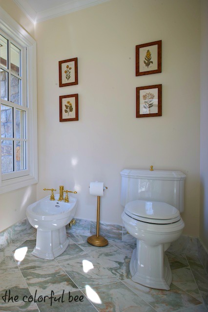
A beautiful bath I staged, but the builder chose the wall color – which has the wrong undertone. Better color choices would be Halo or Classic Gray by Benjamin Moore
As an artist and faux finisher, I have been taught to see these undertones. Many times I get called in to “fix” a color that’s just been painted on the wall and it’s “off,” which really means the undertone of that paint color isn’t blending with the major elements in a room. Usually, I have to mix up a white or cream glaze with a little bit of tint in the opposite color on the color wheel to the undertone – to tone down the wall. Or else I am altering the paint color with tints to get it to the right color so that the painter can repaint. But if you practice recognizing these undertones beforehand, you won’t make these kinds of mistakes (or else – you will have to call me!)
Decorator’s White in satin for trim. The cool pink taupey faux finished walls we did needed a cooler white trim. I wanted to put a little glaze on the moldings, but the homeowner was so happy without it.
If you have access to a white and off white fan deck of a major paint manufacturer, like Benjamin Moore, you’ll see they have over 140 whites and off whites. If not, pick up a host of white paint chips in the paint store and you’ll see that there is a whole variety of undertones happening – pink, yellow, gray, green, blue and violet. To isolate the undertones, so you can start noticing which is which, take a piece of pure white cardstock and cut out a square the size of the paint chip and place the different whites underneath it. You’ll see that some of these whites will mysteriously turn into a slight pink or yellow etc against the white background. That’s the undertone. Alone, without context, a white paint chip will look, well, plain white. You will be amazed when you start to recognize all the subtle differences. It takes a little time and practice but this exercise is so worthwhile.
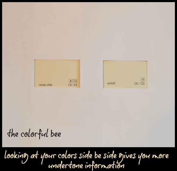
After you have figured out the undertones in your room and you have picked out some white/off white candidates, place the colors side by side on your cardstock viewer to get an even better picture of the undertones. The above photo shows two warm undertoned off whites. You can see (even though my photo might not be as accurate a depiction) that the Navajo White is a bit warmer and more yellow and the Seashell is still warm but not as yellowish. I always specify Seashell when a client wants Navajo. I just have seen that color a bit too much…like in every apartment I ever lived in in the 80s!
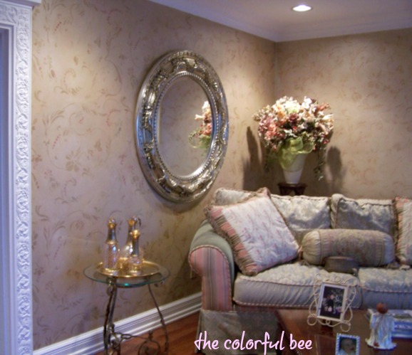
Windswept (OC-94), one of my favorite trim colors, paired with Richmond Gold below the chair rail and an antiqued golden tissue finish
I always recommend that before committing to a paint color, roll your chosen color(s) on a large piece of oaktag (2 coats please!) and place your sample vertically on the wall – next to any fixed object in your space. Move it around to check if the color blends or clashes with the items in your room. See how the color looks in the morning, noon and night (and very specifically when you use the room the most).
If you follow these suggestions, you’ll be well on your way to picking the right white for your space. I hope you will come back tomorrow when I talk more about choosing white – and what are the key elements your white room has to have to transform it from blah to ahh! For more information on paint colors and their undertones, please go to Maria Killam’s blog. She has so many posts about this topic – I highly recommend it!
Thanks for stopping by The Colorful Bee! Stay in touch and never miss a post.
*Subscribe to receive an e-mail when a new post is up, HERE.
*Subscribe to receive an e-mail when a new post is up, HERE.
Leave a comment
Posted in Benjamin Moore, Color Roundup, interior design, Paint, Tutorials
Embossed Plaster Art for a Home Staging Project
For a home staging assignment two weeks ago, I had to create some artwork for the property. Yes – I could have used some that I had on hand…but nothing was quite right. The investors wanted the home to be a bit more contemporary than what I usually do – and I didn’t have anything that would work in a contemporary setting, artwork-wise. So, I decided to create my own.
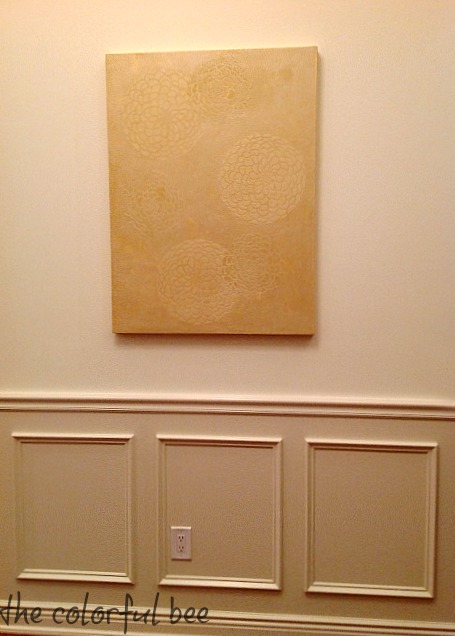
I did several pieces for this home but on this post I will show you how I created the raised stencil art that would be the first thing that a potential buyer would see when they opened the front door. (more…)
Thanks for stopping by The Colorful Bee! Stay in touch and never miss a post.
*Subscribe to receive an e-mail when a new post is up, HERE.
*Subscribe to receive an e-mail when a new post is up, HERE.
9 Comments
Posted in Decorative Finishes, Home Staging, interior design, Makeovers, Paint, Tutorials
Giving Thanks and Setting Family Goals
Thanksgiving – a Time for Reflection and Spending More Time with My Family

Thanksgiving always gives me time to think and reflect on what I am grateful for – mostly things that I forget about and take for granted all year long. As the leaves fall off the trees and we get ready for the barren months ahead, I want to fill up that time with warm memories of my family and how much I am so thankful that I have a large and wonderful one. Sometimes I have been guilty of working a bit too much and not taking time out to revel in the joys and simple pleasures of just hanging out with my husband, daughters, my grandchildren, my stepkids, siblings, cousins and nieces and nephews. I want to remember how happy I am when I am with them – that it trumps everything else. (more…)
Thanks for stopping by The Colorful Bee! Stay in touch and never miss a post.
*Subscribe to receive an e-mail when a new post is up, HERE.
*Subscribe to receive an e-mail when a new post is up, HERE.
2 Comments
Posted in Business, My Life
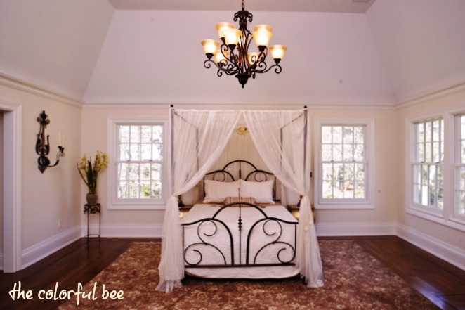
A Successful Home Staging Project
Something I don’t talk about quite so often on the blog is some of my Home Staging work. I thought I’d show you a project I did a little while back that was very successful. It was a $3.5 million house that was sold in 3 weeks. The property sat for nearly 2 years vacant and unsold until I put some furnishings in it. Some of these items were painted by myself and my crew…and we also did a little bit of faux finishing in the house as well to help sell it. We did everything in about a week – so it was a very busy week! Here are some photos from the home.
Thanks for stopping by The Colorful Bee! Stay in touch and never miss a post.
*Subscribe to receive an e-mail when a new post is up, HERE.
*Subscribe to receive an e-mail when a new post is up, HERE.
1 Comment
Posted in Decorative Finishes, Home Staging, Makeovers
My Interview with Artist, Mary Hong
I follow a fellow designer, Cara McBroom, and was really taken by two art pieces in one of her client’s homes. It was by Mary Hong, an artist working in Florida.

Mary, receiving an award for Artist of the Year 2014
I had to contact her and found we had a lot in common – she appreciates the experimentation that faux finishers are fond of and she’ll be traveling to the same region of France that I visited back in 2001. Mary, though, will be visiting there to attend an exposition of her work! (more…)
Thanks for stopping by The Colorful Bee! Stay in touch and never miss a post.
*Subscribe to receive an e-mail when a new post is up, HERE.
*Subscribe to receive an e-mail when a new post is up, HERE.
2 Comments
Posted in Decorative Finishes, interior design
Decorating the Porch for Fall with an Outdoor Rustic Sign
So, I came across a wonderful, rustic Welcome sign made by Shayna of The Woodgrain Cottage – such a nice touch to her absolutely beautiful fall porch.

I am in the midst of decorating my front porch and felt that something like that sign would be a great addition. My husband had an old wooden board taking up space in our shed, sooo… I felt it could have been a little taller…but for now…it was perfect. (more…)
Thanks for stopping by The Colorful Bee! Stay in touch and never miss a post.
*Subscribe to receive an e-mail when a new post is up, HERE.
*Subscribe to receive an e-mail when a new post is up, HERE.
3 Comments
Posted in Decorative Finishes, Garden etc, interior design, Makeovers, Paint, Tutorials
Blue, Blue, My World is Becoming More Blue!
I have been a non-lover of blue for a long time now…but my taste has been slowly changing. I guess that happens to everyone. Has this happened to you?
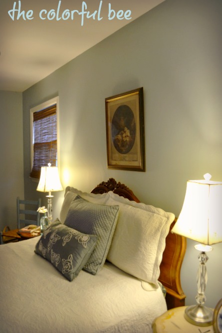
Back in 2007, my husband was diagnosed with a rare form of cancer and while he was in the hospital I made a huge change in our Master bedroom, knowing that he would be recuperating for quite awhile. I wanted the room to be as serene and healing as possible. Blue was the answer. It’s such a restful and peaceful color – perfect for someone who needs some calmness! (more…)
Thanks for stopping by The Colorful Bee! Stay in touch and never miss a post.
*Subscribe to receive an e-mail when a new post is up, HERE.
*Subscribe to receive an e-mail when a new post is up, HERE.
4 Comments
Posted in Benjamin Moore, Color Roundup, interior design, Makeovers, Paint
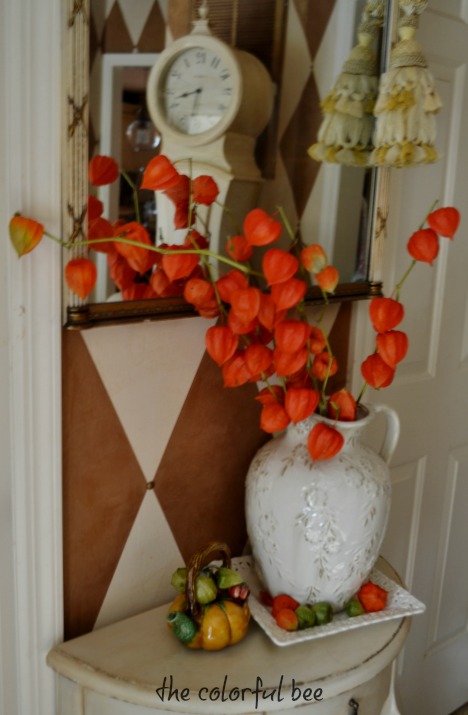
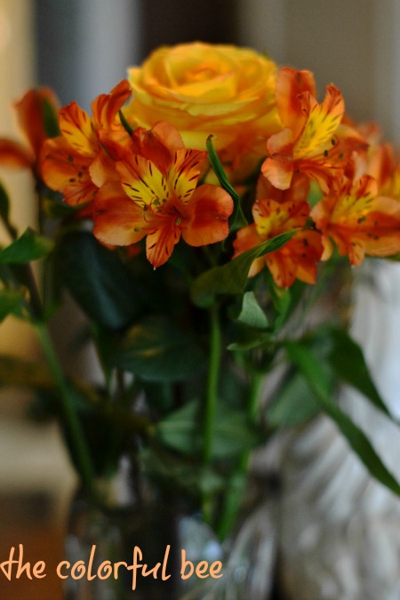
Chinese Lantern Pods: An Old Favorite Re-Discovered
I love Chinese lanterns! These colorful beauties are a natural for fall décor. They can be dried and used in wreaths and floral arrangements around the home. One of my clients, Dottie, gave me a beautiful bunch of these plants last week. As soon as I saw them I was transported back to my childhood.
Thanks for stopping by The Colorful Bee! Stay in touch and never miss a post.
*Subscribe to receive an e-mail when a new post is up, HERE.
*Subscribe to receive an e-mail when a new post is up, HERE.
Leave a comment
Posted in Decorative Finishes, Garden etc, interior design, Makeovers
Orange You Glad It’s Fall? I Am!
“Orange is red brought nearer to humanity by yellow.” — Wassily Kandinsky
If you haven’t noticed, I am a big fan of the color orange. Now that’s its fall I can find all sorts of accessories, florals, leaves…and pumpkins to plop into my home to give it a little fall lift. So, it’s a favorite time for me to decorate, redecorate and move things around a bit.
Don’t be afraid to use orange in your home. Here are some ideas… (more…)
Thanks for stopping by The Colorful Bee! Stay in touch and never miss a post.
*Subscribe to receive an e-mail when a new post is up, HERE.
*Subscribe to receive an e-mail when a new post is up, HERE.
2 Comments
Posted in Color Roundup, interior design, Paint
The Custom Blue Chalk Painted and Stenciled Coffee Table
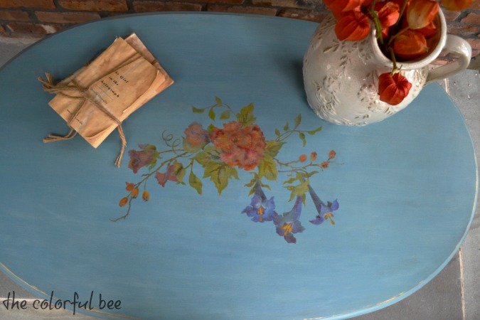
I finally finished a coffee table I had been working on for a while. I didn’t want to post it until I figured out how to tame the super shine I was getting from the wax I put on the table. I figured it out soon enough…made the necessary adjustments (not hard – a little more sanding back) and it’s a beautiful finished table. (more…)
Thanks for stopping by The Colorful Bee! Stay in touch and never miss a post.
*Subscribe to receive an e-mail when a new post is up, HERE.
*Subscribe to receive an e-mail when a new post is up, HERE.
4 Comments
Posted in Decorative Finishes, interior design, Makeovers, Paint, Tutorials


 Decorative Finishes
 Interior Design
 Home
Home Garden
 Holiday
 Makeovers
 My Life
 Business
 Tutorials
 Videos
 Paint
Paint