
A very good friend of mine, Dianne Scalza, just opened up a new real estate franchise – Exit Realty All Pro in Bay Shore NY. Dianne is a colorful, dynamic and fearless woman and so when I saw her private office – all beige – I knew I had to feminize it and bring more color and “Dianne” into the space. Luckily, she asked me to help make it her own.
Before the transformation
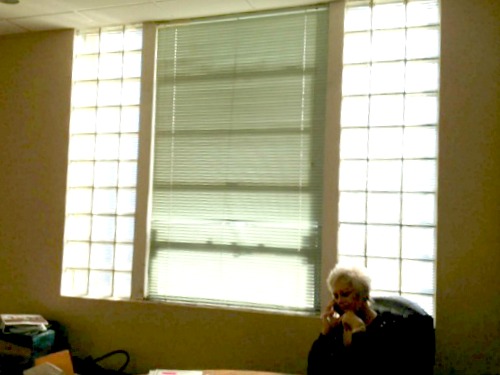
…And we just had to do something about those glass blocks (with no budget to remove them. Tomorrow on the blog I will show you how we transformed the window!).
She needed some extra storage in her office but she didn’t want ugly file cabinets – so she brought along a bombe chest that she had purchased 10 years ago. A bookcase was also a priority – so I went in search of something that would work in this feminization of a boring real estate office. I found just what was needed on Craigslist – for $60!
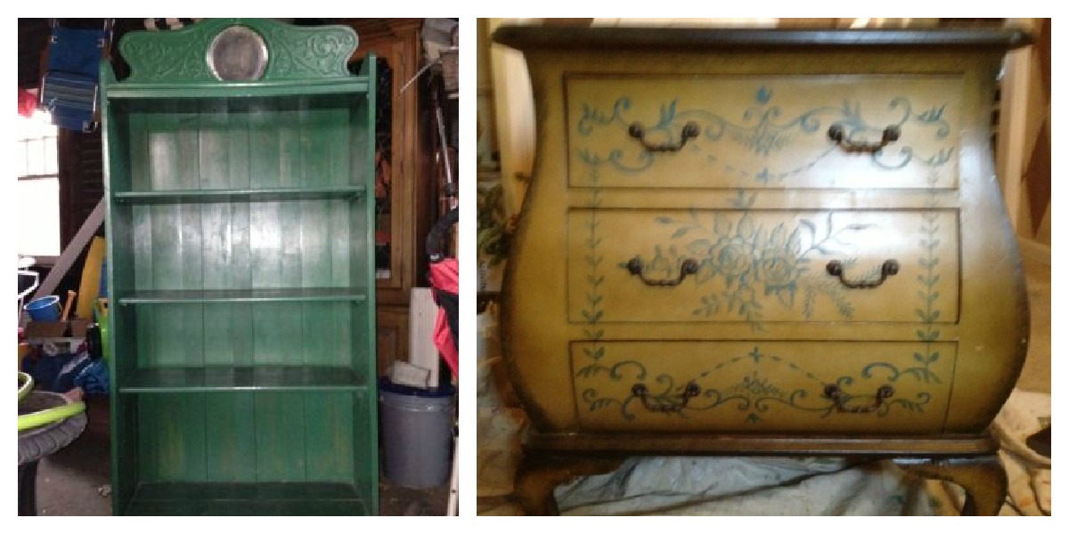
Before: The antique green bookcase and the bombe chest
Both of these pieces had some nice curves and sex appeal – but the colors were ugly. So – I got to work.
The Bombe Chest
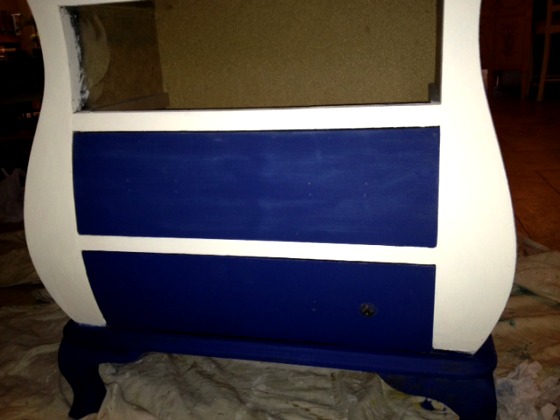
During…
I used some Annie Sloan Chalk Paints to revive this piece – Napoleonic Blue and Old White. Dianne loves anything nautical, so these colors really hit the mark. But I had to add some beachy elements to bring in Dianne’s love of shells and the beach. So – I added this…

On my porch, ready to go to her office!
I added this shell and roses design to the middle drawer. It’s a design called Shell Eloquence from Royal Design Studio – but I did something a little different than just stenciling. I first stenciled the design in Old White…then I freehanded the rest of the motifs – adding some Dutch Metal Gold and some dark brown for shading. I also touched up the hardware with some Dutch Metal Gold. Here’s a closeup of the drawer…
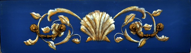
Closeup of the middle drawer design
I waxed the entire piece with Miss Mustardseed’s wax to make it durable. Here’s the chest in Dianne’s new office…
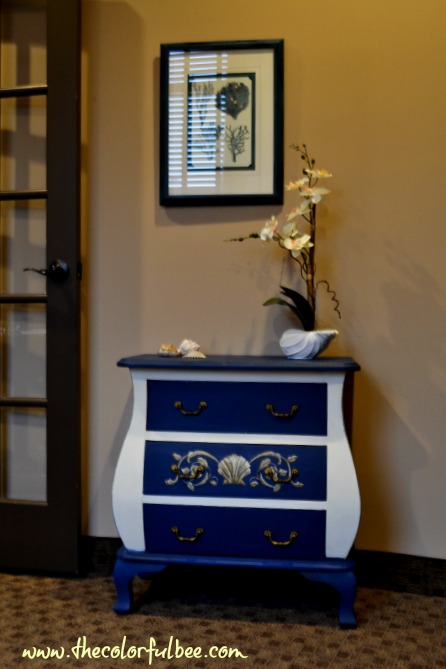
Additional elements added were a lovely blue coral picture that I found at HomeGoods (for $10), but it had a black frame, which I changed by adding some Annie Sloan Chalk Paint and some shells – including a shell planter with a faux orchid.
The Bookcase
Being that it was a deep forest green, you really couldn’t see the lovely scroll work at the top of the piece, so I had to make sure that this was prominent. You also didn’t really notice the wonderful paneled backing of this bookcase. I don’t know what year it’s from but the panels had a lot of depth being that every other panel protruded a bit (a staggered bead board effect). I wanted the inset top and the back of the piece to stand out – so I created a custom pale blue paint color for it. The rest of the bookcase was painted an Off White.
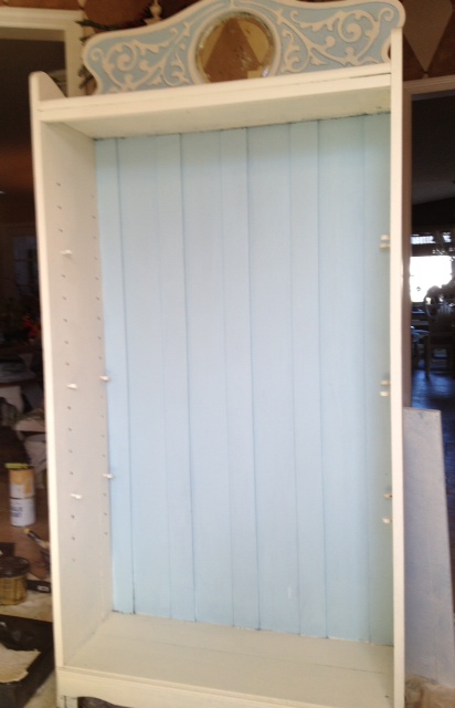
During – right before antiquing
I antiqued the bookcase with some raw umber and dark brown glaze, just to bring back the history of the piece.
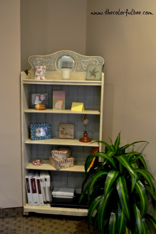 Much more feminine…don’t you think? So – please come back tomorrow when I show you how we transformed the windows!!!
Let me know what you think in the comment box below!
Linking this project to: Miss Mustardseed; French Country Cottage; Redoux Interiors; Liz Marie; Common Ground; Between Naps on the Porch; It’s So Very; Katherine’s Corner


 Decorative Finishes
 Interior Design
 Home
Home Garden
 Holiday
 Makeovers
 My Life
 Business
 Tutorials
 Videos
 Paint
Paint
I love it!! I think it looks fantastic and inspires me to use some color in my pieces instead of just white. Thanks for sharing!!
Theresa@junk2jewels-diy.blogspot.com recently posted..Ahoy! Tiny Bathroom Tidied
Hey Theresa – thanks for your comment! I know – I usually do very saturated walls – I tend to go colorful there (and fabrics too!). But, I have been fairly cautious with furniture…staying neutral and antiquing it mostly. But there are so many great colors out there to use and work with – that I just had to jump in. My blog is called the Colorful Bee, after all! So glad to give you inspiration to go for color on your next few pieces! Thanks for liking my Facebook Page too! I sent you a friend request on your profile – will look to see if you have a Facebook Page!
Linda
Hi Linda
The new pieces are so plush and opulent. I love the dark navy drawer fronts with the stencil design and the soft blue on the bookcase is so much prettier.
Can’t wait to see what you did with the windows.
Kristine
xoxo
Kristine recently posted..DIY No Sew Rolled Window Valance
Thanks Kristine! I know – the paint job really made both of those pieces. The loveliness was hidden underneath them! Thanks for commenting!
Linda
great remake! Love the cobalt blue!
Mary of The Decorative Paintbrush recently posted..Loving Pink
Thanks Mary – I love comments! I am off to look at your blog as well.
Linda
Linda you have created a warm and welcoming work space. Thank you for sharing at the Thursday Favorite Things hop xo
Katherines Corner recently posted..Valentine Banner Bunting
Thanks Katherine – love to partcipate as much as I can. Hope your weekend is going great!
Linda