
-

-
Subscribe
Thanks for stopping by The Colorful Bee! Stay in touch and never miss a post. Subscribe to receive an e-mail when a new post is up, HERE.Sponsor
If you're interesting in advertising on The Colorful Bee, click here to learn more.Contact
You can also email me at Linda.Leyble@gmail.com -


Categories
Subscribe
Popular posts
-
Recent Posts
Blogroll
Links

Tag Archives: DIY ideas
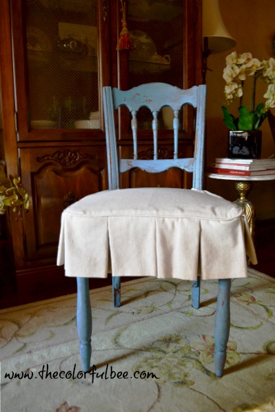
Miss Mustardseed’s Flow Blue Milk Paint: A Before and After Chair
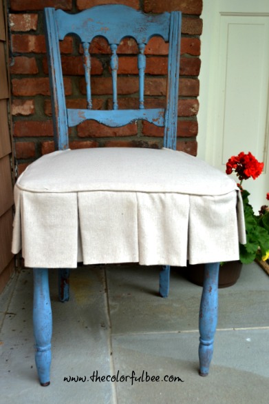
I don’t know why it took me so long to try out Marian Parson’s Milk Paint – but I finally did and I loved it. I’m not the world’s biggest “blue” fan but because Marian uses it so effectively in her home and her Milk Paint colors are so beautiful (especially this blue!), I figured I would try to learn to love blue!
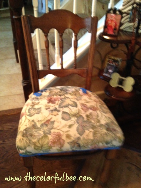
Sorry for the blurry “before” pic, but here’s the sorry little “free” chair that I had from one of my clients. Lovely shape but the upholstery was so dated. I sanded down the chair somewhat – I say “somewhat” because what I really mean to say is I did it so quickly that you would hardly notice that I even sanded at all. Mistake! I mixed up the Milk Paint per the instructions and then I went at it. It was chipping – yippee!! But, guess what – it chipped so much that even a whole section just about came off entirely. I should know better, being a decorative artist, but I guess I was so anxious to experience this product that I didn’t prep correctly. So – give your furniture some sanding before using, especially if it’s a shiny, varnished finish, as mine was.
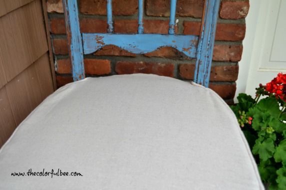
Here’s a closeup. I finally did some sanding on the piece and so the chipping was much gentler which was more to my liking. After I finished, I waxed the piece with Miss Mustardseed’s Furniture Wax – that helped to preserve any further chipping as well. So. if you have a shiny, varnished piece, make sure you sand to give the product a surface that will accept the paint.
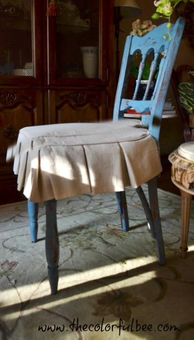
The final touch was to give it a better cover. I had some leftover Osnaburg linen fabric from the project I did revamping a realtor’s office, I always loved how Miss Mustardseed would cover her dining chairs – so I shamelessly copied her! Somewhat. My amazing window treatment guru, Mary Ann Schultz, made me this lovely skirt for the chair from the leftover fabric. I wish I had sewing skills – but, very sadly, I don’t.
I am not sure where this little piece will eventually go – perhaps in our guest room (which I hope to show you soon!) or maybe it may have a temporary home in my next staging project.
Let me know what you think! Have you used Marian’s Milk Paint? If you haven’t, I hope you will give it a try. And no – this is not a sponsored post. Just love the product and the creator!
A few other pics…
Sharing this with…Miss Mustardseed; Redoux, Shabby Nest; French Country Cottage,
Thanks for stopping by The Colorful Bee! Stay in touch and never miss a post.
*Subscribe to receive an e-mail when a new post is up, HERE.
*Subscribe to receive an e-mail when a new post is up, HERE.
3 Comments
Posted in Uncategorized
Powder Rooms: Great Ideas to Transform Your Powder Baths for Upcoming Holidays
With the Fall and Winter Holiday Seasons upon us, it’s a great time to add some zing and lift to your powder rooms. You’ll wow your guests with food and drink…but why not surprise them with a beautiful bathroom experience as well?
I love to decorate and design beautiful powder rooms. Today I’ve put together some beautiful ideas from around the blogosphere – as well as some of my own designs. Some projects are easy yet creative and others are a bit more challenging…but I will offer some ideas to simplify the process.

A lovely and lively abstract wall finish from Little Green Notebook
Jenny Komenda from the Little Green Notebook blog did a fantastic, abstract finish on her powder room walls. She had always loved Kelly Wearstler’s entryway wall finish in her home and so she set about to replicate it in her powder nath. If you click on the photo above, you can see her step-by-step directions – plus her inspiration photo of Kelly’s home.
 A simple yet very effective transformation from Melissa of The Inspired Room blog just required lots of paint, a few extra accessories and some artful wall displays. She used white for the vanity, shelf and mirror and for the walls – Snail Shell from Martha Stewart Paints. Click the photo to read the step-by-step.

Click on the image to see the step by step process
Another totally fabulous (and not that expensive to do) is this gallery wall and dark painted powder room from Jenny of the Evolution of Style blog. She used Benjamin Moore’s Gentleman’s Gray (BM 2062-20) – such a fabulous color for a powder room and all of the artwork was framed in gold. This is an amazing transformation!

Click on the photo for my step-by-step creation of this room
A beautiful powder room project I did earlier this year involved adding some beadboard, doing a stried faux finish on the walls and adding a new mirrored vanity, mirror and a beautiful window treatment for the shower. To do this in your powder room (minus the faux treatments), just add beadboard or panelled wainscoting and use a soothing aqua wall color, such as Stratford Blue from Benjamin Moore, and add a rich, damask window treatment. Click on the photo above for how I created the room.

A deep chocolate wall finish helps set off the beautiful sink and toilet
Using a deep, rich color can add the necessary drama for a great powder room. In this powder room that I did for a wonderful client a few years ago, we did a rich chocolate metallic plaster. We used an off white paint and then antiqued all of the moldings. A beautiful Stone Forest marble sink really becomes the focal point of the room because of the deep wall finish. I will be doing a blogpost soon about this powder room but, if you would like to accomplish a similar look – paint your room a deep chocolate. Some great colors to use are Benjamin Moore’s Affinity colors (their Aura line): Wenge AF-180, Barrista AF-175, French Press AF-170…or the lighter Kona AF-165. You might also try mixing two of the colors – just add the lighter Kona to one of the darker brown paint colors.

OK, it’s not a holiday theme, but this powder room will brighten your guests’ experiences
How about painting your powder room a bold coral color – then adding some coral stencils to your walls? Not just for beach properties, coral motifs can work anywhere. Great for the summertime – but very welcome in the fall and winter months when you want a burst of warmth. Canadian faux finishers, Paint a Lifestyle, did a fabulous bath with a coral color and theme. Think of all the accessories you could use – coral guest towels, real coral on the toilet shelf, some real sea fans or seafan artwork and some coral motif fabrics for Roman shades. The list of accessories is endless.
Some paint colors and stencil ideas…
- Coral paint colors to consider: Italiano Rose (Benjamin Moore 2087-30), Perky Peach (Benjamin Moore 2012-50), Ardent Coral (Sherwin Williams 6874).
- Some stencils to use on the walls are from Designer Stencils or consider making your own stencils – here’s a great How To.

Incredible Powder Room Transformation from Centsational Girl
A great wall color, a simple chair rail and a lighter lower wall color, a fabulous light fixture and bamboo Roman shade totally transformed Kate from Centsational Girl blog’s powder room. Visit Kate’s blogpost by clicking the above photo for her transformtion details. Simple changes that yielded unbelievable results!
I will be doing more transformative powder room posts. I just love these rooms because they can take on the most dramatic changes with very little effort. That’s a miracle in the design world (or rather in everyone’s world – as our dollars have to stretch further these days!). Let me know what you think of these transformations! Have you done any re-decorating in your powder or guest baths? Let me know! I’d love to hear about it!
Sharing this with: Between Naps on the Porch; Primp; Savvy Southern Style
Thanks for stopping by The Colorful Bee! Stay in touch and never miss a post.
*Subscribe to receive an e-mail when a new post is up, HERE.
*Subscribe to receive an e-mail when a new post is up, HERE.
5 Comments
Posted in Benjamin Moore, Paint
Using Metallic Foils: For Artwork and Embellishing Other Surfaces
 I was in Marshall’s the other day shopping for a client in NYC. I was staging his huge apartment that needed a lot of work. I was buying some soaps and other toiletry items for his barren bathrooms (he has 4!!). I spied a very pretty plastic hand soap dispenser with a lovely hummingbird on the label. I said to myself, “This is mine – not his. Sorry!”

The inspiration!
I immediately thought that I could use the image idea for artwork. What attracted me was the metallics used for the wings and the head. I immediately thought – metallic foils. I had purchased some for a client awhile back and I had some left over…so I figured, why not?

Metallic foils come in several sizes and many colors
If you’re not familiar with metallic foils, they are similar to gold and silver leaf but they come in larger sized sheets and rolls – and they come in a variety of colors. You can buy a sample pack, which I would recommend, so you can get a feel for using them while you see how many colors are available. They also come in holographic foils which are great too. I’ve used them to effect glass tiles. I think Michael’s carries them now – but you can order them from Royal Design Studio or Prismatic Painting Studio.

From plain to pearl metallic painted canvas
I decided that I could do a humming bird series of small paintings (as I’ve been collecting images for this purpose). I had 3 small pre-primed canvases, so I took one and painted it in a metallic pearl.

You can practice the placement of leaves first – or if you’re brave or really talented…paint them on freehand!
Then I floated in some leaves and stems in a raw umber color with a little water added. If you want to try this, you could practice this on a piece of paper first to get a feel for placement. I painted it lightly at first – knowing I could always amp up the leaves up later on.

I traced using graphite paper but use any method you’d like
Then I enlarged, cropped and printed the photo and traced it onto the canvas using graphite paper. If you decide to do this – use any transfer method you are comfortable with.

Richen up the shadows, add size and foil
I took the same raw umber color and began to fill out and outline the body, wings etc. You can build this color up slowly. If you go too dark, just blot a bit with some cheesecloth to lighten.Then I “painted” on some adhesive size using Wundasize in the areas I wanted the metallics. (You can see it somewhat in the above left photo). I first did the green areas. I decided not to put all the size on at once because I didn’t want any green foil going into gold areas and vice versa. When the size comes to “tack” you can start putting the foil on. On these small areas I was able to start foiling after about 15 minutes or so. I used the “knuckle test,” which means I placed my knuckle gently into the area and if it made a slight pop sound, it was ready.
I cut smaller pieces of the foil and placed it Shiny Side Up (very important). I used a medium sized stencil brush to transfer the foil to the canvas. I used a fairly hard, swirling motion because I wanted to transfer it fully.

You can learn from my mistake. The blue metallic foil didn’t transfer, so I painted it blue first. Didn’t like that either! Too dark.
I didn’t have pink or purple foil, as in the image, so I decided on blue and gold. The gold went on beautifully – but something was wrong with the blue. It didn’t transfer much at all. In fact, when I rubbed hard it transferred a brown, muddy color. Yuck. I tried repainting it with blue and then sizing and transferring again – but no luck. So, I had to abandon the blue idea.
I have to say that I felt that this mess up ruined my day – and it made my painting not as good as I thought it would be. But – I carried on and decided that I learned something important. Test your foil if it’s old!! Perhaps that was the problem.
Anyway, I had a little tack left on those areas, so I sprinkled some gold mica powder on it to save it somewhat. I learned that you need to have a clean surface in order for the foil transfer to work. When I transferred the blue – the backing of the metallic foil transferred instead – and I think it made the canvas a bit dirty. So – lesson learned.

Gold mica powder softened the blue problem and glazing over the entire piece melded everything together
After the foils were on I added some more shading and I added some gold to the belly of the humming bird. I also added some more leaves to the canvas and I added some gold to the leaves as well.
For the final touch, I made up a glaze of Raw Umber, Van Dyke Brown and a touch of Gold to go over the whole canvas. (In the photo, above right, you can see that I softened the glaze at the top and not yet on the bottom – to show you how dark the glaze was when I started). You don’t have to do this but I wanted to “push back” the bird and leaves and I wanted to soften the whole look of the painting.
 I may outline the edges of the canvas with some gimp – and I may add some upholstery tacks on the edges as well.
Hope you enjoyed this. Have you ever used metallic foils? Let me know. I’d love to hear how you are using them. Stay tuned this week because I am going to show some ideas for wall finishes and moldings using metallic foils. Thanks for coming by!!
Sharing this with these friends…
Between Naps on the Porch; DIY Showoff, Jennifer Rizzo; Market Yourself Monday, The Creative Spark Link Party; Savvy Southern Style; Our Delightful Home, Blackberryvine; Artsy Corner
Thanks for stopping by The Colorful Bee! Stay in touch and never miss a post.
*Subscribe to receive an e-mail when a new post is up, HERE.
*Subscribe to receive an e-mail when a new post is up, HERE.
7 Comments
Posted in Tutorials
 Decorative Finishes
 Interior Design
 Home
Home Garden
 Holiday
 Makeovers
 My Life
 Business
 Tutorials
 Videos
 Paint
Paint