
-

-
Subscribe
Thanks for stopping by The Colorful Bee! Stay in touch and never miss a post. Subscribe to receive an e-mail when a new post is up, HERE.Sponsor
If you're interesting in advertising on The Colorful Bee, click here to learn more.Contact
You can also email me at Linda.Leyble@gmail.com -


Categories
Subscribe
Popular posts
-
Recent Posts
Blogroll
Links

Author Archives: Linda
Happy Summer’s Day: Some Butterfly Pics
Just wanted to post some pics of some Monarch Butterflies that were in my backyard. They are my favorites.


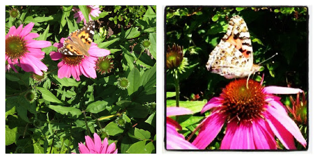


True to their name – this particular Butterfly loved the Butterfly Bush. But just a few minutes earlier, I was able to capture a younger Monarch Butterfly in another part of the garden – with my IPhone. This guy preferred the Coneflower.
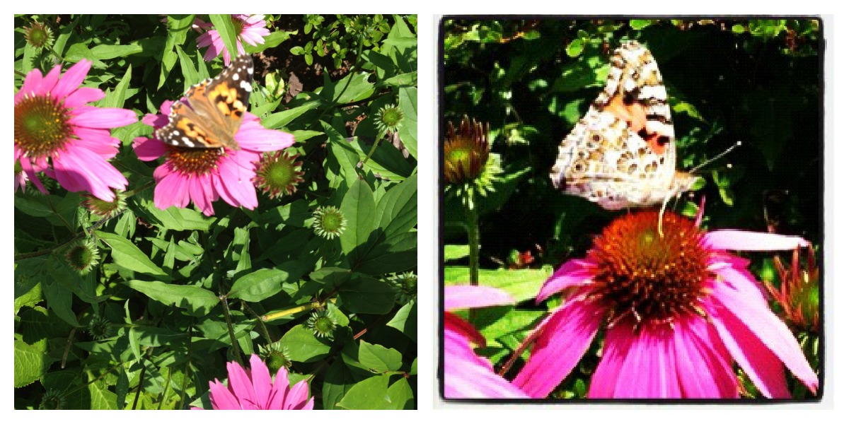
Later in the season I will post some other Monarch Butterfly images – when they do their trek from Fire Island. It’s a sight to behold – seeing swarms of these beautiful creatures hovering over the Great South Bay.
Hope you enjoyed these. If anyone has some Monarch Butterfly (or other) pics to share I would love to see them!
Thanks for stopping by The Colorful Bee! Stay in touch and never miss a post.
*Subscribe to receive an e-mail when a new post is up, HERE.
*Subscribe to receive an e-mail when a new post is up, HERE.
2 Comments
Posted in Uncategorized
Deck and Porch Decorating for the Fourth of July…and a Recipe
I’m two days late with this post, but I thought I’d show everyone how I decorated my front porch and back deck for the Fourth of July holiday.


The Front Porch

The main staple of the porch is always my antique church pew. It’s from Connecticut, circa 1870s and supposedly once belonged to Skitch Henderson (so said the man who sold it to me – no real proof, but it’s a good story). Skitch was the original conductor of the Tonight Show band before Doc Severinsen. I added some colorful pillows and my favorite piggy bank that I bought many years ago on a trip to Maryland – on Assateague Island. I added some red, white and blue sunglasses for a touch of humor.

My granddaughter and I made some pinwheels in red, white and blue and placed them in a plant stand. The little red chair, which I bought at the NY Gift Show in January, was a perfect perch for red and white striped petunias in a holiday pot. The red star was a $3 purchase that I painted in Annie Sloan’s Chalk Paint – Emperor’s Silk. The antique red watering can I found at a garage sale several years ago and the planter was a gift from one of my best friends, Alex.

Here’s the full view (sorry about my van and me showing up in the window!!) I purchased the buntings from Indepence Bunting and Flag – which is a great company (not a paid endorsement) and they carry many different decorations for all holidays.
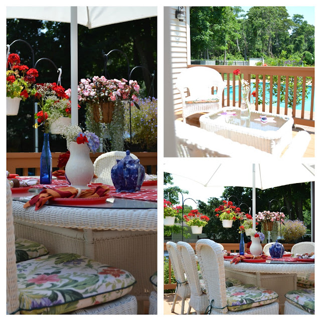
The Back Deck
OK – yes those are red plastic plates! So sue me! I have a family that doesn’t always help with the dishes…so it’s a time saver for me. Besides I had these red babies on hand – so it made perfect sense. I found a great outdoor table runner at Home Goods ($7 – thank you very much) that has a velcroed (is that a word now?) opening for the umbrella hole. For those of you who sew – this is an easy enough thing to do for your outdoor tables.
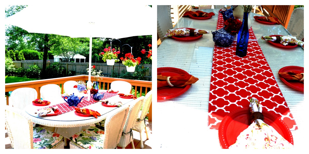


It looks like my family had a great time! (Note that the sangria pitchers on the table are just about empty…save for the fruit!)

Even Cassidy – my daughter’s dog!
Hope everyone had a great holiday!! In case you might be interested in the Sangria recipe I used…here it is. Combine all ingredients and let sit for an hour or two at room temperature to blend all the flavors. Chill and serve with ice.
-
Large bottle of Red wine
-
1 1/2 cups of Orange Juice
-
1 cup of Club Soda
-
1/2 cup of Orange Liqueur (I used Patron’s)
-
Cut up peaches, cherries and strawberries
-
Sugar, to taste
I’m linking this up to:
Thanks for stopping by The Colorful Bee! Stay in touch and never miss a post.
*Subscribe to receive an e-mail when a new post is up, HERE.
*Subscribe to receive an e-mail when a new post is up, HERE.
5 Comments
Posted in Uncategorized
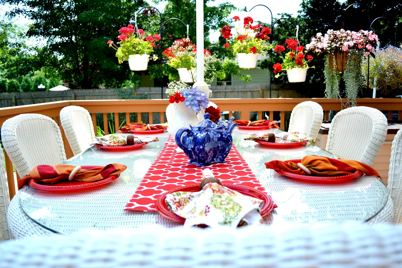
Happy 4th of July Tablescape
I have to admit that my family used to be lucky 1) if I served anything more ambitious than a hot dog on a bun and some salad on July 4th and 2) it was always served on paper plates (and they were lucky if the plates had some red, white and blue on them. Plain old white ones were the norm). With single motherhood, energy and money had to be placed in other areas.

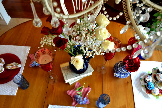


But since I’ve remarried and have a blog…my family gets to have better decorated holidays! I was always so busy decorating other people’s homes – that mine suffered for quite awhile. So, I spent today decorating. My granddaughter, Meghan, came over to help and my husband put up some stars and stripes buntings for me on the porch and did some other odds and ends things that helped me out a great deal. A big thanks to both of them!
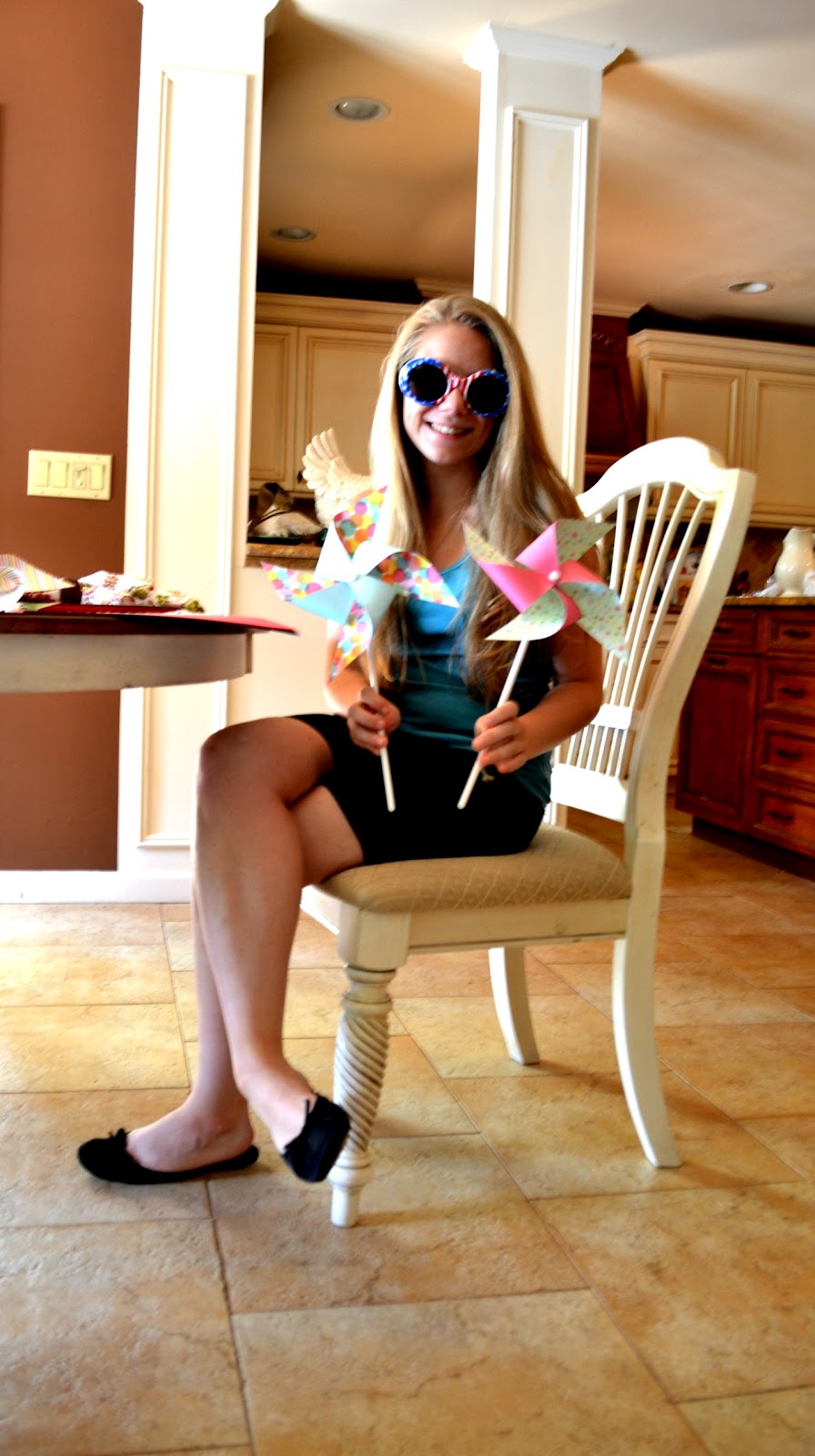
Meghan – with holiday specs and pinwheels we made

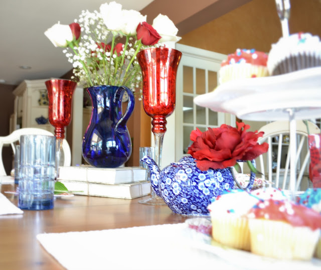
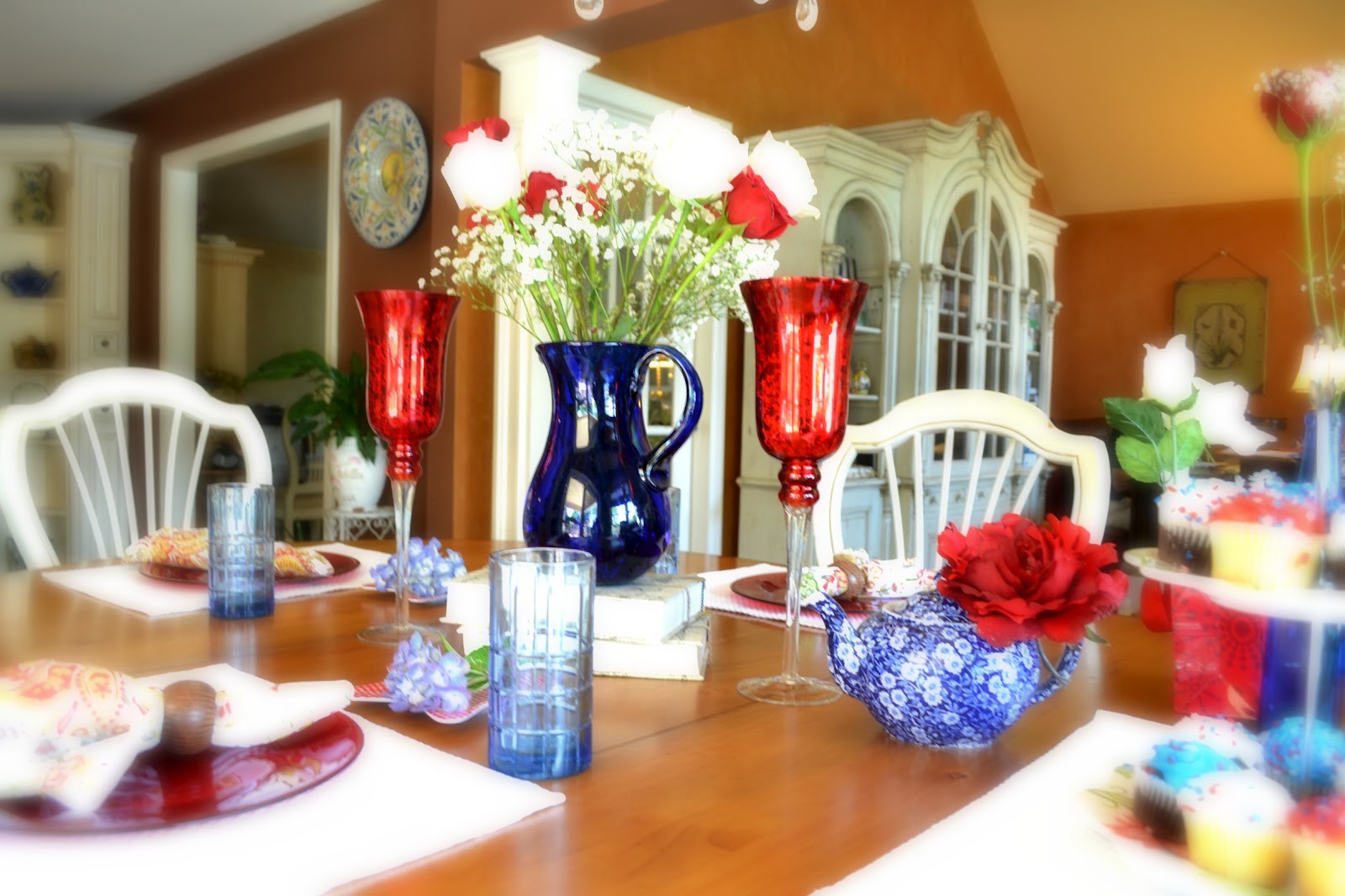
One of the toughest things for me this holiday was trying to find red, white and blue things. I used to be a “blue” person back in the 80s, so I had a few next to none ’cause I sold most of them accessories that would go. I’ve had the blue pitcher/vase since the mid 90s – I bought it in La Conner, Washington during the annual tulip festival. I never missed a festival while I lived in that state – it’s a gorgeous vista that I could never get enough of.

Via
I collect teapots – so I have a good supply of blue ones. The rest of the items I had on hand because of my home staging business. Placemats, plates, napkins, napkins rings etc – you need to have those items on hand at all times. The red plates were a bargain ($3 a piece at HomeGoods) – couldn’t resist! The red mercury candle holders – were from Christmas…but the color was perfect!
I hope that everyone has a safe and happy, healthy Fourth of July! I am hoping that the weather here on Long Island will hold up for a barbeque. We’re grilling chicken, salmon and corn on the cob. Hope it won’t have to be done with an umbrella over our heads!!
Have a great holiday!
Thanks for stopping by The Colorful Bee! Stay in touch and never miss a post.
*Subscribe to receive an e-mail when a new post is up, HERE.
*Subscribe to receive an e-mail when a new post is up, HERE.
7 Comments
Posted in Uncategorized
Antiquing Kitchen Cabinetry in New York City and a Surprise
A short while ago I had to help a client in Manhattan who had had a flood in her kitchen – which marred the cabinetry that I had painted and antiqued nearly 6 years earlier. The only day I could go was when President Obama was in town. That meant I was going to experience some nerve wracking, heart attack inducing traffic as I live on the eastern end of Long Island and the drive to Manhattan can take over 2 or more hours. But the slow traffic allowed me to take some shots along Central Park West while I was waiting to move uptown.


Heading uptown:The large pic on the left is the famous Dakota building, where John Lennon lived
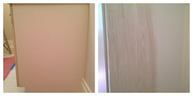
My client’s small NYC kitchen had looked darker and smaller with mid toned maple cabinetry – which was in great shape but the somewhat dark tone of the cabinets didn’t help the small space. I wish I had taken shots of “before” but who knew then I was going to have a blog!!

The finished cabinetry
The flood had damaged two major areas in the kitchen and all along the baseboard as well. We first primed and repainted the areas with the same paint we had used – an off white. After that was dry, I looked at my recipe that I had used for the antiquing and made up a sample glaze. I used the exact same measurements of tints – some Van Dyke Brown and Raw Umber – but the glaze wasn’t matching. I guess it could have been that the cabinets aged somewhat in 6 years. I had to add a touch of a warmer brown to match it exactly.
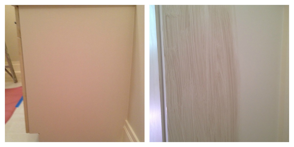
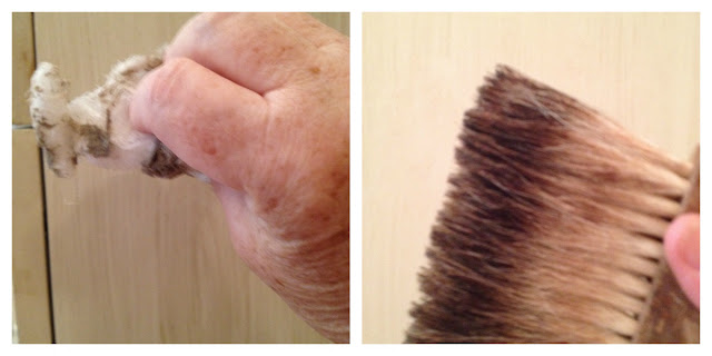
Before…and the application of the glaze with a chip brush

All the glaze is on…just needs to be manipulated and smoothed. What’s that on the right?

Moving and smoothing the glaze first with cheesecloth and then – a badger brush to smooth out
Pardon my fat, old unmanicured fingers – but I thought it would be helpful to new faux finishers/DIY homeowners to see how how I gently age a painted cabinet. The cheesecloth is great for moving the glaze around – you have more control of how much you want to remove. The cheesecloth can also help you push some glaze into crevices etc to get the look of built up dirt and age. The badger brush – which should be in everyone’s arsenal – softens and smooths out a glaze. It helps to give the cabinet a more natural, softer look.

The right side panel now blends with the rest of the cabinetry
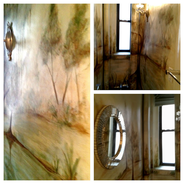
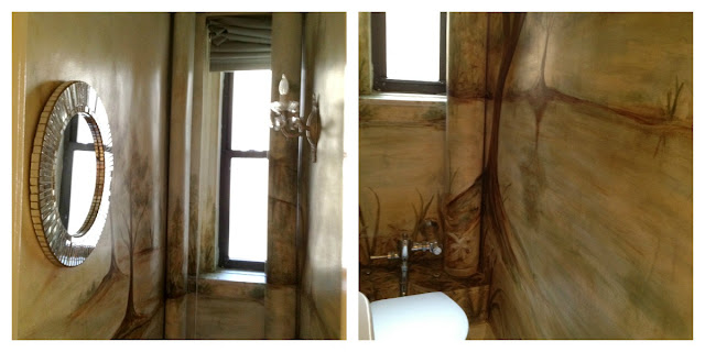
While I was antiquing the cabinetry 6 years ago, the powder room in the apartment was one of the tiniest I had ever seen. I suggested to my client that while I was painting and antiquing the cabinetry, I could have one of my artists come in and paint a quick, impressionistic mural that would help make the room seem larger…more expansive and interesting. She agreed – and so it began. Here are some images from the room.


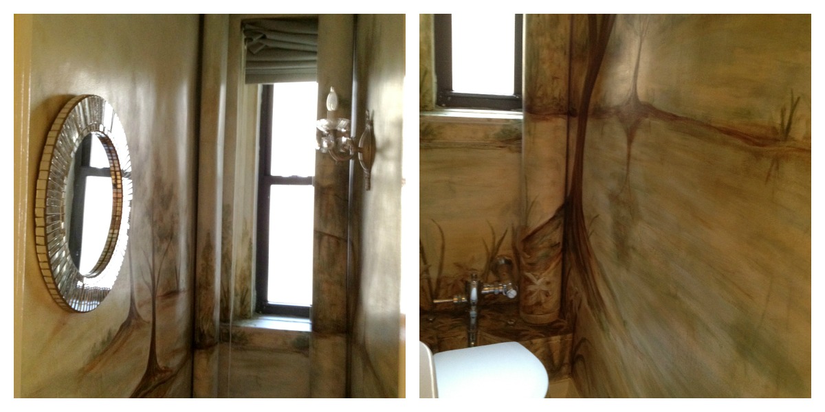
See how tiny this powder room is? You really need something interesting in here – or else you’ll get claustrophic being in this space!
So, after a day’s work it was time to fight the traffic again and head back home. It took nearly 3 hours to drive back but I felt great that the day went well and that my client was happy! I took some parting shots while driving (bad girl), but I thought you might like to see them!
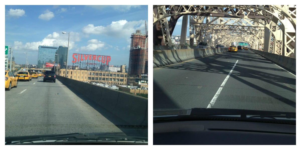
“Slow down, you move too fast!” Going over the 59th Street Bridge!
Hope you enjoyed my day in New York City. Let me know if you have any comments or questions – would love to answer them.
Sharing this project at…
Between Naps on the Porch; Nifty Thrifty Things; Saturday Nite Special; Sundae Scoop; Be Colorful; Boogieboard Cottage
Thanks for stopping by The Colorful Bee! Stay in touch and never miss a post.
*Subscribe to receive an e-mail when a new post is up, HERE.
*Subscribe to receive an e-mail when a new post is up, HERE.
4 Comments
Posted in Portfolio
A Boat Tour Around My Neighborhood on Long Island
I’m changing things up a bit today. I thought some of you might want to see the beautiful place I call home. I think I live in one of the prettiest spots on Long Island – Great River, NY. It’s a small town and we even have to pick up our own mail instead of having it delivered. But that gives this place an old timey feel and I really love it.


We have a sailboat that we’re on most weekends. My husband, Richard, is a diehard sailor and he feels more comfortable and at home on his boat than anywhere else. Sailing is a stress reducer. When you’re aboard, life’s worries seem to melt away.

My stepsons, Tim on the left and Dennis, right; My step daughter Megan (without makeup, I must add, right) and brother Dennis…and Megan’s so stress-free that she even allows a picture of her toenails and nails in two different shades!
When we pull out of the dock where we have our slip, you can see one of the beautiful homes on the water…and look at that sky!!! How gorgeous is that??

As we make our way on the Connetquot River (it’s actually part of the Great South Bay and Connetquot mean Great River in an Indian language), we see lots of boats and beautiful scenery left and right.

I love sailboats…but I wouldn’t mind a spin on that nice yacht!
And here’s a cat boat, which only has one main sail. My husband almost bought one of these. You can see that the water was a bit choppy – one of the reasons we only sailed with the jib that day!
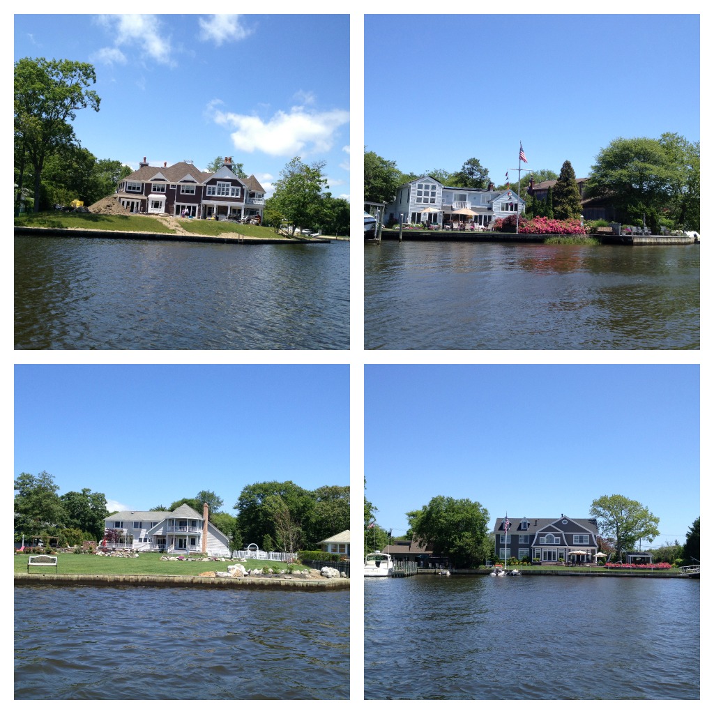
There’s a lot of eye candy – housewise – along the way. Everywhere you look, there’s a beautiful home and lovely scenery. I’m glad I don’t steer too often because we’d topple over if I was in the driver’s seat. I only steer and tack (change directions with the jib) when my husband is doing something else!

The large photo on the left shows The Bayard Cutting Arboretum and the main house on the property (a must see if you ever visit here) . The home styles on the water vary – from Miami Vice-esque modern to traditional and Hamptons beach homes.
You never know what you will see – maybe even a bird that’s not native to the area. As I was snapping away with my Iphone I spotted this bird that was floating and then he submerged himself completely for a really long time (a Houdini bird??) and then only had his neck showing above the water. This was a first for me!!

There’s the bird – in researching it I believe it’s a Anhinga (or snake bird) and it’s native to the southern part of the east coast of the US. This is the first time I’ve ever seen this bird.
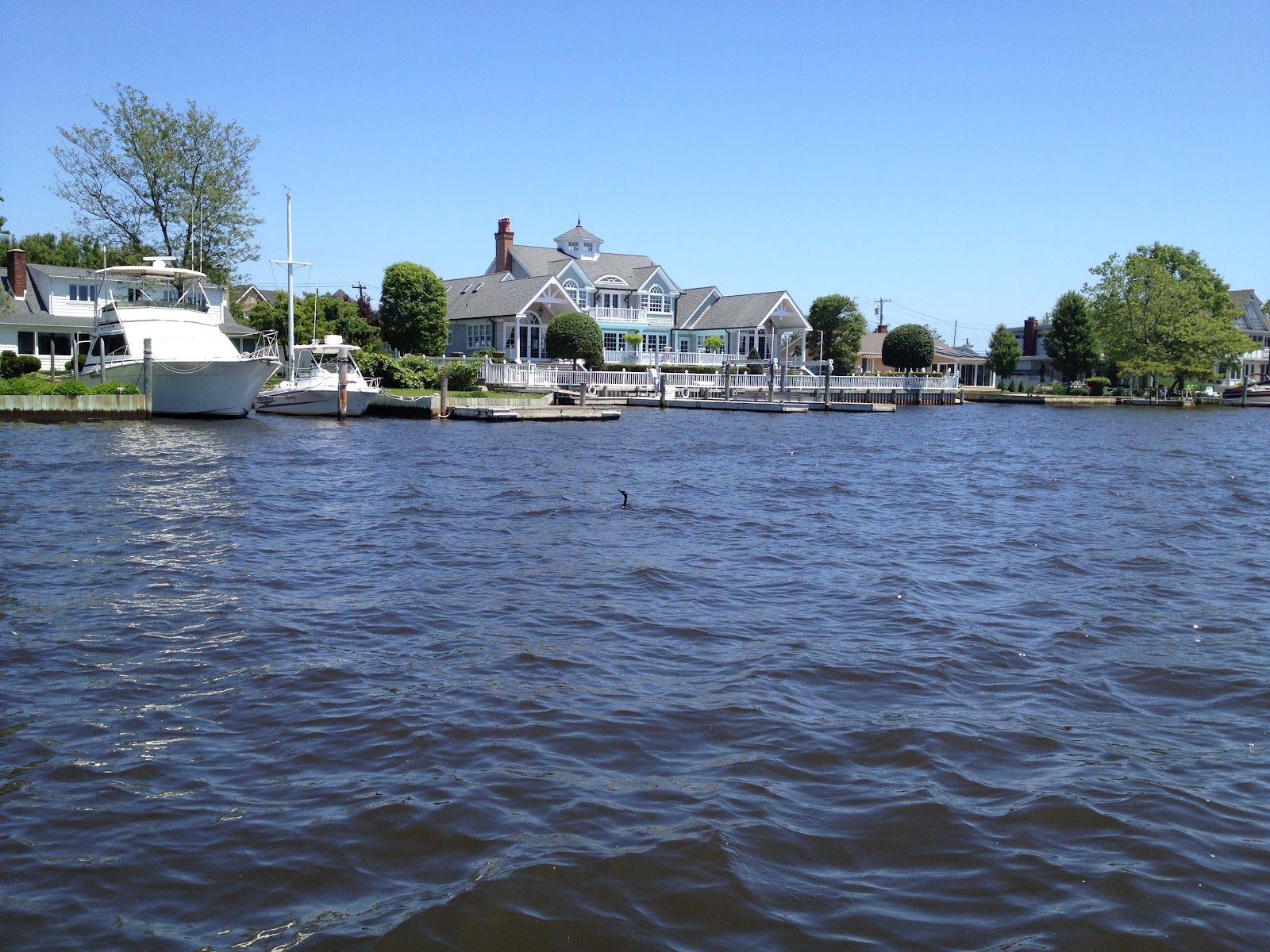
There he is again – with only his neck sticking out! Amazing! And what do you think of that gorgeous house on the right? I saw that home being built over the past few years. When I walk down to the end of my block – there’s a small dock on the water there – and that’s the home I see.
Some of the other sights you’ll see on the Connetquot River are Dowling College and the View Restaurant (that used to be called the Riverview and was once part of the William K. Vanderbilt estate).

Dowling College pics – and The View Restaurant, upper right.
There’s always a lot of sporting activity on the water – kayakers, the crew team practicing, waterskiers, upright paddlers. They give kayaking lessons near where we have our boat slip and sometimes it takes a little while to be on our way because of some inexperienced kayakers…but we don’t mind – we wait.

Here are some more pics of the lovely homes that I see every week…
I hope you enjoyed this little tour! Let me know what you think of it – and if you’ve ever been to Long Island to visit!
Sharing this with…
Thanks for stopping by The Colorful Bee! Stay in touch and never miss a post.
*Subscribe to receive an e-mail when a new post is up, HERE.
*Subscribe to receive an e-mail when a new post is up, HERE.
11 Comments
Posted in Uncategorized
A Commercial Range Hood Gets a Beauty Treatment
One of my long time clients, Staci, had a commercial range hood installed in her kitchen. She loves to cook (she’s Italian and a great chef!) but she never loved how her residential range hood performed in terms of eliminating cooking odors. She’s still be smelling the dinner she cooked for her family that night when she went to bed upstairs. So, in other words, it wasn’t working!! Her kitchen is quite large and her cooktop is on the kitchen island and so an exhaust duct (not sure what you call that) would have a long way to travel in order to work properly.
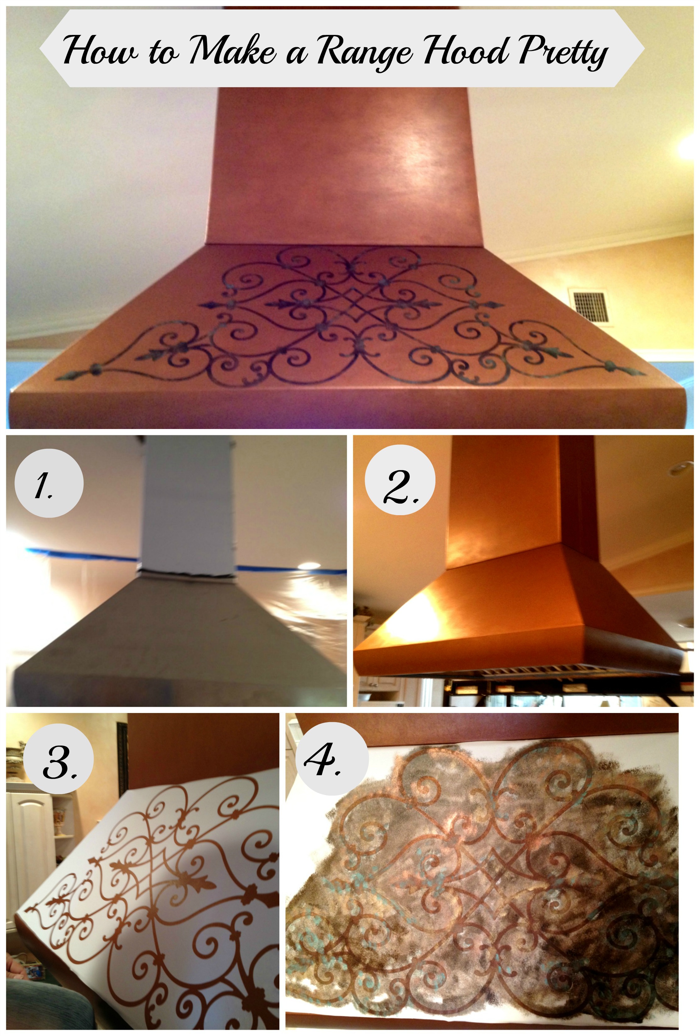
She was loving how the commercial range hood was eliminating cooking odors – but boy it was ugly!! So she called me to see if I could help her. Feast your eyes on this monster!

Lovely…right?
So, I had my work cut out for me. First of all, it’s pretty difficult to paint on a shiny, stainless steel surface because it’s hard to get any paint to stick. You can’t just use a primer, then paint it and voila! No – you need to degrease the surface (I cleaned it with Krud Kutter, a non toxic cleaner) and then you need to use something to etch into the surface so that it will give you some tooth (painter-speak for “it’s OK to paint’). I used a product by Faux Effects called PrimeEtch. I had used this only one time before when a client had asked me to paint and antique her bathroom vanity which was finished with a very shiny factory finish. I have to thank Cat Faust at Faux Effects in Florida for telling me how best to apply the primer (thinly, with a sponge brush). I then let it dry overnight to work its magic. When I had first used the product, I was in a hurry so I only let the primer cure for a few hours – but luckily everything worked just beautifully. This stuff is like liquid flypaper (that’s what I call it) because it really gives you a great surface that paint can stick to.
As always, I did some samples for my client. I had done a lot of work in her home before and I knew her favorite colors and what she liked.

Sample Board for color and ideas for design
I also did a sample on the stainless that her installer gave her – to see how the PrimeEtch would work. It worked on the sample – so the project was a “go.”
I blended a 50/50 mix of bronze and copper metallic paint for the basecoat. Copper alone would have been too bright…and bronze alone would have been too dark – so this was the perfect solution.

Range Hood with the basecoat, without antiquing or design
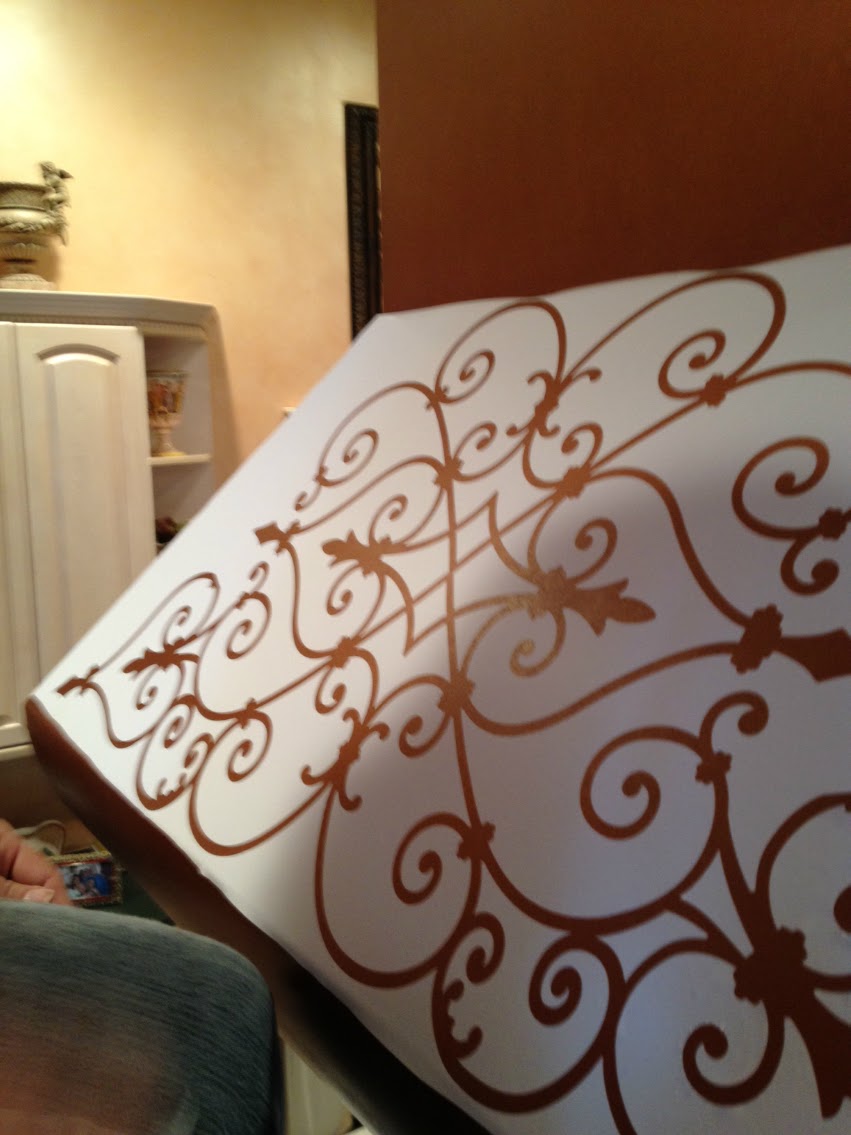
I suggested a few decorative motifs from Modello Designs – which I’ve talked about before (see the post about how I used an intricate one on my ceiling Here. This company makes one time use stencils that are truly gorgeous and intricate. Staci chose a lovely wrought iron gate looking design, which would go with the look in her kitchen. She has a lovely piece of wrought iron artwork over one of the doors in her kitchen, so the design would pick up on that. The placement of the design on the hood is perhaps one of the trickiest parts of the process. You have to measure and measure again to make sure the stencil is level and not lopsided. The adhesive on the underside of the Modello is pretty darn tacky…so if you make a mistake – it’s not all that forgiving. So – measure twice…place once!
That’s me and my knee up on the scaffold

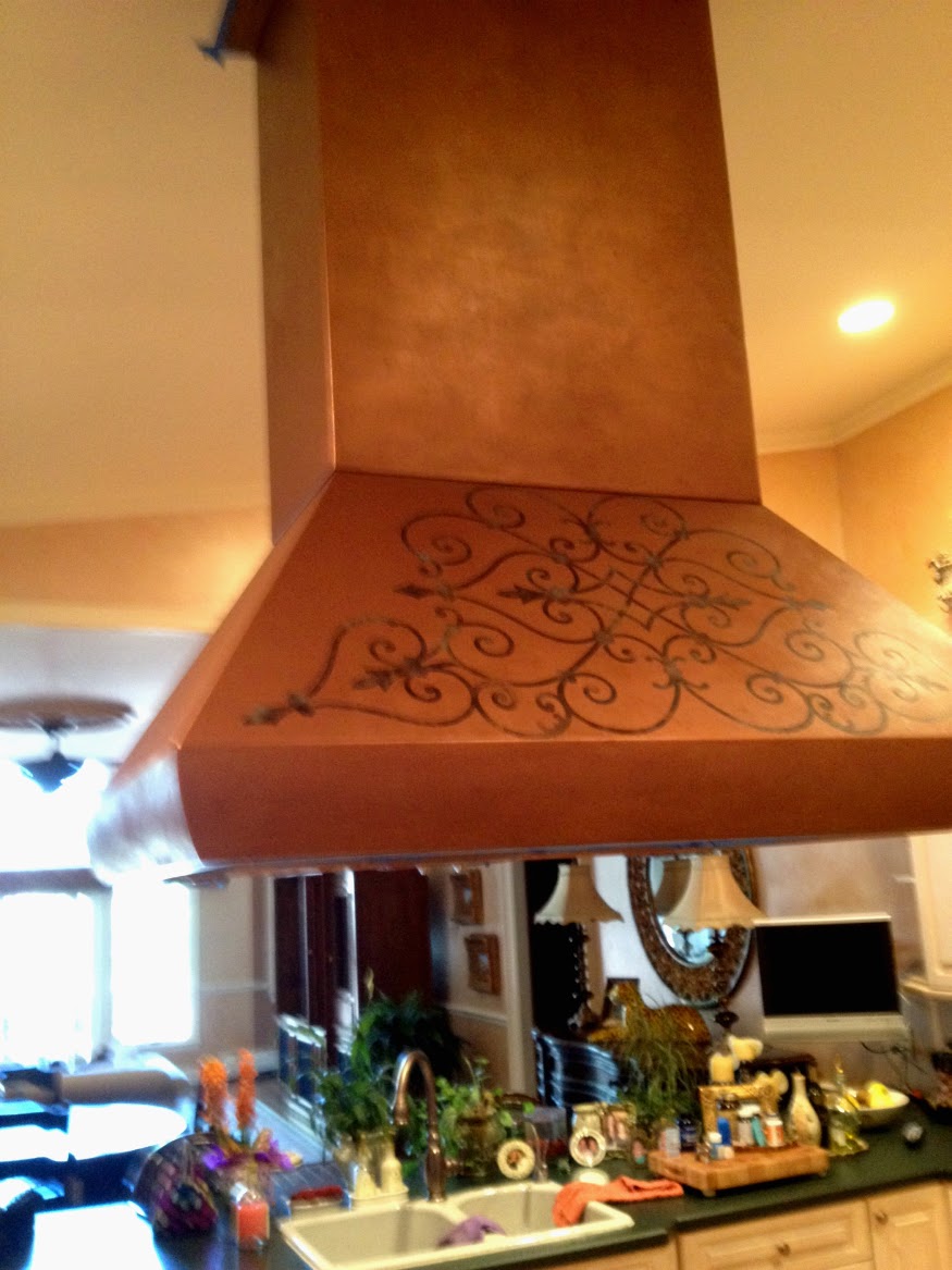
The design done with dark brown, copper, gold, verdigris and black
Looks lovely, huh? You always need to do a sample with this method because it’s very hard to see what you are doing. Unlike a stencil, which you can lift up to see how light or dark your design is, you can’t lift this up until you are done. But the designs are so beautiful, it’s worth the extra effort to make a sample so you don’t overdo or underdo (is that a word?) a color. I wanted to effect an antique wrought iron look, so I started with an overall dark brown – and then I floated in some copper and some pale gold – and then some verdigris color. To finish it off I added some black to help pop the design and give it more depth. Then I gave the entire range hood an antiquing glaze of brown and dark brown…just enough to age it gently and to cut down on some of the shininess of the metallic base.
I hope you enjoyed this little tutorial. So, if you have a range hood like this – don’t despair. It can be made beautiful! Let me know what you think of this transformation!

Thanks for looking! Please leave me a comment or a question.
I will be linking this project up to…
Thanks for stopping by The Colorful Bee! Stay in touch and never miss a post.
*Subscribe to receive an e-mail when a new post is up, HERE.
*Subscribe to receive an e-mail when a new post is up, HERE.
27 Comments
Posted in Uncategorized
Welcoming in Summer! Transforming a Mantle to Celebrate the Season
Although we had a wonderfully snow-free winter (almost, except for the freaky Halloween and one other little storm), I always look forward to the warm weather, swimming, barbequing, sailing and just enjoying going outside without a coat! I’ve already been in our pool – the water temp got up to 79 degrees (and I know that most of you have to wait til it’s high 80s and above) – but I just had to kick start summer by jumping in.So, my house had to get a summer thing going on…and the first place is the mantle! Since we live a block and a half from water, I had to add some sea fans, starfish and coral. And – the birds are a must. My husband’s favorites are the small piping plovers, which are endangered here on Long Island.
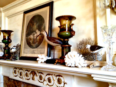


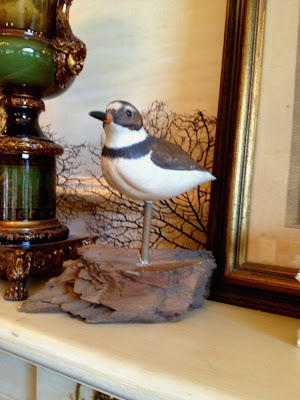
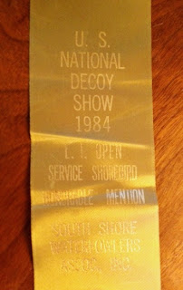


I picked up the bird carvings last summer when I went to pick up an outdoor rattan seating group on Craigslist. The young man selling me the rattan told me that he had some other items from his dad’s house that he needed to get rid of and so…of course I had to take a look. The carvings, done by his father, were sitting in dusty boxes but I could see they were wonderful. In fact, one of them got an Honorable Mention in a National Decoy Show.
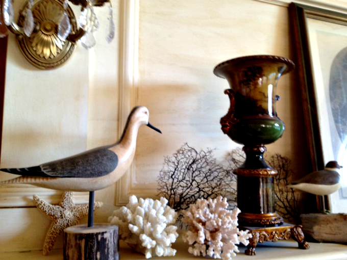
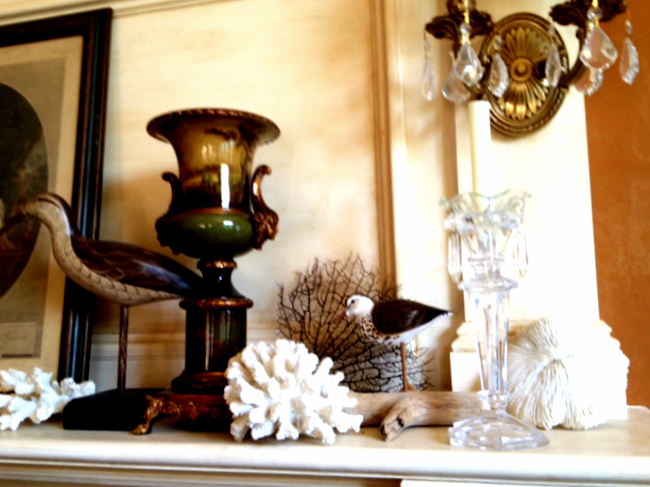
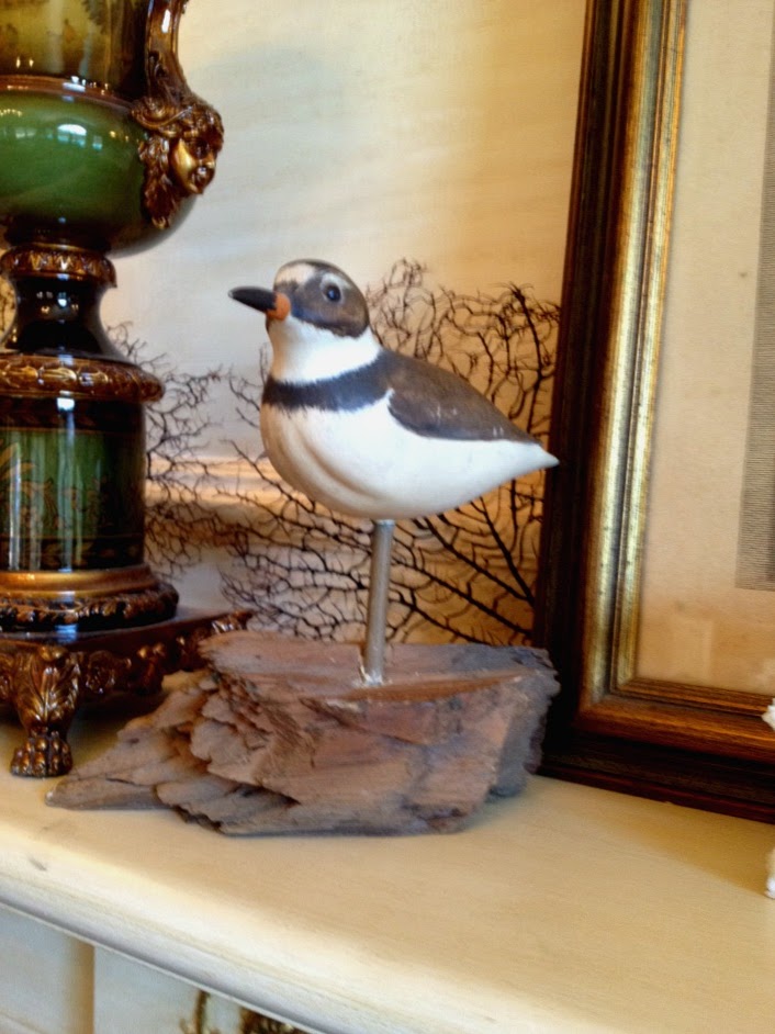
Here’s the winner! My husband’s favorite.

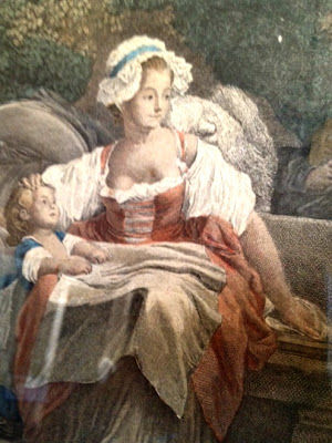
And whenever I decorate anything in my house, there always has to be things that jog my memory and bring me back to a different time in my life. One of these is the centerpiece, the framed antique print. I’ve had this since about 1979 and I bought it in Manhattan at the Argosy Bookstore on 59th Street. The Argosy, still in business after 87 years, is a treasure trove of old prints and books that I always loved to browse in. Back then I only had a little bit of money to spend on artwork – but this wasn’t too expensive and it reminded me of myself with my children. I was a single mom then and this image helped get me through some hard times.

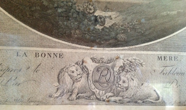
The title “The Good Mother” gave me solace when times were bad
I didn’t even have the money to get it framed but years later a wonderful boyfriend got it framed for me. It was done beautifully with an gold and antique blue frame – which used to go with my living room furniture. But in my home now, I had to re-stain the frame in an antique green to blend better with the decor on the mantle.

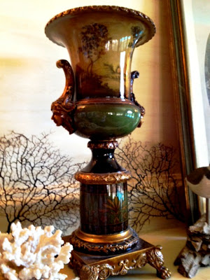
And the urns? Well, these were the first things I bought at the New York Gift Show when I went into the design field. They look antique (although they aren’t) and the landscapes on them seem to go well with my antique print.

So, I hope you enjoyed my little homage to summer (with some of my memories thrown in!).
You might also enjoy reading how I created the mantle and gilded and antiqued it. Click here to read about it!
I am sharing this project with….
Thanks for stopping by The Colorful Bee! Stay in touch and never miss a post.
*Subscribe to receive an e-mail when a new post is up, HERE.
*Subscribe to receive an e-mail when a new post is up, HERE.
16 Comments
Posted in Uncategorized
The San Francisco Decorator Showcase 2012: Part 2
As promised, some other images and ideas from the Showcase House in beautiful San Francisco, CA. The Showcase was situated in Laurel Heights, which is one of the most beautiful enclaves in SF. There’s a lot of history in this area – and the surrounding houses show it.
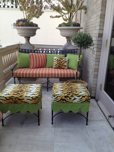
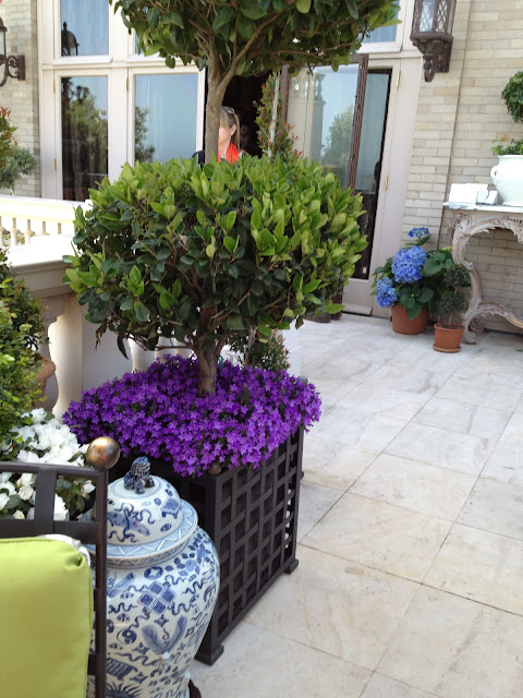
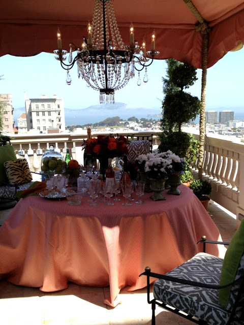

One of the most lovely areas was the upstairs terrace. I could have stayed there all day! It had views that went on forever of the area but the decorations on the terrace itself were so incredibly gorgeous.
The “Roof Terrace” by Frank Holbrook Design
I just loved this furniture from the Barlett Collection with these tiger striped ottomans with the green and coral fabrics.

The plantings on the terrace were so colorful and sumptuous (and more purple hues!)
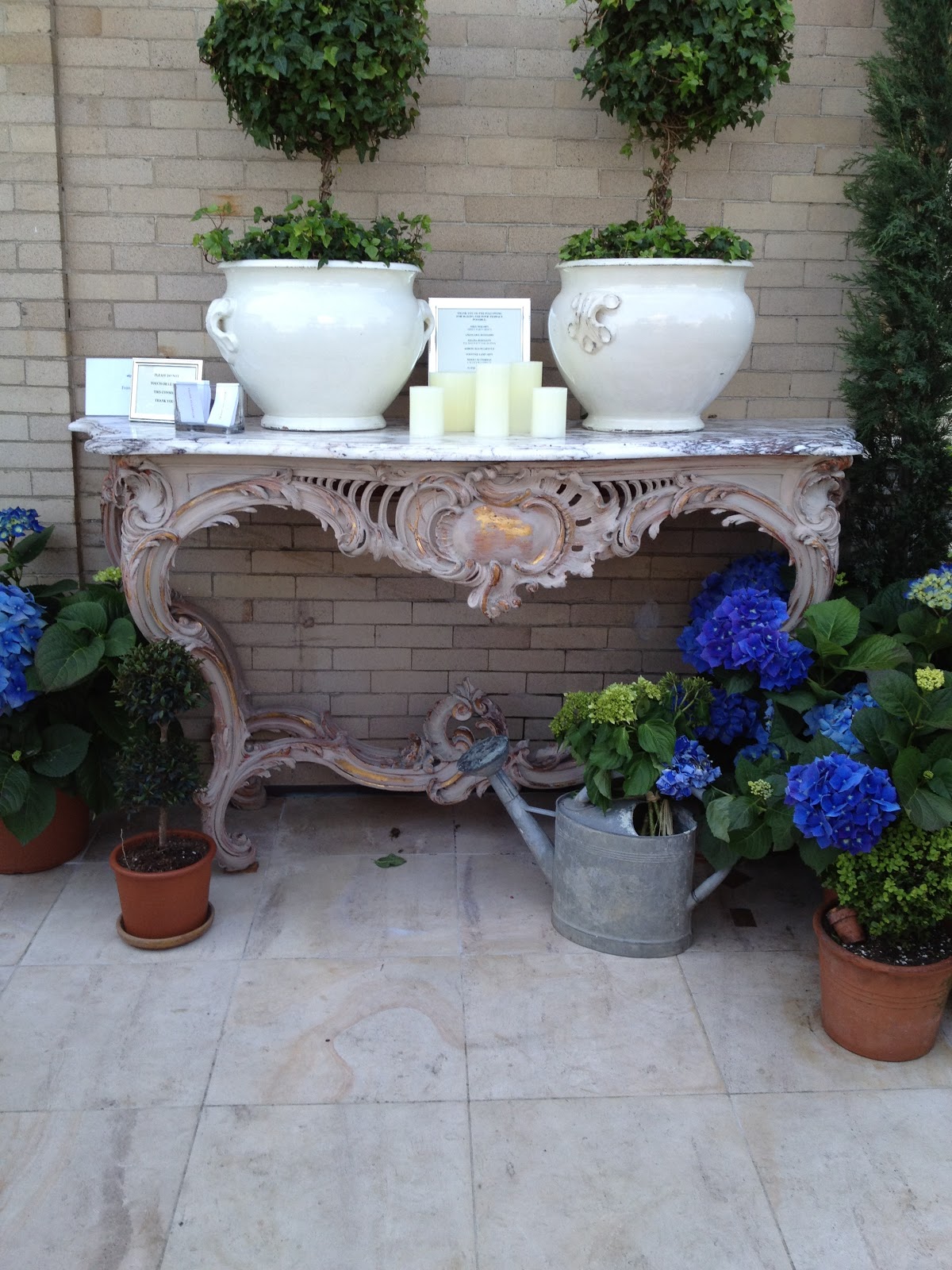
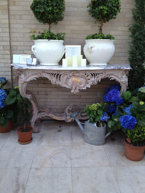
I loved this 1920s marble console, which the designer aged by painting over the original brass base. Purists would say “Don’t touch it!” but I think it looks great and in keeping with the theme and color fo the terrace. Beautiful job! I love the old watering can with the hydrangeas spilling out – I have been thinking of doing this with an antique red watering can that I bought recently at the New York Gift Show.

Look at the views and the wonderful table setting! Woudn’t you want to just sit here,
relax…and have a cocktail?
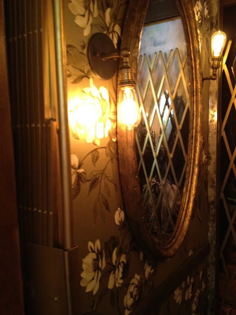
Some of the more unusual designs at the Showcase, included this really unique and beautiful elevator in the home that was inspired by Alice in Wonderland. Designed by Lawanna Cathleen Endonino, the outside was a nailhead studded keyhole on the faux ostrich door.
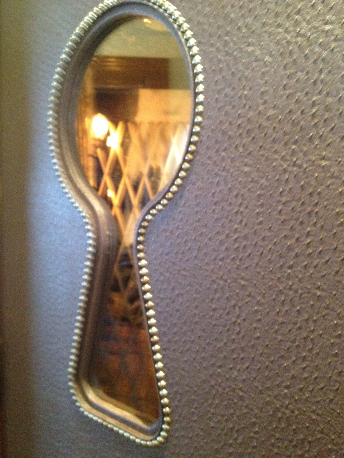

The picture above doesn’t really do it justice – but it was a lovely vignette with wallpapered walls of Osborn & Little/Designer’s Guild Nubucco Gold Watelet Wallpaper. Once inside it was difficult to tell which was was in and which way was out! There was soft music playing and wonderful mood lighting. I loved it.
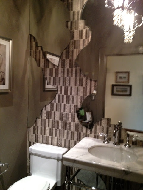
Another unusal room was the upper floor powder room. I stayed inside this room for a while because it was really so unique. The mirror was a work of art.
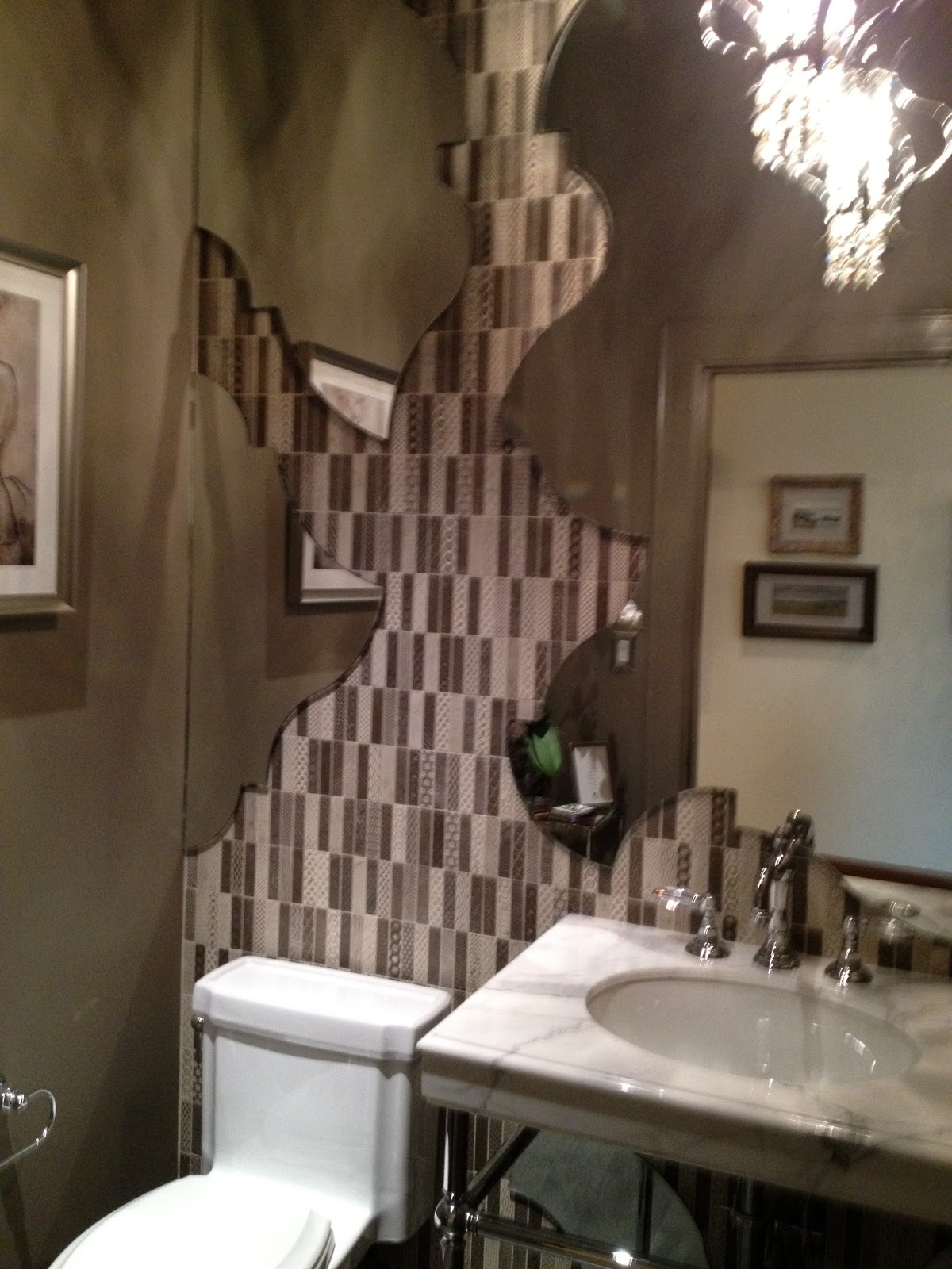
The designers, Joe McGuire and Sophia Kabler Cowley of KCS Inc, wanted to blur the typical lines of mirror and vanity and so they created this mosaic of tile and mirror on the wall. The mirror cuts away to reveal “Tacciato Diva” tile by Walker Zanger. This artistic feat must have taken many days to do – it was really beautiful.
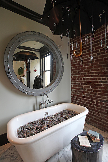
Another unusual room was the first floor bathroom. This was a” bathroom as gallery.” created by Ma(i)sonry designers, Michael Polenske and Carissa Duncan. It featured a chandelier made of an umbrella with “airport-confiscated” scissors hanging from it and a clawfoot tub filled with scissors.

This room also featured repurposed fixtures and petrified wood – as well as antique books and other treasure (notably a sculpture made from book pages).
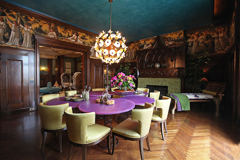
Another very unusual room was the Dining Room. I could have stayed there for hours, just eyeing all the beautiful changes and designs in this room. Created byMarysia Rybock of Scavullo Design, this very clearly grand, Victorian architectural space was transformed into a modern and informal place to eat and entertain. Also note, the room was sporting some high chairs and splashes of purple/lilac – which I found in many of the rooms in the Showcase.
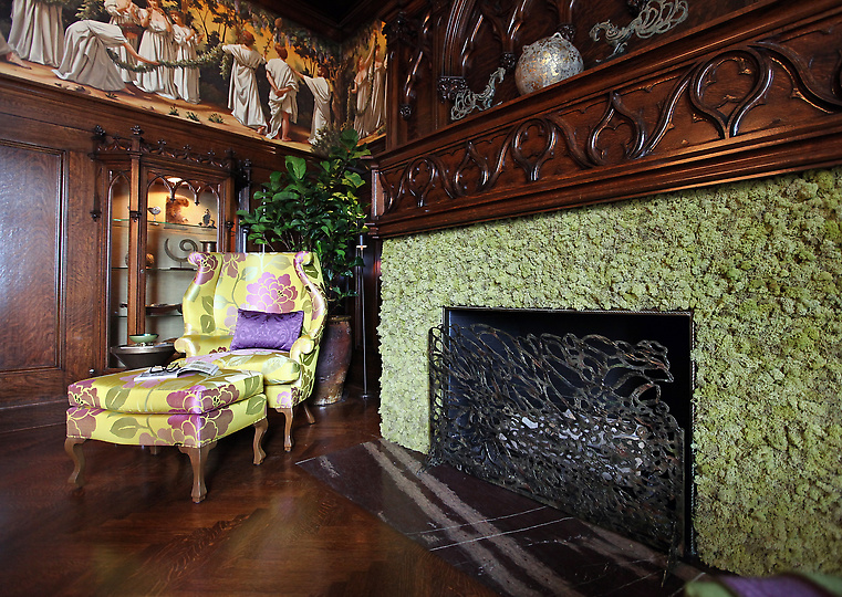
The use of multiple resin tables makes the room more playful, modern, as well as informal and functional. I loved the creative use of reindeer moss on the stone fireplace that was beyond repair. This was a stroke of genius – and it adds to the whimsy of the room. Another modern touch was on the traditional mural that had some “bubble quotations” from the figures, i.e. “I never looked so good.”
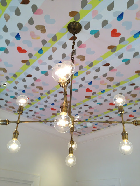
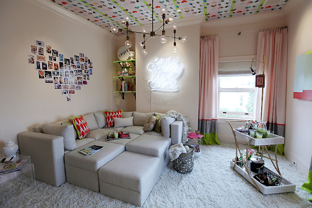
Another fabulous room that was out of the ordinary was the “Teen Only Hang Out Room,” designed by Emily Meghannam of EM Design Interiors. Just one look at the ceiling’s removable wallpaper and the funky chandelier, you knew you were in for a unique treat.


I loved the sofa pit idea – my kids (and I) would have loved a room like this. I thought that the heart shaped photo collage as a focal point was a great idea – something I would like to do in my stepdaughter’s room at home. I also loved the retro use of the bar cart and the neon sign saying “You Only Live Once.”
More images coming soon!!! Hope that you enjoyed this. For more information go to San Francisco Decorator Showcase. The show runs until May 28th. The location is 202 Jackson St in San Francisco. It’s so worth a visit
Thanks for stopping by The Colorful Bee! Stay in touch and never miss a post.
*Subscribe to receive an e-mail when a new post is up, HERE.
*Subscribe to receive an e-mail when a new post is up, HERE.
10 Comments
Posted in interior design
Here are a Few of My Favorite Images from the San Francisco Decorator Showcase 2012: Part 1
.jpg)
Hi everyone…I had the pleasure of attending the San Francisco Designer Showcase yesterday with my daughter, Jessica. We stole some precious “girl time,” since daddy was going to mind my little granddaughter, Peyton.
Most of the pictures, taken with my iPhone, were a bit rushed because even though I was technically allowed to take photographs because I am a design blogger – it seemed every docent in the Showhouse hurried me on when I was snapping away…and there was always someone in my way!! Anyway – the people at the Showhouse were much more lenient than any I’ve experienced in New York.
.jpg)
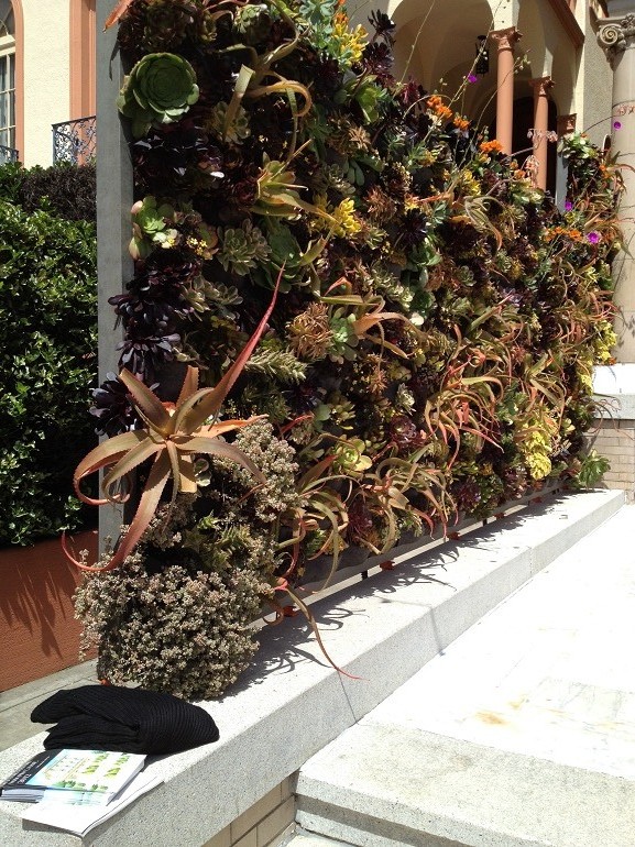
The first thing you saw was an entire green wall, made from beautiful succulents, designed by Davis Dalbok of Living Green as well as Plants on Walls. I would love to do this in one part of my backyard. This is gorgeous.


The beautiful sculpture just adds to the serenity
The entry hall, by Dara Rosenfeld, was beautiful. I gravitated to the zebra Porter chairs that flanked a very stately fireplace first. I had blogged about Porter chairs before – the history of them and how they are being used now. You can read that post HERE.
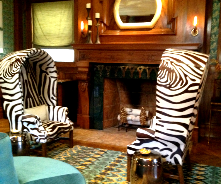
The zebra hide Porter chairs are drop dead gorgeous!
The gorgeous fireplace mantle in the hall is original to the house
Other trends at the Showcase House…
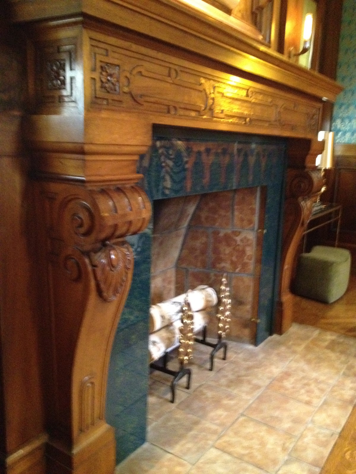
Besides these chairs, many rooms sported other kinds of tall chairs. I also saw several striped rooms, but instead of vertical…they were horizontal.

I love how the designer, Heather Hilliard Design, just ignored the panels (and the fireplace columns, see above) in the room and had the decorative artist – Willem Racke – stripe right over them. Trust me – that is not an easy thing to do because the woodwork etc. will tend to get your stripe off kilter. It seems to lend a sculptural quality to the room and it blends so beautifully with the other elements in the room. (And speaking of sculpture – look at the fireplace screen!)
Even the custom headboard was striped – this increases the peacefulness and the serenity of the room.

I’ve heard that some people don’t understand horizontal striping – but when done beautifully, as in this room, it lends a peaceful quality to a space. You know how calming it is to look at a horizon? That’s the effect that horizontal stripes have in a room. And you feel peaceful in this bedroom – so it really works.
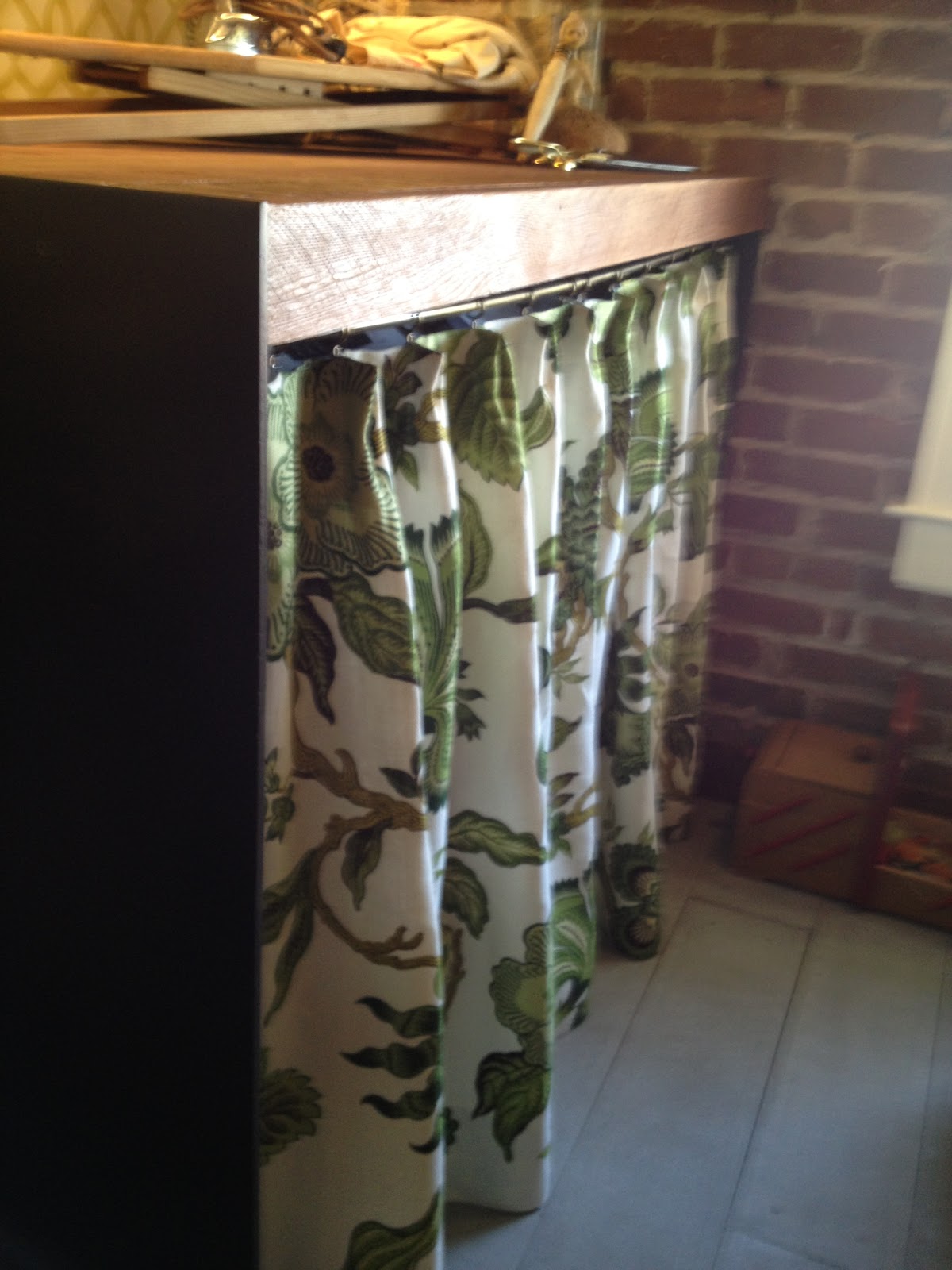
Another trend I noticed was the use of natural materials – burlap and linen and fabric, in general, to cover open shelving, as below.
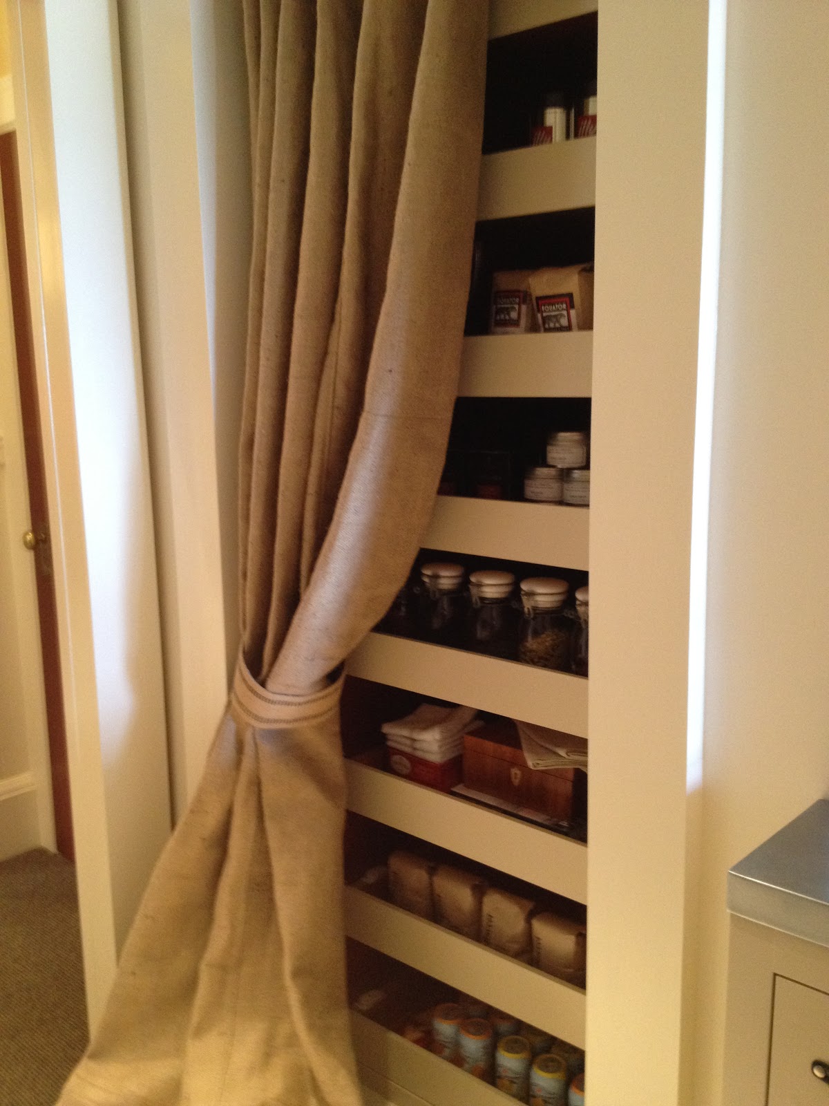
Fabrics were used to cover unsightly items – like the washer and dryer below in the “Press Room,” by Lisa Bakamis Interior Design.
More of the Press Room – using some of the other trends…graphic, trellis wallpaper and mounted black and white photos (love the “black strip”s over the eyes – a humorous touch)
And fabric – this time an Hermes scarf, was used behind glass paned cabinets…
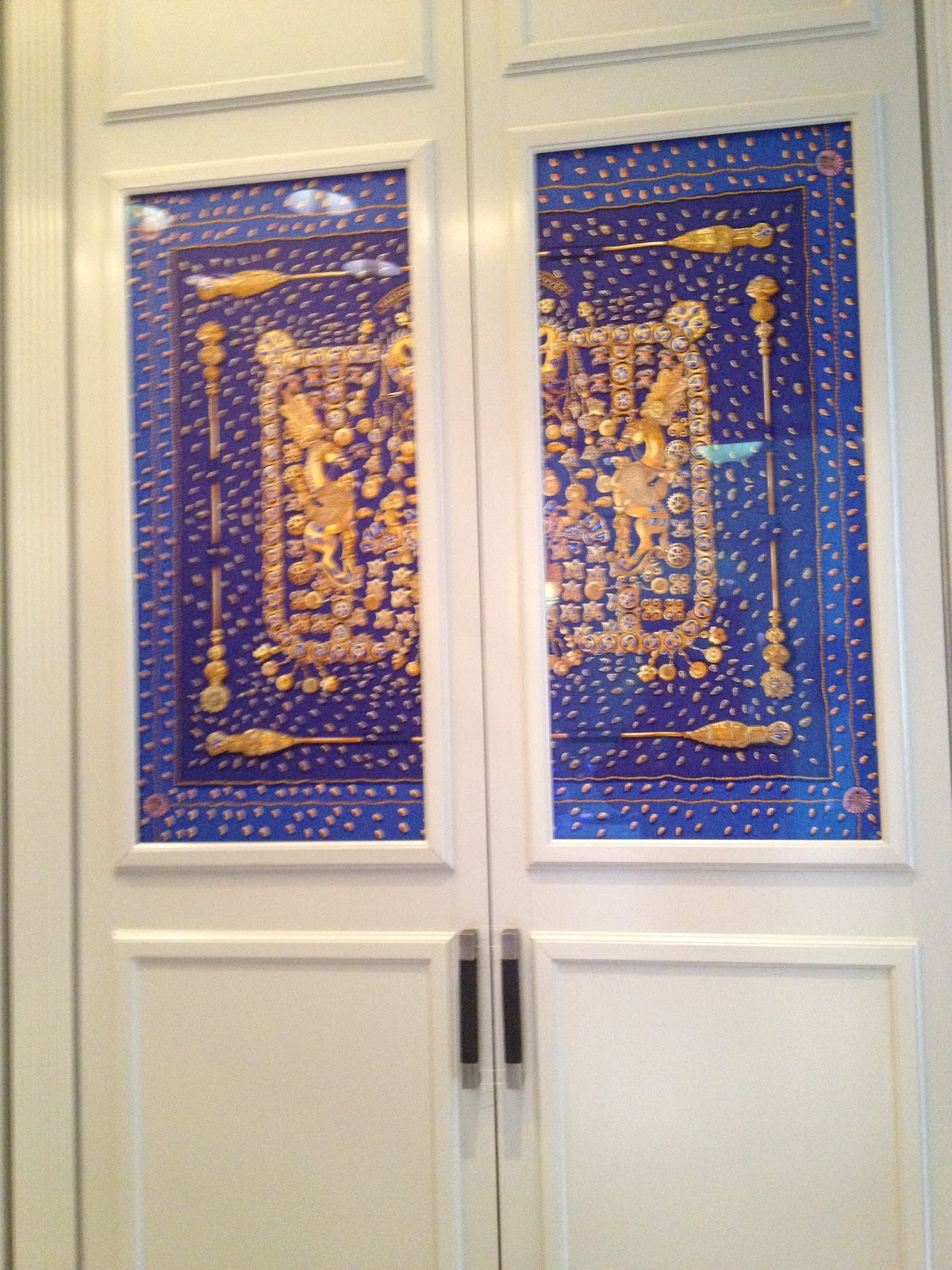
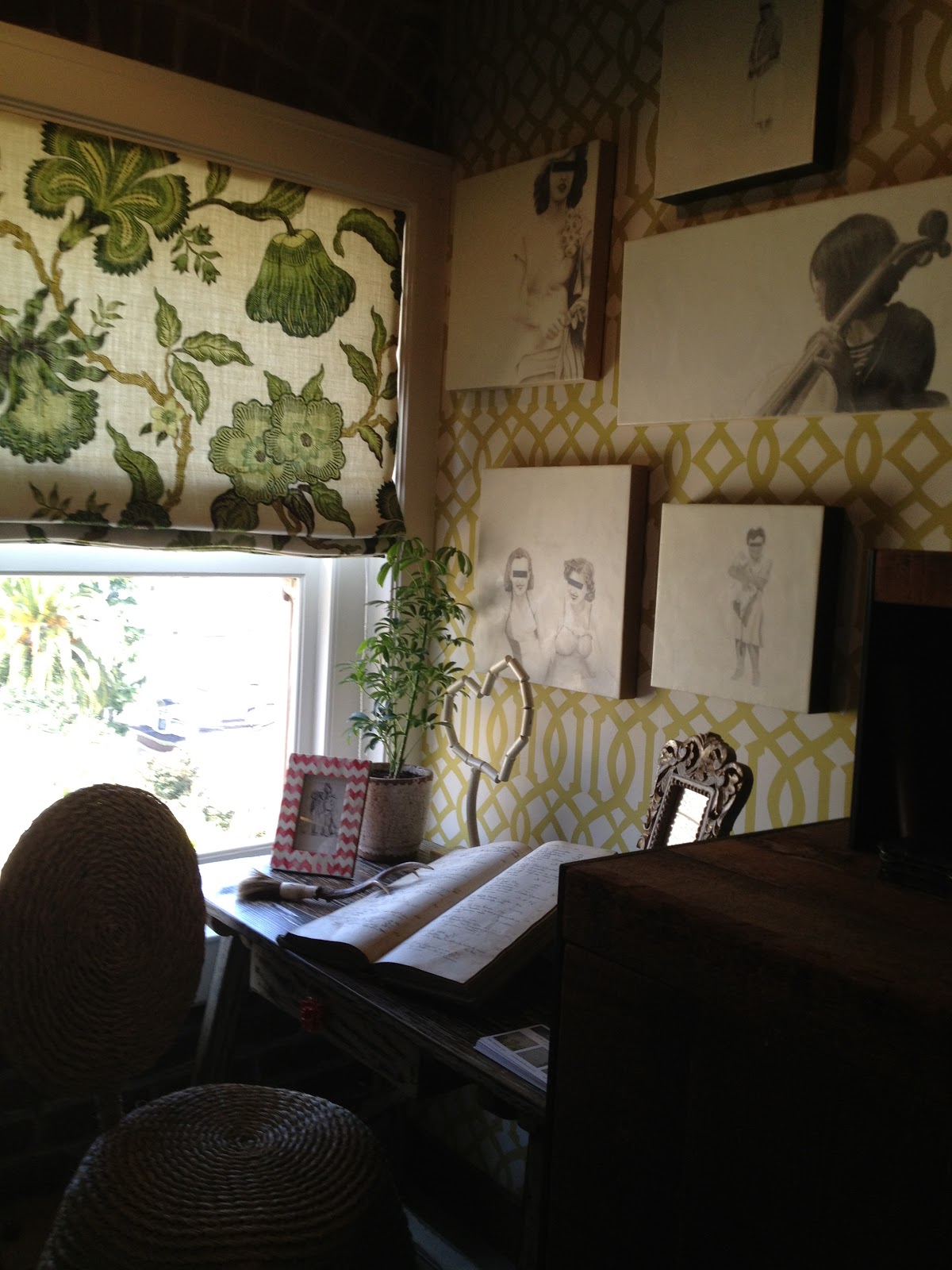
From “Her Office,” designed by Catherine Kwong
There was also a lot of purple and lavendar fabrics and colors being used in the Showcase. I was really taken with this lovely bathroom by Tineke Triggs of Artistic Designs for Living.

The sconces, by Visual Comfort, lend a sophisticated elegance to the room. I just adore the pattern on the wall. It was taken from the designer’s favorite fabric – but blown up and stenciled on the wall by Laura Smith Blair. It looks a little like Jane Shelton’s Vermicelli Square – but I’m not 100% certain. Anyone know this pattern?
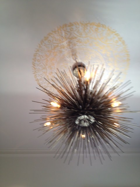
And the ceiling in this bathroom, featuring a beautifully stencilled design in gold, was made more lovely with this chandelier, from DeSousa Hughes, which echoes the sunburst mirror.
Other touches of purple include…

From “Her Office” by Catherine Kwong
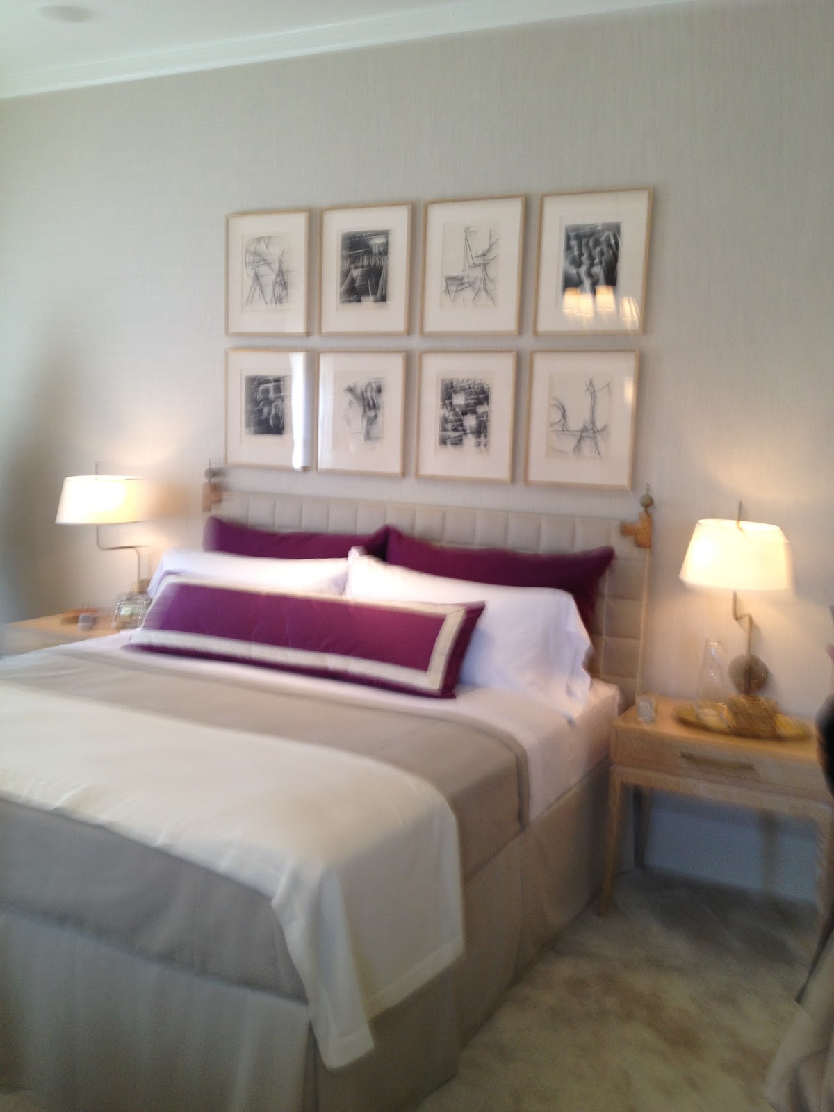
Guest Bedroom by Matt Murphy Studio
More images and trends from the Showcase in the next post!
Thanks for stopping by The Colorful Bee! Stay in touch and never miss a post.
*Subscribe to receive an e-mail when a new post is up, HERE.
*Subscribe to receive an e-mail when a new post is up, HERE.
6 Comments
Posted in interior design
Another Decorative Idea for Wainscoting: Raised Stenciling Over Stried Texture
Hi Everyone…


I just wanted to do a quick blog post while I’m away in CA. I have to go back to this home to take better photos…but I thought I’d share another idea for panels in wainscoting.
A friend of mine, interior designer, Rosemarie Spratt, wanted something very special for her entryway – she wanted it to be drop dead gorgeous! Oh boy – not too much to ask of me, right? We first used a cinnamon color on her walls – and then troweled on a metallic plaster in a brown suede color from Modern Masters on her walls.
1) For the wainscoting panels – you can use any texture you’d like, but I used a mixture of two products from Faux Effects – 1 part PlasterTex and 1 part Softex. I rolled it on and then I took a wallpaper brush and stried the texture to form a vertical design.

Before…Nice, but Plain!

During
2) Then, after it was dry, I did an embossed stencil. I used two designs from Royal Design Studio – Delicate Floral Panels. Size-wise, they fit these panels perfectly. To get the raised design, I used PlasterTex as the texture. Then, I let it dry.
3) I painted all the panels with a bronzey/copper metallic paint. Again, you can use any one that you’d like but I used two mixed colors of Faux Effects’ Metal Glow paint.
4) When that was dry, I antiqued all the panels with a dark brown glaze.

The Entryway After
5) For the final touch, I antiqued all the moldings with the same dark brown glaze.
Here are some other pics from the project…


And here’s a peek into her powder room, while I will blog about very soon!!

This was a fairly huge entryway, so the entire project took about 8 days to do. But – it was so worth it – Rosemarie loves her entryway – and that’s the most important thing, right?
I promise to go back and re-shoot this project. So, please return again soon to see more pictures of this gorgeous room.
Thanks for looking! You also may want to see another way I decorated wainscoting – with burlap…HERE
I’ll be linking this project up to…
Thanks for stopping by The Colorful Bee! Stay in touch and never miss a post.
*Subscribe to receive an e-mail when a new post is up, HERE.
*Subscribe to receive an e-mail when a new post is up, HERE.
19 Comments
Posted in Uncategorized


 Decorative Finishes
 Interior Design
 Home
Home Garden
 Holiday
 Makeovers
 My Life
 Business
 Tutorials
 Videos
 Paint
Paint