
-

-
Subscribe
Thanks for stopping by The Colorful Bee! Stay in touch and never miss a post. Subscribe to receive an e-mail when a new post is up, HERE.Sponsor
If you're interesting in advertising on The Colorful Bee, click here to learn more.Contact
You can also email me at Linda.Leyble@gmail.com -


Categories
Subscribe
Popular posts
-
Recent Posts
Blogroll
Links

Author Archives: Linda
Annie Sloan’s Chalk Paint
I just started playing with this paint from England – and I think it’s really terrific. I have to do a few more pieces (thinking of re-doing my entire dining room furniture – every bit of it!).

But to start with – I just did two small entry tables and a mirror (actually – it’s a frame that will become a mirror!).
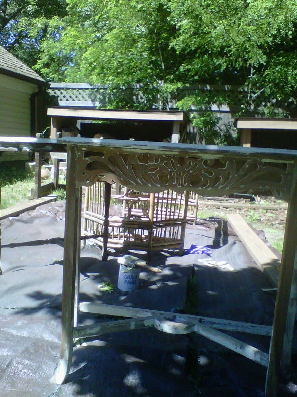
This is one table with a faded brocade stencil on top.
Here’s what it looked like before…chippy, with half of its paint taken off
Here’s a table I picked up for $25 from Craig’s list…before
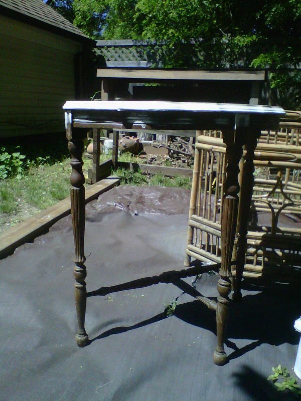
Here it is after – with Paris Gray and Old White and some Dark Wax


In the future, I plan on putting a mirror on top of it – and I’ll antique the mirror. I think it will look incredible. It won’t be going in this spot in my entry (colors don’t match!!). I will probably use it for staging one of the homes I do in the future.
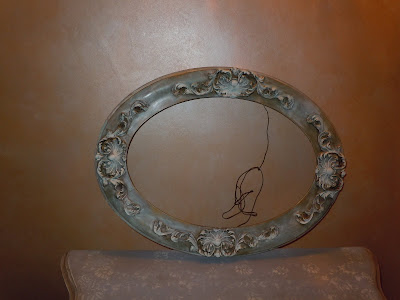
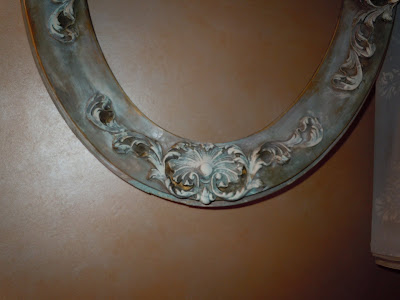
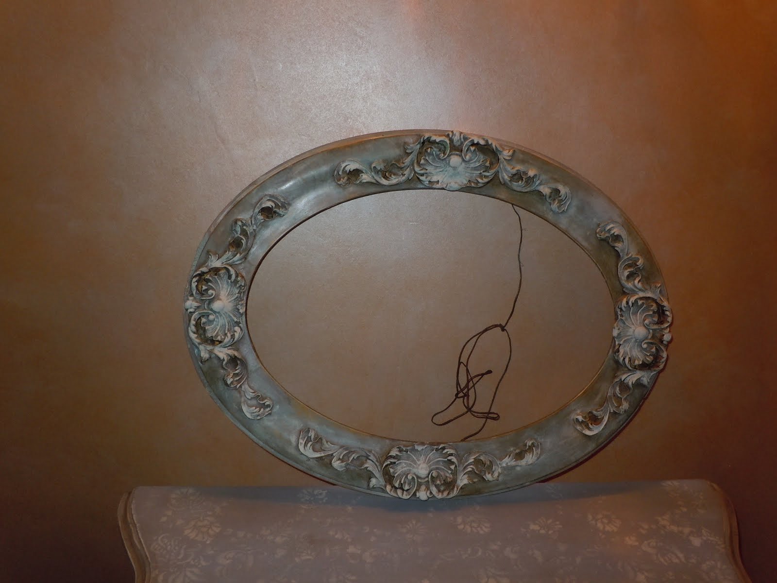
Now…for the mirror frame. I bought this ornate frame in an antique store in Sag Harbor. The store was going out of business, so I got it for a song – $20. It was dusty – but a nice shade of pale blue – so I just enhanced it a bit. I used some Chateau Gray, Paris Gray and Old White to highlight the carvings. I waxed and buffed – and put some Dark Wax in the crevices.
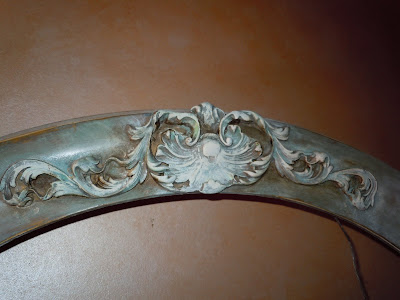
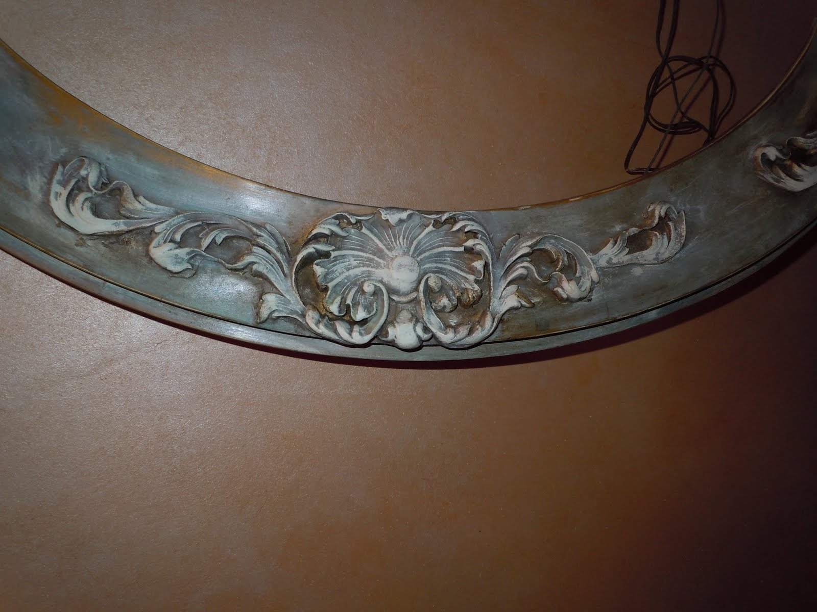
Here’s a closer look…


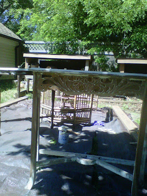
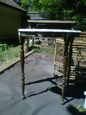
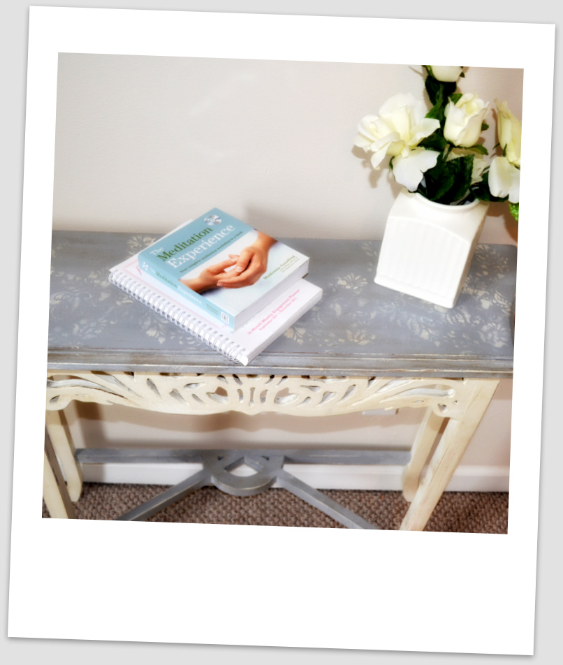
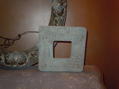
Then I started playing with some old things in my studio that had great promise – but somehow they didn’t turn out all that great. Would Chalk Paint save them? I think so! I took a frame that I had done some quilted texture on – plus an embedded stencil. I had originally painted it an off white – and it looked great. Then – I mucked it up by painting it a coppery metallic and it just didn’t work. So – I tried some Chalk Paint on it – then sanded away.

If you would love to have some of your old pieces of furniture revived, call me at 631 793-1315. I would be glad to create something beautiful out of an old, forgotten piece.
Thanks for stopping by The Colorful Bee! Stay in touch and never miss a post.
*Subscribe to receive an e-mail when a new post is up, HERE.
*Subscribe to receive an e-mail when a new post is up, HERE.
2 Comments
Posted in Annie Sloan's chalk paint
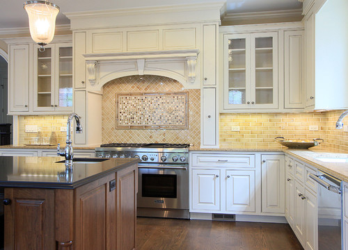
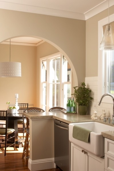
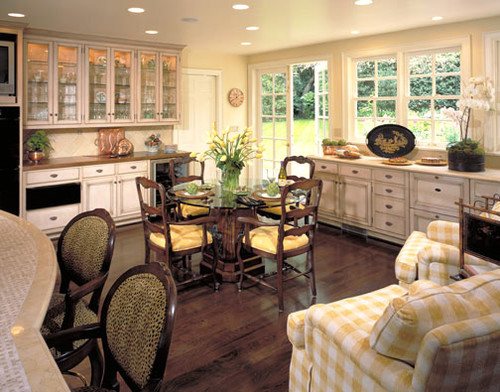
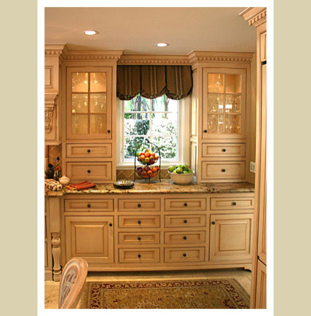
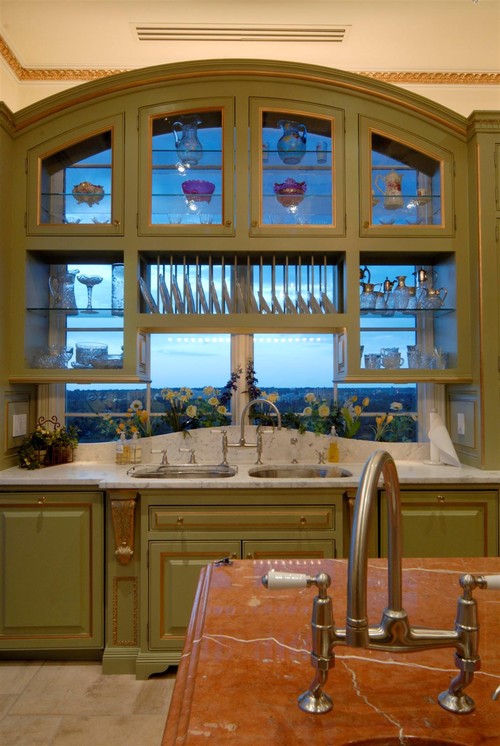
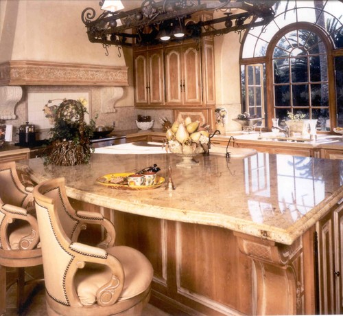
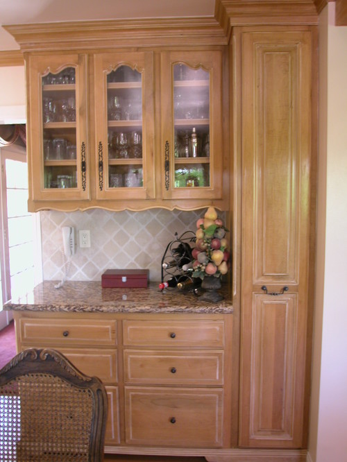
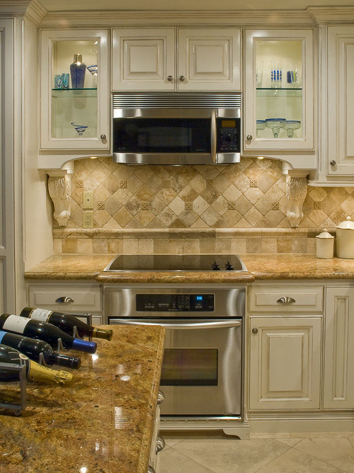
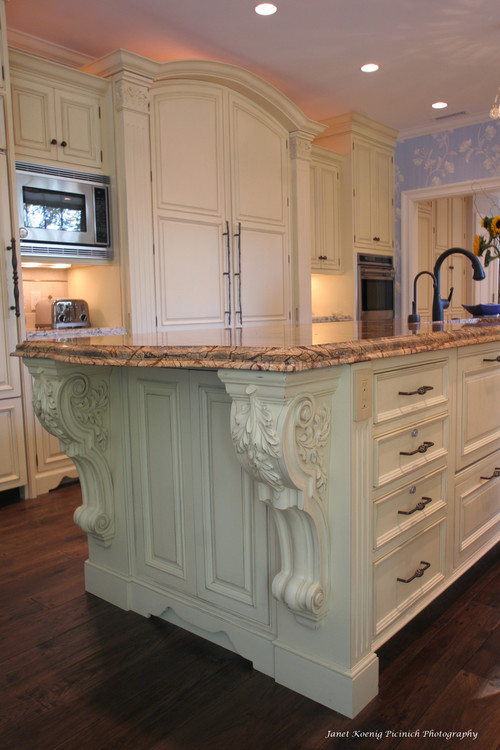
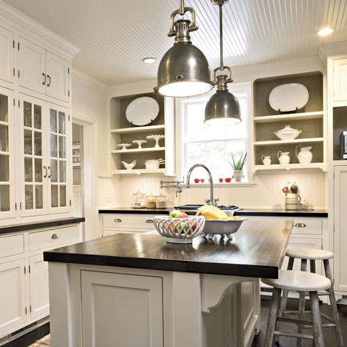
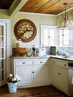
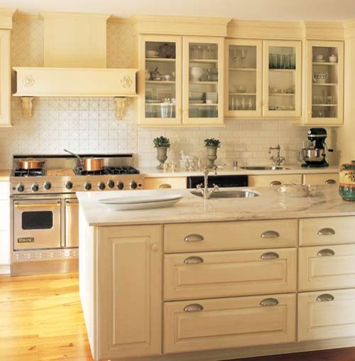
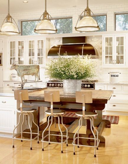
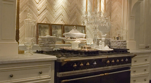
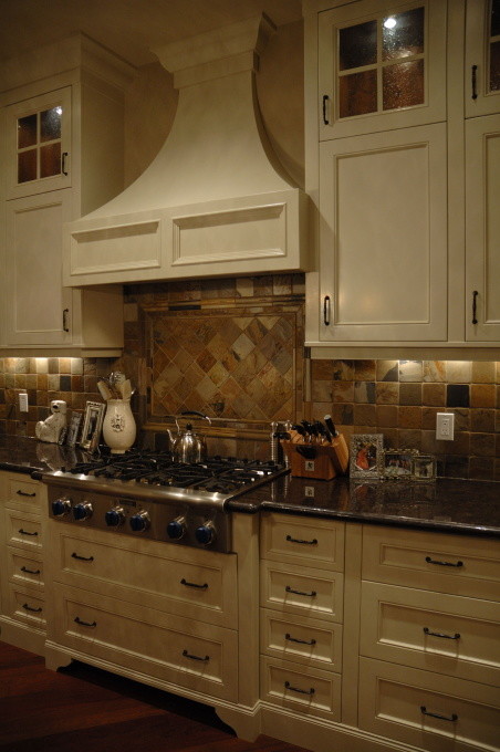
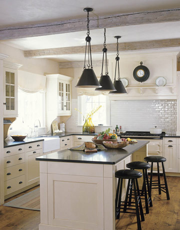
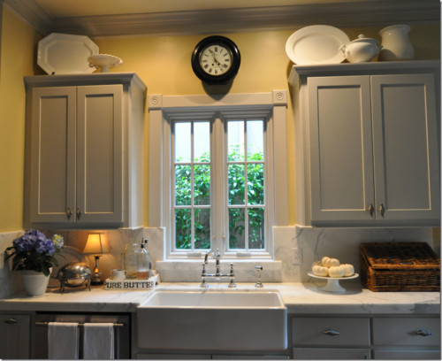
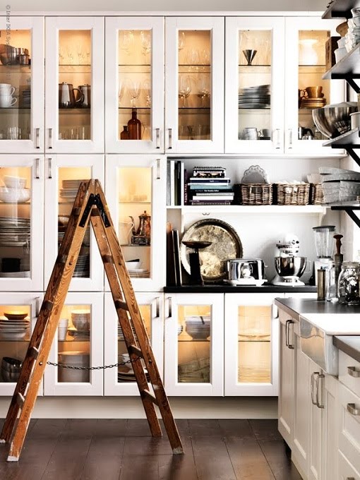
Some Inspiration Photos for a Client Who Wants to Remodel Her Kitchen
Tomorrow I am seeing one my clients who wants to have a beautiful new kitchen. Here are some photos I will be sharing with her for inspiration.
Thanks for stopping by The Colorful Bee! Stay in touch and never miss a post.
*Subscribe to receive an e-mail when a new post is up, HERE.
*Subscribe to receive an e-mail when a new post is up, HERE.
2 Comments
Posted in Uncategorized
Happy Easter! Some Beautiful Easter Tablescapes & Some Last Minute Easter Gifts!
It’s Easter! I love this holiday because it’s a harbinger of spring and warm weather – and you really don’t have to go crazy buying a million gifts like you do at Christmas time. It’s just a lovely holiday that you share with your family and friends.


It’s a great time for decorating…so I thought I’d share some great ideas for tablescapes and more. I’l be sharing some great places to buy last minute gifts and decorations also.
With Easter table settings, you can express your creativity – and more is more. So bring out your pastel tablecloths (a soft pastel paisley tablecloth would be great!) and napkins, white dinnerware and cups – and head over to Michael’s for some inexpensive faux daisies, forsythia etc. Check out the wedding aisle for some tulle and other fabrics that you can fill an inexpensive vase with – and you’re on your way.
Oh – and don’t forget some pastel M&Ms and other goodies!
An “aerial view” of the tablescape by Courtney & Phronsie Dial from CourtneyOutLoud blog
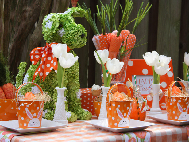
If you would like a more vibrant way to dress your table, this setting (in my favorite color combination of green and orange) would be right up your Easter alley. A clear glass vase with cloth carrots is a creative centerpiece. I adore the dog topiary with the orange and white bow! If you have some patience and time, you could make one from a foam model and then stick faux greenery through it. Add a checkered tablecloth and white plates (love the square ones used here), personalized orange and white Easter baskets with name tags – plus some white tulips (faux or real) in milkglass vases and you have a beautiful setting…ready for guests.
Courtney & Phronsie Dial from CourtneyOutLoud blog
Courtney & Phronsie Dial from CourtneyOutLoud blog
You could also add these little numbers of you are a great baker. My friend and dynamo realtor – Dianne Scalza of Netter Real Estate in West Islip NY could whip these up in a heartbeat. She is such a talented baker – among other things. And probably as I am writing this, she is whipping up some conconctions. If so, I’ll add them to this blog! But even if you’re not a baker – how easy are those skewered Nabisco’s Marshmallow Sandwich Cookies. I could do that! You could also just add your own creative toppings to a plain cupcake!
Susan Herrin from the blog BetweenNapsonthePorch
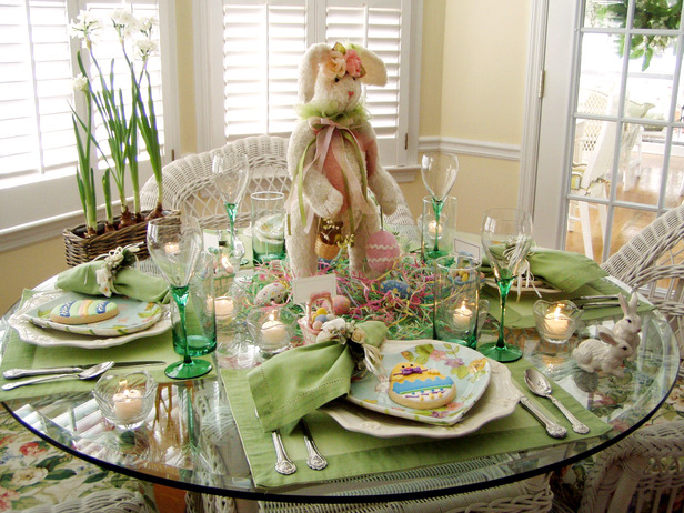
Continuing with the green theme – but adding more kid flair, add some decorated egss on faux grass in pastel colors on a plate…with a beautiful plush bunny as the centerpiece. Use colorful plates, green napkins, placemats and stemware – and a colorful cookie to greet your guests.
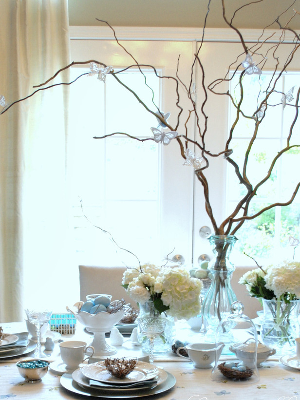
If you are looking for a more ethereal, natural tablescape – here is a great inspiration for you. Use a clear, glass vase and take some curly willow or some long, bare twigs from your yard and add some beautiful butterflies to it here and there. I purchased some great, inexpensive ones from Michael’s around Christmas time – hopefully they still have them. But you could use clip on birds or bees – anything natural would do to attach to the branches. In smaller clear vases, add some white flowers and have some curly willow flowing from the centers or sides.
This is a fun and easy tablescape to do. A natural runner is the starting point, with a serving tray with with a bed of straw (or you could use faux grass), with a wire bunny, eggs – and for fun – some faux ants! The surrounding plates are easy – with a napkin folded underneath the teacup filled with a pear – or you could have colored eggs or candy. I see that the faux ant makes an appearance on one of the cups as well. Hanging from a chandelier could be an egg wreath with grapevine wound around it. You could place a bunny on either side of the table as well.
All images above are from HGTV where you’ll find other ideas as well.
You might want to shop for some other goodies and fun items (or perhaps get crafty and make some things for you and your family). Here are some great. last-minute ideas…

Some decoupage eggs from Pottery Barn

Some copper cookie cutters from Sur la Table

Some decoupage eggs from CatnipStudio.com
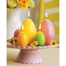
Easter egg candles from Pier 1

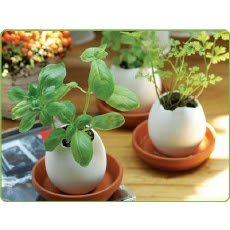
Egglings from Urban Outfitters – which have herbs in them…how lovely on a windowsill

A pretty basket for the chocolate lover from Red Envelope

Don’t forget your four legged friend with this Hop-A-Long outfit from Etsy

Some Mommy & Me matching aprons from Sur La Table
 |
| Some Easter Bunny glasses from CB2 |
These are just a few ideas for you to consider – so use your imagination and unearth all your pastel table items – and have wonderful and decorative Easter. And – Happy, Happy Passover to all my Jewish friends as well.
In my home in Great River, NY, I will be fast at work the next few days – getting my tables ready for Easter. I’ll be borrowing some ideas like these above. It’s fun to finally bring some bright, happy colors to the table after the dreary winter we had on Long Island.
If you would love to have some beautifully decorated rooms in your house, call me at 631 793-1315.
Thanks for stopping by The Colorful Bee! Stay in touch and never miss a post.
*Subscribe to receive an e-mail when a new post is up, HERE.
*Subscribe to receive an e-mail when a new post is up, HERE.
4 Comments
Posted in Uncategorized
Kitchen Cabinet Makeover: From Drab to Fab
One of my favorite things to do is to redo kitchen cabinets. It’s a great money-saver and it can really transform your kitchen. Here’s one that we did not too long ago.

First, we had the homeowner add some crown moldings – then we did a base color and the first coat of glaze

Here I am putting the first coat of glaze on…

I then did a oak woodgraining that matched the cabinetry. Since the tones of the oak were different in some places, I had to change my recipe a bit here and there! I then did a border stencil to look like inlaid wood on the soffit to bring your eye up – and to be more decorative.
It really changed this kitchen! The cabinets appear taller and it’s a more modern look disguising the soffits! This is a great idea for anyone who wants to update their kitchen…but especially when you are selling your home – this can really make a difference to a potential buyer.
We are doing another kitchen makeover like this the end of this month – only we are doing an antique cream finish over oak cabinetry. I will post those pics as soon as the project is finished!
If you would like to transform your Long Island home creatively, call Linda at 631 793-1315 for a complimentary design consultation.
Thanks for stopping by The Colorful Bee! Stay in touch and never miss a post.
*Subscribe to receive an e-mail when a new post is up, HERE.
*Subscribe to receive an e-mail when a new post is up, HERE.
5 Comments
Posted in Uncategorized
Stencilmania: How a Simple Stencil Changes Your Walls, Furniture, Floors and More
I love stencils!! I remember the first time I ever tried to stencil, I was living in the Pacific Northwest and I bought a few stencils to liven up my bathroom. Well, true to form back then – I didn’t read a manual or book or anything on how to actually use a stencil…I just tacked the stencil up on the wall, took a stencil brush and put some paint on it – and away I went. Well – the paint seeped through the stencil (because I didn’t “offload” the paint) and, in short, my project came to a schreeching halt!
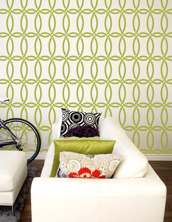
I’ve since learned how to work with these beautiful bits of plastic and there are never ending ways to use them. Melanie Royals – who is my go-to designer whenever I want a stencil – has the most incredible line of stencils in her online store, Royal Design Studio. There you can find very traditional stencils – like damasks and other allover designs…as well as some more modern, transitional patterns that would fit in beautifully in today’s interior designs. She has come out with a new line of stencils that I feel the younger, more contemporary homeowner would love.

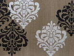
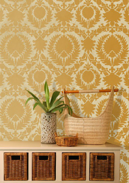
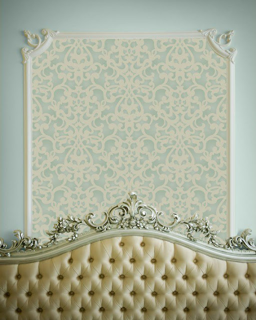


I’ve since learned how to work with these beautiful bits of plastic and there are never ending ways to use them. Melanie Royals – who is my go-to designer whenever I want a stencil – has the most incredible line of stencils in her online store, Royal Design Studio. There you can find very traditional stencils – like damasks and other allover designs…as well as some more modern, transitional patterns that would fit in beautifully in today’s interior designs. She has come out with a new line of stencils that I feel the younger, more contemporary homeowner would love.
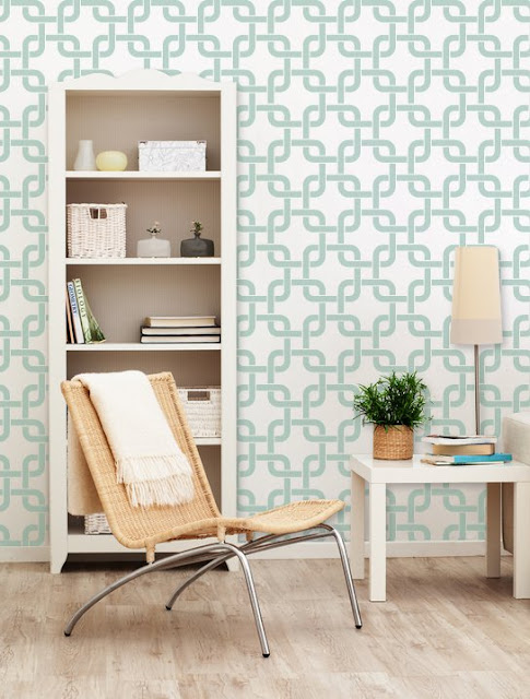
This is “Chain Link” from her new collection. It looks very modern and “today, ” unlike what many people feel about stencils – old and grandma-like! I just love using geometric patterns in interiors.

This is “Linked In” – how’s that for being current? Again, a great overall geometric that many of my younger clients would gravitate toward. It’s subtle – but it has a great energy to it.

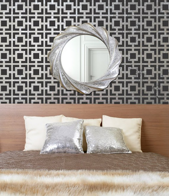
This is “Hollywood Squares” – and it’s, again, geometric but there’s a definite Hollywood glam and retro feel to this pattern.
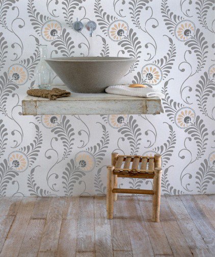
This is called “Feather Damask,” and it has a modern Swedish kind of feel to it, I think. This can be used as an accent wall – perhaps with a neutral gray on the other walls. Add some yellow and gray and cream fabrics and you have a simple but elegantly modern room.

Here, just taking one single motif – in black and white…over a stried glaze and you a have a modern interpretation of a traditional pattern.

Another pattern I see a lot of (and I love) is the Suzani pattern. But this time instead of being on a bed or a pillow – it’s on an entire wall. This is refreshingly beautiful.
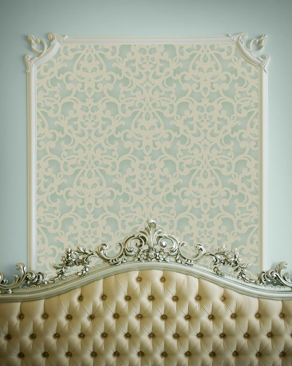
This is the Donatella Damask – a beautiful, more traditional pattern. It looks lovely in a bedroom in soft, hushed colors. Using it as only an accent, as above, is a very inexpensive way to add some pattern and spohistication to a room.
We used 2 of Royal Design Studio’s stencils for this wall in a Designer Showhouse
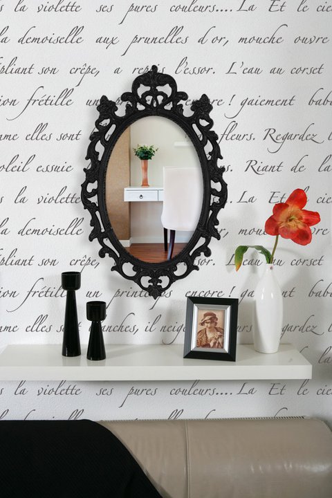
And finally, for the true traditionalist, how about adding a poem in French on an accent wall, as above? I have always loved this French poem stencil called “April in Paris” from Royal Design Studio. I’ve used this on dressers and on tables as well to give them that special touch! You can read more about this beautiful French script pattern here – where we used this stencil and also “Florentine Corner” in a Designer Showhouse last year,
If you would like to give your home a special look and feel, call Linda at 631 793-1315 for a consultation.
All photos courtesy of Royal Design Studio, except the last one, which is from me!
Thanks for stopping by The Colorful Bee! Stay in touch and never miss a post.
*Subscribe to receive an e-mail when a new post is up, HERE.
*Subscribe to receive an e-mail when a new post is up, HERE.
5 Comments
Posted in Uncategorized
Emily Henderson & Secrets From A Stylist on HGTV: Part II
Well, after watching the premiere show last week I have to say there were things that I thought were great – and things that I was a bit puzzled about. I loved the final room creation and the way that Emily was able to meld the husband and and wife’s styles – but I had a little trouble with the fact that Emily painted the entire room blue first – only to completely change the color later.
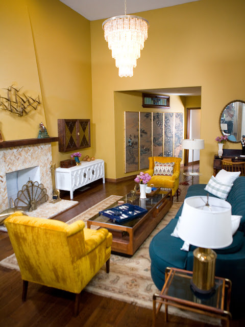


The first incarnation from the premiere show,
which was more the wife’s style – a Hollywood Regency look
This is a gorgeous look, but it suited the wife’s style more than the husband’s. So – Emily went into her “change the wall color etc” mode…

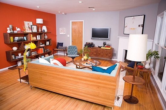
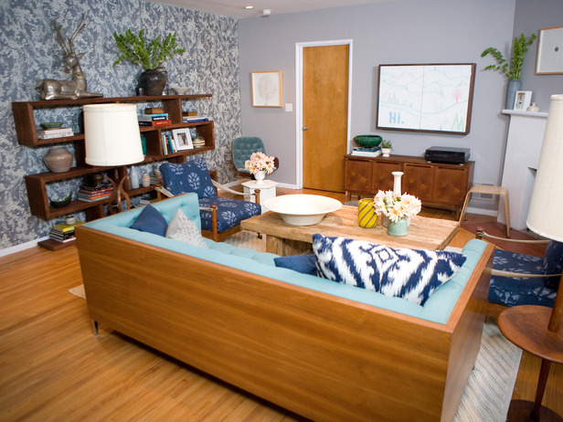
Living Room…After. This brought more of the Hollywood Men’s Club look that the husband loved
With the wall color change plus some of the furniture and accessories changes – I think she really achieved a beautifully blended look that suited both the husband’s and wife’s styles.
After seeing Episode 2, you begin to get the real method behind the madness theme in this show – The first look is supposed to be good and the second…better. If my clients ever start making me change the wall color after approving one – I would be out of business! However – on Emily’s blog – we learn that the production company is OK with this and the cost to re-do is included.
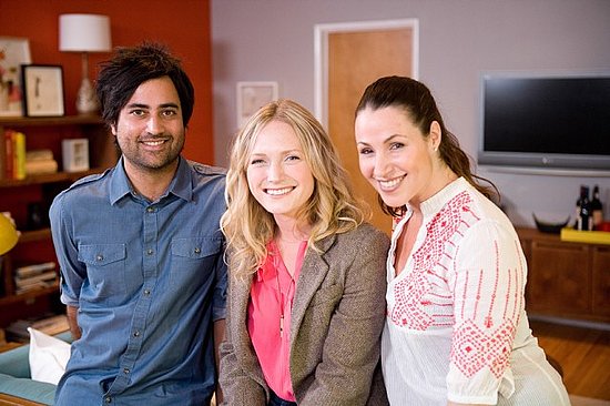
Emily with the Ravals from Episode 2
If you notice the orange accent wall in the picture above, that was the “re-do” wall in this episode. Emily says that men love accent walls. That must be so because my husband had accents walls all over his house (that I changed after moving in!). Most were done with wallpaper (nothing worse than wallpaper for a decorative painter!). In this episode, Emily painted the accent wall orange – for the husband. It really wasn’t good – and I am a lover of that hue.

The first incarnation – the orange accent wall that the husband favored somewhat
The second incarnation – that retains an accent wall – but softened and
more in keeping with the wife’s style
All images from “Secrets” from HGTV
I love what Emily did here – the ikat pillows and the chairs (and that great velvet chair in the corner). She brought in more the Madmen look into the room – but softened it to suit the wife’s aesthetic. I am still not in love with the door that remained in a wood tone – but it does blend with the floor. I would have painted both the moldings and the door in the soft gray because I think it stands out too much and it’s not a great standout look.
On the Accent Wall Change. On her blog she tells readers that the accent wall looked great on TV but the wallpaper (an Asian grasscloth) installer did a really bad job, complete with seams showing etc. She had to bring in another installer (a woman who she said she would never give out her name because she’s so good and she’s be afraid she’d get too busy!). Oh brother – I hope my clients don’t feel that way! But, I digress. This installer came in and removed the badly done grass wallpaper and re-did it perfectly.

I think she did a beautiful job. I am really starting to love this show. Would love to hear what others think!
Speaking of grasscloth/fabric looks on the wall. I just love the look of grasscloth etc on wall…accent wall or full room walls. It’s a lovely way to bring in texture to your room. At our studio, we do install wallpaper – but one of our specilaties is doing faux fabric and grasscloth looks on walls and other surfaces. In the Hamptons, we did a beautiful raw linen look/parchment on nightstands, so it’s a great effect even on small accents in your home.

A faux raw silk finish that we did in Garden City NY

A pearl silk patterned finish that we did in a sitting room in Bay Shore NY
This fabric/grasscloth look is really beautiful. I am even doing this look in my mudroom. When I’m finished – I will post!
If you would love to have these beautiful looks in your home, call me at 631 793-1315 or email me for a free consultation at Linda.Leyble@gmail.com
Thanks for stopping by The Colorful Bee! Stay in touch and never miss a post.
*Subscribe to receive an e-mail when a new post is up, HERE.
*Subscribe to receive an e-mail when a new post is up, HERE.
2 Comments
Posted in Uncategorized
Will “Secrets from a Stylist” Bring Me Back to Watching HGTV?
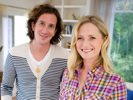
Tune in Tonight: I am hoping that HGTV’s new show “Secrets From a Stylist” will renew my spirits so that I’ll start watching this channel again. I used to be very addicted to HGTV – but the channel has lost its lustre for me over the years. Too many cheaply created or formulaic programs (endless Househunters ad nauseum) had me switching the dial to find other prograns more worthy of my time. So I hope that this year’s Design Star winner, Emily Henderson, will create a buzz on that network. Then I’ll gladly return to watch!

Emily Henderson, with Glee co-creator, Ian Brennan
She has a modern., yet traditional take on designing – which I am looking forward to. I like the way that she can take an unused, non-functional room and create a useful and beautiful space. Practicality – not something over-the-top – is what people really need to see on television today.
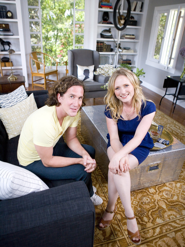
Emily with Ian in his newly designed living room
I love her style and I am rooting for her. Just hope that she has taken some diction lessons – and that she starts to speak a little more slowly. Let’s see how she does tonight – Saturday at 9PM. Let me know what you think of the show!
Thanks for stopping by The Colorful Bee! Stay in touch and never miss a post.
*Subscribe to receive an e-mail when a new post is up, HERE.
*Subscribe to receive an e-mail when a new post is up, HERE.
5 Comments
Posted in Uncategorized
Do it Now: Some Thoughts and Words from a Chronic Procrastinator & the Red Dining Room
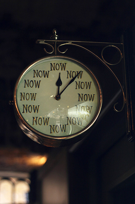
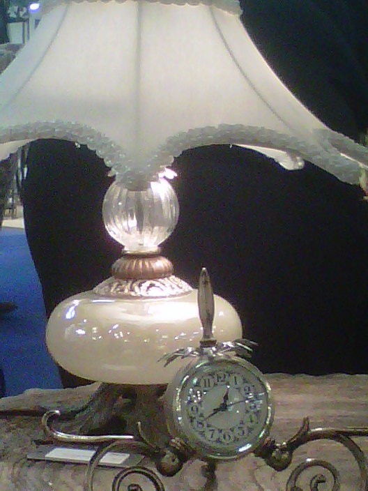
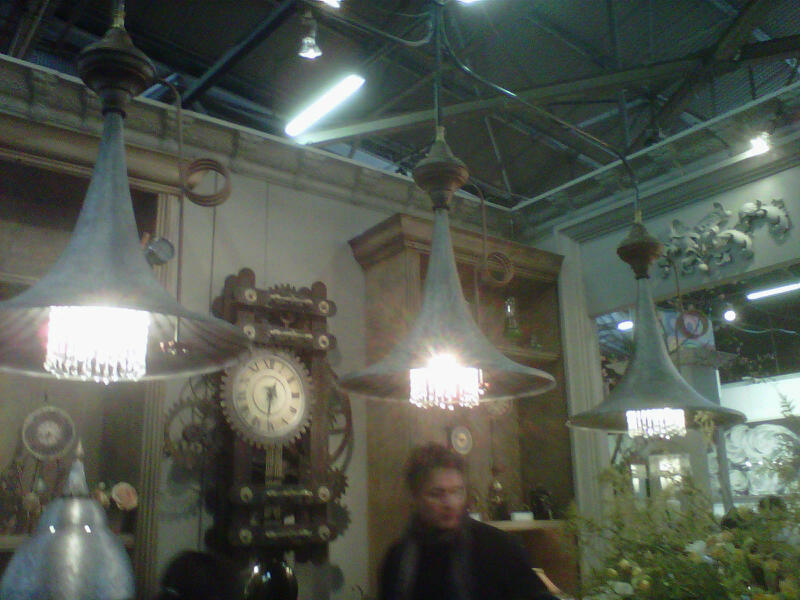
The Clock that I Need, from the Blog – Come Full Circle
As I sit here, looking on the Internet for that perfect color and idea that I want to present to a client for a dining room re-design, I came across this image quite by accident. I need this clock…badly. If I procrastinate any more with this client – I may lose her. I have the idea for her dining room in my head already – but I don’t think I have ever seen it. So – I started searching for something close. The client is pretty color fearless (thank goodness!) and she’d love to have a red dining room.
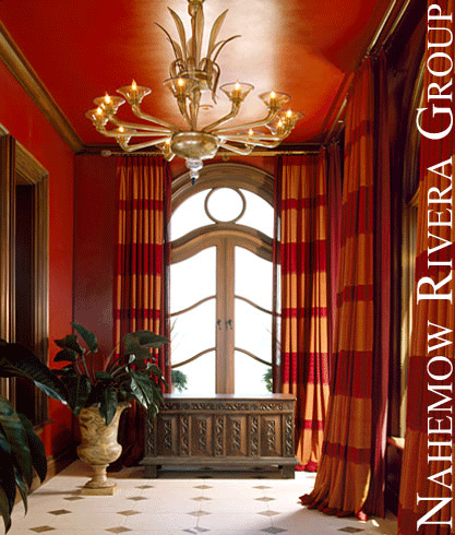
Beautiful use of red and orange by the design team at Nahemow Rivera
This image may help her see an entire room – but her space is not as grand as this and she has 9 foot ceilings. An entire red room would close up her space too much.

Here is another beautiful dining room, but again there’s quite an expanse of white moldings and built-ins that allow the room to be light and bright despite the rich color
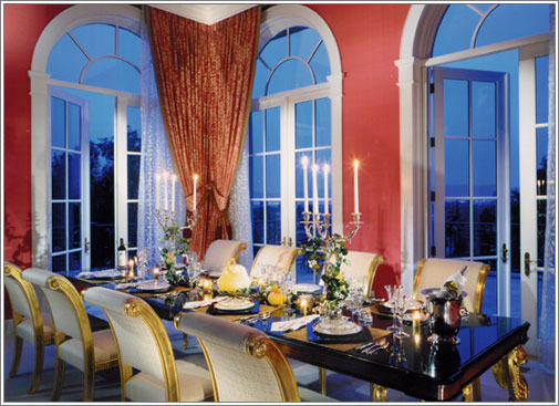
A beautiful pinkish red dining room by Mark Morris Design Group
Again in this beautiful room, the tall ceilings and windows allow the use of a deep saturated color. So I have been thinking that the red hue could be beautifully used on the upper portion of the room – and we could create a beatiful cream or white painted wainscot treatment below. It’s a very formal and traditional look for a dining room. That would work – but then I remember that she purchased a large wrought iron chandelier and perhaps this this treatment might be a bit too formal. The client has a young family and the room will be used for homework on weekdays. Nothing like trying to clean scuff marks off the light colored wainscoting (not to mention the banging chairs!).
So I think that I have to come up with a durable finish for the wainscoting – perhaps a beautiful deep, rich semi-gloss red. To create a lighter feeling, I’d like to have vertical panels above – that feature a grasscloth wallpaper in a honey tone (or I could do a faux grasscloth, if the cost of the wallpaper is too dear). That way my client’s room will look taller and the room won’t look as closed in and the look will be less formal – and more durable.

Not a dining room – but this is closer to the idea of the wainscoting and panels (below and above). The above picture shows a longer horizontal upper treatment, whereas I would like to create vertical panels on the upper portion. Having a lighter tone with the grasscloth inserts would help lighten the room – plus the client would like to have a yellow, honey toned living room, which is adjacent to her dining room. The colors of both rooms would go beautifully and the red wouldn’t be coming out of nowhere.
I had also suggested to my client that we should do something special with the ceiling. Perhaps a gorgeous design to tempt your eyes upwards…

Ceiling design by artist, Kay Allen
Or I could paint and antique a beautiful Anaglypta (raised wallpaper) and trim it with molding to create a faux tin ceiling panel (only in a copper and perhaps with verdigris) that would keep it traditional but more informal.
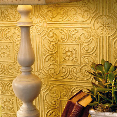
Anaglypta wallpaper, from Southern Living
I can see some beautiful gold and red striped silk panels (or faux silk, if we’re being more practical) to finish the first few parts of this room.
So, now I think that I’d better call my client. Blogging has helped me figure out the room for my client – and I have some visuals that will help her to see what I’d like to do in her room. All without sketching (which I still may have to do!)…but at least now I have killed two birds with one stone – a blog post and a mood board!
Wish me luck!
Thanks for stopping by The Colorful Bee! Stay in touch and never miss a post.
*Subscribe to receive an e-mail when a new post is up, HERE.
*Subscribe to receive an e-mail when a new post is up, HERE.
Leave a comment
Posted in Uncategorized
Some Unique Decorative Items From the New York Gift Show January 2011
So Many Beautiful Things to Look at…Too Little Time: I always try to make it to the New York Gift Show in January and August at the Javits Center and the Piers. I missed the show last August because I was in the throes of creating a room for the Designer Showhouse at Caumsett State Park – and so…I couldn’t make it.
But I made it this January – despite the frigid temperatures and snow. I have to say that the show was pretty good – a few of my favorite companies were noticeably absent. But, there were a few new ones that made up for it. Here are some of my finds.
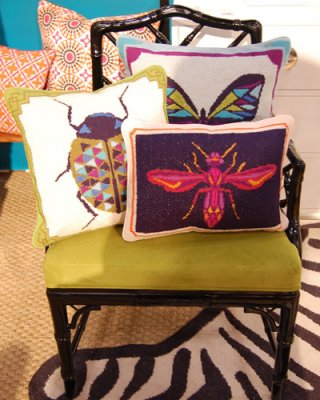
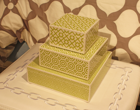
Jonathan Adler had some beautiful products – beautiful porcelain boxes and, of course, some bug pillows – which were everywhere. First image: Elle Decor
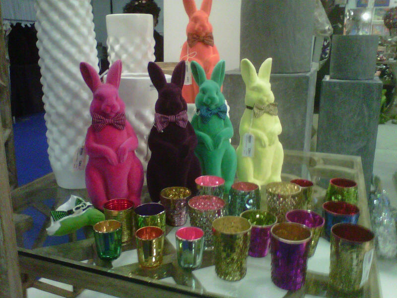
Wholesale heaven! These velvet bunny banks were so much fun – I bought 3 @ $14.50 a piece. The multicolor votive holders came as a set of 18 – for $69! From Barreveld DK Living
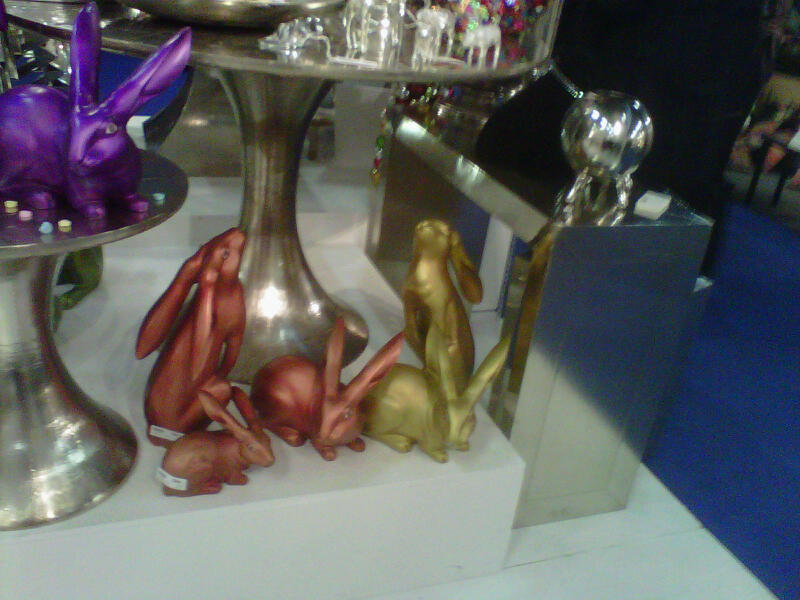
Same company had these gorgeous iridescent bunnies also. Was I attracted to all the signs of spring? You better believe it!

Barbara Cosgrove was there of course. I love all of her lamps.
More bugs! From Two’s Company. Image: Elle Decor

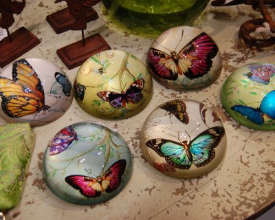
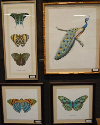
And butterflies. From La Maisonette. Image: Elle Decor

This was my favorite find – a new company from Highland Park, IL that makes these beautiful storage ottomans called Couefs (and that’s the name of the company). It stands for Chair Ottoman Upholstered End Table Furniture because you can use them as seats, end tables etc. They had am array of fabrics – even tile and wallpapered ones and you can customize your own with COM.
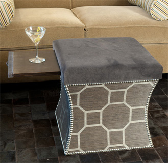
You can even have a pull out surface for a drink!

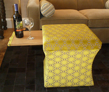
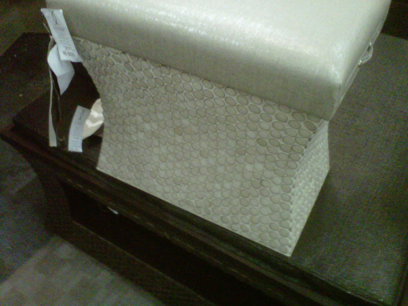
Here’s a view of one of their tiled coeufs – with a shiny metallic fabric top. Beautiful!
Vintage Print Gallery made me think of spring also! Image: Elle Decor

Images above, of course, from perennial Gift Show favorite – Luna Bella. I have several of their lamps and pendants and I always get so many compliments on them

Modern lighting was also represented, as in this felt (yes, felt) pendant
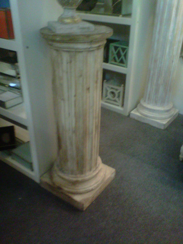
Of course, some beautiful distressed items like these columns from JM Piers
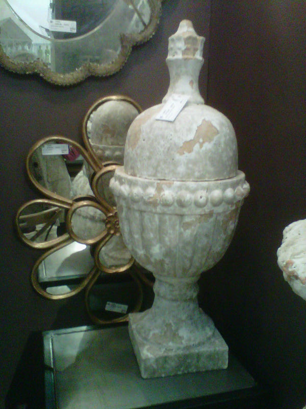
Antiqued urns from Go Home
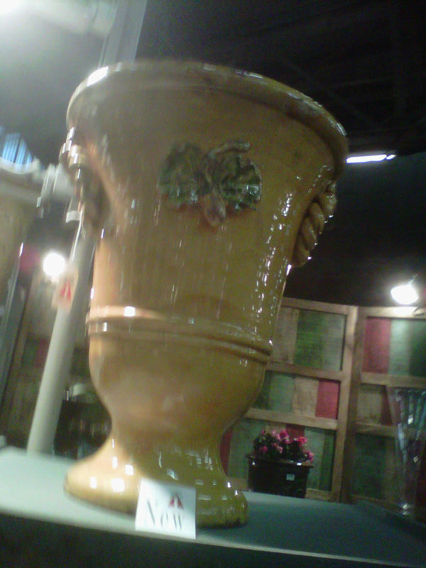

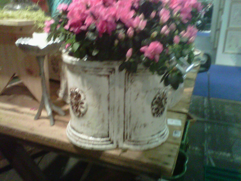
And beautiful Tuscan vases, urns and planters from Abigail’s
Thanks for stopping by The Colorful Bee! Stay in touch and never miss a post.
*Subscribe to receive an e-mail when a new post is up, HERE.
*Subscribe to receive an e-mail when a new post is up, HERE.
7 Comments
Posted in Uncategorized
A Step-By-Step Recipe for a Romantic Bedroom: Part II
Part II of creating a romantic bedroom for Valentine’s Day & Beyond…


Pillow from Alexandra Ferguson on Etsy, details below
You might not want to be that obvious (or would you?), but in this post, I continue to give some ideas to build up the romantic qualities of the bedroom – layer by layer. I call it “Layers of Love.” Maybe you can bring out the “Let’s Make Out Pillow” once you’ve created your Love Retreat!
After re-doing my own bedroom when I was single, I told my soon-to-be-husband that I was creating layers of love for Valentine’s Day. I did all the things that I am telling you in this post (well – almost all of them!) – and six months later, we were engaged. I think that it all really helped to set a mood for us. Designing for all of the senses is important every day – but for Valentine’s Day…it’s extra important!
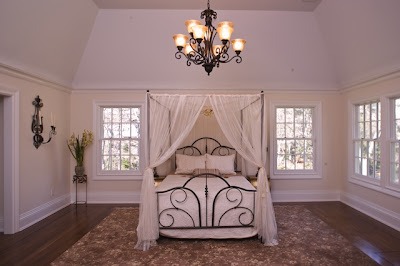
Drape Fabric: If possible, add draped curtains or gauzy fabric to the bed. This gives your bed a cocoon-like aura that’s so romantic. Here’s a great (and inexpensive) idea that we did for a beautiful home that we staged in Muttontown NY.
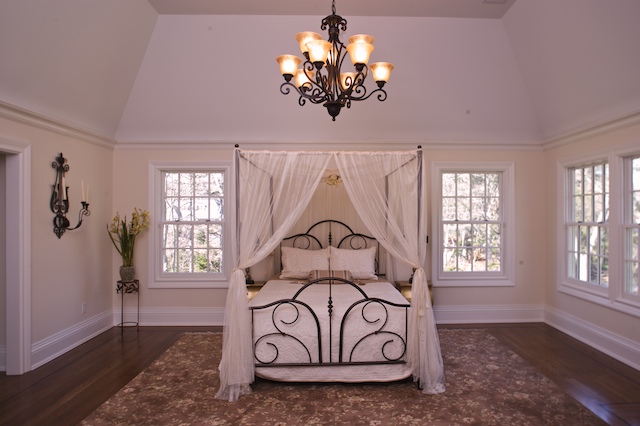
Romantically draping gauzy fabric on this bedding helped sell this $3.5 million home

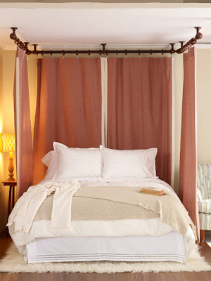
This is an easy and simple way to add fabric when you don’t have a canopy bed: From Redbook
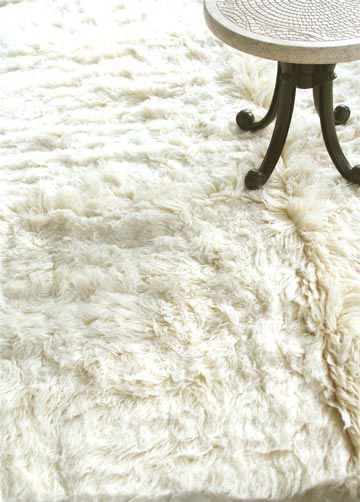
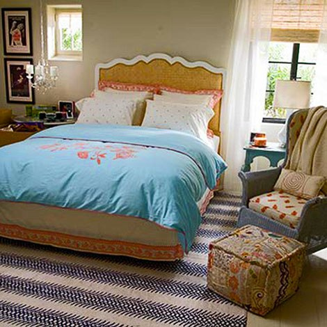
Area Rugs: You want a tactile experience for your feet as well, so why not bring in something luxurious – such as a soft rug.
A luxurious Flotaki rug; Image from Apartment Therapy
Accessories that Set the Stage for Romance: If your budget allows, bring in opulent silks, velvets, tapestries and textured fabrics for the bedding, pillows and throws.
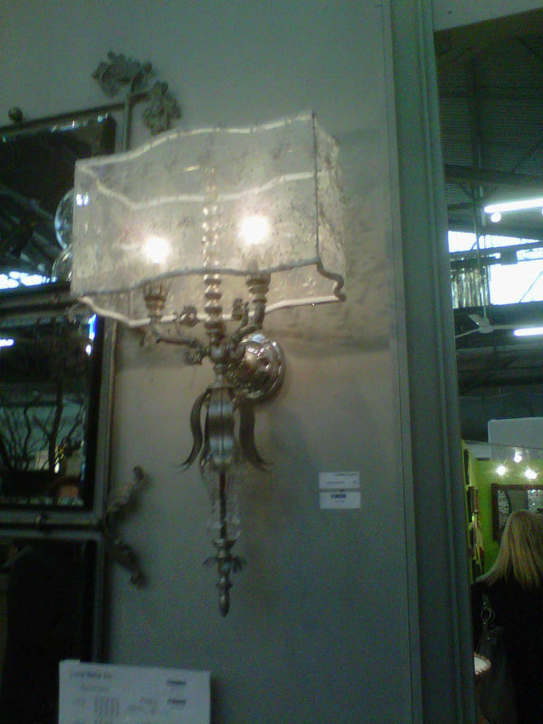
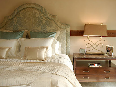
Lighting: Besides candles, bringing in beautiful lighting can help set the mood. Chandeliers not only look beautiful but they can also cast a lovely glow in the bedroom. Remember to install a dimmer switch as you don’t want harsh lighting overhead. I’ve also seen two small chandeliers over each nightstand – and the look is so beautiful and romantic.
The bedroom from “It’s Complicated” had a small chandelier over a night table – not over the bed.
And you don’t necessarily have to have a traditional chandelier. Modern lighting works beautifully as well, as seen in this bedroom designed by Lee Ann Thornton
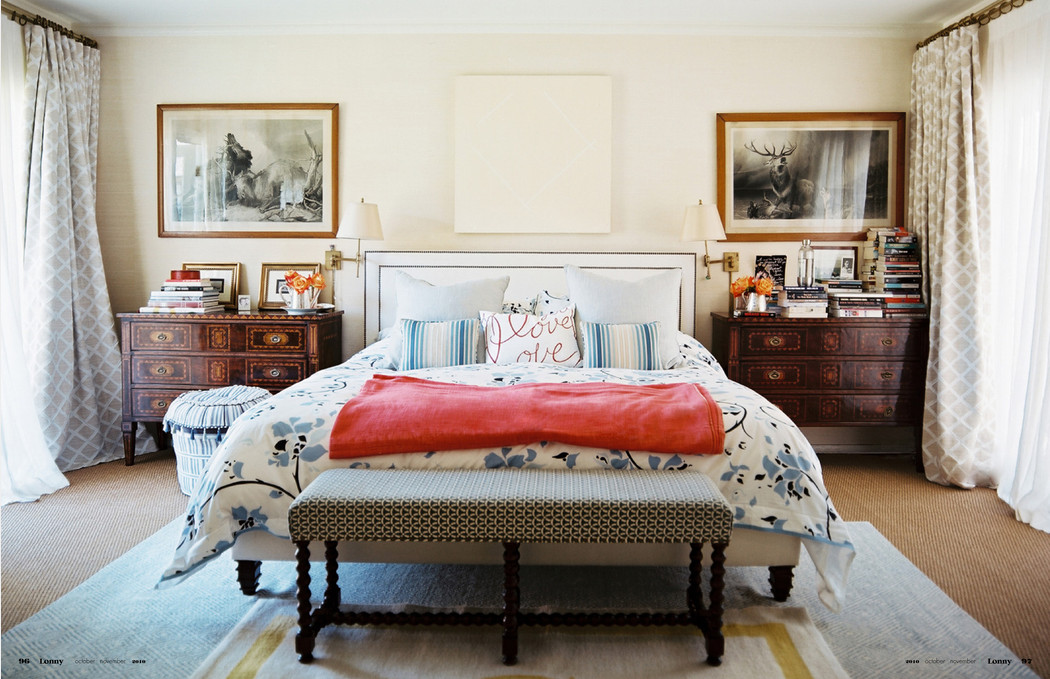
Lamps with beautiful silhouettes or gorgeous damask fabric and beaded lampshades on the nightstands (also on dimmers) add another soft dimension. You might want to have an uplight in a corner to cast a beautiful shadow. Think about how a beautifully lit plant in a corner can look with an uplight gently delineating its curves on the walls.

A beautiful lamp, mirrored night tables, tufted headboard
and a picture of you and your love is a recipe for romance
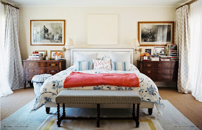
Art for the Bedroom: Think about adding a scene that both of you love – a landscape or perhaps a place that you vacationed together (Paris, Rome…Hawaii). You don’t want to be overtly sexual with your art – just a suggestion of the love and togetherness that you both share.
Soft tones call for gentle art as in this room designed by Gerri Bremmerman

Art and pillows can be very holiday specific
It can be more masculine-oriented (with a mix of feminine decor),
as in this room designed by LuLu Powers

Or, it could be artwork depicting a favorite topic or pastime. Room designed by LuLu Powers
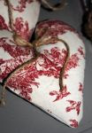
Make it personal: Perhaps you made (or received from your love) something that was special. Make sure that that is prominent in the room. My husband made me a small framed photo of our initials that we carved on a bridge in Paris. He added the words “On a bridge in Paris.” I love this present every time I see it and it reminds me of how much in love we were then and are still today. You might even consider making something special for your love for this day. Some decorative cupcakes, a heart made out of construction paper (remember doing that in gradeschool?). It doesn’t matter how beautiful – it’s the thought that counts.

Easy to make (easier to buy) sachets made from Toile de Jouy fabric and lavender from Provence Available at www.fabulouslyfrench.com
Mood Music and Sounds: Continuing the sensory experience, you may want to add some soft music to your love recipe. Pick your beloved’s favorite music and add it to your ipod for that special night. Be it classical or contemporary, music played so softly in the room will add to the romantic mood. You can also think about a sound machine to add forest sounds or some gently moving waves.
Lastly, Add Something Sweet: Whether it’s chocolate or some simple Sweethearts from your childhood, adding something for the palette finishes the layers of love. Don’t forget some champagne (or red wine, if you are eating chocolate!). Forget your diet today – it’s allowed!

Image from www.freedigitalphotos.net
So start doing some of these things and I know that you will have a beautiful Valentine’s Day. Give yourself permission to just linger and cuddle and enjoy some special time together.
Happy Valentine’s Day to All!
Link to purchase Alexandra Ferguson’s pillows
Thanks for stopping by The Colorful Bee! Stay in touch and never miss a post.
*Subscribe to receive an e-mail when a new post is up, HERE.
*Subscribe to receive an e-mail when a new post is up, HERE.
2 Comments
Posted in Uncategorized


 Decorative Finishes
 Interior Design
 Home
Home Garden
 Holiday
 Makeovers
 My Life
 Business
 Tutorials
 Videos
 Paint
Paint