
You all know how much I love color…especially on walls. I don’t have any white walls in my home but that doesn’t mean I hate white – I just hate it when white walls fail…because then the room fails. The room fails because most people either put a cacophony of color in the room to make up for the lack of color on the walls…or they don’t use any color or textures or patterns to make the room live and breathe. Or…they don’t choose the right white for their room. White can be tricky. Click here to read my first post on choosing white.
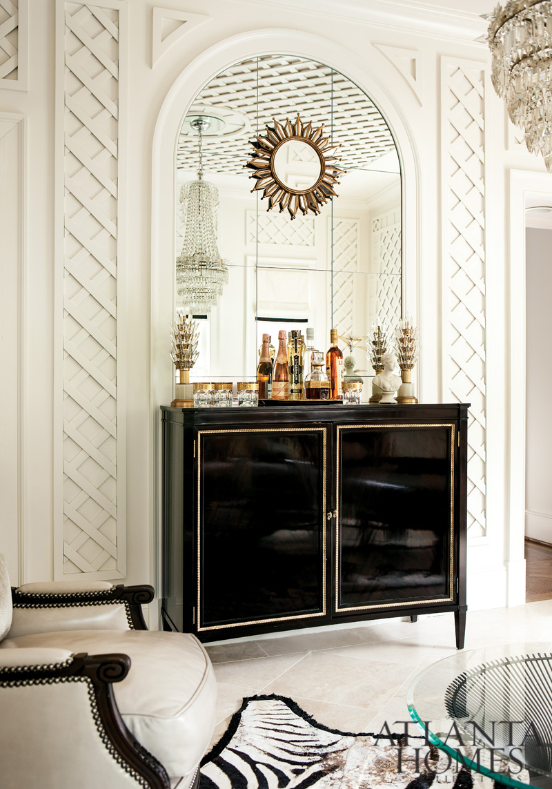
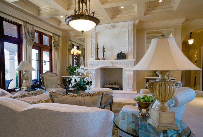
Everything in the above room, designed by Margaret Bosbyshell and Clary Bosbyshell Froeba, was done beautifully. Every element in the room conspires together to make white the star of the show. The textural, geometric trellised walls and ceiling, the unique architecture and moldings, the black bar and the other black accents, the white marble floors, the mirrors, the chandelier – all foster the color choice of this space.
A totally white room can be deathly sterile in the wrong hands. And there are a lot of “wrong hands” out there. So, if you really want white walls and nothing else will do…here is what you need to know about white and what you have to have to go with your white walls.
So – what’s the real problem with white? White is really a whole panoply of colors. Black is the absence of color and white reflects all colors. Depending on how white is used – how much or little light in a room…what type of sun exposure…and what is placed near the white wall (flooring, furniture etc), white can exhibit different effects. An oak floor near a sunny window will reflect a warm honey tone on the wall. A white wall in a northern exposure can look a bit purplish in the late afternoon. In addition, cool whites can have purple, gray, blue or green undertones. Warmer whites will have yellow, beige or peach undertones. I always recommend to my readers that they roll on their chosen paints on a large sample board – and tack them up vertically on the wall and see how they look in the morning, afternoon and nighttime.
Once you have chosen the right white for your room, don’t forget these other elements to make your room memorable instead of forgettable.
Add Texture
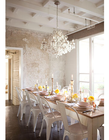
When you add textures, whether on the wall or in your accessories, your white room will start to come together. In the above room in photographer Amy Neunsinger’s home, workers were chipping away at old tiles and revealed an old concrete wall. It looked perfect – so it stayed. It made the room so much more interesting.
Don’t have a beautiful textured wall? Think about adding nubby, tactile throws, linens, wools, seagrass, antiqued furniture – these items will stand out and give depth to an all white room.
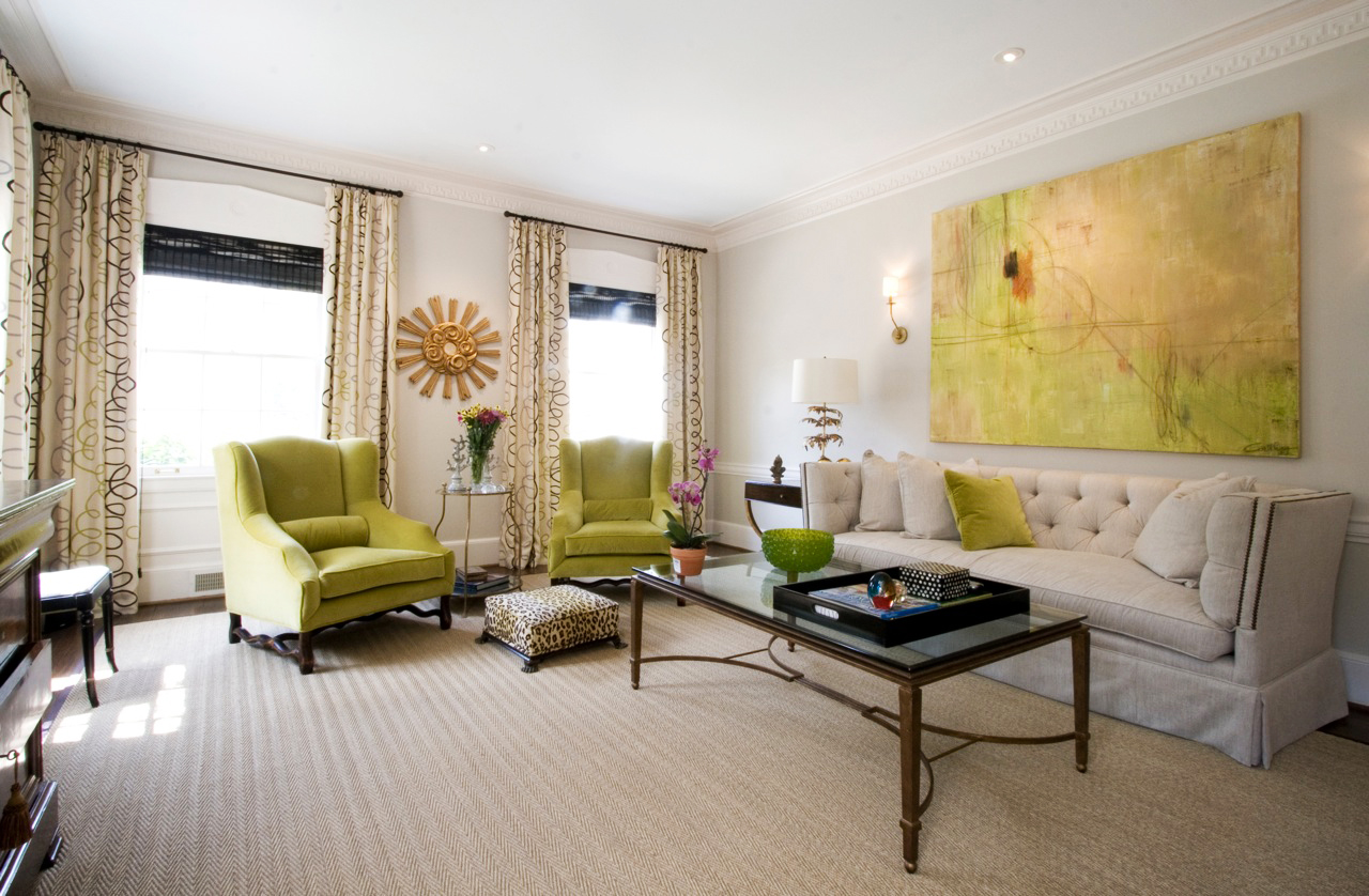
Add Color
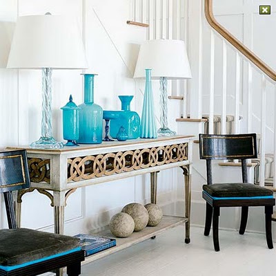
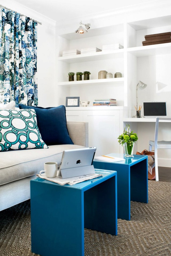
 Color in a white room can make people even forget or ignore that your walls are white! The designer, Tobi Fairley, uses color so well that she is known for her “colorful” rooms, even when the walls are white or neutral. That’s the mark of great design. The two spaces above show that the blues and greens in these rooms are the lead actors…and the walls play supporting roles. Use her rooms as inspiration for your own spaces.
Add Moldings and Millwork
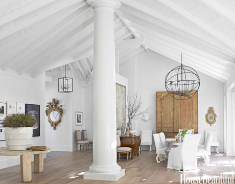
Beamed or coffered ceilings, built-ins, decorative crown and base moldings, columns, wainscoting, clapboard paneling, substantial mantels – these architectural features in a white room will really make the room spectacular. Above, designer Myra Hoefer, used Benjamin Moore’s Winter White on the beams, columns and moldings to give a sculptural effect to the rooms. Otherwise the architecture would have been too busy and it would have downplayed the serene quality of the rooms.
If your room is large and tall – but you still want to use whites and off whites in your room, consider adding a coffered ceiling and painting it. It helps to bring down the size of the room – making it a cozier space. In the above photo, notice how the walls etc are off white but the limestone mantel is white. Just that subtle difference allows this feature to stand out.
Add Art
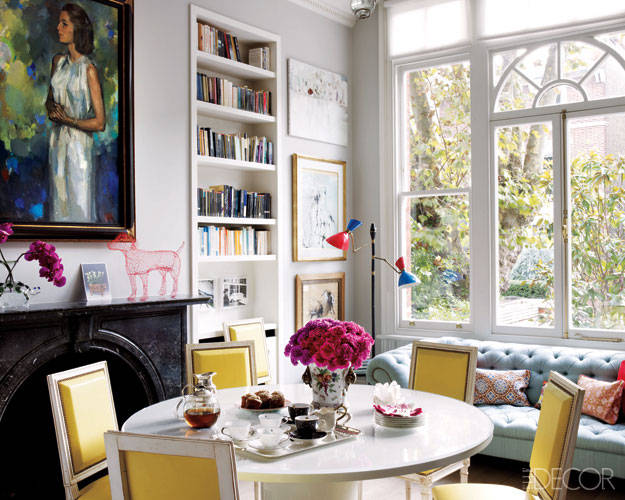
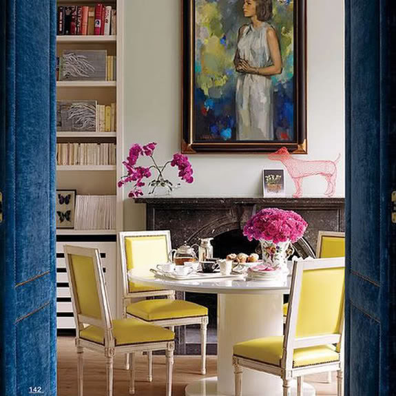
Since white will pop anything placed against it, make sure your art is worth that pop! The mistake people make is placing unremarkable artwork on the walls. Make it count! The above photos of the dining room/library of Christine d’Ornano, who oversees the British operations of her family’s cosmetics firm, Sisley, displays the use of art beautifully. The art informs the color scheme for the room – mostly blue and yellow. Those blue upholstered doors are to die for, aren’t they? But they also serve as a hint as to what’s behind them.
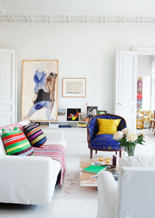
Don’t go for “basic” or neutral art pieces – go for the wow factor. Let the colors in the art inspire you to bring in a few other colors (not too many…just two, three…maybe four max).
Let me know how you have decorated with white. Share with others in the comments below!


 Decorative Finishes
 Interior Design
 Home
Home Garden
 Holiday
 Makeovers
 My Life
 Business
 Tutorials
 Videos
 Paint
Paint
Great post about choosing white! Love all your examples! x Maria
Thanks Maria. Coming from you, it’s a big compliment! Did you see on the post before this one that I linked to you and highly recommended people to go to your site for everything related to “Undertone!”
Thanks again…good luck with the tulips!
Linda
We have all wood trim and wood floors. One room we did is painted an orange earth tone that we ragged a design into and I did it to match the oak flooring, but that has not worked out very well; too much blending and no contrast. Recently I was thinking to paint the trim and walls white in that room as it is so popular. Now, I am thinking to paint the Walls the most cream colored soft ivory I can find, which I think will go with the wood floors and trim. In general, is that a good idea?
Sue recently posted..My Silver and Gold Christmas Tree Theme
Hi Sue – you should send me a pic of your room. I can get a much better idea of how to help me. Are your wood floors oak? What other things do you have in the room. Send a pic! In general, I think your plan is a good one. I love trim to be painted. Wood floors and wood base molding – it just blends into each other. I love having some contrast.
Send me a pic – and I will help! You have been so helpful to me…it’s your turn for some help!
Li da
First time choosing wall paint here!
Thank you for your two helpful articles on finding the right white for the room. They are quite informative!
My predicament: I’m using Benjamin Moore paint and am searching for a warm ivory white that doesn’t say “here’s a giant expanse of yellow wall.” There is a lot of light that come through at all times of the day (it’s nearly 1pm on a bright cloudy day and I have zero lights on!). Large windows facing east. Here’s a only a few what I’ve tried so far.
linen white = too yellow
navajo white = too yellow/peachy
ancient ivory = too yellow/green(?)
ballet white = too grey/tan
bone white = too tan
balboa mist = too blue
china white = too bright white
etc.
So far Seashell seems to be the closest!
I was thinking of trying fog mist, floral white, tapestry beige, or gray mist.
Any suggestions would be much appreciated! Can you tell I’m new at this?
🙂
Hi Tara – I hope that I can help you out. The difficult thing about choosing white or off white (as you have figured out) is that each of these whites have a different “undertone.” It could be peach, gray, yellow etc. Couple that with what is in your room (floor etc) and the amount of light you get in the room and you have other intervening factors that will “color” (pardon the pun!) your walls.
If your flooring is oak – that will reflect on the walls when the sun comes in. Linen White in that case, would come out with a yellow undertone. It’s already a warm paint color – but your floors may be making it more so.
You could try a 50/50 mix of Linen White and Decorator’s White. You will still have the warmth but it will be tempered by the Decorator’s White.
White Dove may work also if you are tending toward the gray undertones. Cloud White is nice also and it has some slight gray undertones as well. Cottonballs is another designer favorite.
I just did my guest bath (blogpost coming soon!!) in a sort of pale gray (Collingwood)and I used Hardwood Putty (BM CW-5) as the trim color. It came out great! I don’t know what Hardwood Putty would look like as a wall color but I found it to go well with the warm gray of the wall.
You should send me pics of your room – maybe we could do a blogpost on it!
Linda