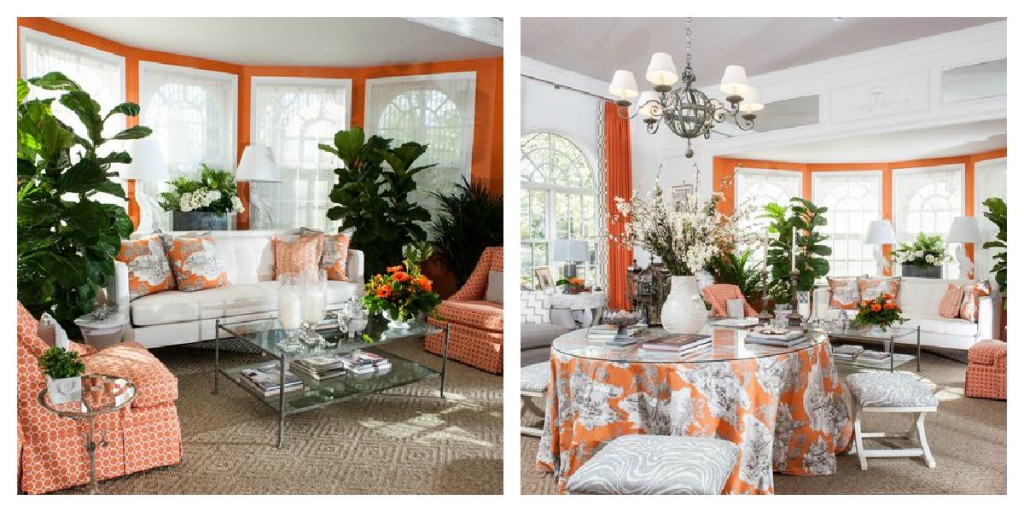
 It’s almost December and soon the warm and lovely colors of Fall will give way to the reds, greens, golds, silvers and whites of the Holiday Season. So today I wanted to pay homage to orange, burnt orange and russet hues. They are among my favorites to use because they seem to go with just about every color and they can warm up a room instantly.
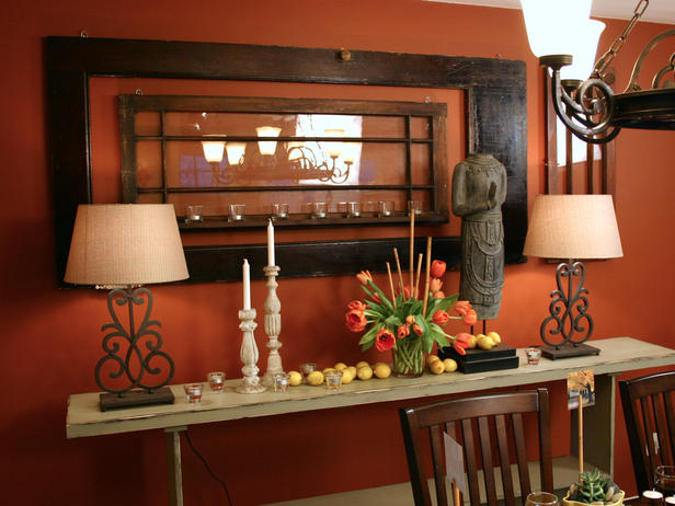 There’s nothing better than a warm, inviting and appetite inducing dining room and nothing helps you do this better than a warm orange hue. How wonderful does this color look with weathered wood and cream tones?
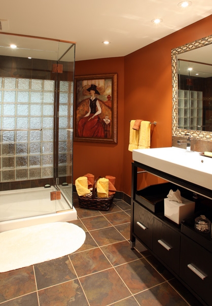 On cold winter mornings, this bathroom would help warm anyone up! I love how the artwork, the flooring and the rich tone of the vanity all work to make this room so inviting. I’m not a fan of glass blocks {ugh} but you almost don’t notice them that much because of the beautiful wall color – and they are helping to bring more light in to this room. I probably would have taken the floor mat up for this photo shoot though!
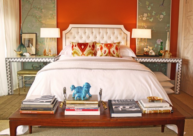
I love the colors in this bedroom! It’s giving me more ideas for my own Master Bedroom. The rich and vibrant wall color enlivens but doesn’t dominate the scene because of the gorgeous Chinoiserie panels, the white bedspread and tufted nailhead headboard and the light draperies and distressed door on the sides. Love those ikat pillows on the bed!
 A paler orange {mixed with yellow} softens the orange theme. In this Moroccan-influenced bedroom, designer Barry Dixon shows us the subdued side of orange.
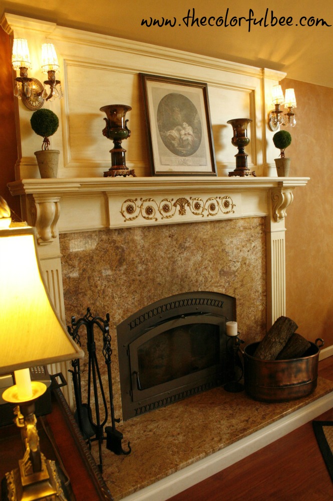 In my great room, I had mostly cinnamon tones and warm paisley fabrics, antique rustic finishes, so I decided to do a suede-like plaster on the walls. It’s a matte plaster with a soft hand – and it gives the room that laid back, Ralph Lauren feeling (without the expensive Ralph Lauren pricetag!). It’s my favorite room in my house – and if I could sleep here…I would!
How appropriate is using orange in an “Orangerie?” From the toile fabrics to the orange drapery fabric and the accent wall color – I don’t think I could have thought about another color to use in this beautiful space. For those who don’t know what an “Orangerie” is.. it’s like a sunroom, conservatory, 4 season room – a space with a lot of windows/glass – originally named for a place that could be used to grow oranges and other fruits in colder climates.! We almost did one in our house – but decided that something with actual sheetrocked walls made better sense. I don’t know about that now – this room makes me yearn for my old decision to wall a room in glass!
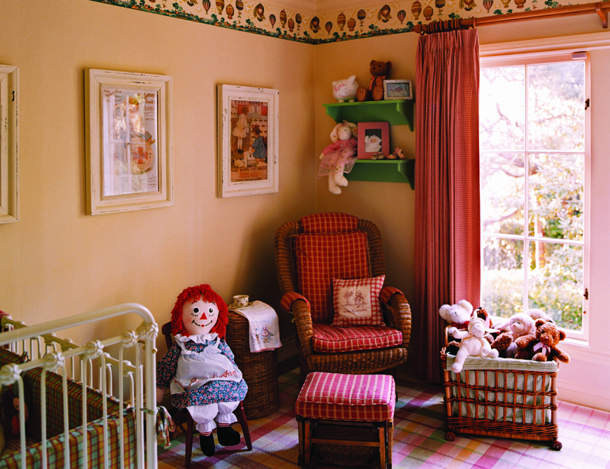 A pale orange or coral is a great color to use in a nursery. It brightens and warms a room and it can be used for either sex. Adding spashes of green, some plaids/checks – and coral/pink draperies are ways to use orange with a light touch.
If you are not quite ready for the boldness of an entirely orange room, use it in your artwork, decorative pillows and other accents in the room. Celerie Kemble did that beautifully in this living room.
Hope that you loved this little orange color visit! How have you used orange in your rooms? Let me know. I welcome all of your comments! You may also want to see other Color Roundups, featuring other hues. Check out my special Column on this!
Image Credits: 1a and b, 7) Kelley Proxmire 2) Angelo Surmelis/HGTV 3) Schnarr Craftsmen 4) Domicile ID 5) Barry Dixon 6) The Colorful Bee 7) Adeeni Design/Ramos Photography 8) Celerie Kemble







 Decorative Finishes
 Interior Design
 Home
Home Garden
 Holiday
 Makeovers
 My Life
 Business
 Tutorials
 Videos
 Paint
Paint
Great pictures and information….thank you again for your expert advice.
Janet
I am such a fan of orange and a favorite is when it is paired with light turquoise. The image of the orangerie is amazing. Just love the fabric on the table. Thrilled to find and follow your blog!
Hi! Thanks for your comment and for following me. I love the color orange as well – I think I was influenced by my mother who was a fan of the color. She loved using orange and green together. I hate to even admit this…but in the late 70s I even had an orange shag rug and orange draperies. The draperies were lovely (I had mostly, browns, creams and caramels and off white walls and they went with the orange drapes beautifully). But – I have to say that I went way overboard with the orange shag rug! In fact, I regret it and, truth be told, I hocked my engagement ring (I was newly divorced at the time) in order to afford the rug! Live and learn!
Orange is the bee’s knees when it comes to color… Love it! I’m remodeling a bathroom with a slightly brighter orange, mixed with slate and dark wood on the floors, then, because the wall is so damaged, I’m putting up wainscotting in a different color wood. It will POP- I’m thinking copper or bronze on all the hardware.
That sounds wonderful. I love orange as well – I have it in my great room and in many accessories. Good luck with your bathroom. Show me pics when you are done. Copper or bronze hardware would be great.
Linda
Hi Linda
I just found your website and love it. My new favorite for ideas, would you happen to have the name of the color for the first and second picture I just love it. warmest regards
Dear Linda,
Do you happen to have the paint brand and shade for the colors shown in your photos of the dining room and bathroom? They’re really warm, and we’d like to use something similar on the walls of one of our rooms.
Thanks very much,
Pete
Hi Pete – not sure but you can try one of these for a color that’s close. For the dining room color – try Sherwin William’s Tango and for the bath color…try Benjamin Moore’s Peruvian Chili. Hope that helps!
Linda
Great colors. We are getting ready to paint our laundry room with Sherwin Williams Rejuveniate and use white cupboards and accents. We are 70 years old and this is a big bold step but looking forward to the look. Thanks
Wow – please keep me in touch in terms of what you choose and do. I love it so much when someone finds a blogpost I’ve written and decides to take the plunge. Bravo to you both!!
Linda