
-

-
Subscribe
Thanks for stopping by The Colorful Bee! Stay in touch and never miss a post. Subscribe to receive an e-mail when a new post is up, HERE.Sponsor
If you're interesting in advertising on The Colorful Bee, click here to learn more.Contact
You can also email me at Linda.Leyble@gmail.com -


Categories
Subscribe
Popular posts
-
Recent Posts
Blogroll
Links

Author Archives: Linda
Some Verdigris and Rust to Antique Contemporary Vases
I have to apologize for being away from my blog for awhile – I have been so busy with work that I am exhausted by the time I get home. I know – no excuses – but I will have so much to blog about very soon. I have been hard at work on a restaurant that will be opening in May. It’s coming out so beautiful – I can’t wait to post the “after” pictures!
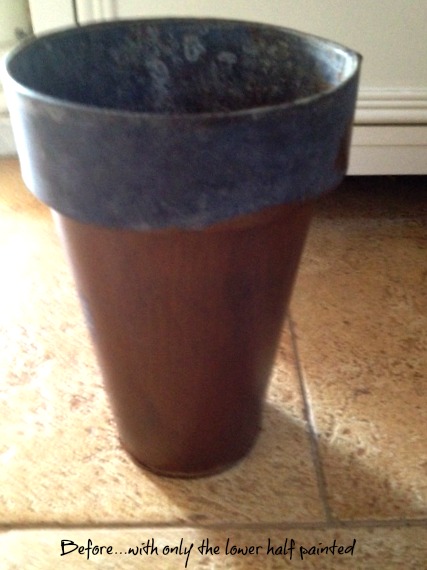
Today, I just wanted to show a quick project that I am also working on for a wonderful client – Debbi Boehl, floral designer and owner of Honeysuckle and Roses on the east end of Long Island. She had purchased some very inexpensive tall vases that she needed for a few projects – but she wound up not using them because they were too contemporary and, truth be told, too ugly! She saved money by purchasing them for a few dollars apiece – but she never used them! She gave them to me and said “Do something with them – anything will be an improvement!”
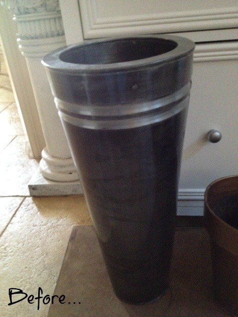
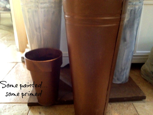
She gave me a little hint on what she wanted – some rusting and perhaps some patina on the vases. I started experimenting on a small vase and one of the larger vases to show her a few ideas. I love anything verdigris – and I seem to love a bronze undercoat more than copper – so I started with that. First, I had to prime and because the large vases were some sort of plastic, I used an oil-based primer. Then I did 2 coats of Modern Masters’ Antique Bronze Metallic paint.
I’ve used verdigris before, especially in stenciling – but I never did it on an object, so I had to figure out how to make it look realistic. On the small vase I put it in my slop sink and I dipped two verdigris colors (I used Faux Effects light and medium verdigris colors) on a chip brush, then I poured some water on the brush to let it drip down. On this small vase, I didn’t like the drip look so much – so I took a piece of cheesecloth and I mottled the colors together over the bronze. When that was dry, I used Faux Effects’ Rust kit to effect more age on the piece. It’s a two part system – first you put on a texture and then, once dry, you put on a rust glaze. I wasn’t as fond of the “orangey” color, so once it was dry, I took a small brush and dry brushed a dark brown tint over the rusted areas – especially on the edges to give more depth. I dry brushed this tint on other areas of the vase to age it further.
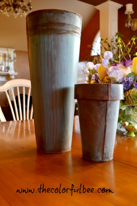
In determining where to put rust on a piece – it helps to look at Pinterest for some old rusted pieces (looking here helps with verdigris also!! As you know, there are some awesome pics on this site!) I didn’t want a lot of rust – so I chose to add it where the piece was joined and also on the bottom of the vase – where it most likely would have sat in water and rusted naturally.
On the larger vase, I let the verdigris colors drip – and then I took the cheesecloth and I stretched the colors down – so that they were not as drippy looking. I left some of the streaks of drippiness – if it looked like something natural. If I had a little too much of the medium color – I let it dry and then I dripped some of the lighter tone in.
This is a great project – especially for your porch or garden. Because Debbi will be handling these a lot with wet hands – I am going to be top coating first with a product called Duragard (from Faux Effects) and then a topcoat of C-500 in a dull sheen (also from that company). The C-500 will help waterproof the vase.
Hope you enjoyed this little project. It was a lot of fun!!
Sharing this with…Between Naps on the Porch
Thanks for stopping by The Colorful Bee! Stay in touch and never miss a post.
*Subscribe to receive an e-mail when a new post is up, HERE.
*Subscribe to receive an e-mail when a new post is up, HERE.
1 Comment
Posted in Uncategorized
A New Guest Bath with a Metallic Plaster Finish

The Completed Guest Bath
Just a quick post today. I helped a client recently who could not come up with the right color for her new guest bath. The bath was done in gray, white and pearl tones and so my client figured that a clean white would work for the walls – it didn’t. I brought over all the gray and white colors that I thought would work – they didn’t…and I knew why.
Closeup of the plaster finish
A static color just would not work in this room – it needed depth and variation. One of the reasons I went into the faux finishing industry in the first place was because of how you could come up with a finish that would blend with even the most difficult of interiors. Using a glaze over a static color could always “save” a room whose color seemed impossible to pick. A Venetian or a Metallic Plaster could always give depth and you could always pull two colors together and softly blend them. A decorative finish – done correctly – was always the remedy for a difficult room.
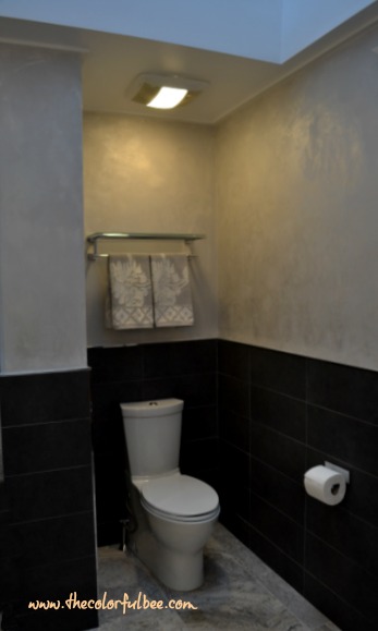
I wish I had taken a picture of the room with the white walls – because it just looked so bland. I knew that this room neededsome kind of a soft, light Pearlish Gray metallic finish, so I brought along a sample of a Crushed Pearl Metallic Plaster. The client was ecstatic – it blended with everything in the room and she loved it.

During the plaster process…Ok, so i didn’t do my hair!!!
It took me a day to do the finish and I think it came out really beautiful. I troweled on two layers of the material – a full strength layer and one with some water added to the mix, which gives it some shine. The way this finish catches the light {and there are no windows in this room, so light is at a minimum} really helps give luminescence and depth. It’s a beautiful thing!
I don’t know how it is in other states, but here in New York, the faux finish industry has just about shriveled up. Many schools have closed their doors because of lack of attendance and also because many faux finishers are not buying any of the great products that are available. The economy is, of course, to blame but I think that it’s sad that this has happened to a once thriving industry.
Sharing this project with: Between Naps on the Porch; My Uncommon Slice of Suburbia; Under the Table and Dreaming; Savvy Southern Style; Power of Paint
Thanks for stopping by The Colorful Bee! Stay in touch and never miss a post.
*Subscribe to receive an e-mail when a new post is up, HERE.
*Subscribe to receive an e-mail when a new post is up, HERE.
13 Comments
Posted in Color Roundup, interior design
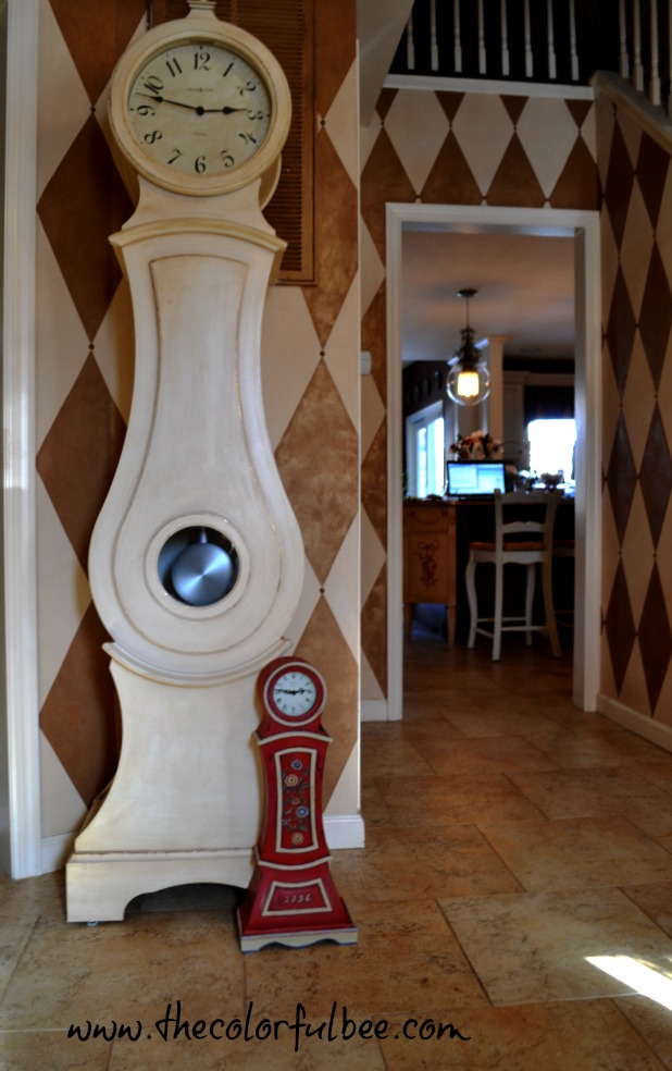
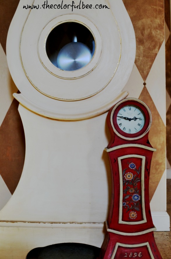
A Hand Painted Miniature Swedish Mora Clock

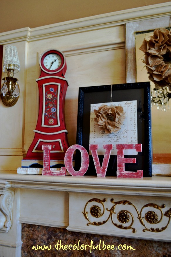
Last summer, a friend of mine – Anthony {who is related by marriage} suggested to me that my reproduction Mora clock in the entry would look great if it was painted red. I would have never considered that color in a million years – I have zero red accents in my house. I love the color – but it never happened in my decor. Now, Anthony is not just a casual observer who puts in his two cents…he is an artist and a designer and I have great respect for his talent and ideas. Red would be such a radical change! But – I did have this small reproduction Mora clock that I bought when I was first starting to stage homes for sale. Maybe that could be my test case!
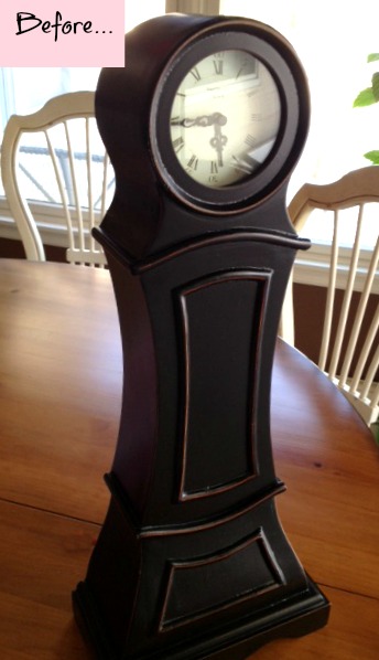
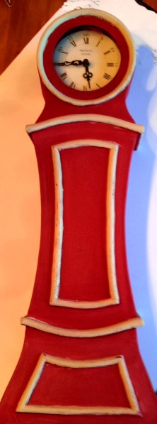
So, I had some Annie Sloan Chalk Paint left over from another project…so I dove in. I paiinted the body in Emperor’s Silk and the moldings in Versailles. Then I did some distressing.
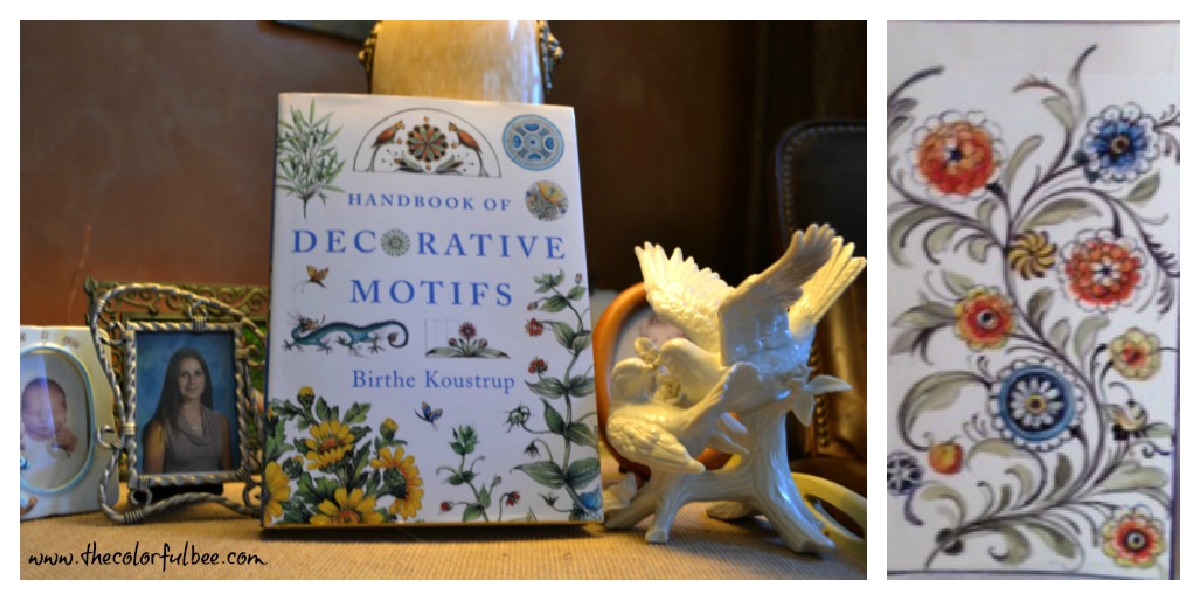
Then I started to do a little bit of research on various motifs that would be seen on authentic Mora clocks. Several years ago I bought a fantastic book “Handbook of Decorative Motifs,” by Birthe Koustrup – a Danish artist. This book is a great resource for any painter or designer. The book has so many great motifs in it – so I highly recommend it. But, there were two pages on Swedish design that interested me for this project. There were bouquets and garlands from paintings in the Zorn Museum of Mora (in Dalecarlie). I wanted something authentic for the center panel. I also look up some other designs online and a few that could be placed elsewhere on the clock.
 Pic of the bouquet…pic of the book
I first did the center design the same size as it was in the book – big mistake. It looked jumbled and crowded and I spent the better part of Saturday afternoon doing this. Waste. Of. Time. But – lesson learned. So I painted over it, enlarged the pattern and deleted some of it so it would fit – and traced the S-shaped vine and made circles where the flowers would go and repainted again. I just added two more flowers – one on the top and the other on the bottom to fill out the design. Much better.
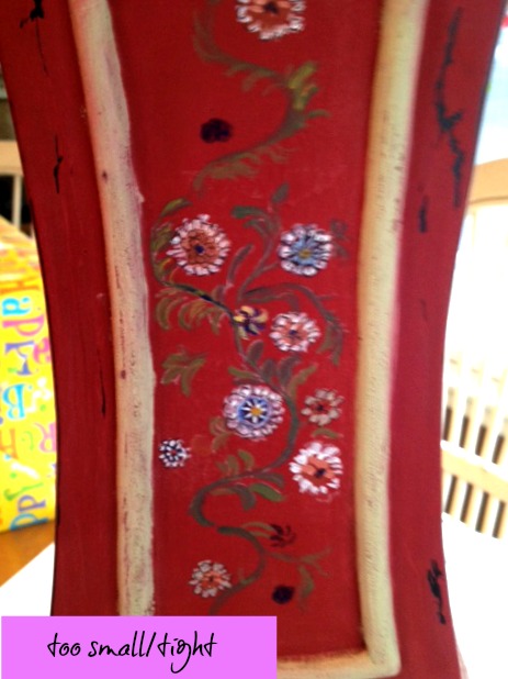
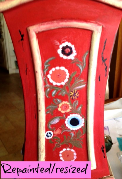
I wasn’t happy with a few of the flowers, so I changed the orange ones to Yellow Ochre and did my own design within it. Nice thing about Folk Art – and Swedish Folk Painting in particular – is that their florals are fanciful and not true to life – very representative. It’s really a lot of fun painting flowers like these!
I had to add a date to the piece, of course. I remembered seeing one Mora clock with “1896,” so I put that date in the small center molding panel on the front. I used the font Blackadder and sized it up to 72 pts. This font seemed the most naïve to me, so it worked.
Trying to figure out where it goes!
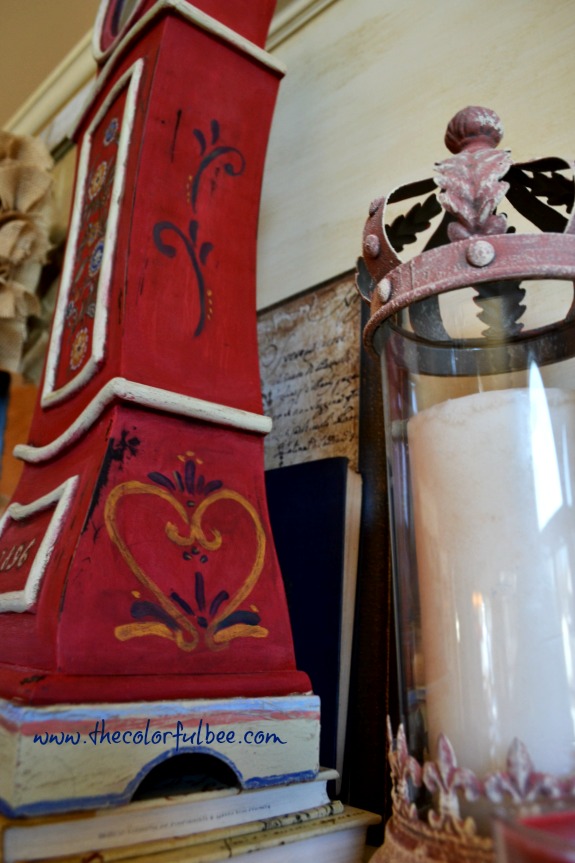
I added some other scrolls etc to the sides – and I used some Dark Brown Faux Crème Color with a little bit of water to age some of the corners and motifs. I haven’t waxed it yet – but I will probably use some Annie Sloan Clear Wax and then if it needs a bit more age – I’ll add some Dark Wax to it.
Mama and baby Mora clocks!
I hope you like it – it was fun to do. I am especially thrilled to be able to do some close up work now. As some of you know, I had some eye surgery last week to correct an exo-tropism that had been plaguing me for the past year. Better known as a lazy eye, this malady of mine should have been picked up when I was a kid but the doctors seem to think I just had great muscle control for many, many years. It started to really affect my vision in the last year or so – my depth perception kept getting worse and worse. As an artist, when your eyes begin to go – it’s very depressing. My eyesight is still a but blurry because the surgery was so recent – but every day I am seeing better and better. The surgery even improved my general eyesight. Unbelievable! Now – if only they could do something about the pain right after the operation…
To read about how I antiqued the Mora clock in my entry, click here
Sharing this with…Miss Mustardseed; Between Naps on the Porch; Savvy Southern Style; Power of Paint; Katherine’s Corner; My Uncommon Slice of Suburbia; Under the Table and Dreaming; Liz Marie Blog; House of Hepworths; The Shabby Creek Cottage; The 36th Avenue; Ivy and Elephants; Redoux; Romantic Home; French Country Cottage; Be Colorful, One Project Closer
Thanks for stopping by The Colorful Bee! Stay in touch and never miss a post.
*Subscribe to receive an e-mail when a new post is up, HERE.
*Subscribe to receive an e-mail when a new post is up, HERE.
26 Comments
Posted in Annie Sloan's chalk paint, interior design, Paint, Tutorials
Happy Valentine’s Day!
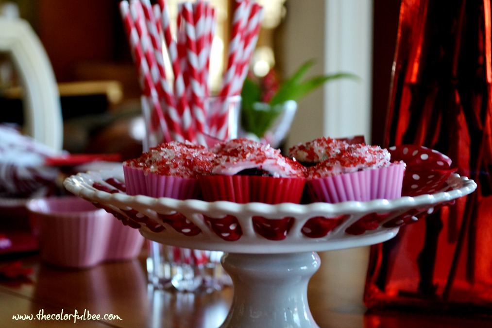
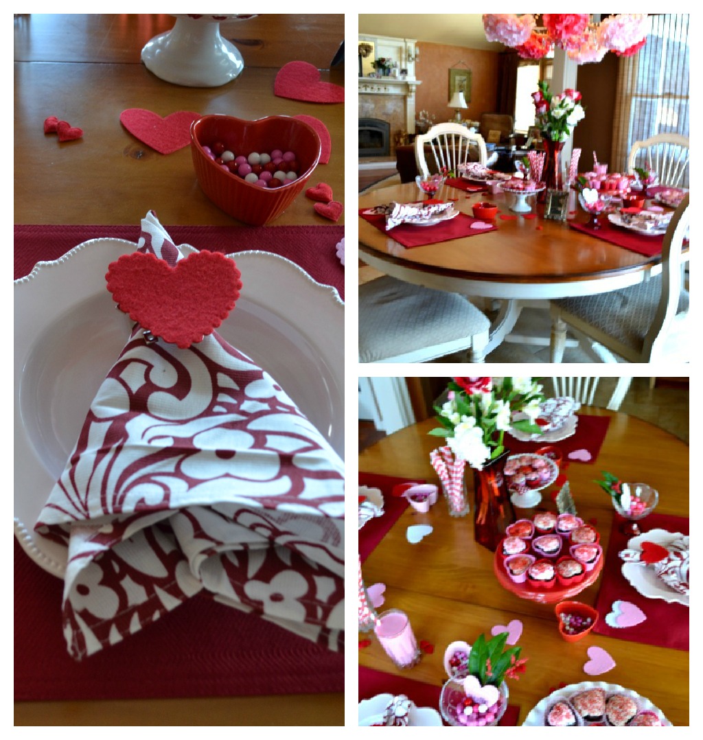
Happy Valentine’s Day everyone! I hope that your day is filled with love, kisses and chocolate {and diamonds???} Here are some pics from my table to yours…
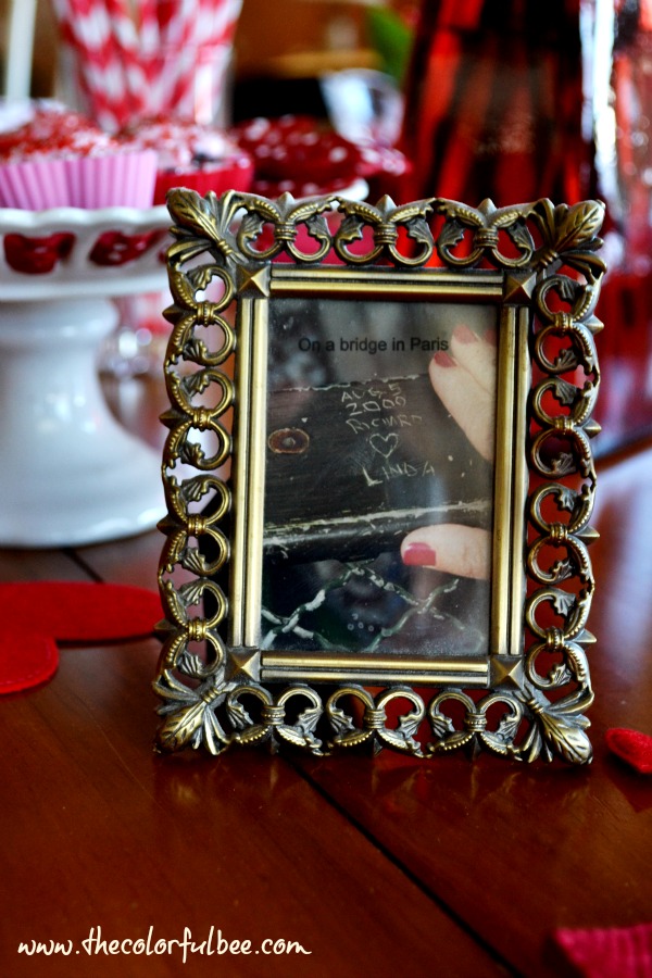
Had to add the picture of our names carved on a bridge in Paris! This picture is a gift my husband gave me one year for Christmas

 With much love…
Thanks for stopping by The Colorful Bee! Stay in touch and never miss a post.
*Subscribe to receive an e-mail when a new post is up, HERE.
*Subscribe to receive an e-mail when a new post is up, HERE.
4 Comments
Posted in interior design
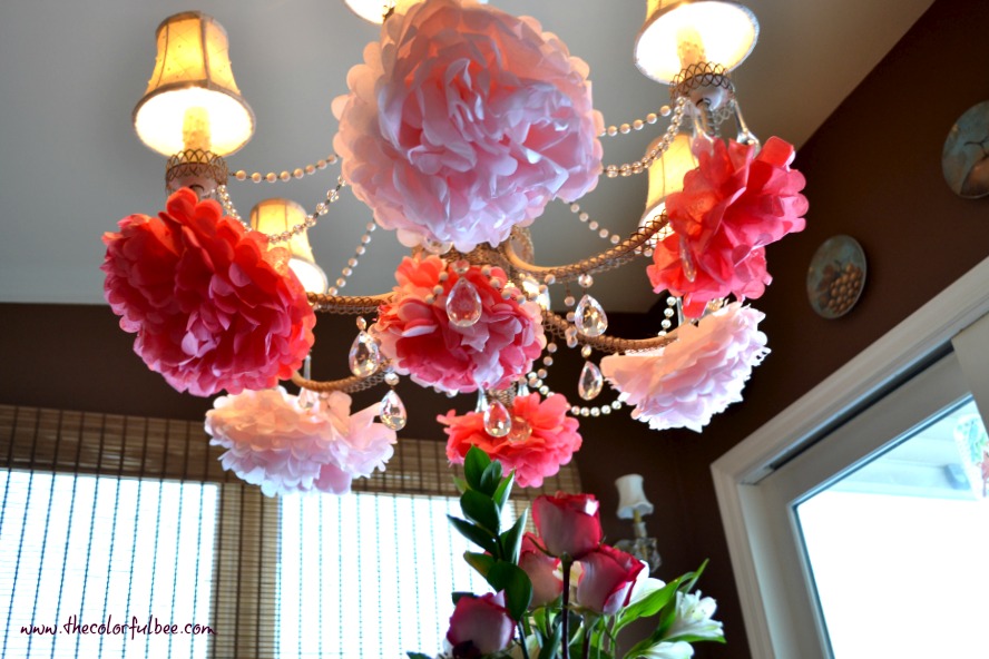
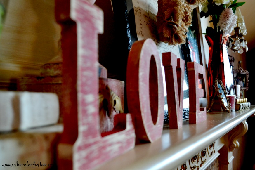
Valentine’s Day Mantle
I love Valentine’s Day – perhaps as much as Christmas and my birthday. So decorating for this holiday is such a joy. Even though this year’s Valentine’s will be a bit different – I will be going in for some eye surgery and I’ll be a bit blurry and bloodshot and seeing double – I will still have a great time. Good thing I love my husband because I’ll be seeing two of him!
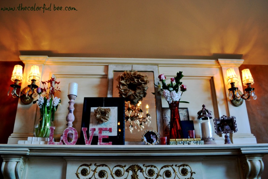
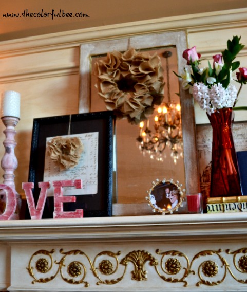
I had a little trouble with decorating this mantle and I’ll tell you why. I started with a smaller center piece – a lovely shabby chic mirror that I had bought about 30 years ago in Laguna Beach CA. When you get that center right – the rest is a piece of cake. So, I added some artwork on either side of the mirror – an antique framed “bill” from England on the left and in front of the mirror…and another antique print on the right side and in back of the mirror. This helped to widen the grouping. I made some burlap heart wreaths to hang over the mirror and the antique bill – to give some extra texture.
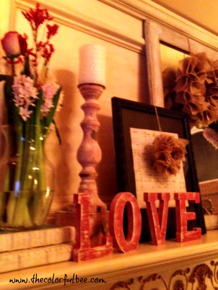
I added painted “LOVE” letters, a painted candlestick (used some Annie Sloan Chalk paint), some books and florals as well.
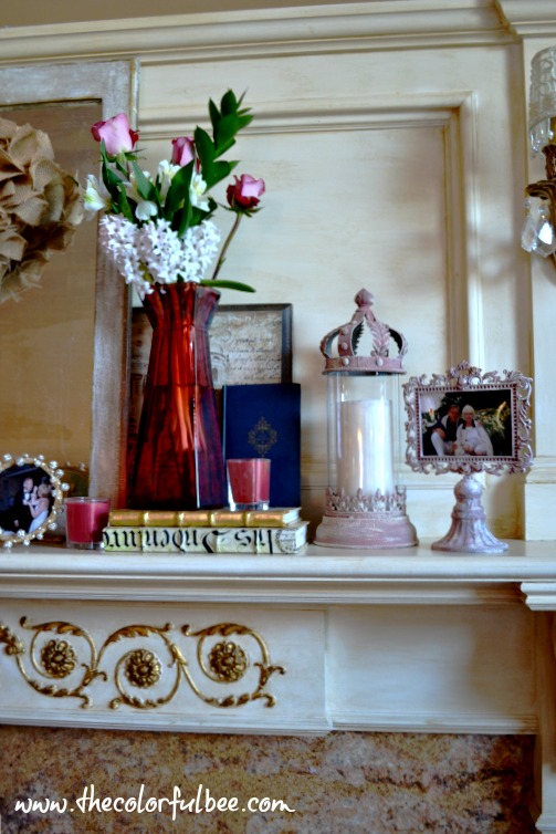
I added more books, florals and a re-painted lantern and frame (the lantern was a dull gray and the frame – a dark green). Much better in pink! Used some Annie Sloan Chalk Paint – Scandinavian Pink with a dusting of Old White.
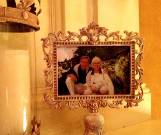
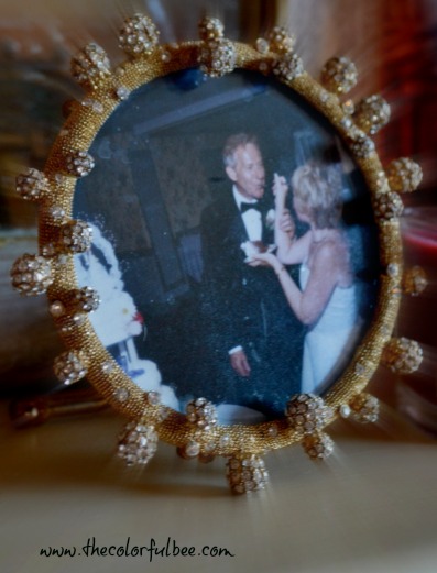
I also added of my favorite pictures of us on our wedding day – when I was feeding him the wedding cake. Little did my husband know that he would be the one doing all the cooking and feeding me now that he’s retired. The tables have certainly changed since that day!
Here are a few more pics…
I hope that everyone has a great day! Do you decorate for Valentine’s? Let me know in the comments below!
Thanks for stopping by The Colorful Bee! Stay in touch and never miss a post.
*Subscribe to receive an e-mail when a new post is up, HERE.
*Subscribe to receive an e-mail when a new post is up, HERE.
2 Comments
Posted in Annie Sloan's chalk paint, Paint
Adding Some Love in the Entry: A Valentine’s Table
I wanted to add a little extra romance in our entry, so I put together some Valentine’s decor on the little table in the foyer. I wish I had a grand entrance – but I always try to give this humble little space some extra love.
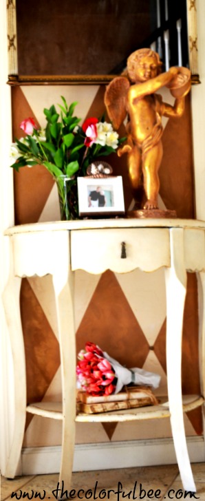
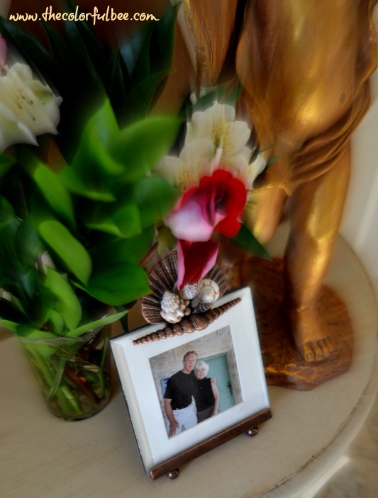
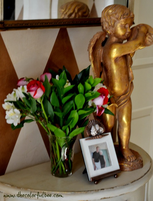
It’s just a little decoration…but it makes me happy when I see it. It validates, once again, that my husband and I are in love.
Happy Valentines’s Day!
Thanks for stopping by The Colorful Bee! Stay in touch and never miss a post.
*Subscribe to receive an e-mail when a new post is up, HERE.
*Subscribe to receive an e-mail when a new post is up, HERE.
Leave a comment
Posted in interior design
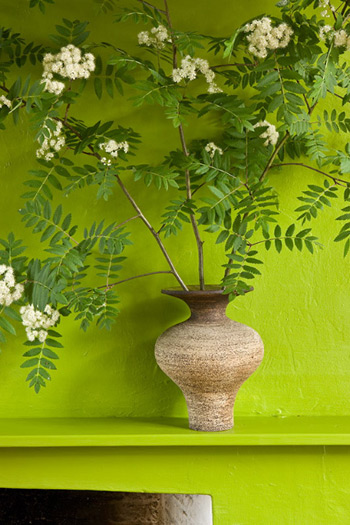
Color Roundup: Chartreuse, Lime and Apple Green in Interior Design
Since I’ve been planning on decorating another guest room in my house, I’ve been thinking long and hard about using chartreuse or lime green fabrics in it. It’s the smallest bedroom in my house {vacated not too long ago by one of my stepsons} which now houses a lot of my home staging accessories, fabrics, wrapping papers and other items that come and go in my home. I am thinking of keeping the walls light – probably white – and adding some lovely fabrics in the lime green family. I love the vibrancy of this color family – it makes me so happy to see it. So, I thought my readers might want to see some of the color ideas I’ve collected in this palette.
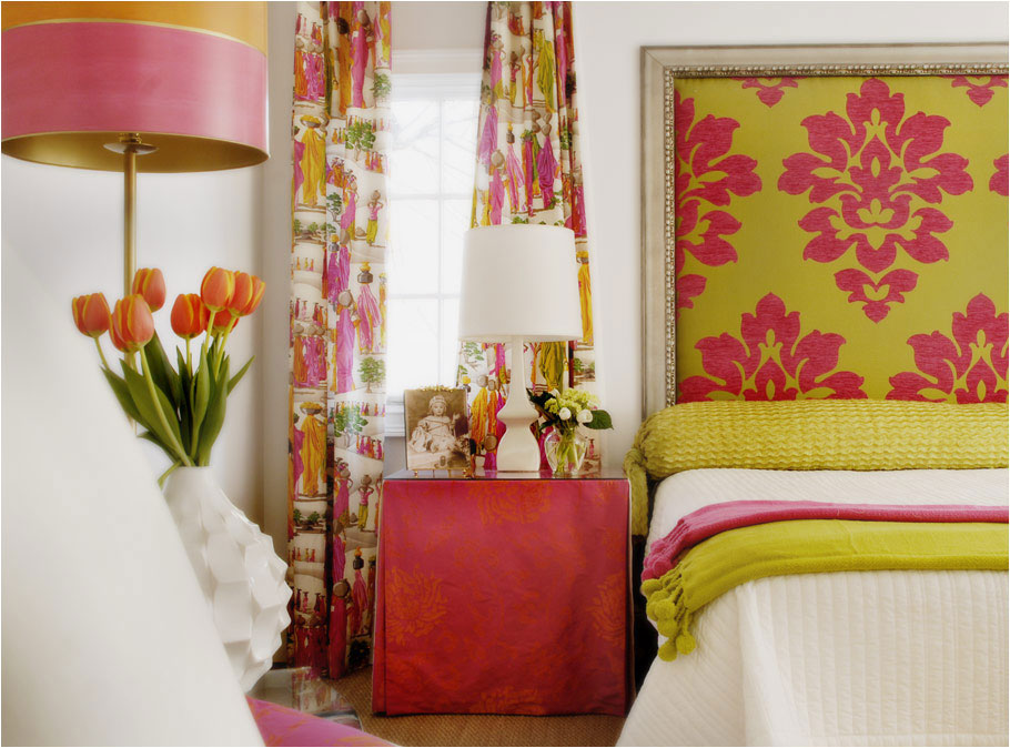
Paired with fuchsia, white and orange, it’s a color pairing that’s great for a bedroom
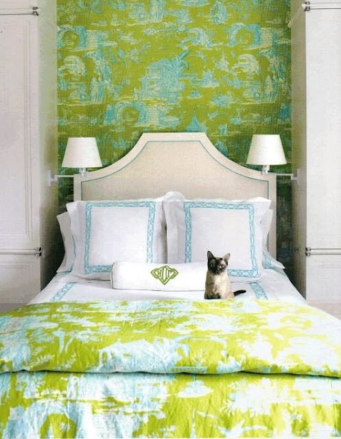
With blue and white, it makes an elegant bedroom statement
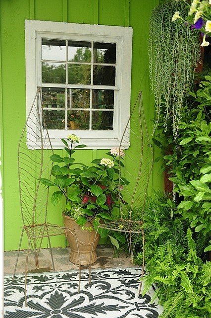
For an outdoor patio area, it’s a great color that blends with all the greenery
 It makes a great statement painted on doors
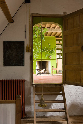
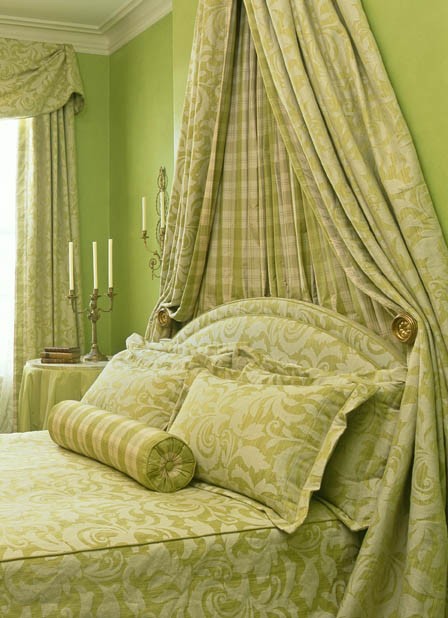
Maybe not everyone’s choice for a mantle – but this is gorgeous!
Here’s a closeup
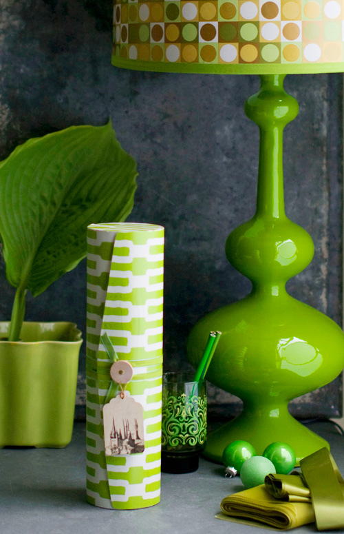 The bright accessories against a dull background really pop
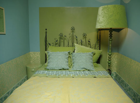
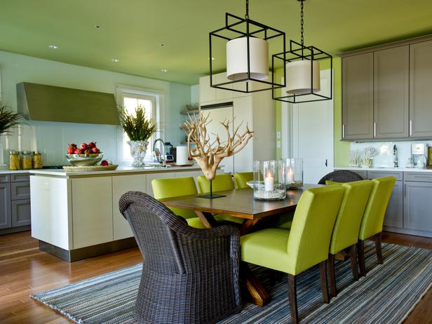 Love the pale lime green ceiling and those lovely leather chairs
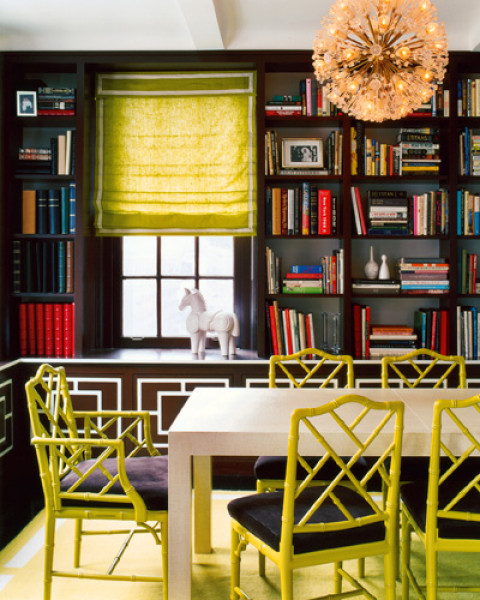 Jonathan Adler used chartreuse yellow on the chairs and window treatments to brighten this room
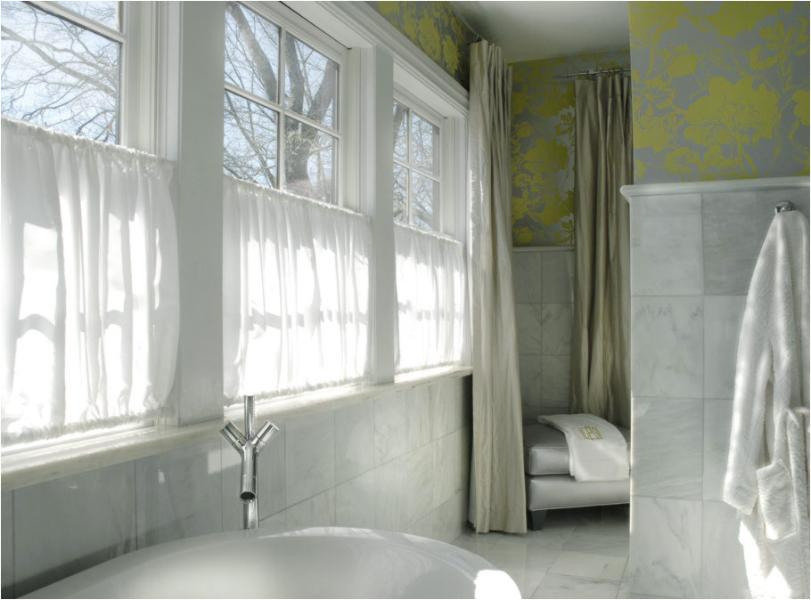 In a neutral bathroom, add some color with gray and chartreuse wallpaper
 Works well with other greens!
Blue and green should never be seen? Nonsense!
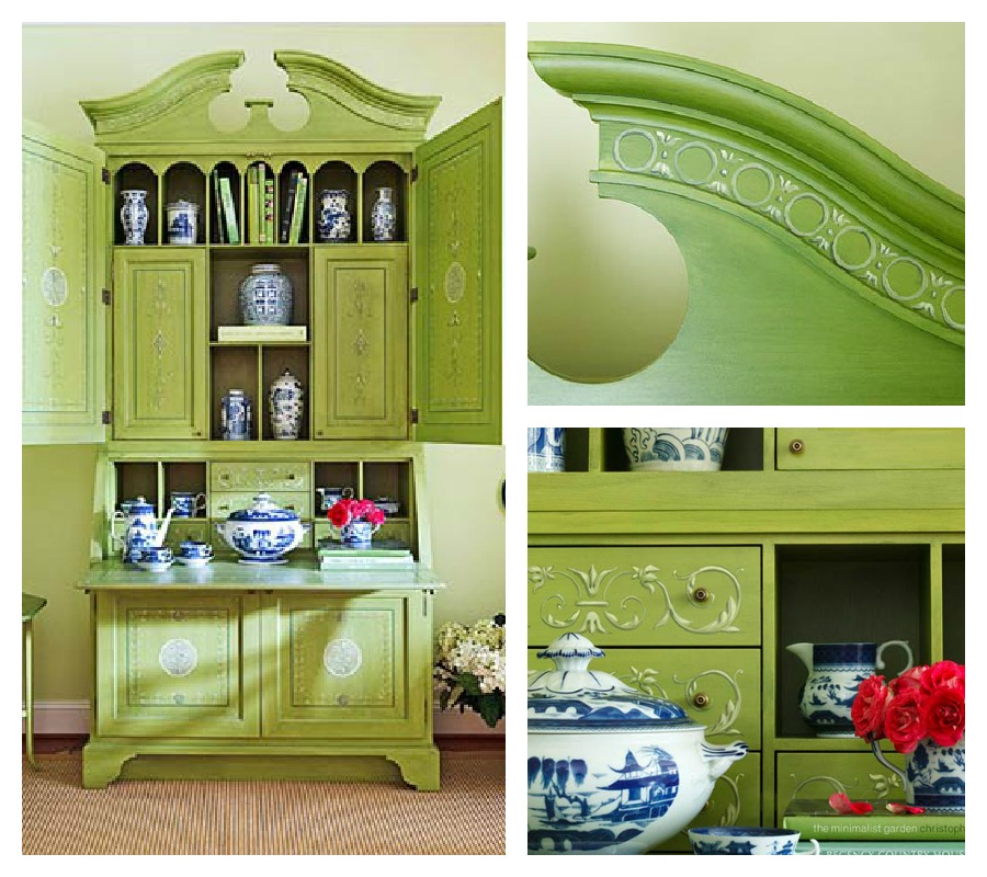
It’s beautiful as painted furniture

Lovely in bouquets…
Favorite Paint Colors: Hearts of Palm by Sherwin Williams; Summer Lime by Bejamin Moore; Dill Pickle by Benjamin Moore; Pear Green by Benjamin Moore;
Have you used this color palette in any of your rooms? Let me know in the comments below. If you have any questions about using chartreuse, lime or apple green – you can always ask me the section below. I will always get back to you!
Image credits: 1 and 10) Caldwell Flake 2) Tumblr 3) 4) D Magazine 5 and 6) Gilles Trillard 7) Matthew Mead via decor8 8) HGTV 9) Jonathan Adler 11 and 13) Mary Douglas Drysdale 12) Apartment Therapy 14) BHG.com
Thanks for stopping by The Colorful Bee! Stay in touch and never miss a post.
*Subscribe to receive an e-mail when a new post is up, HERE.
*Subscribe to receive an e-mail when a new post is up, HERE.
10 Comments
Posted in Benjamin Moore, Color Roundup, interior design, Paint
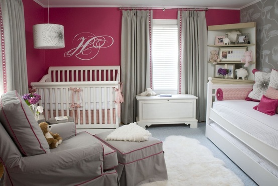
Color Roundup: Fuchsia in Interior Design
I don’t know what it is…but I have been seeing this color EVERYWHERE lately. Wasn’t a version of it, Honeysuckle, the Color of the year for 2011? What happened to Emerald Green?
I see it, in its warmer tones, in wedding color schemes…
In Clothing…

On Etsy, bolero via and tutu via
Or, with some purple added, in home furnishings…
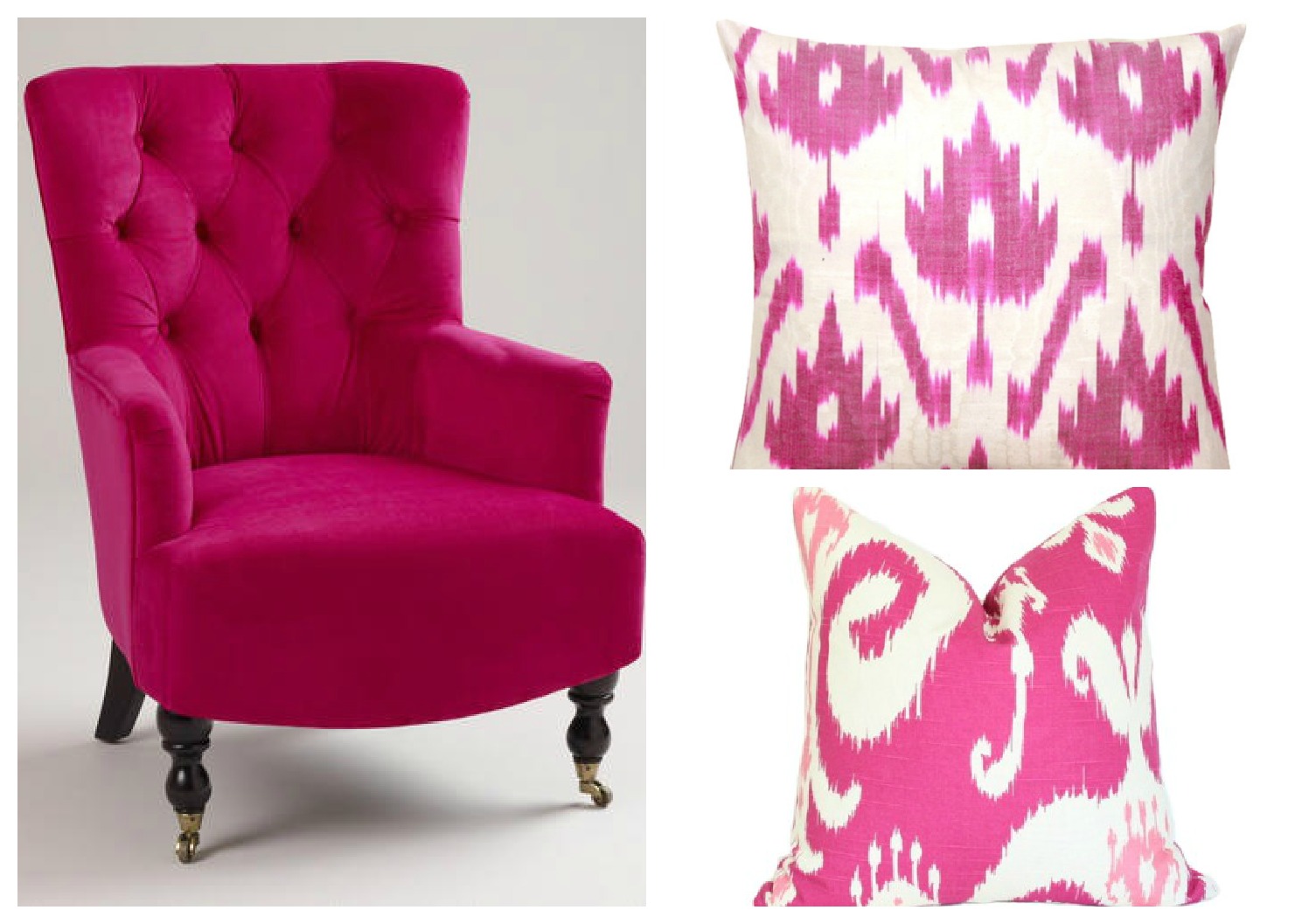
Nina chair from World Market; Ikat pillows from Furbish and Arianna Belle
I remember when I was 15 and my oldest brother was getting married, his wife-to-be chose fuchsia for the bridesmaids’ dresses. The reason? Not because she loved the color – but that she got the dresses for free from a friend’s wedding party. She had 3 sisters and, thinking economically, she figured it was best for eveyone. Except me – I hated this dress and I couldn’t wait until the day was over. It was a shiny silk taffeta and it fell to the shoulders (a little too fancy and sexy for my 15 year old body!).
But, as I got older, I learned to really love this color – especially when I realized it looked good on me! Whether my hair was brunette, red or blonde as it is now – it always seemed to bring out the best in me. And, I think that the color brings out the best in rooms as well.
Love it in nurseries…
You don’t have to use a lot of it…sometimes a touch of the color will perk up a room
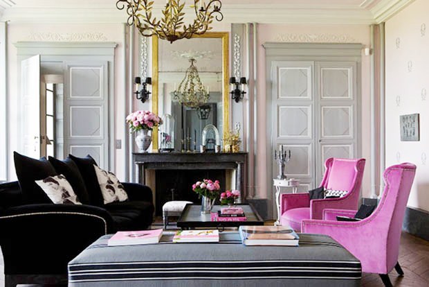
Photograph by Gilles Trillard
Or in the entryway…
Or…in a hallway or on a door via
I love it in bedrooms. Jamie Drake did a beautiful job with the hue one year at the Kips Bay Designer Showhouse – love the moire fabric he used on the walls.
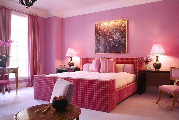
Here’s a closeup…
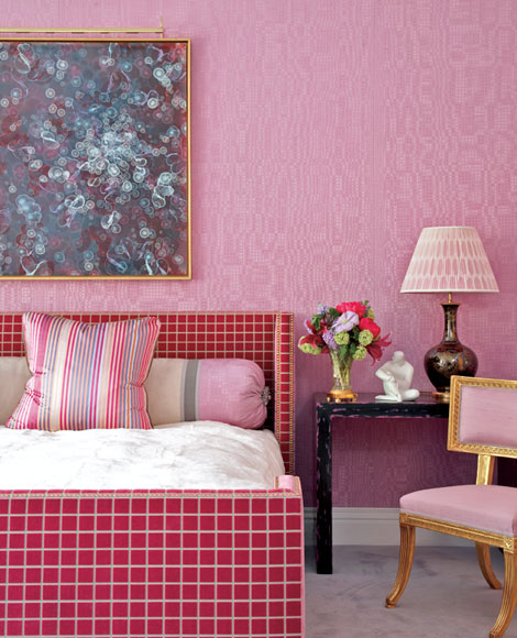
The other side of the bedroom…
Jamie Drake Via Traditional Home
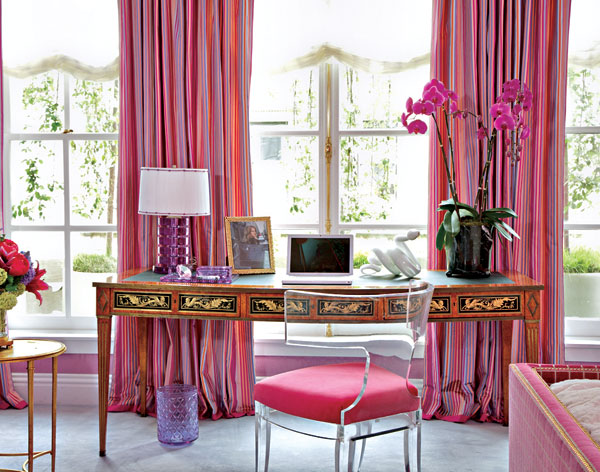
So, whether it’s the hot pink variety or a pink with some purple in it, fuchsia is just such a lovely color to use in your home {or all over your blog…can you tell I love it?} Here are some paint colors to try and some other colors to use with this hue…
- For a rich color, try Benjamin Moore’s Royal Fuchsia
- Want to go deeper…with more purple? Benjamin Moore’s Pink Corsage
- Want some lighter colors? Benjamin Moore’s Primrose Petals and Misty Rose
- For a light and modern look, combine fuchsia with gray (like the nursery pic above) or try a few shades of gray and black and feature fuchsia as an accent color.
- Add orange plus other shades of fuchsia and warm pink fabrics like Jamie Drake did in the Kips Bay Showhouse
- Pair with chocolate brown for a traditional look
Let me know if you have used this color and how you used it! If you need any color or design help, just call or email me. I would be glad to help!
Follow me on Facebook!
Follow me on Pinterest (I have a great Fuchsia Board there for you to look at too!)
Thanks for stopping by The Colorful Bee! Stay in touch and never miss a post.
*Subscribe to receive an e-mail when a new post is up, HERE.
*Subscribe to receive an e-mail when a new post is up, HERE.
1 Comment
Posted in Benjamin Moore, Color Roundup, interior design, Paint
Some Sunny Shots for a Snowy Day
I am doing some armchair gardening today because we had snow on the ground this morning – and I felt like giving myself a break from winter.
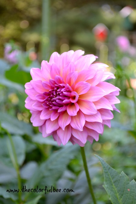
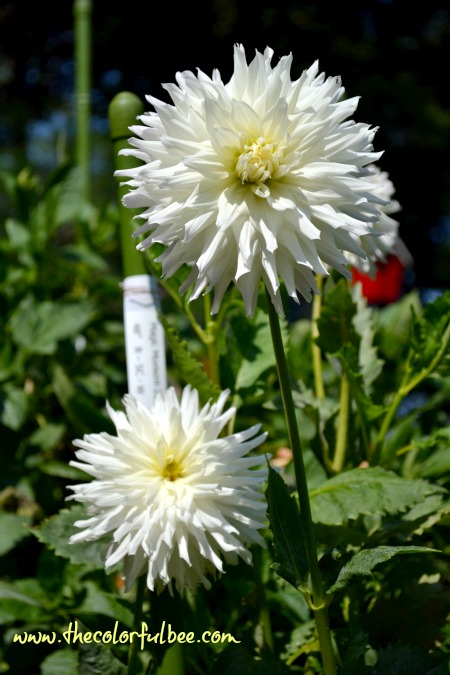
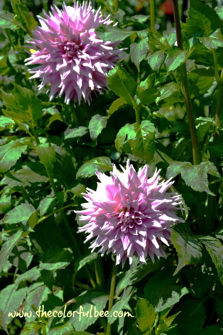
I took all of these photos last fall in the dahlia garden at the Bayard Cutting Arboretum near my home. I was supposed to enter a few of these pictures in the yearly contest that the Long Island Dahlia Society holds every year – but I missed it {thinking I had another week to submit..oh well I will enter this year for sure!} I got some really good bohkeh {the blurred stuff in the background!} on some of the shots.
 I didn’t do much editing to any of these pictures – I only reduced the size and I just adjusted til I got to a look I thought represented what was in my memory. I think that the beautiful colors of these flowers speak for themselves, don’t you think?
This year, I am going to be more serious about growing dahlias in my yard. I only planted about 4 or 5 of them a few years ago and I loved how they looked in the bed I have right next to my deck. I didn’t dig them and over-winter them {I got too busy with projects that year I remember}, and so that was the end of the dahlia experience for me. I substituted gladiolas – which I love mainly because they are hardy and they come up every year without me having to dig up the bulbs. But – they are like the best looking guy at a dance – nice to look at…but they don’t stick around very long!! So – I have to do some editing and transplanting of my gladiolas (or is it gladioli???) – and bring back some beautiful dahlias.
 I could easily wake up to these beauties every morning! Couldn’t you?
 The intensity and the blending of the colors really speaks to me…
 The textural beauty and endless combinations that expert gardeners have come up with is artistry itself.

 Just looking at these shots, I can imagine many color schemes.
 Oh – is that the colorful bee???

Have you planted dahlias in your garden {or are planning to?} Let me know your experiences and thoughts in the comment box below!
Thanks for stopping by The Colorful Bee! Stay in touch and never miss a post.
*Subscribe to receive an e-mail when a new post is up, HERE.
*Subscribe to receive an e-mail when a new post is up, HERE.
Leave a comment
Posted in Uncategorized
Making a Real Estate Office “Pretty:” Part 2
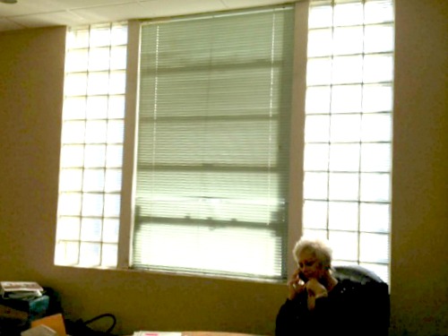
Before the transformation
So…one of the most glaring bits of ugly in this new real estate office was the huge window with the even bigger glass blocks. With a small budget – the best thing to do was to make some window treatments to cover them. I called upon my window treatment guru, Mary Ann Schultz from the Cornice Board, to make some simple panels. I had some Osnaburg fabric (an inexpensive linen) on hand that I had bought online awhile ago for $8 a yard. While I loved the fabric and it went beautifully with the walls etc, there was really nothing special about it – so after Mary Ann finished the panels…I stencilled a border on the panels.
 I put a large piece of cardboard in-between the front of the draperies and the lining and I stencilled a simple design that would go with the rest of the patterns in the room. I used Fabric paint (from Faux Effects) for this – but you could use any acrylic paint plus a fabric medium to get similar effects. I wasn’t going for bold – just a little ornamentation to make these plain linen panels a little bit nicer.

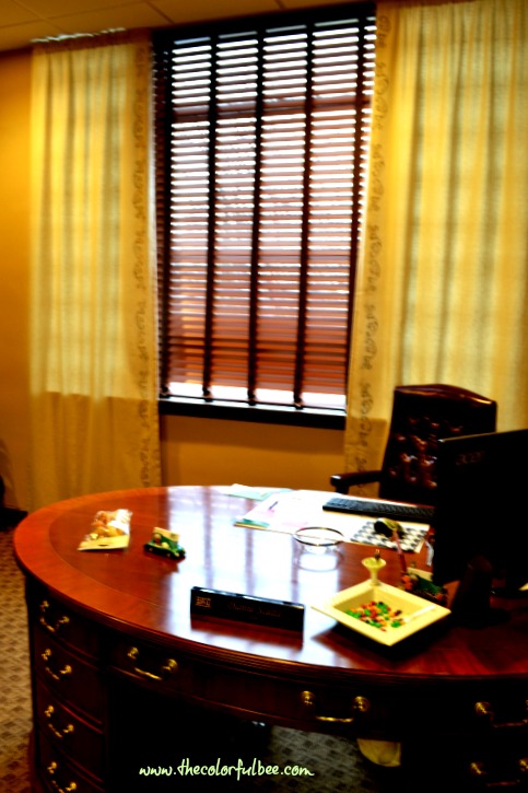
So much nicer than seeing the glass blocks!! One huge problem we encountered was that when we installed the rods we found out that part of it had to be put into an i beam – and we thought it was only concrete! So – since we couldn’t get the cement drill bit to drill through steel, we had to drill through the top part of the blinds (carefully – so that we didn’t upset the mechanism!).
If you missed Part One of this revamp of a realtor’s office, click here
Let me know what you think of this transformation!
Thanks for stopping by The Colorful Bee! Stay in touch and never miss a post.
*Subscribe to receive an e-mail when a new post is up, HERE.
*Subscribe to receive an e-mail when a new post is up, HERE.
3 Comments
Posted in interior design


 Decorative Finishes
 Interior Design
 Home
Home Garden
 Holiday
 Makeovers
 My Life
 Business
 Tutorials
 Videos
 Paint
Paint