
-

-
Subscribe
Thanks for stopping by The Colorful Bee! Stay in touch and never miss a post. Subscribe to receive an e-mail when a new post is up, HERE.Sponsor
If you're interesting in advertising on The Colorful Bee, click here to learn more.Contact
You can also email me at Linda.Leyble@gmail.com -


Categories
Subscribe
Popular posts
-
Recent Posts
Blogroll
Links

Author Archives: Linda
Making a Real Estate Office “Pretty”: Part 1
A very good friend of mine, Dianne Scalza, just opened up a new real estate franchise – Exit Realty All Pro in Bay Shore NY. Dianne is a colorful, dynamic and fearless woman and so when I saw her private office – all beige – I knew I had to feminize it and bring more color and “Dianne” into the space. Luckily, she asked me to help make it her own.
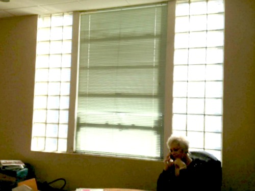
Before the transformation
…And we just had to do something about those glass blocks (with no budget to remove them. Tomorrow on the blog I will show you how we transformed the window!).
She needed some extra storage in her office but she didn’t want ugly file cabinets – so she brought along a bombe chest that she had purchased 10 years ago. A bookcase was also a priority – so I went in search of something that would work in this feminization of a boring real estate office. I found just what was needed on Craigslist – for $60!
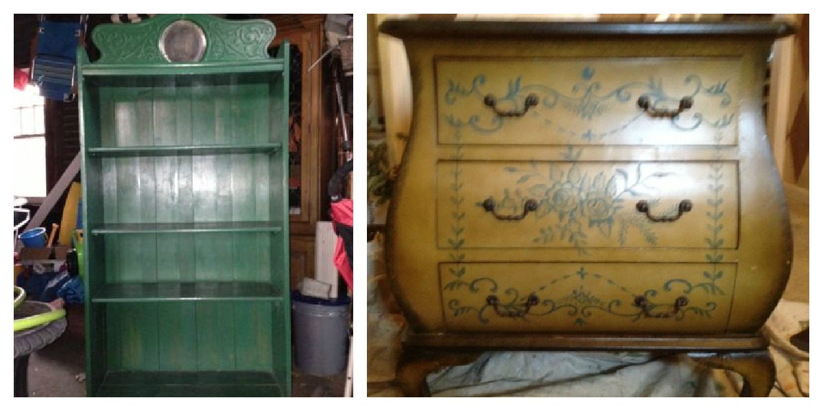
Before: The antique green bookcase and the bombe chest
Both of these pieces had some nice curves and sex appeal – but the colors were ugly. So – I got to work.
The Bombe Chest
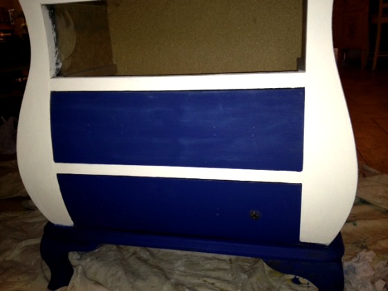
During…
I used some Annie Sloan Chalk Paints to revive this piece – Napoleonic Blue and Old White. Dianne loves anything nautical, so these colors really hit the mark. But I had to add some beachy elements to bring in Dianne’s love of shells and the beach. So – I added this…

On my porch, ready to go to her office!
I added this shell and roses design to the middle drawer. It’s a design called Shell Eloquence from Royal Design Studio – but I did something a little different than just stenciling. I first stenciled the design in Old White…then I freehanded the rest of the motifs – adding some Dutch Metal Gold and some dark brown for shading. I also touched up the hardware with some Dutch Metal Gold. Here’s a closeup of the drawer…

Closeup of the middle drawer design
I waxed the entire piece with Miss Mustardseed’s wax to make it durable. Here’s the chest in Dianne’s new office…
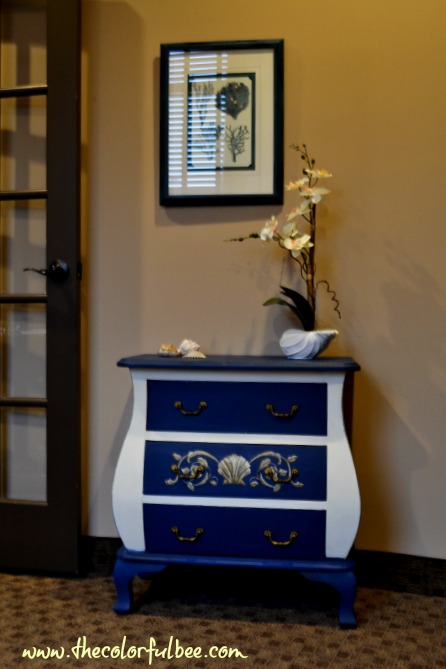
Additional elements added were a lovely blue coral picture that I found at HomeGoods (for $10), but it had a black frame, which I changed by adding some Annie Sloan Chalk Paint and some shells – including a shell planter with a faux orchid.
The Bookcase
Being that it was a deep forest green, you really couldn’t see the lovely scroll work at the top of the piece, so I had to make sure that this was prominent. You also didn’t really notice the wonderful paneled backing of this bookcase. I don’t know what year it’s from but the panels had a lot of depth being that every other panel protruded a bit (a staggered bead board effect). I wanted the inset top and the back of the piece to stand out – so I created a custom pale blue paint color for it. The rest of the bookcase was painted an Off White.
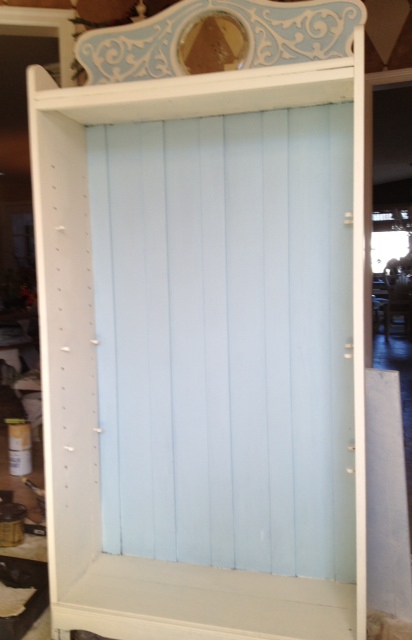
During – right before antiquing
I antiqued the bookcase with some raw umber and dark brown glaze, just to bring back the history of the piece.
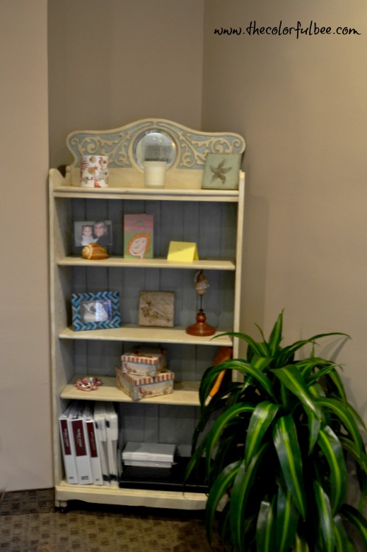 Much more feminine…don’t you think? So – please come back tomorrow when I show you how we transformed the windows!!!
Let me know what you think in the comment box below!
Linking this project to: Miss Mustardseed; French Country Cottage; Redoux Interiors; Liz Marie; Common Ground; Between Naps on the Porch; It’s So Very; Katherine’s Corner
Thanks for stopping by The Colorful Bee! Stay in touch and never miss a post.
*Subscribe to receive an e-mail when a new post is up, HERE.
*Subscribe to receive an e-mail when a new post is up, HERE.
8 Comments
Posted in Annie Sloan's chalk paint, interior design, Paint
Color Roundup: Using Black in Interior Design
OK – I know that you might be a bit scared to use a lot of black in a room (especially on your walls). But if you haven’t tried it, I encourage you to use black in at least one of your rooms for 2013. As you’ll see in the examples I’ll show you today, black – when used correctly – lends sophistication, drama and punch to a space.
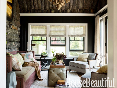 In a rustic room, black adds a restful quality to this light-filled space designed by Thom Filicia. He used Pittsburgh Paints Black Magic as the color.
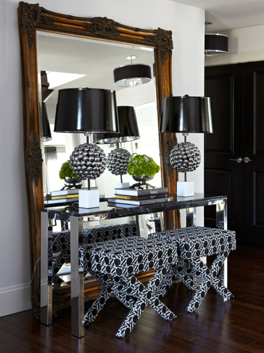
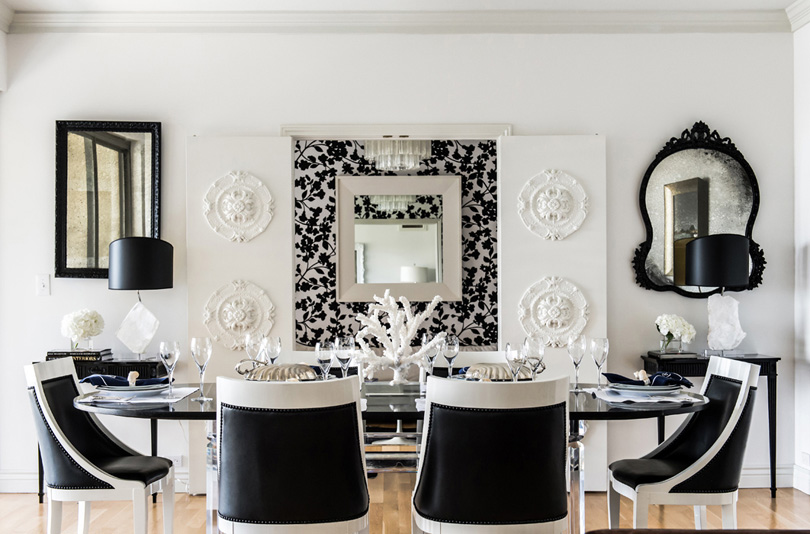
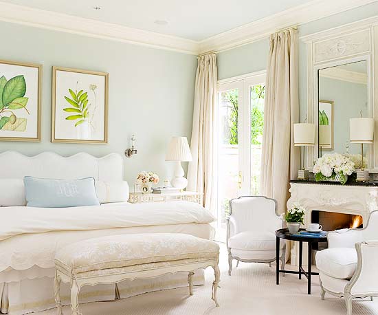
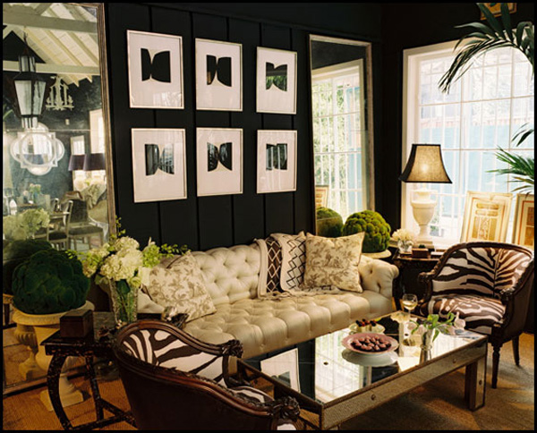 A room with a lot of natural light, large mirrors, some cream upholstery and matted artwork doesn’t look dark and moody. Contrast always brings interest and light to a seemingly dark space.
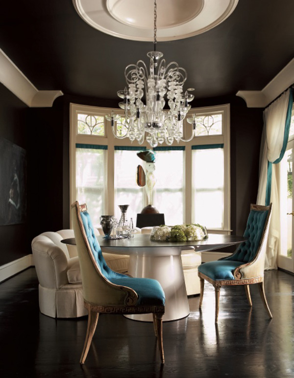
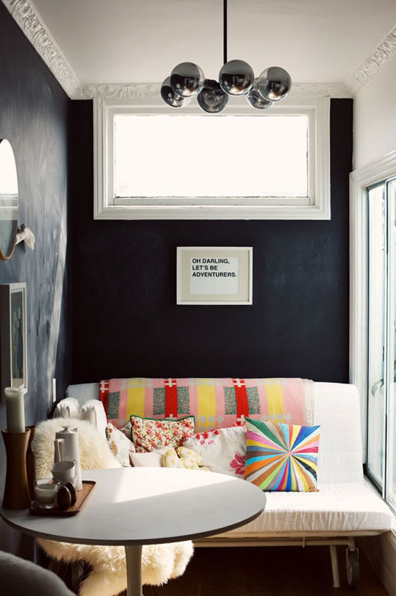 In small, intimate spaces – black can be the impetus for conversation and reflection. Add sprightly dashes of color to make sure talk and meditation are positive!
 The graphic nature of black and white lends itself easily to artwork. Not only does this piece speak in text…it speaks in emotion, volume and contrast.
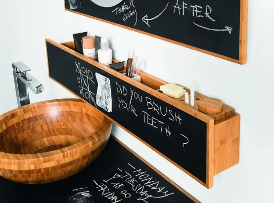
Using Black Chalkboard Paint…for Interest, Functionality and Art
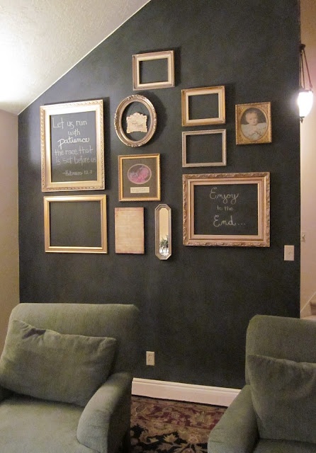
My blogger friend, Michelle, created this beautiful black chalkboard wall in her home that is not only functional – but beautiful as an accent wall.
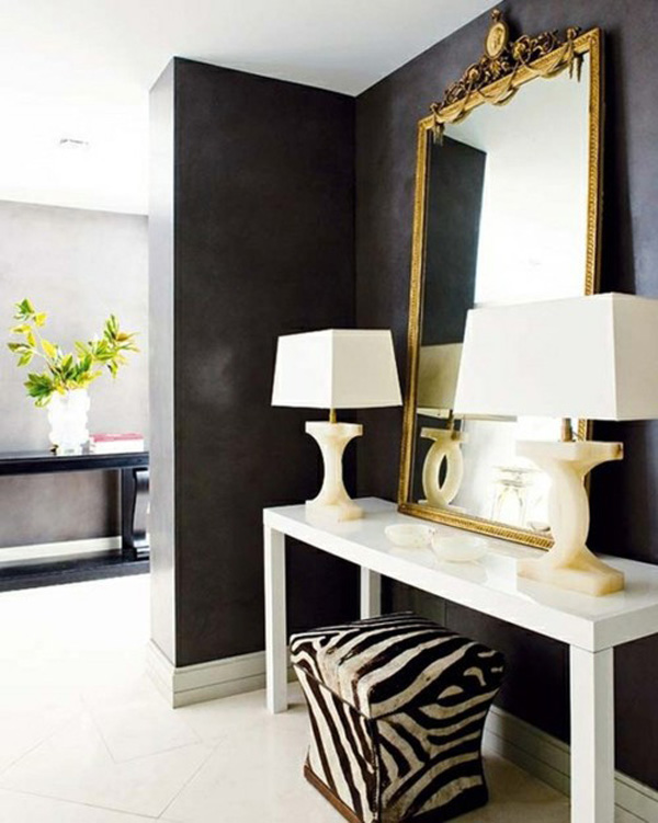
Using Black in the Entryway
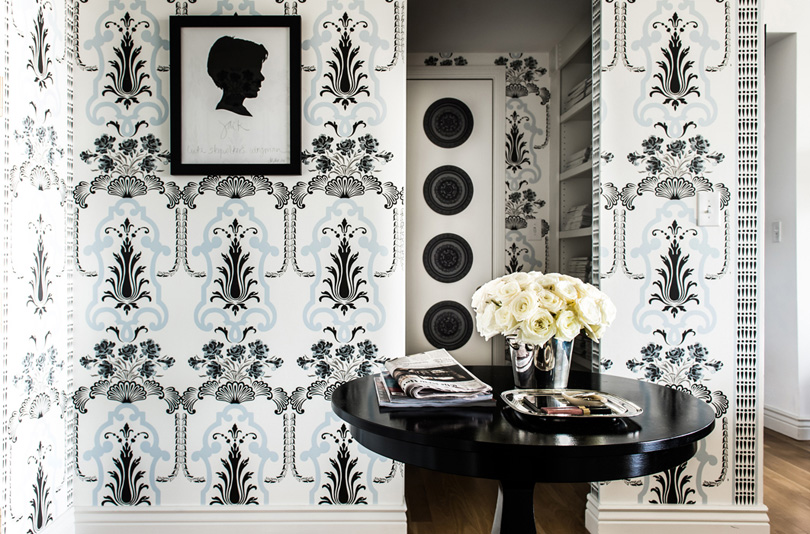
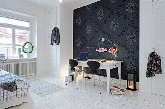
Black, even in small doses, can liven up an entryway. Whether it’s on a door, your stairs, in a wallpaper, lampshades or in a fabric – black will get noticed.

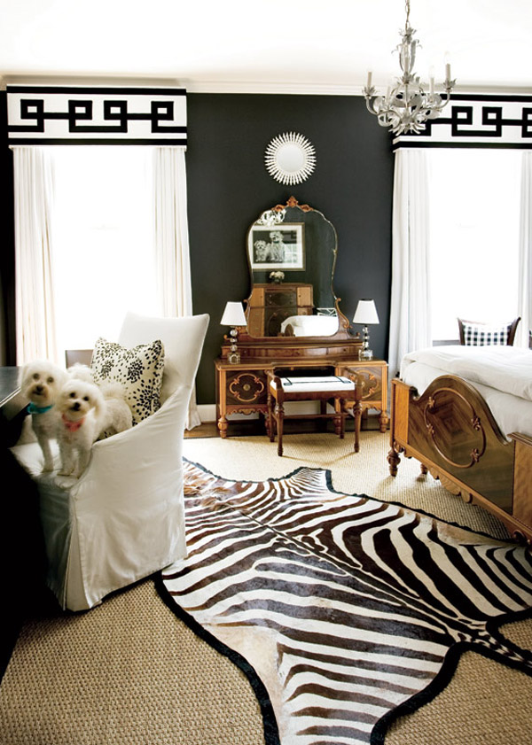
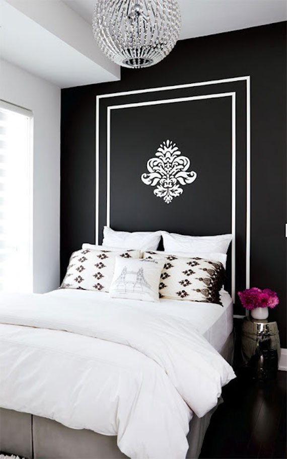
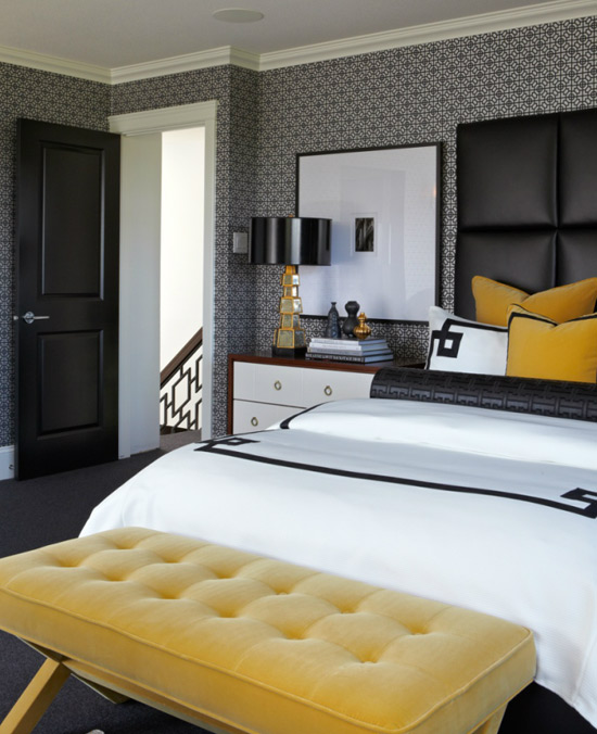
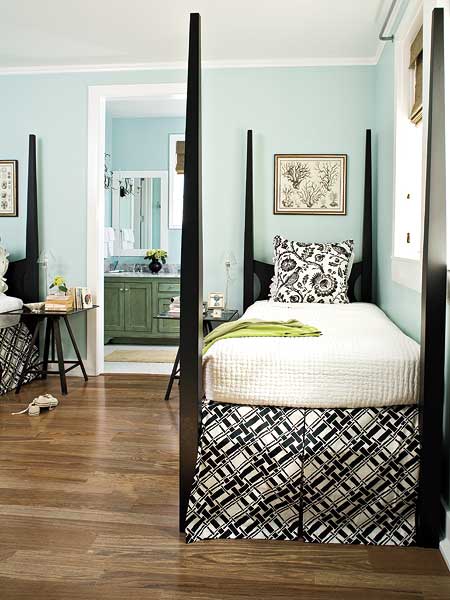
Using Black in the Bedroom
It’s the one space where you want enough peacefulness so that you can get some rest – so why not use some black. Add some white graphic draperies, to punch up the contrast…or stencil a faux headboard in gold for interest. Used as an accent wall – it’s a lovely way to be dramatic in a soft way. In a very feminine room, adding black will help your husband or significant other to feel more “at home.!”
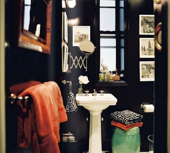
Black in the Bath
Black works in small spaces as well. Why try to hide a small space – celebrate it by giving it some stature. What about adding a jolt of color to a black bath – like yellow…orange…or green? For a child’s bath – add functionality and fun by adding chalkboard furniture. For an elegant and unexpected bath, how about a black vanity?


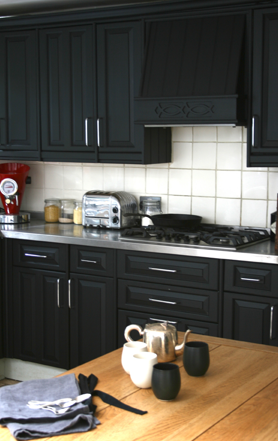
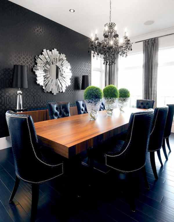
Black Kitchens and Dining Rooms Anyone?
Though very un-traditional, black cabinetry can update a tired kitchen in a hurry and under budget. A black dining room tells your guests that you are anything but predictable!
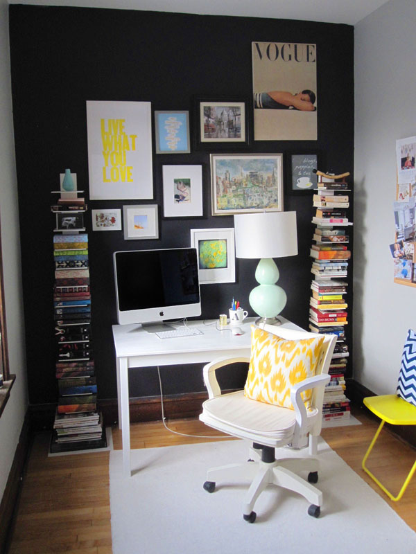
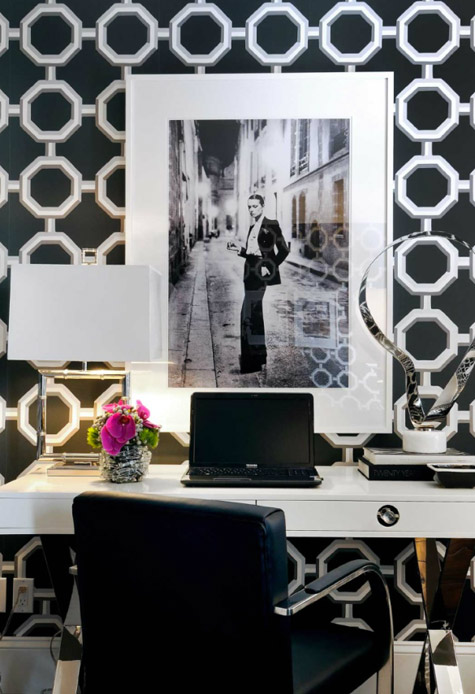
Using Black in Office Spaces
You want your office to be a place that is serious enough to be professional and believable yet fun enough to make you want to spend a lot of time there – in a space that inspires you to be creative. Black fills the bill.
Some Favorite Blacks: Martha Stewart’s French Bulldog Black; Benjamin Moore’s Black Satin; Pittsburgh Paint’s Black Magic.
Not quite ready for all black? Try charcoals like Benjamin Moore’s Iron Mountain and Witching Hour.
So – I hope that I have convinced you to, at least, think about using black in your rooms. A small accent…a focal wall…a full 4 walls of black – I know that you will love the punch and liveliness that this {supposedly} lack of color can add to your space!!
If you have used black in your home – even just painting a piece of furniture in black…let me know your experience in the comment box below! Ah come on! Leave a comment – even to tell me how you feel about black interiors!!
Image credits: 1) Thom Filicia vis House Beautiful 2, 10, 14, 19, 22) Freshome 3, 6, 11,12, 23) via Impressive Interior Design 4) Art by Barteski 5) Michelle 7) Architectural Digest Espana 8) Via The Lennox 9) via Desire to Inspire 13) Atmosphere Interior Design 15) unknown 16) Alberto Demel via Cocoboro 17) Cocoboro 18) BodieFou 20) Atmosphere Interior Design via Freshome 21)
Thanks for stopping by The Colorful Bee! Stay in touch and never miss a post.
*Subscribe to receive an e-mail when a new post is up, HERE.
*Subscribe to receive an e-mail when a new post is up, HERE.
5 Comments
Posted in Color Roundup, interior design, Paint
Color Roundup: Rustic Stone and Brick Used in Interior Design
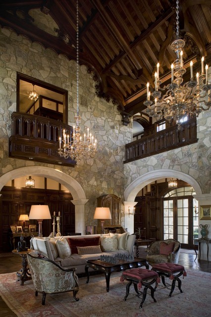
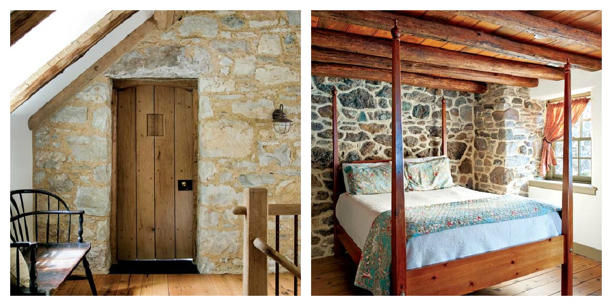
For today’s Color Roundup, in lieu of a color, I decided to show some incredible stone and brick interiors. Nothing says rustic like a beautiful stone fireplace, accent wall or exposed brick ceiling or wall. I’ve always been so attracted to interiors that incorporate these elements. Whether majestic, as the gorgeous Tudor style living room, above, by Mark Cravotta Studios…
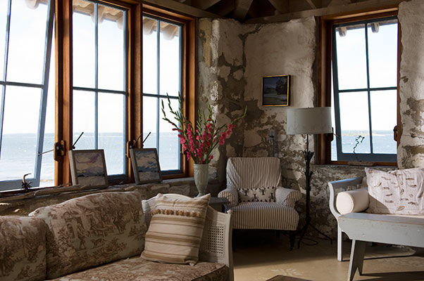
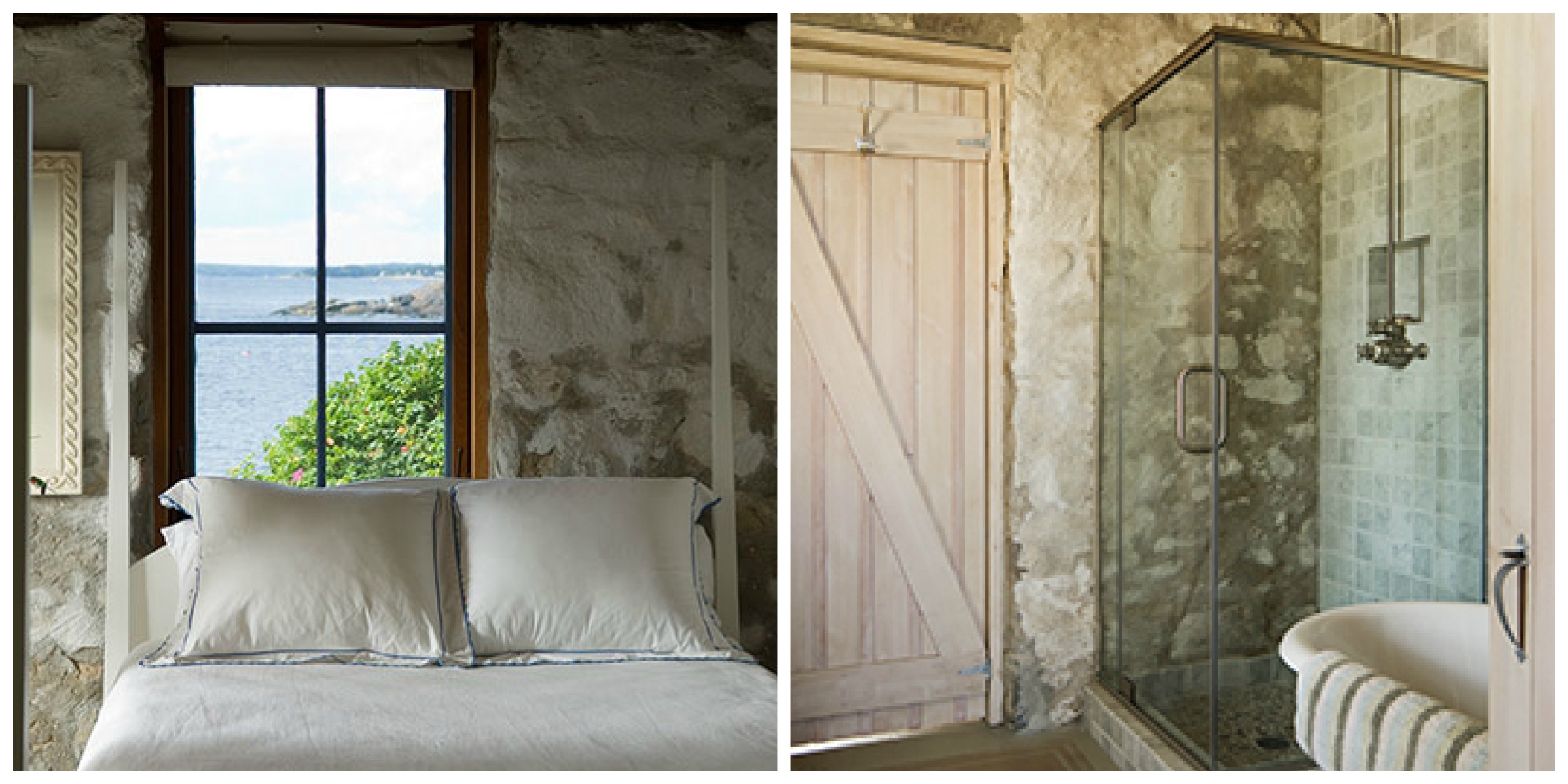 Or cottage style, as above by The Knickerbocker Group in Maine. Using stone can transform your room into a warm and rustic space that’s steeped in history {whether real or faux}.
Here are a few others images of their work…
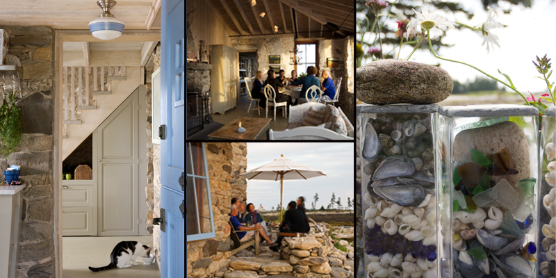
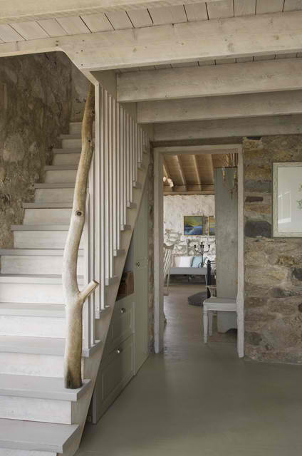
The stonework is amazing…but how lovely is the driftwood railing!
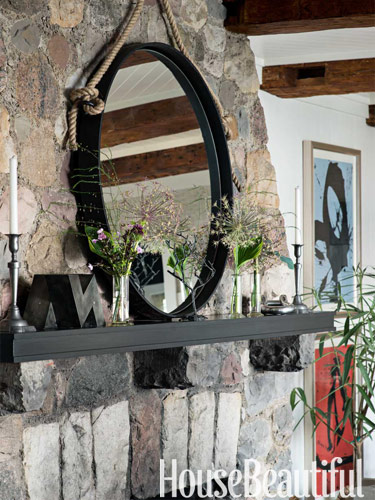
Beautiful fireplace with a simple mantle and Restoration Hardware mirror
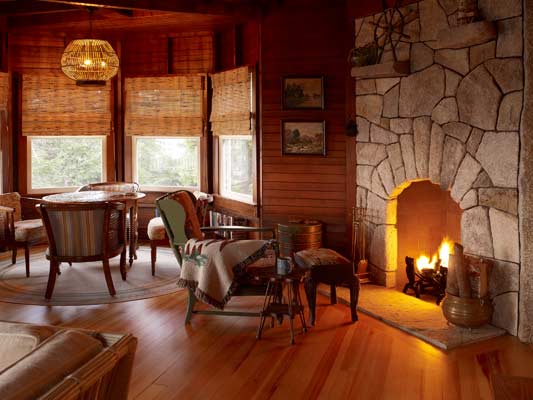
Speaking of beautiful, rustic spaces, above – a great fireplace by designer Thom Felicia.
 Whether old or new – stonework walls lend authenticity to any home.
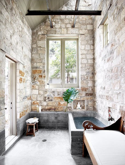 One of the first photos, above, that I saved while researching for this post was a gorgeous bath – image by Ryann Ford photography. It is so Zen-like, I can imagine meditating here daily – and I don’t do enough of that {do I hear a resolution coming on??}
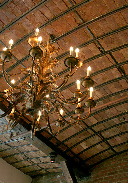
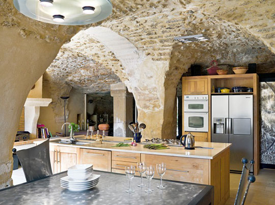
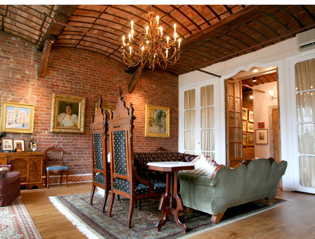 Let’s not forget about brick – the two above photos are images I saved several years ago from a feature on Apartment Therapy. This space in Greenwich Village, NY has such amazing architecture. I’m not a fan of the furnishings…but I love the barrel vaulted ceiling and all the brickwork and this feature – a gorgeous stone fireplace…

I think that of all the rooms that feature stonework, the kitchen is my favorite. There’s such simple beauty in it that I just want to start cooking and invite people over.
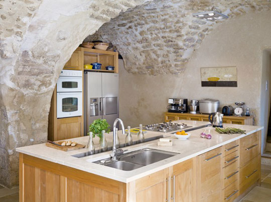
 This beautiful kitchen in Provence has very simple, clean-lined cabinetry and modern amenities – but the original stonework is amazing! When you juxtapose the modern with the old, it creates such beauty.
The French really know how to cook and they whip up beautiful kitchens as well. The following spaces were designed by Marie Laure Helmkampf, an interior designer practicing in the South of France.
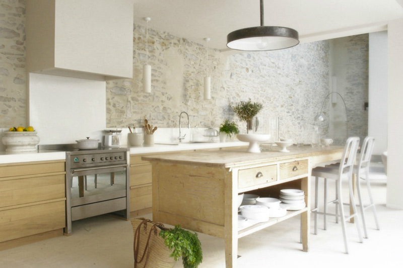
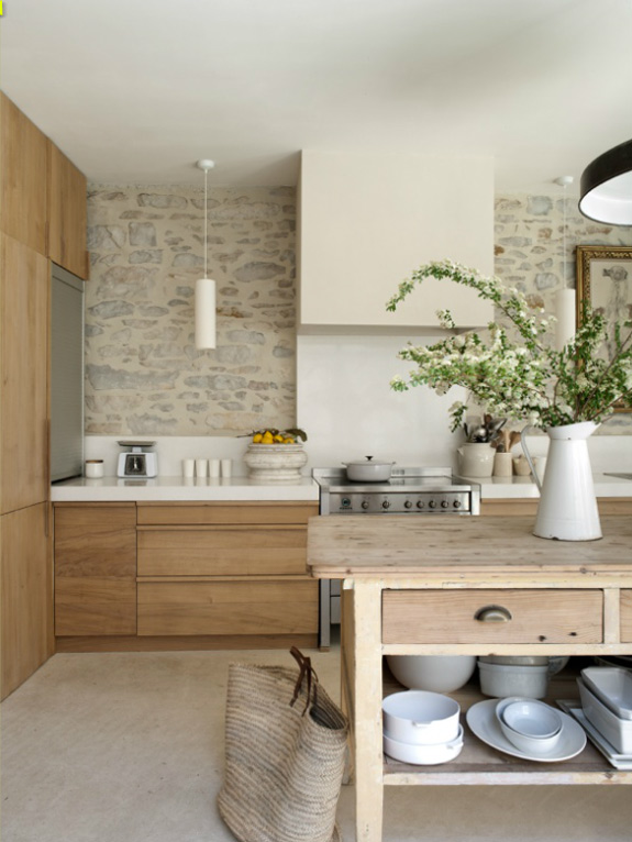
She does really beautiful spaces, other than kitchens as well.
 I love how she used the stonework as the headboard
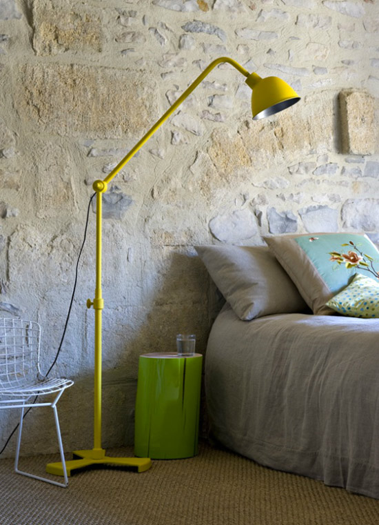
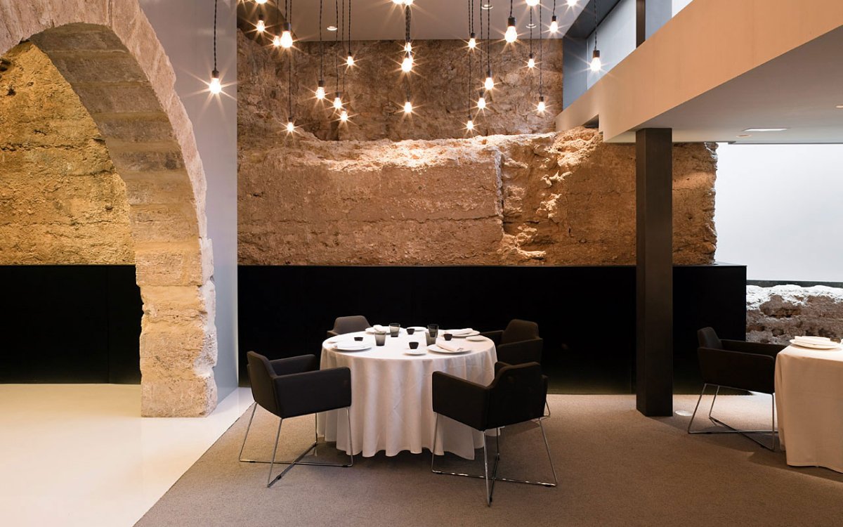
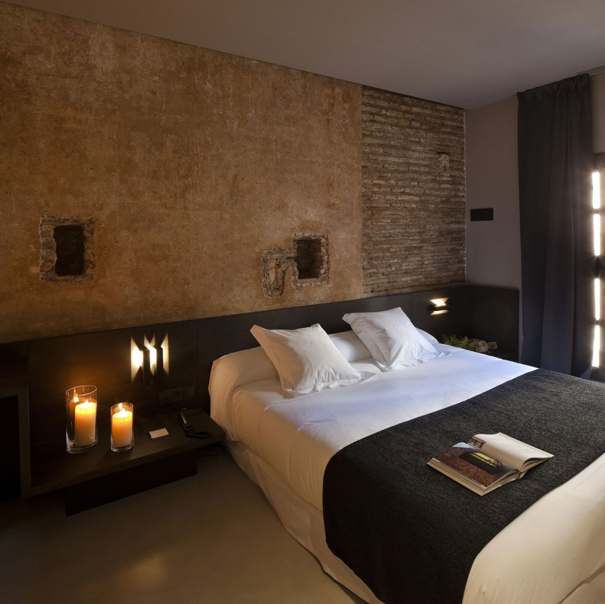
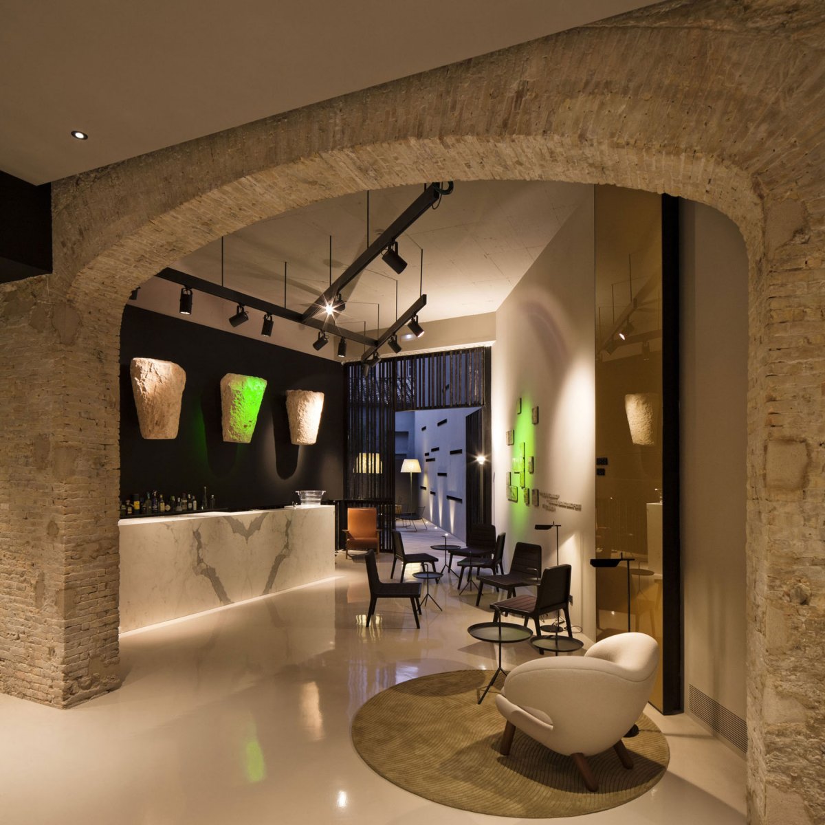
You can get great inspiration on using stone by looking at some hotels in Europe and elsewhere. Here are some images from the Caro Hotel in Valencia, Spain – a great mix of modern and old world.
Have you used stone or brickwork for any of your interior rooms? Let me know – I would love to see them. Later this week, I will show you some projects and samples of how I created some faux bricks and stonework using plasters.
Hope you are having a great 2013 so far. Happy New Year!
Image credits 1) Cravotta Studios 2 – 5) The Knickerbocker Group 6) Thom Felicia via House Beautiful 7) Old House Online 8)Ryan Ford Photography 9-11) Apartment Therapy 12-13) The Kitchn 14-16) Marie Laure Helmkampf 17-19) Caro Hotel
Thanks for stopping by The Colorful Bee! Stay in touch and never miss a post.
*Subscribe to receive an e-mail when a new post is up, HERE.
*Subscribe to receive an e-mail when a new post is up, HERE.
5 Comments
Posted in Color Roundup, interior design
Wishing You a Very Happy New Year
I want to wish everyone the very best and happiest New Year. I am not sorry that 2012 is coming to a close – it wasn’t the best year for many of us {Superstorm Sandy being one of the things we could have done without!}
May you have…
 Wonderful family celebrations {here, with my youngest daughter, Jessica, on her birthday}


A wonderful spouse/partner who cherishes you…
 As much uncontrollable laughter {as my grandson}
 Make new friends as easily as you did when you were a kid{my niece on the left and my granddaughter, right}
 Someone to make beautiful music with {like my granddaughter and I}
 And like my nephew and I…
May you be blessed this year with wonderful family and friends, abundant health, laughter, prosperity…and new roads to travel down that will give you more happiness and peace.
Happy 2013!
Thanks for stopping by The Colorful Bee! Stay in touch and never miss a post.
*Subscribe to receive an e-mail when a new post is up, HERE.
*Subscribe to receive an e-mail when a new post is up, HERE.
Leave a comment
Posted in Uncategorized
Favorite Projects and Blog Posts from the Past Year
Hello everyone! I hope that you are all enjoying your holidays and some much needed time off. I thought I would have some down time – but, as usual, a few clients need my help before the New Year. I don’t know why this happens to me every year – but it does! Not complaining at all…but I was looking forward to some rest. Yesterday I finished a logo on a gym floor (oh my aching knees and back) and tomorrow I am helping a client move into a new home. I had a few minutes, so I thought I’d share my most popular posts…in case you might have missed a few! Happy Holidays and a very prosperous New Year to you all!!
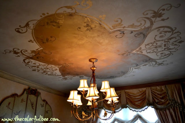 My Dining Room Ceiling: You can read about how I created this step-by step here
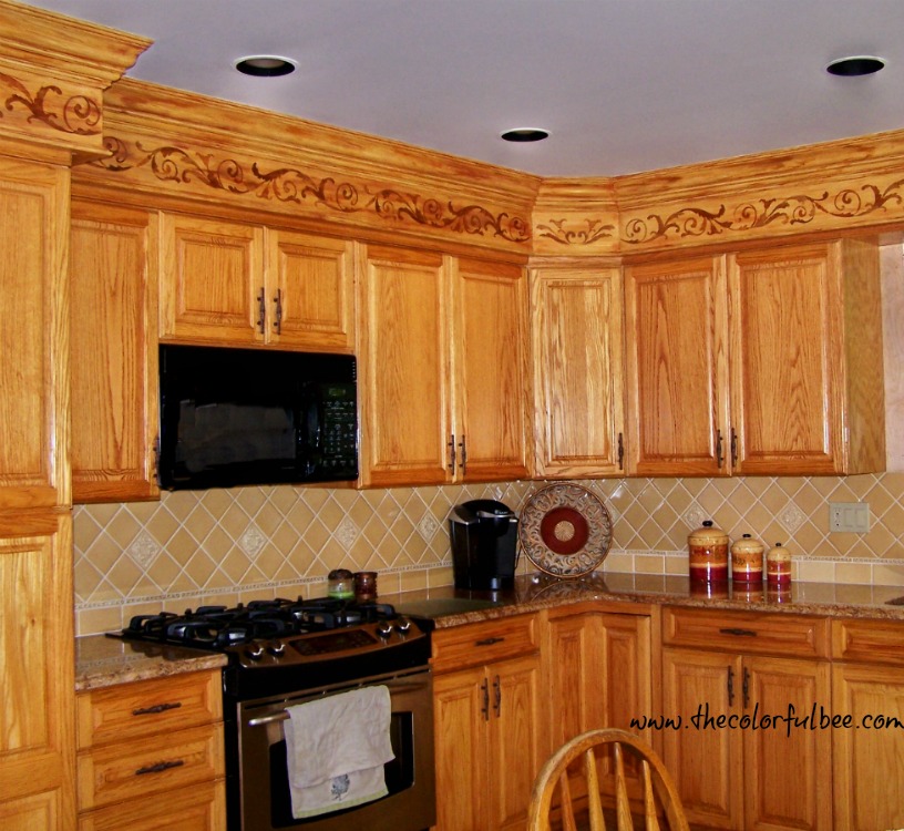 A Creative Way to Disguise Ugly Kitchen Soffits: Read about how I helped a client transform her kitchen very inexpensively here.
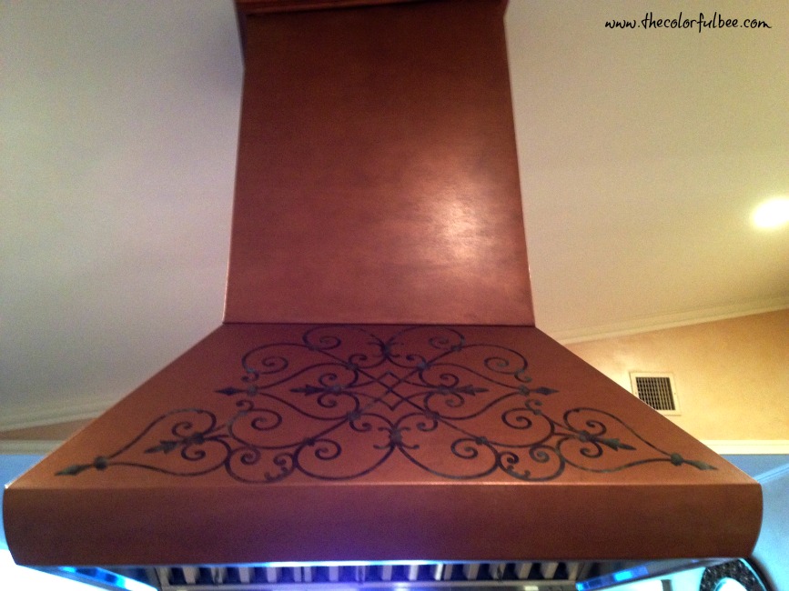 Here’s how I helped a client transform her ugly commercial range hood into a design statement. Click here for the steps I took to do this.
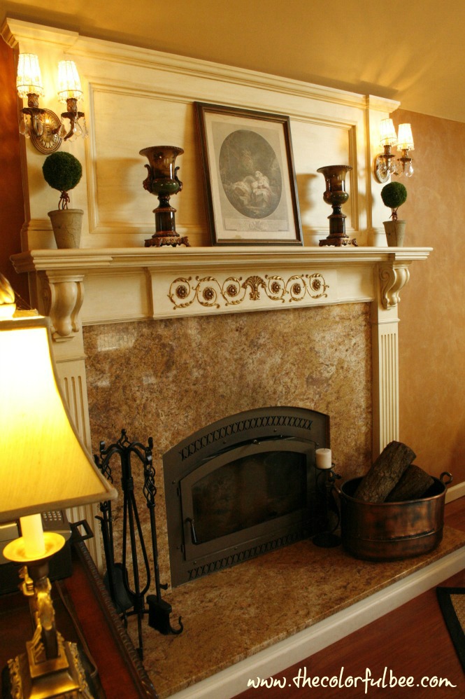 My how to antique and gold leaf a mantle was pretty popular on the blog as well.
 And so was this tutorial on how to do a stried wall treatment and how I transformed a powder room that the homeowner was finally proud of.
Hope you enjoyed this! Comment below and let me know what projects you were most proud of this year!
Sharing this with: Katherine’s Corner
Thanks for stopping by The Colorful Bee! Stay in touch and never miss a post.
*Subscribe to receive an e-mail when a new post is up, HERE.
*Subscribe to receive an e-mail when a new post is up, HERE.
2 Comments
Posted in interior design, Uncategorized
Color Roundup: Using Sky Blue in Interior Design
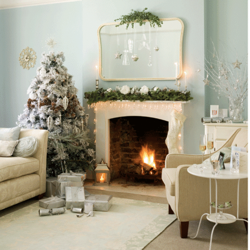
Since it’s Christmas time, I thought I would start this Color Roundup with a very pretty sky blue room with a lovely flocked tree and white and silver decorations. When you have pale walls and cream furnishings, it’s best to color coordinate your tree to your decor – instead of going with red and green. Your tree and decorations will then flow with your surroundings. Adding natural elements, like greenery, can be added on your mantle, but keep your other decorations light.
I guess I have started to think about light and airy, more beachy colors lately because I am so yearning for warm weather and spring. I love the deep, saturated colors of winter time – but I need a dose of warmth right now, as New York is so cold right now {I have two sweaters on as I write this!}
I have to admit that blue is not one of my favorite colors, but when used correctly…it becomes one of my favorite colors. If you want a calming and restful space, think about using sky blue. When my husband was in the hospital for his cancer surgery several years ago, I quickly had our bedroom painted a soft blue – knowing that he would need a lot of bed rest and recuperation. The color really helped him to relax, to feel better and to get well.
 Even just a touch of blue tint in white paint can give you an airy, sky feel. It can make a room seem larger than it is and that perceived spaciousness helps you feel more peaceful and at ease.
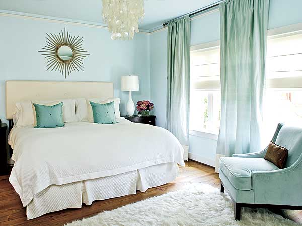
 I love this guest bedroom. Simple woven woods on the window…white trim, beautiful floors and the sky blue walls goes so well with the black furniture and black and white and cream bedding.
 This bedroom is for a girly girl – and it’s not pink! Love the chandelier!
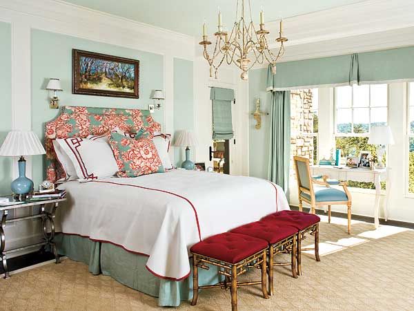 Sky blue works well with other colors and here’s a great example of using red accents in a blue room. The red really pops in this room.
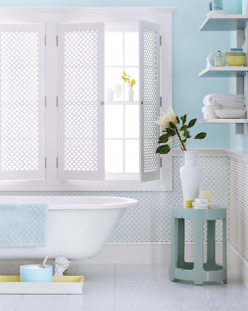
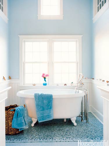 As relaxing as sky blue is in a bedroom, it’s really peaceful for bathrooms. Designer Frank Roop created a relaxing haven in this beautiful bath. The wall color here is Borrowed Light from Farrow and Ball. Look at this intricate mosaic floor – beautiful.
 Another soft and relaxing bathroom.
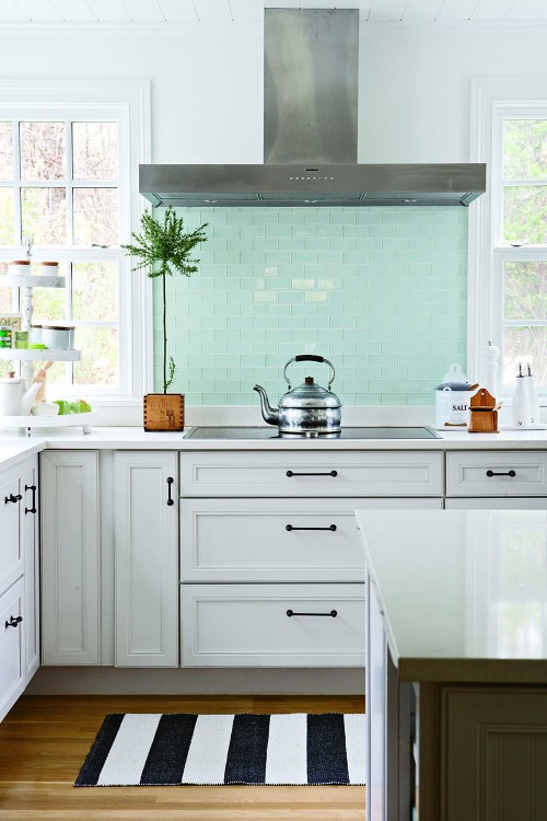 I wouldn’t normally suggest a blue kitchen…but how light and airy is this space? I love glass tiles and now you can get them in many colors, sizes – even recycled glass for tiles {so beautiful!}.
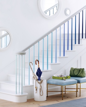 Here’s an unusual use of sky blue {and deeper blues}. Without the blues and the colorful accents on the spindles, this room would have been pretty dull!
 Sky blue is not just for bedrooms and baths. How relaxing is this living room? The beautiful painting, the soft blue side chairs and the blue and cream patterned pillows – everything about it says “calm.”
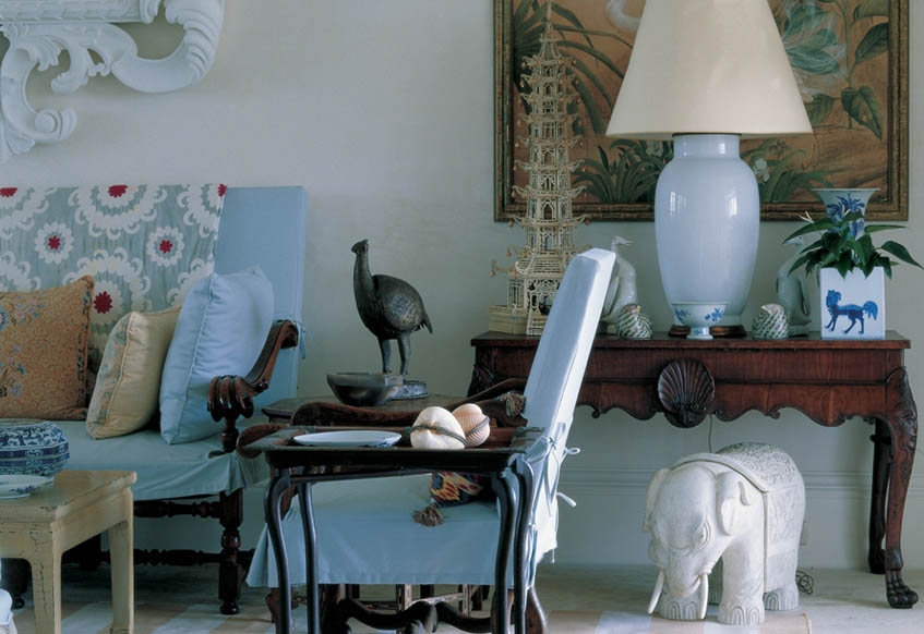 This room is from Bunny Williams’ home in Punta Cana. The sky blue fabrics help to soften this room. How gorgeous is that suzani on the sofa. Just beautiful.
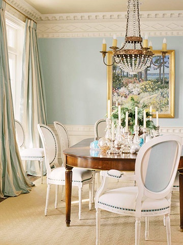 Sky blue in a dining room can be so elegant. Look at that drapery, the chandelier and the lovely striped chairs – and that millwork!
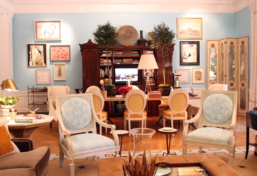 Another Bunny Williams room from the Kips Bay Designer Showhouse 2009. I remember seeing this room in person and although there’s a lot going on here, the pale blue of the walls lends a calmness.
Some tips for using Sky Blue…
- Use sky blue for your ceiling color in low ceiling rooms. The color will trick the eye into thinking the ceiling is higher than it is.
- If you are going through some stressful times, think about painting your bedroom in sky blue. It helps to soothe emotional problems and anxieties.
- If you picked a blue color that now seems too dark on your walls, stop painting and put white paint or white tint into your paint to soften and lighten the color. I always keep a gallon or two of white paint on hand – it always comes in handy.
- Use sky blue for small rooms – it helps to make the room seem larger
- Already have a blue on your walls but you don’t like it any more? Get some glaze, white paint or tint – and do a soft colorwash over your walls. If you’re ambitious, do a stried glaze over it. Click here for how to do this!
- If your space is mostly white or neutral, think about adding sky blue with fabrics, pillows, painting a piece of furniture or the back of a bookcase or china cabinet in sky blue.
Have you used sky blue for any of your rooms? Let me know in the comments below!
Image credits: 1) Best Home Decorators 2) My Home Ideas 3) Interior Design Room 4) Southern Living 5) Interior Design Room 6) Southern Living 7) House Beautiful 8) Martha Stewart 9) Via Fox Hollow Cottage blog 10) Martha Stewart 11) Via Love and Styles on Tumblr 12) Bunny Williams Via Mark D Sikes blog 13) BHG.com 14) Bunny Williams via Mark D Sikes Blog
Thanks for stopping by The Colorful Bee! Stay in touch and never miss a post.
*Subscribe to receive an e-mail when a new post is up, HERE.
*Subscribe to receive an e-mail when a new post is up, HERE.
3 Comments
Posted in Uncategorized
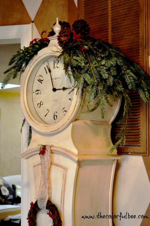
A Merry Swedish Mora Clock Christmas
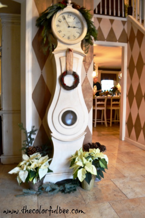
Merry Christmas!!
Every Christmas I always want to do something special with my entry – but I have such trouble with it. It’s small, it’s oddly shaped and the most special item I have in there is my Swedish clock. Anyway, while perusing Pinterest this morning I came across a Mora clock that was decorated with mostly just evergreens on the top.
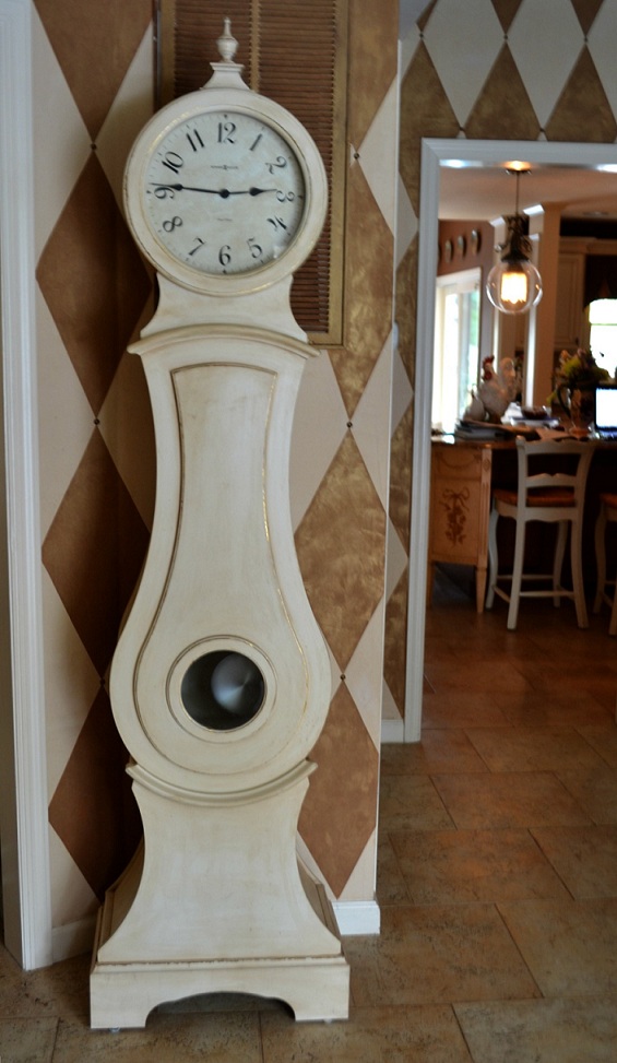 Here’s our clock “Before.”
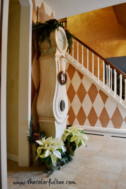
After!
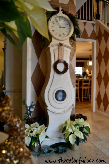 I had plenty of greens, so I went to work. I added a few extra things for fun. It’s a special piece of furniture for me, so it needed a little special treatment. Hope you like it.
If you would like to know how I made this new clock look older and antiqued, click here
Merry Christmas and Happy Holidays to All!!
Sharing this with…Miss Mustardseed; Jennifer Rizzo; Cottage Magpie; Between Naps on the Porch; Under the Table and Dreaming
Thanks for stopping by The Colorful Bee! Stay in touch and never miss a post.
*Subscribe to receive an e-mail when a new post is up, HERE.
*Subscribe to receive an e-mail when a new post is up, HERE.
4 Comments
Posted in Uncategorized
The World is Praying for You

…to let you know that the world is praying for you
Since the tragedy in Newtown CT, I’ve had a hard time focusing and working. So, instead of doing the Color Roundup today, I just wanted to take some time here on the blog to honor the victims and to pray for the families. I cannot imagine the depth of the parents’ grief and I pray that they can somehow get through this horrible time.
I hope that this sends a big message to our lawmakers. We need to stop gun violence and the only way to do that is to be more strict with our current gun laws. We need to limit the sale of assault weapons and we should have stricter adherence to background checks (including checks on those who buy ammunition). Guns should be taken away from anyone who is being treated for psychological problems…and now we should add taking away guns from people whose family members have psychological problems. Don’t know how you could enforce this but it would have helped save those 20 youngsters and the 7 adults killed recently by Adam Lanza.
So, to the families who are grieving so badly now, know that we are all praying for you and thinking of you and wishing that there could be some way to mend your broken hearts.
God Bless you…
Thanks for stopping by The Colorful Bee! Stay in touch and never miss a post.
*Subscribe to receive an e-mail when a new post is up, HERE.
*Subscribe to receive an e-mail when a new post is up, HERE.
Leave a comment
Posted in Uncategorized
A Rustic Plaster Wall, an Antiqued Bookcase and a Great Client and Friend
 I love it when one of my clients becomes a friend. She was a great client to work for (a little picky, but she knows what she wants and she’ll wait to find the right furniture piece, the right wall finish etc). For her wall finish, I must have created 12 or more samples for her – and she almost chose a rich olive metallic plaster (this was before she got the beautiful bookcase) but decided on this beautiful light and warm rustic plaster instead.
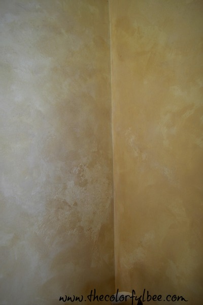 Here’s a close up. I first repainted the room then applied a rough textured plaster (FauxTex by Faux Effects) here and there around the space – then I troweled on a smooth plaster (OVilla by Faux Effects) – leaving some of the rough plaster showing. Then I lightly glazed the entire room with a mix of ochre yellow and raw umber. The glaze reacts differently on the smooth and rough plaster giving it that crumbling, peeling layer look. Every now and again I had to go back over the rougher plaster with more glaze because it tended to absorb it a bit more. We then painted and antiqued all the moldings in the room.
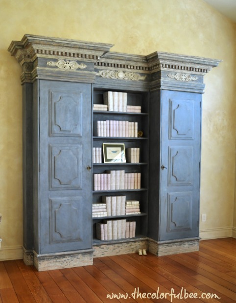 When my friend and client, Adele, went down south about 6 months after we did the finish, she found Tara Shaw’s furniture store – and she fell in love with this piece (but the real one, not the replica as this is). She just had to have it. So, months later after ordering – the piece arrived. It looked beautiful in this great room, which is a huge space with 20 foot ceilings. The piece was delivered in the late spring – but by the end of the summer it was cracking in many places. It must have been the temperature differences – not sure if that was the only reason…but the company made good and delivered another piece to her home and retrieved the damaged one.
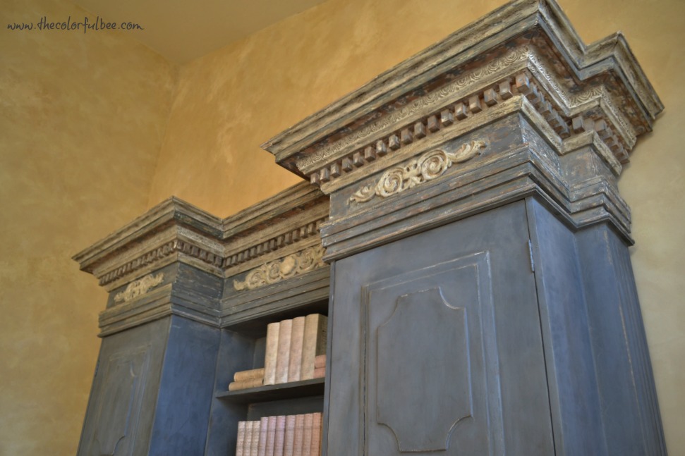
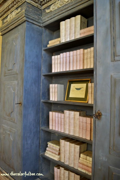 The antique books (all faux ones!) look great in the bookcase. You don’t want anything to distract your eyes away from this gorgeous piece. The finish is a colored gesso, that’s been antiqued (and the moldings drybrushed off-white and gray). I will be doing a sample of this soon – let me know if you’d be interested in learning how to do the finish on this piece! I’ll be doing it with Annie Sloan’s Chalk Paint and wax.
I will be doing another bathroom in this beautiful home in a week – so be on the lookout for that. It’s a gorgeous guest bath, done in Carrera marble,whites and grays. I will be adding a Crushed Pearl metallic plaster to the walls.
My friend Adele told me this morning that she is thinking about moving to Florida. I can’t believe it (and I so hope she changes her mind!). Who will I go to the New York Gift Show with…and all the Designer Showhouses? She loves to talk design endlessly and we have become so close. Plus – how can she leave all the beautiful walls I did for her? I have to help her change her mind!
Thanks for stopping by The Colorful Bee! Stay in touch and never miss a post.
*Subscribe to receive an e-mail when a new post is up, HERE.
*Subscribe to receive an e-mail when a new post is up, HERE.
2 Comments
Posted in Tutorials
Color Roundup: Using Red in Interior Design, Part 2

Hi everyone! I did a post on using red in interior design a little while ago but I had to make it a short post because we were going through Hurricane Sandy. So today I’d like to continue with this gorgeous hue {so fitting because of the season too!}
 Gorgeous red-orange handpainted wallpaper in a home office would make me want to stay there more often and work. Designer Betsy Burnham did a beautiful job in this space, mixing the Chinoserie walls, the Chinese garden stool with the animal print rug over the Persian. I love how the bird on the wallpaper looks like it’s pecking on the orchid on the desk.
 Red comes in many shades and tones but when its a pinkish red, it has such a sweetness to it. How about upholstering your room in felt! This living room, designed by Miles Redd, has a light and feminine feel to it {especially with those lovely pelmets at the window}. I love the touches of blue in the carpet, the lamp, the accent chair and the vase. The wood furniture helps keep the room from being too light.
 Red is a great color to use in a dining room. It helps to stir up the appetite. Benjamin Moore’s Garrison Red, above, has a bit more brown in it than the Miles Redd living room color. I love the mirrored dining table – it magnifies the red even more.

This is a deeper red from Glidden Paint called Red Delicious.
 A lighter red {a deep pink} looks beautiful in a dining room. What a great entertaining space. I love how the designer, Mark Morris, did the window treatments. they give a softness to the room but they don’t obstruct the view or prevent you from using the doors.

Besides paint, fabric and wallpaper, think about putting a smooth red plaster on your walls. We did a beautiful powder room in a Crimson Red metallic plaster and then installed decorative crown moldings {painting them a gold metallic and antiquing them}. The ceiling is a pale gold – just to give it a little extra shimmer.
 If you are a bit timid about using red on all of your walls, try using it in smaller doses. Red is great in a kitchen. Here it is used as a backsplash – beautiful!
 Red, black and white is a great color combination. Love the Dorothy Draper-esque chest! The red and white wallpaper is the punch that was needed in this room.
 Here’s the red, white and black combination again with a more modern twist. I love the Chinese Chippendale chairs painted black.
 Using a red geometric pattern on a ceiling really brings out its curves in this Holiday House 2012 room from designer Inson Wood. The ceiling is a bas relief made from gold dusted and waxed Venetian plaster outlined with red lacquer. I can tell you from experience that this took forever and a day to complete. On the far wall is a hand painted Gracie wallpaper in red. Just beautiful.
So give red a try in your home. Whether in large or small doses…it will warm and liven up any room. It’s a gorgeous hue!
You may also be interested in this link – “The Color Red, Part 1.”
Image credits: 1) Martha Stewart.com 2) Betsy Burnham via Design Sponge 3) Elle Decor 4) Rate My Space 5) Glidden 6) Mark Morris 7) Me – The Colorful Bee 8) Maison Le Dragon 9) Turquoise LA via decorpad 10) Vanessa DeVargas via Houzz 11) Inson Wood
Thanks for stopping by The Colorful Bee! Stay in touch and never miss a post.
*Subscribe to receive an e-mail when a new post is up, HERE.
*Subscribe to receive an e-mail when a new post is up, HERE.
4 Comments
Posted in Color Roundup, interior design


 Decorative Finishes
 Interior Design
 Home
Home Garden
 Holiday
 Makeovers
 My Life
 Business
 Tutorials
 Videos
 Paint
Paint