

-

-
Subscribe
Thanks for stopping by The Colorful Bee! Stay in touch and never miss a post. Subscribe to receive an e-mail when a new post is up, HERE.Sponsor
If you're interesting in advertising on The Colorful Bee, click here to learn more.Contact
You can also email me at Linda.Leyble@gmail.com -


Categories
Subscribe
Popular posts
-
Recent Posts
Blogroll
Links

Author Archives: Linda
Merry Christmas to All: Remembering to Give Thanks
I just wanted to share some thoughts today on giving thanks for all the blessings that have come my way. You can’t package these things and tie them up with a bow and set them under the tree to be opened. No – these are the wonderful heartfelt things that I sometimes forget and I take for granted.


I am so blessed to be with my loving husband, Richard and his four children (my beautiful step children – Ryan, Dennis, Timmy and Megan – who are more like my own now after over 10 years of marriage). I am so happy that I found Richard (and I found him thanks to the Internet!) because my life was a bit too lonely and unstable beforehand. I was happy – but I didn’t know exactly how happy and fulfilled I could be until I met and married him. He gave me the freedom to express myself as I never did before (with art, music and design) and he let my creativity run wild in his home that I moved into. It never looked the same again – it is now unrecognizable to anyone who knew the house beforehand. Thank you for giving up your home as my laboratory.

Richard and I visiting my daughter in San Francisco
I give thanks to our growing family – we have two grandchildren and two more on the way. I am so very happy that my little baby (my youngest daughter, Jessica) will be giving birth to a baby girl in April. I can’t wait to see this little bundle of joy – I know that she will be beautiful, like her Mommy. And Richard’s son’s wife, Kristen, will be giving birth to their second child in July.

My daughter, Jessica, and I in Sonoma…visiting some wineries
I am so thankful and proud of my oldest daughter, Krista, for raising my granddaughter, Meghan. She is such a talented and accomplished young woman. It was not an easy task – raising a child on your own. My daughter Krista overcame so much adversity – I don’t know how she did it. Meghan is now on a 4 year scholarship to Stony Brook University. I was looking at her chemistry homework the other night – my eyes glazed over this in compete ignorance – yet she understood it. She’s going into the pre-med program. So proud and so thankful. She already has ideas that she wants to implement someday to cure cancer. The world is a better place…and will be more so, because Meghan is in the world.

The cutest little girl…Meghan at around 3 1/2

My daughter, Krista…and Meghan

My daughter and Meghan at her HS graduation
These are gifts that I get to have and hold everyday. “You can’t get any better than that!” to quote an oft-repeated phrase of my mother-in-law, Jean – another gift that I am thankful for. A wonderful mother-in-law!
Thank you to my entire family for being yourselves and giving me joy every day.
I also want to give thanks to all my blogging friends that I have met over the years. Thank you for commenting and always encouraging me. I would have never met any of you…had it not been for the Internet. Amazing in itself.
I hope that we all have a beautiful Christmas and a joyous New Year. Remember to think about the gifts that you get every day – the ones that don’t cost anything.
Linda
Thanks for stopping by The Colorful Bee! Stay in touch and never miss a post.
*Subscribe to receive an e-mail when a new post is up, HERE.
*Subscribe to receive an e-mail when a new post is up, HERE.
4 Comments
Posted in Uncategorized
Some Last Minute Christmas Decoration Ideas
I just started doing Christmas decorations in my home – meant to do them last weekend but the time just flew by. I am having my daughter’s baby shower this weekend at my home – so I guess that will be a little Baby Decoration Vs. Christmas and I don’t know how that is going to fly – but as long as everyone has a good time, nothing else matters.


I thought I’d post some interesting ideas that you could whip up in this last remaining week. I always need to do something new for Christmas and I liked these ideas. Let me know what you think of them!
Ever have some old ornaments that have lost their lustre? What not add some glue and glitter to them – to perk them up, as in these ornaments from Upscale, Downhome. You can buy Martha Stewart glitter at Michaels or any other glitter at arts and crafts stores.

But for a real treat, why not use some Meyer’s Glass Glitter? It’s ground glass and much thicker than all other glitters. I’ve used it on chipboard letters and motifs – for any occasion, not just Christmas. You have to order it online here, but it is well worth looking in to. You can use the German Glass Glitter to add sparkle to pine cones too – these look great in a Christmas tree.
Here’s another great idea that’s fast and inexpensive. Take some fabric and place it in a small embroidery hoop, then add a ribbon to hang.

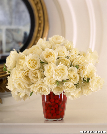
A quick and easy floral decoration idea from Martha Stewart is to use cranberries in a clear vase as a beautiful base for flowers. Make sure you use hard cranberries – or else you’ll be in trouble! Wash them well, place in a clear vase and you’ll see that they actually hold your flowers together very well. Looks great on a mantle or on your table.
Or – use a cloche to hold any number of things: winter branches, pinecones, ornaments etc,

BHG.com
And…another great idea, incorporating greenery

For a fabulous centerpiece, why not place some white, or off white candles on top of a mirror. It’s simple, beautiful and it’s double the glow.

An even easier centerpiece is one made of empty wine bottles and tapers. Just make sure that either the tapers or the bottles vary in size. You don’t want them equal. Very dramatic, I say.

Another great idea is to fashion a wreath into a different shape. Do you live by the shore or do you know a boating enthusiast? This anchor wreath would make a great door decoration or gift. There’s a tutorial on the site that will guide you in making it.

There have also been some great book page wreath ideas floating around the web lately. Living with Lindsay (a great blog) has a tutorial on how to make it on her blog. It will take a little time and patience, but I think it’s worth it.

Isn’t this beautiful? Find out how to do here
Marion Parsons, aka Miss Mustardseed, has a great wreath tutorial on her site as well. Her blog is so informative, you will find hundreds of ideas for Christmas and every day. Check out her site here
Artist, Barry Belcher has a great tutorial on how to do a book page wreath on YouTube (along with many other ideas). He is extremely creative and his how to’s are easy to follow. Check out his wreath video…
So, I hope that everyone will be ready by Christmas. As always, it came too fast this year! Hope these decorating ideas help you make your homes look great this Holiday Season!!!
Thanks for stopping by The Colorful Bee! Stay in touch and never miss a post.
*Subscribe to receive an e-mail when a new post is up, HERE.
*Subscribe to receive an e-mail when a new post is up, HERE.
7 Comments
Posted in Uncategorized
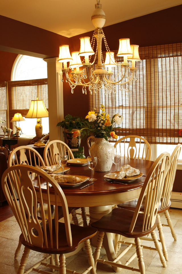
What’s Your Angle? Giving a Room Some Interest by Placing Furniture Diagonally
Hi everyone – sorry about my lack of posts lately, but I am in the midst of creating 2 or 3 longer, more arduous ones and so my page has been blank for a bit. I had a thought this morning when I woke up that perhaps a quick but very useful post might be in order.

One of the quickest, but perhaps most daunting, tricks to making your room more interesting – is to set a piece of furniture on an angle. Some people argue that it takes up space and while that’s true – what it creates is a more interesting room. I don’t know about you, but I would trade that any day.

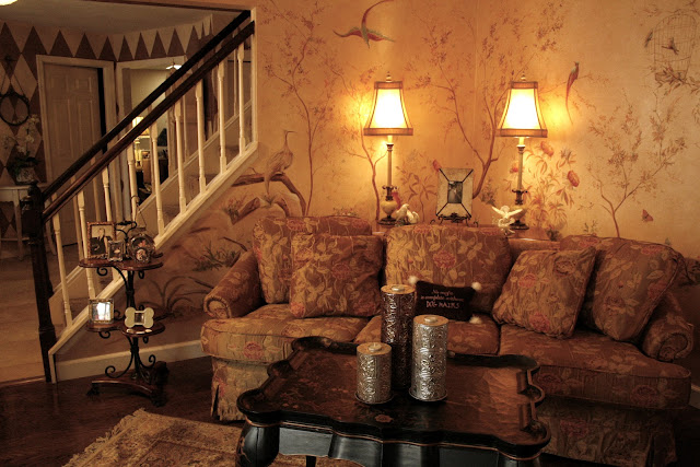
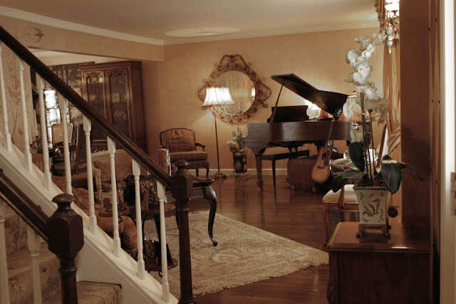
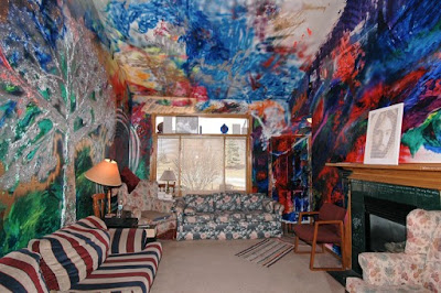
In my living room, I was just so unhappy with most of the furniture arrangements that I did. I have an L shaped living room/dining room configuration – and it’s one of the most problematic ones to make interesting. I finally angled my sofa – which then necessitated that I make the corner interesting…so up went the mural. But, if you don’t want to or can’t do that, place a table behind the sofa and plop two beautiful lamps and a floral centerpiece and voila…a beautiful corner arrangement.
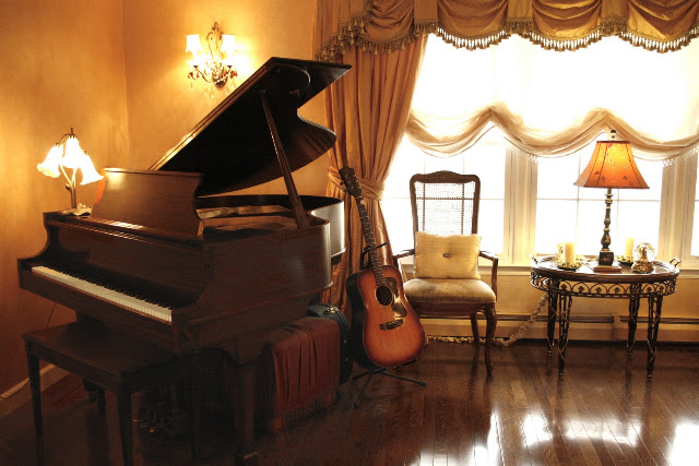
I also had a problem in that I have a baby grand piano in the living room also. So, directly across from my sofa went my piano – on an angle. I was never happy with any other place that I positioned it – until the angle. I can now play my piano…plus look out the window. Before, I had the piano where the sofa is now and I had to squeeze into the seat, which was in the corner. It was non-functional this way and guess what – I played less!
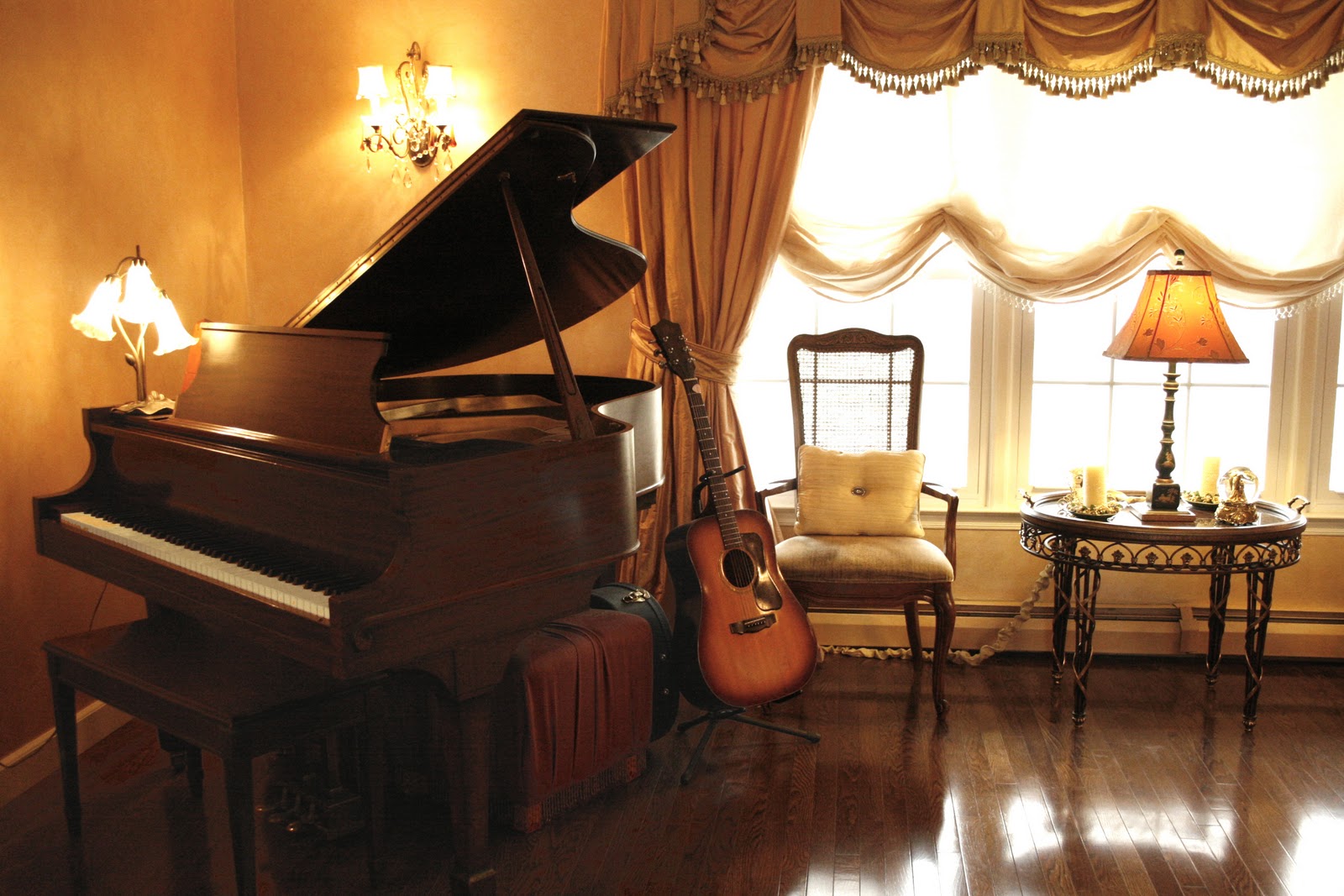
Now, it’s my little music corner…plus there’s more light being by the window and I can see what I’m doing better! So, the angling make my living room more functional as well as more beautiful.
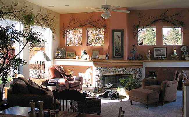
I may have a tendency (and as my husband Richard says – an obsession) with putting things on an angle…but there’s usually a method to my madness. When we did our renovation and added a great room, I was never ever happy with how the furniture looked in this beautiful room. The furniture was beautiful, the wall and window treatments were just as I wanted them – but I thought something was “off” in the room. Because we made the room fairly high – with a cathedral ceiling, the sofa looked too small where it was. This was because it was in front of one of the tallest walls that also had the Palladian window. When I finally angled the sofa in the corner – the sofa was in scale because it now was in front of the lower part of the room.

A little hard to tell in this photo – but the wall behind the sofa is 8 feet tall. Before, the sofa was in front of the tallest wall and it just made this rather large sofa – look like a doll house couch. So, in this case, the angling helped to balance the room because the scale of the sofa to the wall was off.
Try and experiment with putting some of your pieces on an angle. I think that you will find it definitely makes a difference in the room. Let me know how your room looked afterwards.
If you need some help with your furniture arrangements, just give me a call at 631 793-1315 and I’d be glad to help.
Thanks for stopping by The Colorful Bee! Stay in touch and never miss a post.
*Subscribe to receive an e-mail when a new post is up, HERE.
*Subscribe to receive an e-mail when a new post is up, HERE.
4 Comments
Posted in Uncategorized
How to Really Pick the Right Paint Colors for Your Home: Tip #1
WHAT COLOR DO I PICK?? I get this question over and over again, so I thought I would hopefully give all of my readers a quick guide to choosing the right colors in your home. This will be an ongoing column in the blog, so I hope that you stay tuned to learn more.

It’s a fairly easy process if you break it down in simple components – but I think that most people agonize over choosing a paint color. Why? Because there are so many colors to choose from and most people are afraid to make mistakes in their home. You have to remember – it’s only paint and it can be re-done. So – no more worrying! I’m here to help.
Here’s Tip Number 1.
Eliminate Certain Colors Right Off the Bat: One of the most simple, but mostly disregarded tips, is to eliminate a whole host of colors from the start. I could write a book just on this one topic alone, but I will spare you from a lengthy post by whittling down to the basics.
- Choosing Warm Vs. Cool: If you have warm oak floors or warm toned tiled floors or carpets, avoid cool colors (like mint green, ice blue). Stay in the warmer tones, like a Tuscan yellow, yellow green, terra cotta, cinnamon for example. You will be much safer with this combination because warm tones blend easily with other warm tones.
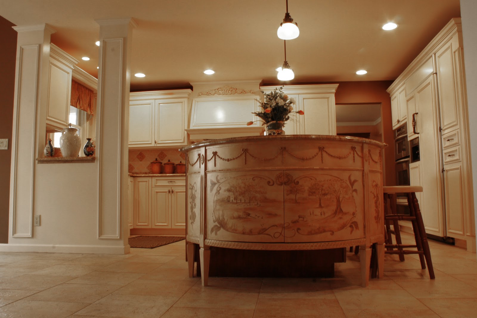
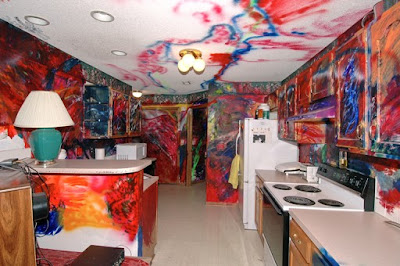
- In the kitchen, you can eliminate certain wall colors as well. If your kitchen gets a lot of light, you can choose darker wall colors, especially if you have white or cream cabinetry – as in my kitchen.
-
Above, the warm tone of the wood floors started the color scheme. The beautiful carpet then dictated the other colors in room – corals, pumpkins, ochres, brown and cream. The use of black grounds this room and prevents it from being too light. I love the traditional style of the room – and the punctuation mark of the modern painting on the mantle.
In my kitchen, which gets tons of lights, I chose a rich brown wall color. Because the cabinetry and other items in the room are light cream, the dark color adds a punch.
- If you have very little light, opt for a lighter color on your walls. Look at your granite or other countertop material – what is the main color in it? That will help you narrow down your choices.

-
Above, this all white kitchen is stunning because of the pattern and texture in this room. The Carrara marble counters, modern backsplash and art…the graphic trellis wallpaper and the gleam of the faucets and appliances save this white kitchen from being predictable. The gray trellis pattern was probably chosen because of the colors of the backsplash and the marble.
- Look at your granite or other countertop material – what is the main color in it? That will help you narrow down your choices. If you have warm, golden sienna or cinnamon tones in your granite, eliminate colors that will clash with it – like blues or greens. If your granite has some blue specks in it, you can choose a color like In Your Eyes by Benjamin Moore – and add white cabinetry for a beautiful blue and white color scheme. Then look at your cabinetry – is it cream or white? Don’t wimp out and choose a light cream or white. Make the cabinets stand out by using a darker or a mid tone color – or do a beautiful damask, stripe or trellis pattern, as above.
- Do you have dark cherry wood cabinetry? Let that stand out by choosing a beautiful pale sage hue. The red tone in the cherry will actually be more vibrant because of the green on the walls. Using an opposite color on the color wheel bolsters each color.
-
If you have cooler colors – like silver, pearl, gray or blue – eliminating many warmer colors and plain white will help narrow down your color choices.

-
Above, in this living room we did in Melville NY, the furniture and carpet started the entire cool color scheme. The silver tone of the mirror, the gray/silver window treatments and the platinum and pearl strie on the walls bolster the sophistication of the color scheme. A white wall would have ruined the beauty of this space

A beautiful blue and white color scheme by Meg Braff Interiors.
This cool color palette of blues and whites works well in an elegant beach home.
-
Your environment can help you choose a color scheme. Think of the sea breezes and the sand of a beach home in the Hamptons. Above, designer Meg Braff used color to emphasize the beach and the relaxed environment of East Hampton. Everything is there – the sand, the sea, the sky and the greenery. I can’t imagine this room with darker hues and fabrics. By contrast, the owners of this Hamptons home probably have gray-toned walls in their NYC apartment that reflect the exterior.
- What is your decorating style? Your style can dictate a wall color and color scheme. If you tend to be more traditional, cream, beige, sage, linen and other neutrals will blend in beautifully with furnishings and fabrics that you already have. If vintage is your style, pastels, light blues and pinks, pale lavenders and yellows and other earth-toned neutrals will go well on your walls. If you are more bold and contemporary, a deep rich cobalt blue, charcoal gray or fuschia pink could enliven your walls.
- What mood do you want in a room? If you want a happy start of the day in your kitchen, then choose sunny colors. If you want a more serious tone in a library – choose deep forest greens or maroon walls with dark mahogany furniture. Mood plays a big role in deciding your wall color.
- The function of the room also plays into what color you choose for your walls. If you want to have your children relaxed for bedtime, don’t paint their rooms yellow. Soothing colors like pale blues and greens will produce a calmer child – ready for bed.
So, through a process of eliminating certain colors, you can begin to whittle down your choices more successfully. This process really works – try it and let me know if it helps you.
Thanks for stopping by The Colorful Bee! Stay in touch and never miss a post.
*Subscribe to receive an e-mail when a new post is up, HERE.
*Subscribe to receive an e-mail when a new post is up, HERE.
2 Comments
Posted in Uncategorized
How About a Little Vin Chaud for the Cold Nights Ahead?
There’s nothing like a warm drink on a cold, cold night and those nights will be soon upon us. If it has some alcohol in it – even better! The English have Mulled Wine and the Germans have a recipe as well – but since I have such a love affair with all things French – here’s a recipe for Vin Chaud.


Recipes for the delightful winter beverage abound, so you can feel free to peruse the web and then change some of the ingredients. Here’s a great recipe to start with…
Prep Time: 15 minutes
Total Time: 15 minutes
Ingredients:
• 1 bottle red wine
• 4 cinnamon sticks
• 1 5-inch by ½-inch piece of orange zest (white pith removed)
• 4 tablespoons granulated sugar
• 2 cardamon pods
• 5 whole cloves
• 1/3 cup Cognac
Preparation:
Cook’s note:For the best flavor, use a slightly fruity red wine.
How to make vin chaud:
Mix all the ingredients together in a large saucepan. Bring the mixture to just under a simmer over the lowest heat setting on the stovetop. Do not allow the wine to boil. The mulled wine is hot enough when the sugar has dissolved and pulling and lifting a spoon from the wine brings up steam. If desired, strain the spices from the wine by pouring it through a fine-mesh sieve or a cheesecloth-lined collander. Add 1-2 teaspoons of Cognac to a mug and ladle the mulled wine over it. Recipe Source
Some people add honey or brown sugar instead of the sugar…and some use Cassis instead of Cognac (or – no extra liquor at all). Let me know what you think of this! I love it – and I’ll be whipping some up on the first really cold night that we have!
Thanks for stopping by The Colorful Bee! Stay in touch and never miss a post.
*Subscribe to receive an e-mail when a new post is up, HERE.
*Subscribe to receive an e-mail when a new post is up, HERE.
4 Comments
Posted in Uncategorized
My Top Artistic Cookies: For Gift Giving and Eating
Now that we are in December, my mind turns to buying unique Christmas gifts and, of course, to COOKIES. Well, any kind of sweet is on my mind all the time but Christmas is a time for making cookies and also – giving cookies as gifts.


Cookie Boy Cookies: If you have never seen Cookie Boy’s work, you’ve been missing out. He can make anything into a cookie. The problem is – he’s in Japan. Here’s a Christmas wreath celebrating the giraffe (but I am guessing it’s the Toy R Us logo) that he made. Take a look at his site – it’s in Japanese but it’s worthwhile looking at his incredible collections.

The Mona Lisa Cookie: I’ve been to the Louve to see the Mona Lisa. I only wish that I was 7 feet tall, so that I could have had a better glimpse of her. So much security and a glass partition – that prevents you from getting close…plua so many people in front of me that it was hard to see her. This not exactly Mona – but you know who’s the subject of the cookie – plus if you go to the site – there’s a recipe on how to make it!!

Anyone for Van Gogh’s Starry Starry Night cookies (my favorite). Who doesn’t love Van Gogh? I was so happy to hear that perhaps he didn’t off himself, but rather he was killed by a teenager.

The Camera Cookie Cutter. For all budding and pro photographers on your list, this would be a great gift. Make the cookies too and give them the cookie cutter along with them.

The Rubiks Cube and Jacks Cookies: From Cooks Central, these would be great gifts for your 50s baby boomers for the Jacks and their children…for the Rubiks Cube.

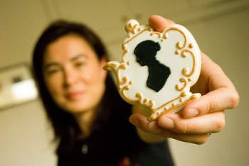
I love these Victorian teapots with the Jane Austen cameo for all your tea loving – book loving fans on your gift list

She is a very inventive cookie designer – here’s her “Year of the Rabbit” cookie

And here’s another one of her designs…I could think of a few people to give this one to! What about you?

And then there’s the fabulous Amber Spiegel in the Hudson Valley upstate NY in her Etsy Shop, SweetAmbs. She makes too many fabulous cookies – here are two of my favorites…


How beautiful is this “embroidered” cookie! Sweet Ambs Etsy Shop
Eiffel Tower Cookies: This company, Ali’s Sweet Treats, makes many kinds of custom cookies but the Francofile in me just had to add this one to the list!

And finally, just a little humorous tidbit of a video featuring How to Make Cookies – in Photoshop! Share this post with your cookie and Photoshop-loving frineds and family. It’s so clever…and so funny. The stop motion is great. Click on the link below.

Enjoy this little list – let me know if you have some others to share!!!
Thanks for stopping by The Colorful Bee! Stay in touch and never miss a post.
*Subscribe to receive an e-mail when a new post is up, HERE.
*Subscribe to receive an e-mail when a new post is up, HERE.
2 Comments
Posted in Uncategorized
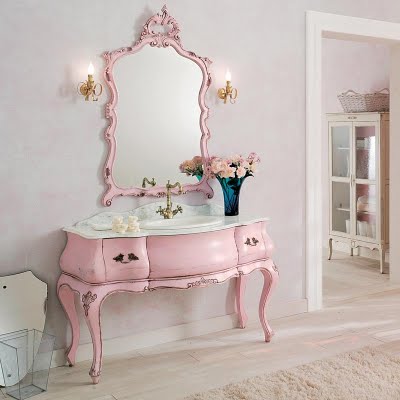
Color Roundup: My Love of the Color Pink for Rooms is Pretty Obvious
Maybe it’s because I’m female…but I just love the color pink. I love pink rooms, pink lemonade, pink shirts, pink dresses – cotton candy – just about anything pink. My living room walls and draperies are pink…my dining room walls and ceiling are pink!


The walls read pink – but my recipe was a peach base color, followed by a layer of pearl metallic paint – then glazed with cinnamon tones.

The Chinoiserie mural helps to break up the pink a bit

I chose to create a pink-like metallic tone because the room is fairly dark – not much natural light comes through at all. When the light hits the walls – there’s a natural glow in these room that I absolutely love. The great architect Renzo Mongiardino said that every room has its finest hour – but my rooms look great just about any time.
In my kitchen, I had a custom demilune made for part of my island. Of course – it had to be some version of pink. But – I made it a coral-like glazed metallic (because I know that Richard probably would have put his foot down if it had been a full-out pink!).
I’m in good company though – lots of designers have had their way with pink.

Uber-Designer Carleton Varney and friends from Cote de Texas

How beautiful is this – from Nellavetrina

Pink & Black – a great combination. From the blog, Ladies of Design

Magenta is pink too! From designer, Jerry Jacobs

Closeup of the portmantiere, from Jerry Jacobs. An elegant way to decorate a bar area.

A pink rug – by Madeline Weinrib

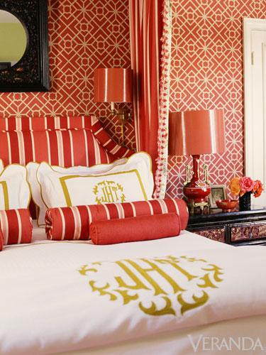
A coral and red bedroom by designer, Mary MacDonald, from Veranda Magazine

Or – maybe just a small accent of pink, like this chandelier from Currey & Company
Some advice for using pink:
-
If you love the color but are afraid of it being “too much” in a room, use it in small doses – an accent wall, some pink pillows or other accessories.
-
Try a deeper shade or hue of pink, like coral, fuschia or magenta
-
Experiment by painting some chairs or small side tables pink
-
Use pink as a base color, then use brown or cinnamon toned glazes over it to lessen the pink.
So – think pink for at least one or two of your rooms. They will stand out and make you happy every time you see them!
Thanks for stopping by The Colorful Bee! Stay in touch and never miss a post.
*Subscribe to receive an e-mail when a new post is up, HERE.
*Subscribe to receive an e-mail when a new post is up, HERE.
2 Comments
Posted in Color Roundup
What Were They Thinking?
As many of you know – I love colorful interiors and homes with a sense of humor. But sometimes it can go a bit far. Kirstie Alley, of Cheers, Fat Actress, Dancing with the Stars and Jenny Craig spokesperson fame, has put her Maine home up for sale – for nearly $2 million – and while it is a fantastic property on a remote island with beautiful views…whoever buys it will have some painting and wallpaper removal to do. The house has great bones – and the redecorating would be fairly easy…but I think a pink kitchen, granny wallpaper and the girly-girly decor may be a bit off-putting to a lot of buyers, She could afford a home stager – I’m available Kirstie!!


And keeping with the colorful home theme…how about these two pics from a home for sale in Des Moines, IA? The blog, Hooked on Houses, always has some very funny Bad MLS pics!

The blurb for the house could read “Loves Jesus and Van Gogh too”

The love of paint continued on into the kitchen! From Hooked on Houses
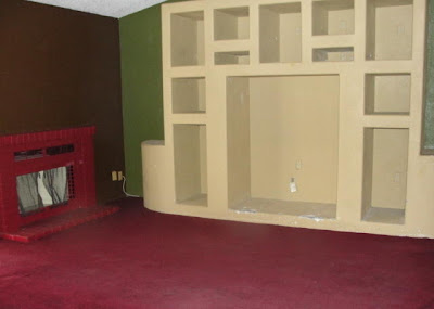
Built-Ins Can Help Sell a House: But not this one!! What were they thinking? Realtor Leif Swanson always posts some doozies on his blog, Ugly House Photos. Just for a quick shot of side-splitting humor – spend some time on his blog to see how some people market their properties!

The damaged wall unit dwarfs the fireplace…the red carpet, the red painted mantle/bricks
&…the green wall need to go!! From Ugly House Photos
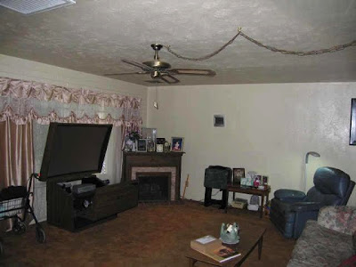
This next one – what can you say? Doesn’t it look like the oversized TV is on some kind of desk unit with a seat in front? Can anyone say “hire a home stager?”

The oversized TV, the frilly drapes in a relaxed room, the poor forgotten mantle in the corner…the clutter…the non-hardwired ceiling fan! Love the orange carpet. From Ugly House Photos
Here are a few others that I’ve seen for sale lately. Hope you enjoy them!

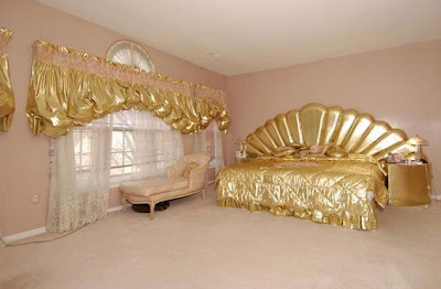
Go for the Gold: Sometimes you can have too much of a good thing.
This house was listed for over a million. Source, unknown

The rest of this house was very lovely – but I just had to laugh at the bear doing a headstand!
This is bringing the outside in – a little too far!
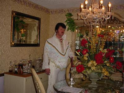
And one of my faves…

Elvis didn’t leave the building before the picture was taken! From Hooked on Houses
So – look at your property photos carefully before you put your home up for sale!! Otherwise, they might show up on a blog!!
Thanks for stopping by The Colorful Bee! Stay in touch and never miss a post.
*Subscribe to receive an e-mail when a new post is up, HERE.
*Subscribe to receive an e-mail when a new post is up, HERE.
4 Comments
Posted in Uncategorized
Venetian Plaster: Fact & Fiction
There are a lot of misconceptions about this beautiful finish. Some people think that they can buy this product at Home Depot and apply it themselves – and, yes, they can. They will have to have very smooth walls (no imperfections) and they will have to follow the directions to the “T” which most people don’t do! But even if they apply it perfectly, it will never look as beautiful as “real” Venetian Plaster – because it’s a cheap (about $35 per gallon) synthetic product that bears very little resemblance to the real deal. Most of these so-called Venetian products are made of acrylic polymers and fillers like clay or gypsum. These synthetic products are more like paint than plaster. As such, they won’t last forever and they fade and get marred easily – just like paint.


You can’t judge a book by its cover – it says Venetian, but…
A Little History: Venetian plaster (lime-based plaster) has been used for thousands of years – from the tombs in Giza and the Moroccan steam baths…to the Sistine Chapel. It has been a key ingredient in the great architectural structures that are world-known for over 9000 years. The artisans of Venice perfected these plasters to a high art and they were highly regarded for their beauty, feel and longevity. It’s been said that many of these artisans took the recipe for their plaster to the grave – rather than to reveal the secret of this beautiful finish.
Authentic Venetian plaster is a wonderful wall option for places that may get humid and wet (like bathrooms). The water will quickly evaporate and exit the finish – unlike their synthetic imposters, which will fail in wet conditions. If you think about the damp canals of Venice and the exteriors of their buildings clad in this plaster – that are still intact and looking beautiful, you’ll understand why this finish is so desirable and worthwhile.
What is real Venetian plaster? Put as simply as possibly, it’s really a chemical process. It starts with Limestone which is taken out of the ground and then put in high temperature kilns. This breaks it down and takes the carbon dioxide out of it. Calcium oxide is what is left over. Mixing these lumps with water – it becomes calcium hydroxide. This is then aged for about 3-5 years. Then marble dust gets added and mixed – and that’s the basis for lime-based plaster. When this gets applied to walls and then burnished and cured – the chemical process really begins. The water is given off, the carbon dioxide from the air is absorbed – and the plaster hardens back to its original state – limestone. You really can’t get that for $35 a gallon.

This beautiful plaster craft was absent for nearly a thousand years until the Renaissance – which of course, revived so many important art forms. What is so important about real Venetian lime-based plaster is its structural quality. Due to the chemical process which converts something hard (limestone) to a putty/plaster that can be troweled on – and then hardens back to limestone – is that it actually changes the structure of your walls. They no longer look like sheetrock – they look like they are made from stone – harder and more thick. And when you do multiple layers – and then burnish them (burnishing is when you take your trowel and press and compress the material as it dries to create depth and shine)…the glow and the depth of this finish is so incredible that any synthetic plaster wall looks dull and depthless in comparison.
How else can you tell real vs. synthetic Ventian Plaster? Aside from the depth and beauty…if you place your hand on the wall and it’s cool to the touch – it’s the real deal. If it’s warm – it’s synthetic. I can’t tell you how many people I’ve disappointed when they rave about their Venetian walls – only to find out that their warm walls are synthetic – and not the real thing.

Here’s a close-up of a sample that I made, illustrating a mix of two colors of Venetian Plaster

Venetian Plaster with an antiqued Anaglypta wainscoting
Above you’ll see one of my first Venetian Plaster projects in designer Louise Foronzy’s bedroom on Long Island. I took the picture with my first digital camera (so I apologize for the photo in advance). I left the glare on the Venetian Plaster on purpose to show that it can be burnished (polished) to a high, medium or low shine. This was burnished to a medium, satin shine. Louise, who soon after we finished her room had to undergo a pretty serious operation, said that she recovered more quickly because she awoke to her beautiful walls every morning and they made her so happy. That’s a pretty good testimonial!!
If you are wondering – the lower half of the walls was a paintable Anaglypta (actually this was something called Superglypta) raised wallpaper from England. I believe it is available now in the US.

Superglypta, in the Alfred pattern, before
We painted it, then antiqued it using a tinted Limewash (to keep the Lime thing going in the room!). We used a window wiper to remove the wash, so that the higher, embossed design showed up more. This type of finish looks great as a wainscoting and also in coffered ceilings.
Many high-end designers specify Venetian Plaster because of its unique depth and beauty. Designer Jamie Drake had this finish hand tinted to match the fabrics he was putting in this small but elegant powder room. He says of the deep rich tone “Slathering a small space in a strong color creates a special event.” It can also “erase boundaries and melt the edges of the walls to virtually expand a diminutive room.” It looks as if the room was carved from a block of stone.


Jamie Drake’s VP from the book “The Luxury Bathroom” by Samantha Nestor

Another one of Jamie Drake’s Venetian Plaster bathrooms – this one in a graphite gray.
Venetian Plaster can be burnished to a high, glass-like shine, satin or you can also have a more matte finish that has depth. In my home’s entryway I did a harlequin design, alternating between a Marmorino Venetian Plaster (a more matte finish) and a LusterStone Plaster, which is a higher sheened, synthetic plaster – but one of the best products that I specify time and again. It’s synthetic – but it is not labeled a Venetian product.


A close-up of the finish
And yes…if you are wondering – I put upholstery tacks on every joint!
The lighter plaster is matte – but you can see the organic depth that you can achieve with Venetian Plaster. Even using just one color of the plaster, you get an amazing variation in depth and tone.
Why else is VP such a great product today? Paint and paint-like plasters need to be reapplied over and over again – but authentic Venetian plaster will last a lifetime. It’s an eco-friendly, green product and it’s naturally mold-resistant.
Venetian plaster is also great for rooms that don’t have much natural light – as in my office at home. It’s a north facing room with no windows, only 3 skylights and some additional light from two French doors that lead to our great room and an archway from our kitchen. I want any light that comes into the room to be captured. So, right now I am doing a pale buttery yellow Venetian plaster with a slightly darker embedded design at the ceiling. First, some layers of Venetian, then mix in some umber into the existing color and trowel through a stencil – or as we did, a Modello one-time use stencil. Then another layer of the original plaster over the entire room, so that you “embed” the design. The shine from the Venetian plaster will make the room glow beautifully.


I promise to post the “after” pictures very soon, when it’s done!
So when you hear people speak about Venetian Plaster, now you can very confidently tell them about the differences from the authentic stuff and the synthetic imposters that abound. If you have been thinking of doing something like this in your home, ask questions to make sure that your artisan/contractor or designer is giving you the real deal. Ask for several samples (and feel them to make sure they are “cool” to the touch) and ask to see pictures of actual homes with the material applied.
You can always call my shop at 631 793-1315 for more information and to have this beautiful, eco-friendly finish applied in your home.
Thanks for stopping by The Colorful Bee! Stay in touch and never miss a post.
*Subscribe to receive an e-mail when a new post is up, HERE.
*Subscribe to receive an e-mail when a new post is up, HERE.
4 Comments
Posted in Uncategorized
I’m Trying to Keep My Home as Designer-Perfect at all Times – But Life Takes Over!
I love my kitchen and I love my backsplash and countertop. Many times I cannot always see my backsplash and countertop because there’s “stuff” on it. I have almost given up putting things away – because they always return. Apparently my husband, Richard, needs to have the toaster, plus the coffee grinder and the bag of coffee – plus our coffee mugs – with a spoon in it (for morning efficiency), the spoon rest, his favorite glass, the dishdrain, the sugar bowl, dish detergent (even though I had a dispenser installed), a sponge and one or two other cleaning untensils, Windex – you get the picture.


Looks better than the toaster, the coffee grinder, the bag of coffee etc
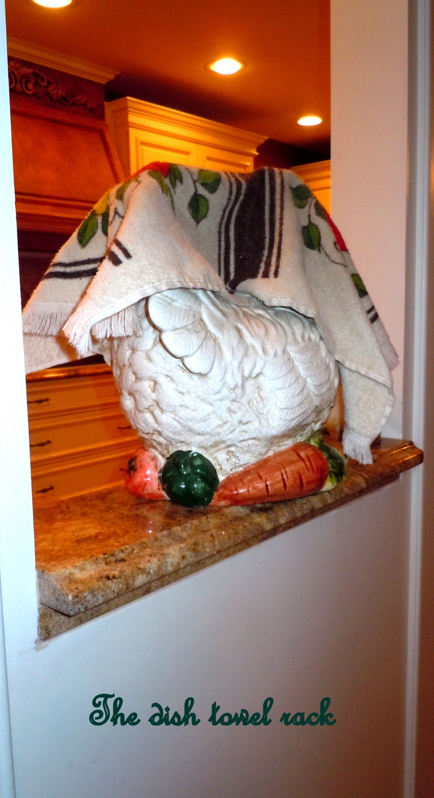
The frying pan apparently needs to be on the cooktop – at all times too. I guess he doesn’t want to bend slightly to open one of the 4 huge drawers that we have underneath to store it. And – to top it all off – he always puts the dish towel to “dry” over my antique ceramic rooster. And it’s never the countless pretty dish towels that I’ve purchased that go with the decor. Oh no – he dredges these up from I don’t know where (he has a secret stash of 70s memorabilia that slips out every now and then). I need to search and destroy (or at least hide this stash so I don’t have to see it!) The one that’s on the “drying rack” now is adorned with strawberries – and it used to be white but now it’s a lovely shade of gray.
How can I be a designer and decorative artist (and a home stager) – and my kitchen coutertop is always crowded with “stuff.” It’s just life and life isn’t always how you see it in magazines. My studio space (with half done projects and samples, brushes, paint cans) and office (with fabrics, folders and countless slips of paper with notes) isn’t the designer showcase that he would love to show off to his friends…so I guess I just have to continue to put stuff away when company and clients come!
My cook top: When we were re-doing our kitchen I tried really hard to get a gas range (Viking preferably) but my very sensible engineer husband said that houses with gas usually blow up. So – no beautiful gas burner for moi. In the beginning everyone was careful cleaning the cooktop. Then life took over. My kids and step kids cooked with abandon and “clean up” wasn’t in the vocabulary. So, our cooktop doesn’t look like it did when it was first installed. It’s not noticeable from afar – but when you’re right on top of it – oh boy. So maybe the frying pan on the cooktop IS a great idea!
But today I wanted to clean it, so I asked Richard to get me the glass cooktop cleaner. He gave me this…
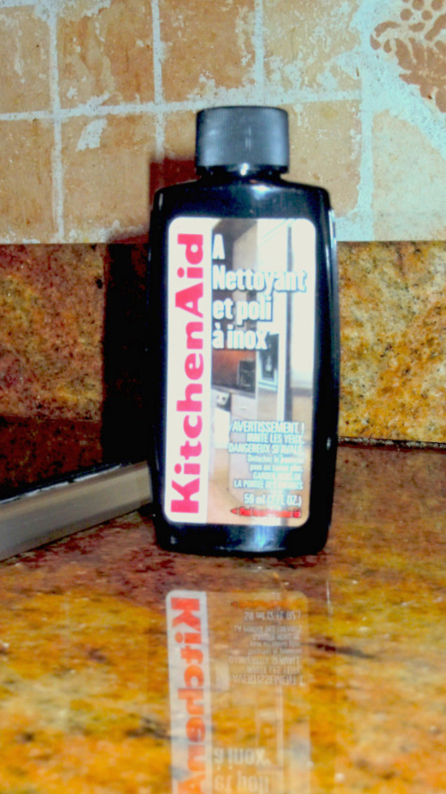
I guess he doesn’t understand French. But I used it (’cause I hardly understand French) and it didn’t do anything. I guess I should have looked more closely at the container…because when you switched it around
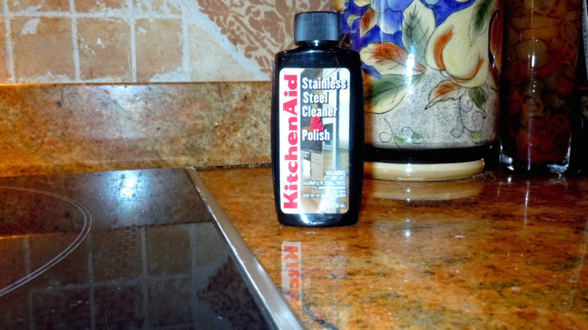
It was a Stainless Steel Cleaner! So then I proceeded to clean the microwave, the oven and the warming drawer (which I didn’t want to do until after Thanksgiving). Then – back to the cooktop. After using the right product – it improved. Not perfect – but better.
So now I guess I just have to buy a beautiful copper pot – that I won’t use – to hide the worst ring on the cooktop. Richard will just have to bend to get the frying pan out of the drawer!
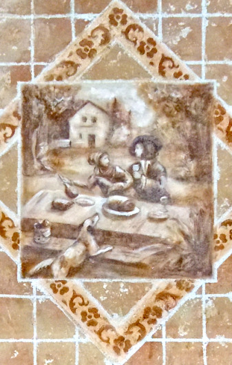
If anyone is interested – the backsplash is all hand troweled with textures…it’s not tile. It took awhile to do because I wasn’t sure of what colors I wanted and how I was going to approach above the cooktop. The space had taped out diamond shapes for quite awhile until I decided on colors! But once I made samples and designed the smaller squares and the handpainted middle square over the cooktop – it went fast. It cost me a lot less than if I had purchased tiles. I looked at so many tiles before I did this. I just couldn’t get the right colors – so I took things into my own hands…literally!
Here are some recent pictures…
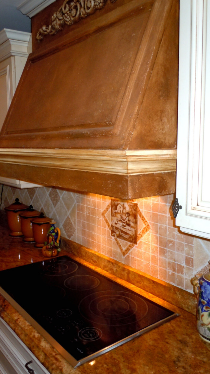
Ahh…there’s the dreaded cooktop! Looking better than it did. I also did a Tuscan texture on my range hood. I think it looks more cohesive than before, when it was cream colored.
Close up of the “tile” over the cooktop. Adapted from a toile by Covington Fabrics. I like to think that the woman is saying to the man “Don’t take away my wine,” which is a pretty accurate picture of what goes on in my house sometimes! Oh yes – I love wine!
So now that everything is clean – just bring on a messy Thanksgiving to dirty it all up again! Hope you all have a Happy!!
Thanks for stopping by The Colorful Bee! Stay in touch and never miss a post.
*Subscribe to receive an e-mail when a new post is up, HERE.
*Subscribe to receive an e-mail when a new post is up, HERE.
Leave a comment
Posted in Uncategorized


 Decorative Finishes
 Interior Design
 Home
Home Garden
 Holiday
 Makeovers
 My Life
 Business
 Tutorials
 Videos
 Paint
Paint